
Recommended
More Related Content
What's hot
What's hot (20)
Viewers also liked
Viewers also liked (20)
Similar to Pr8 Unit 51 Task 1
Similar to Pr8 Unit 51 Task 1 (20)
More from SarahMurrayy
More from SarahMurrayy (20)
Pr8 Unit 51 Task 1
- 2. Date and barcode Masthead Lead Article Lead Article Model Credit Badge Flash Badge Flash Cover Lines Cover Lines
- 3. Kicker Dropcap Pull Quote White Space Headline Gutters Childish kind of Scruffy font Body Text
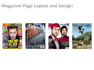
- 4. So the magazine cover I have decided to analyse is Kerrang! Magazine. Kerrang! Is a music TV channel, music radio station and music magazine. I would say that compared to its competition Kerrang! Is quite childish and has a more specified younger target audience. Obviously it is going to be primarily based around people that are into the rock music genre. And age wise I would say 13+, you can tell this from the colours used and the use of the language. Like for example in the Primary Optical Area you see a section dedicated to the free posters you get inside the magazine. It uses the word “Awesome” which suggests it is trying to anchor a younger person. You wouldn’t tend to use the word awesome to a 25 year old. And with the use of colour you have the main title in a really bright red colour. You also see straight away the main story “OLI SYKES PRESENTS HOT SHOTS!” which is in a gradient yellow and orange colour. This also suggests that it could be more leaning towards the female audience as it is suggesting that Oli Sykes is “Hot” and people will want to see him throughout the magazine. Usually you would think that a magazine like Kerrang! Would be more targeted towards the male gender. However with pretty much every weekly issue of Kerrang! There will be a poster feature which is more often than not based on nice looking male artists. Very rarely is it women artists, this obviously suggests that it would me more common for females to hang a poster in their room rather than males. Also with posters I would say that it is another factor at which you can tell it is more based for the younger audiences. You wouldn’t tend to find a 20 year old hanging a poster they got pout of a magazine. However a 13 year old would. When I was 13 my room was covered in posters! Also in terms of the layout of the front cover there is something that grabs your attention in every section. I've already mentioned the Primary Optical Area. In the Strong Fallow Area you see the remainder of the magazine title and a story headline about Corey Taylor, a story about a very popular artist. For the Axis of Orientation you see Oli Sykes a really attractive and popular man. People will see him on the cover and want to buy the magazine. Then in the Weak Fallow Area and Terminal Area you see other story headlines to grab further attention. If you notice the artists used in the different articles vary quite a lot so it is relevant to quite a wider audience. With the use of quite heavy artists like Corey Taylor (Slipknot) to Don Broco and You Me At Six which aren't as heavy. The double page spread I have chosen to discuss is also from Kerrang! Magazine. It is a story on Mark Hoppus form Blink 182. Like I mentioned with the age range for Kerrang! above, the same applies to the double page spread. The same aged audience is targeted. You can tell it is targeted at younger people again due to the colours used and the childish type qualities it has. Like the font, it is as though its written in a rushed kind of untidy font. Like what a child would write. This makes it eye catching as it takes up the majority of the double page spread. Also with there being so much white plain back ground it stands out even more. It would come across as maybe a little unprofessional and immature if the target age was higher. Also Mark himself is posing for the picture as though he is scared, it relates to the title. Its as though he is scared of the so called “DINOSAUR”. I also feel that as Mark Hoppus is in quite an immature band it has relevance to them in real life. Blink 182 are a punk band so stereotypically Punk artists are crazy, so the article helps him as an individual and the band as a whole keep up to the fans expectations. Also with the target age being so low if you notice in the article there is hardly any writing, there is just 3 little blocks of text. There is more going on around the text with the images and the big fonts that more attention is drawn to them. Plus younger readers wont want to read tonnes of writing, if it is just short and snappy like it is and also with the pull quote and kicker it keeps it a bit more easier to read. Also with the use of colour, it is almost a convention of the genre of the artist featuring in the article and the magazines genre as a whole. In the sense that Mark is wearing all black which again is a sign of Punk and also his spikey hair. And then with the simple use of red and black in the title both colours signify danger and death, relevant to the attention drawn to the Dinosaur.
- 5. Scoot – Mag is a magazine for people interested in the extreme sport, scootering. Its only been established for a few years and only has quite a basic specific audience. Compared to music and fashion the audience is targeted around 12 – 25+. And the demographic is a little harder to predict due to it being a more younger audience so a lot of inexperienced people. However the magazine is based on professionals in the sport so in that area it may be quite prestige and high for some of the older readers. I would also have to say that it is more targeted towards males than females purely because the sport is more male dominant, however I'm a female and I read the magazine because I am really interested in the sport. So with the front cover I have chosen is the second issue they released. The rider featuring on the cover is one of the most famous riders in the sport, Terry Price who is sponsored by MADD GEAR. As you can see he is the main feature of the cover in the Axis of Orientation. It definitely anchors the reader as he is doing an insane trick. It will attract the younger readers due to them being mesmerised by upside-down tricks, its a massive convention of the sport. And if you notice the main title at the top of the issue matches the colours he is wearing, turquoise is Terry’s favourite colour so it relates in that perspective which is really clever. And the other writing throughout the cover is the same turquoise colour and white so it stands out of the busy background. The text is all quite short and easy to read especially with it being all capitalized making it seem a bit more in your face and important. There is also the signature barcode they have on every issue in the Terminal Area. Its made to look like a half pipe ramp with someone riding on it which is a clever and creative thing to do and pleasing to that of the younger readers. It looks professional in the sense that the layout is done not too busy and so that even though there is writing over the main background picture it is still really vibrant and obvious to please the readers. And also in terms of the Gutenberg Principle there is nothing going on in the Weak Fallow Area where your eyes lie last. The main focus’ are in the Primary Optical Area, Strong Fallow Area and the in the Axis of Orientation. This is a double page spread from Scoot – Mag . It is an article about a rider called Billy Kendal . Basically a write up about him getting sponsored. The article is headlined as young blood which is quite a clichéd statement for someone that may be new to something and expected to do well. I think its effective how the actual headline is made to look scruffy like it is wrote in blood. Its relevant, and also the red splats on the main article page, again made to look like blood. And they have done well to keep it to the target audiences standards with the picture features, people want to see pictures. It helps get a taste of the riders profile especially with the 2 varied images. Ones quite fashion styled and the other an action shot of him riding. There also isn't an awful lot of writing so readers wont get bored or over faced by reading. Its kept fairly brief which is a good thing considering the rider isn't very well known so readers aren't going to want to read tonnes of information about a new comer. There is a lot of white space on the main article page, but it is pulled off well with the other things Going on within the page. I also like the way the action picture looks torn and scruffy, it contributes towards the messy blood look.