Unit 51 Page Layout and Design
Production Commentary
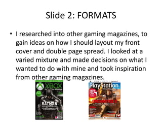
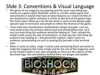
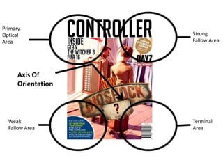
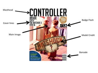
The document discusses the design and layout of a gaming magazine cover and double page spread created by the author in Adobe Photoshop. Research was conducted on other gaming magazines to gain ideas on formatting and layout conventions. The magazine focused on the game Bioshock, so the font and color scheme took inspiration from its art deco style and logo. Design principles like Guttenberg's were applied, with the masthead in the primary optical area and credits along the axis of orientation. The target audience was identified as mainly young males aged 15-25, and the informal language and popular games featured would appeal to this demographic.
