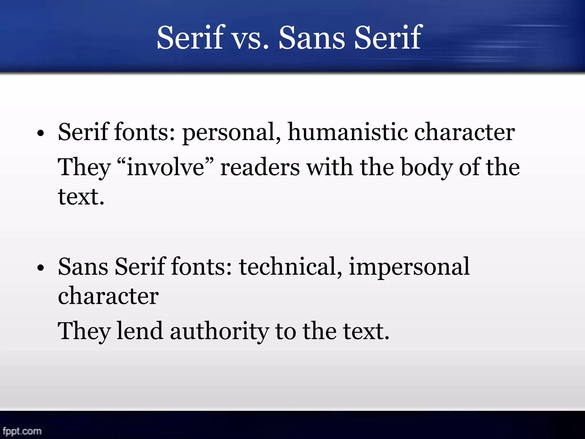
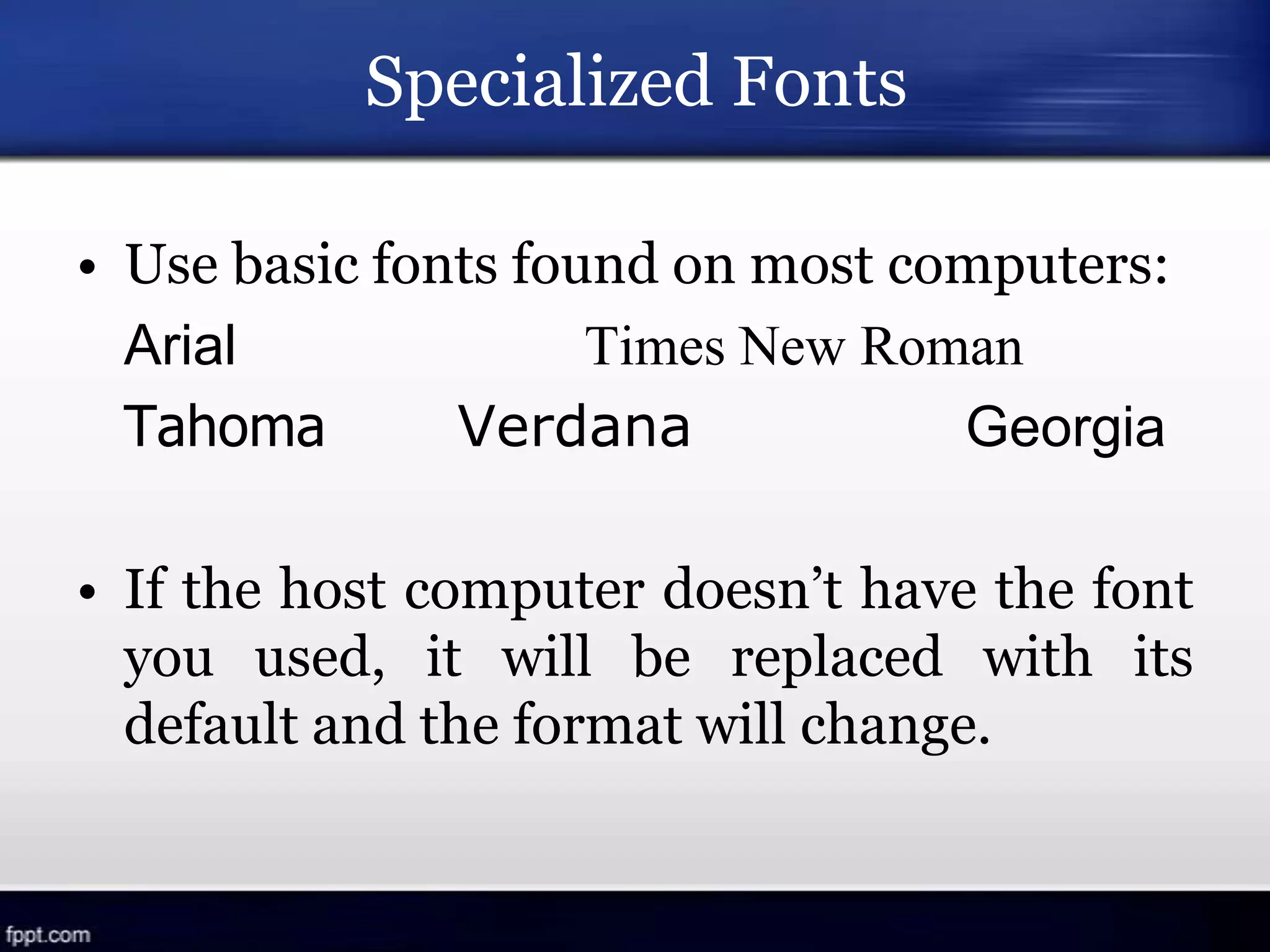
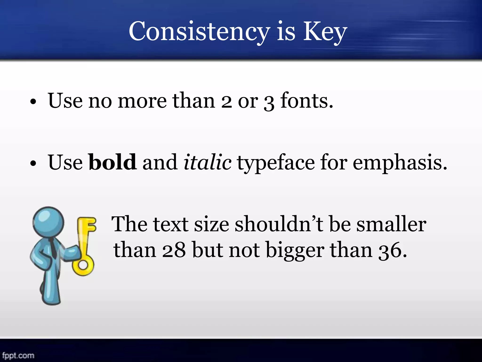
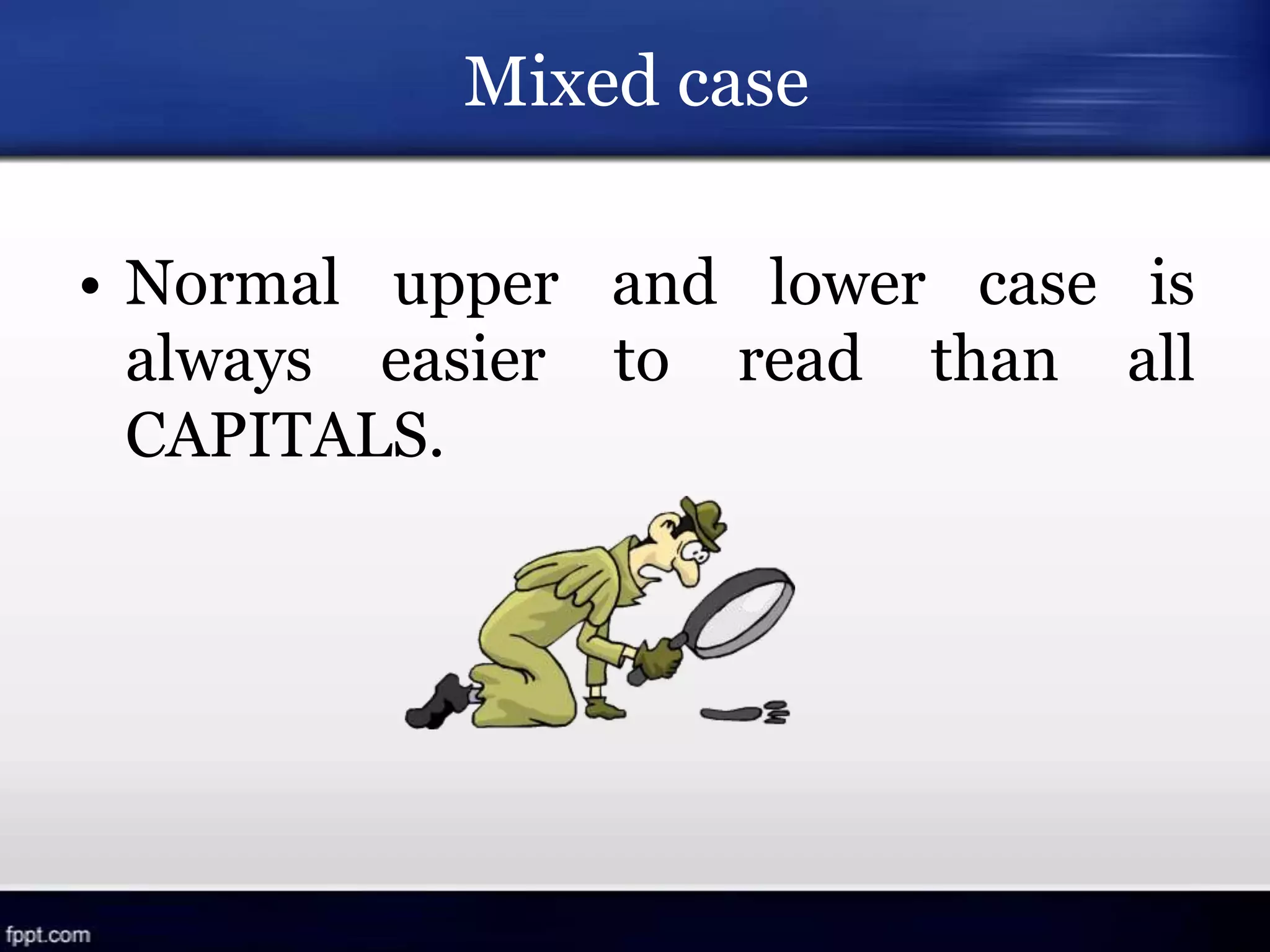
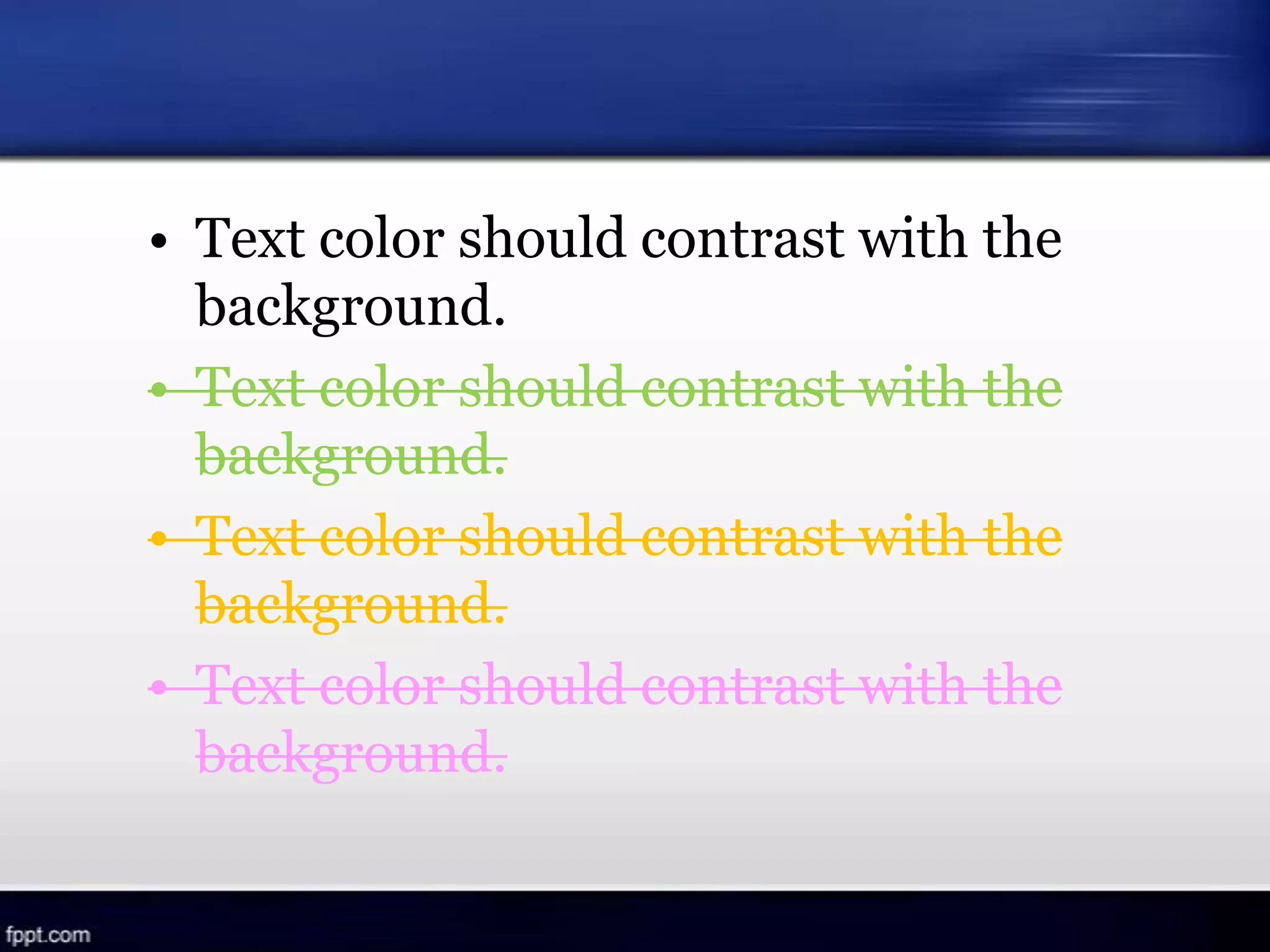
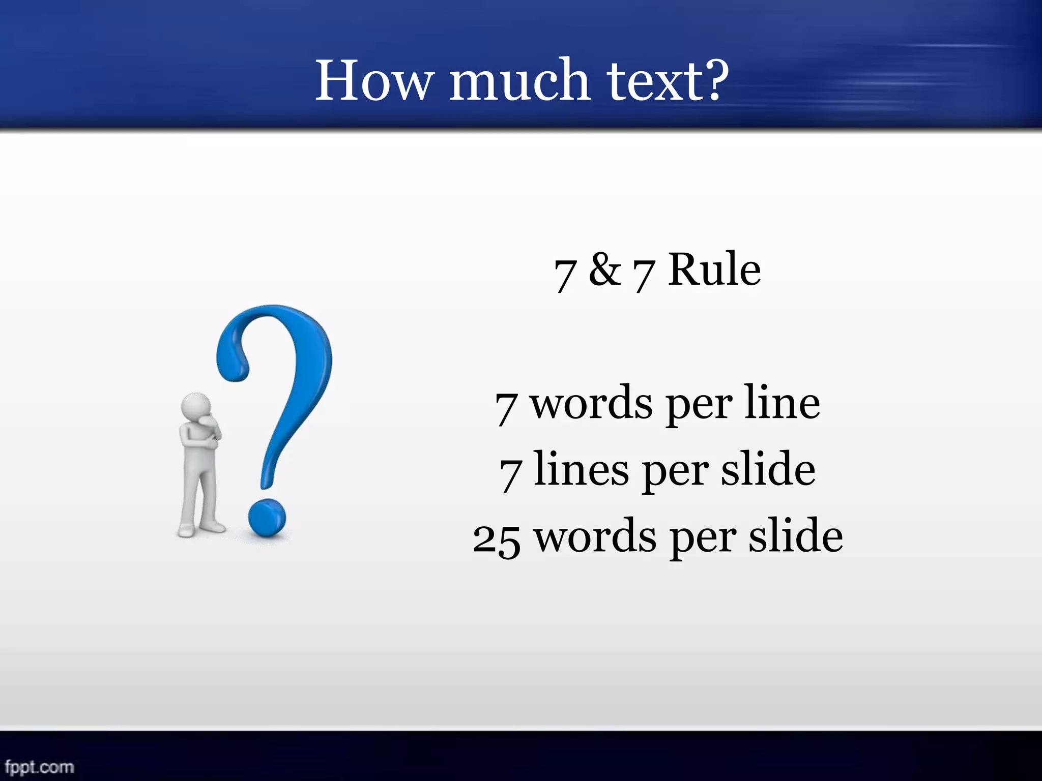
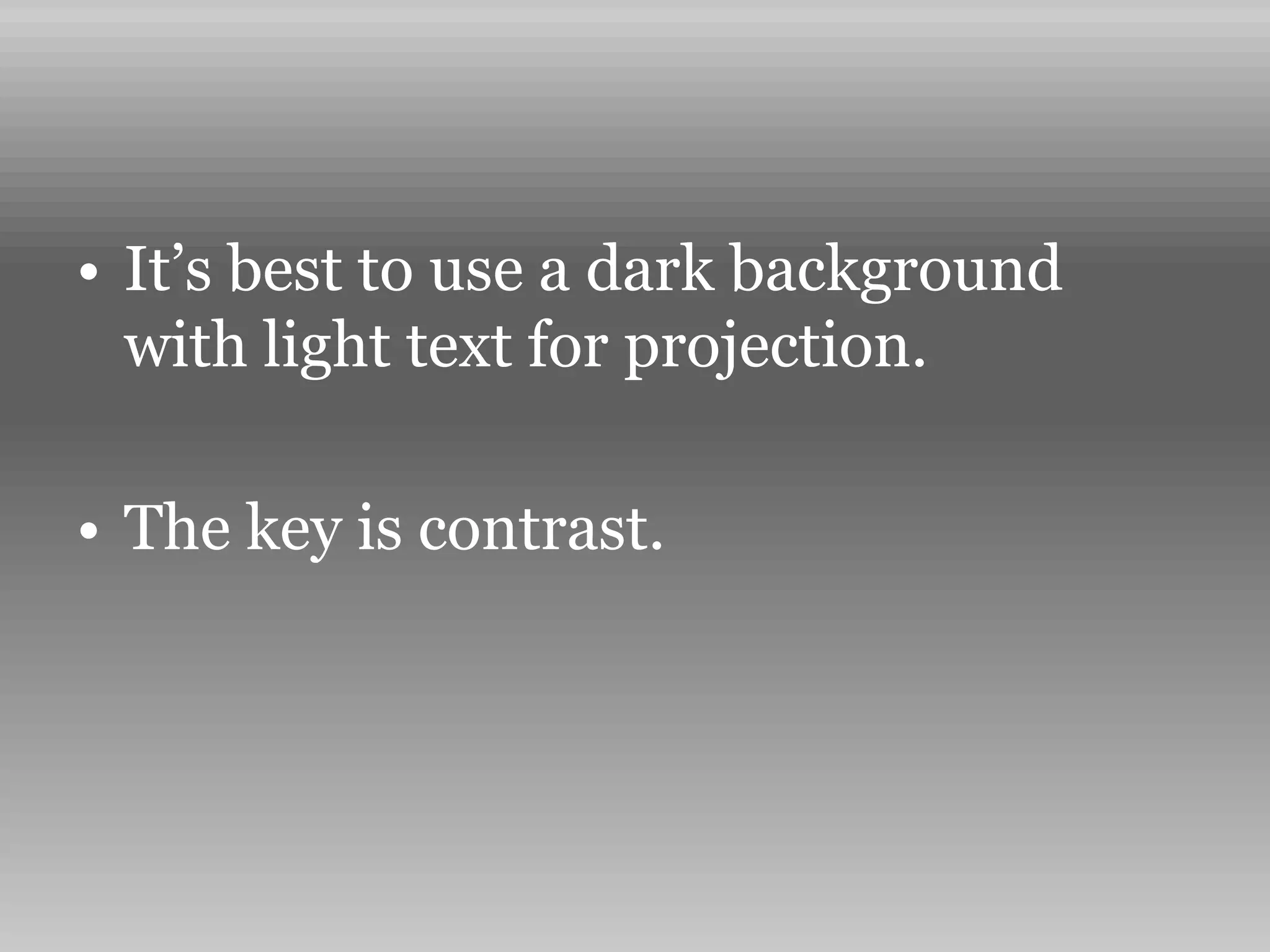
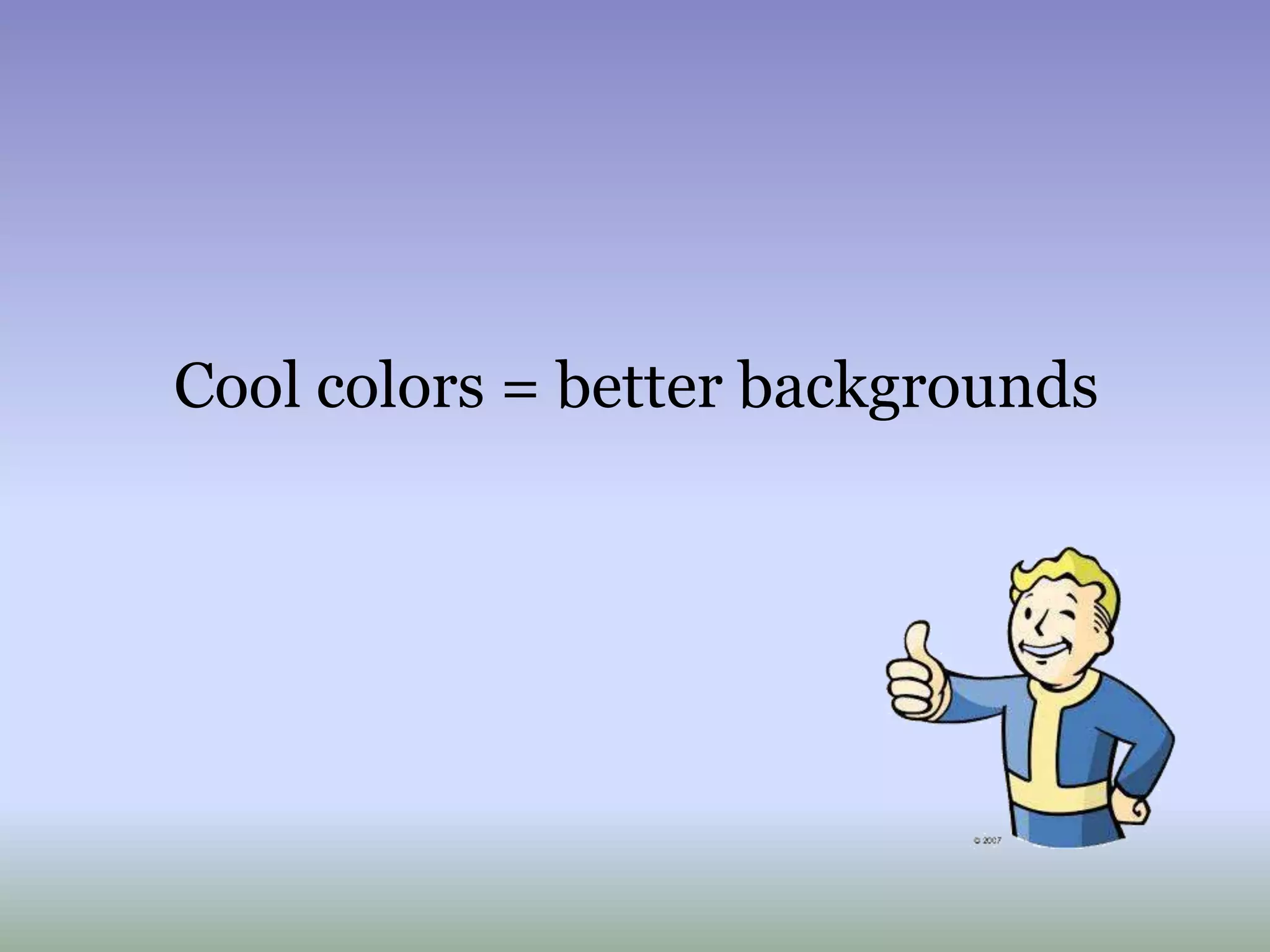
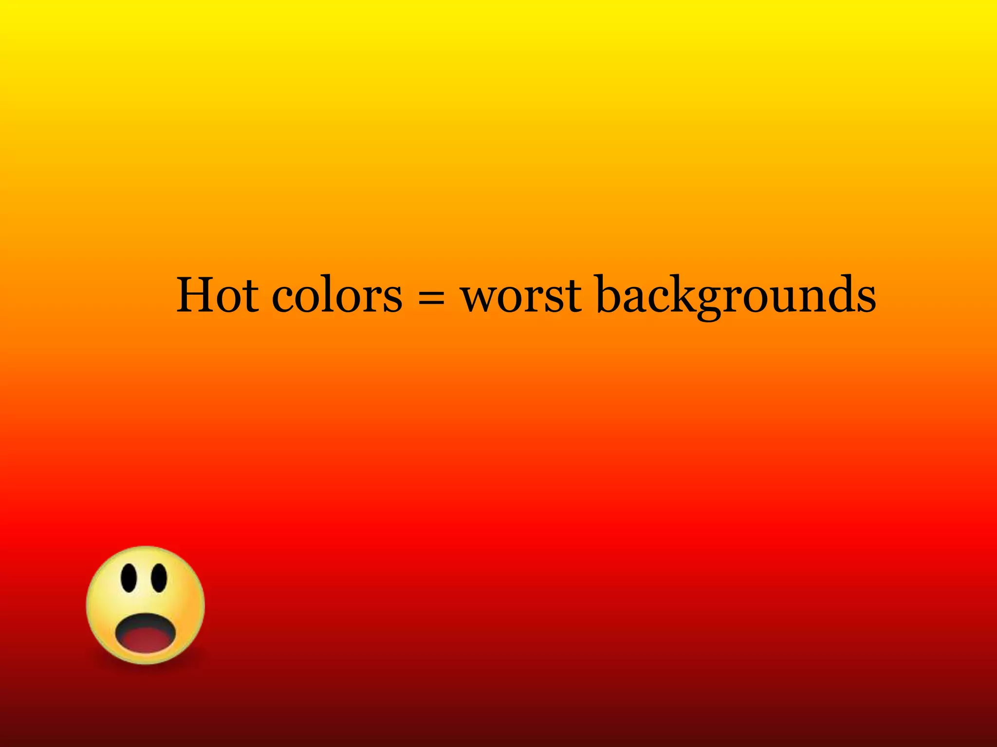
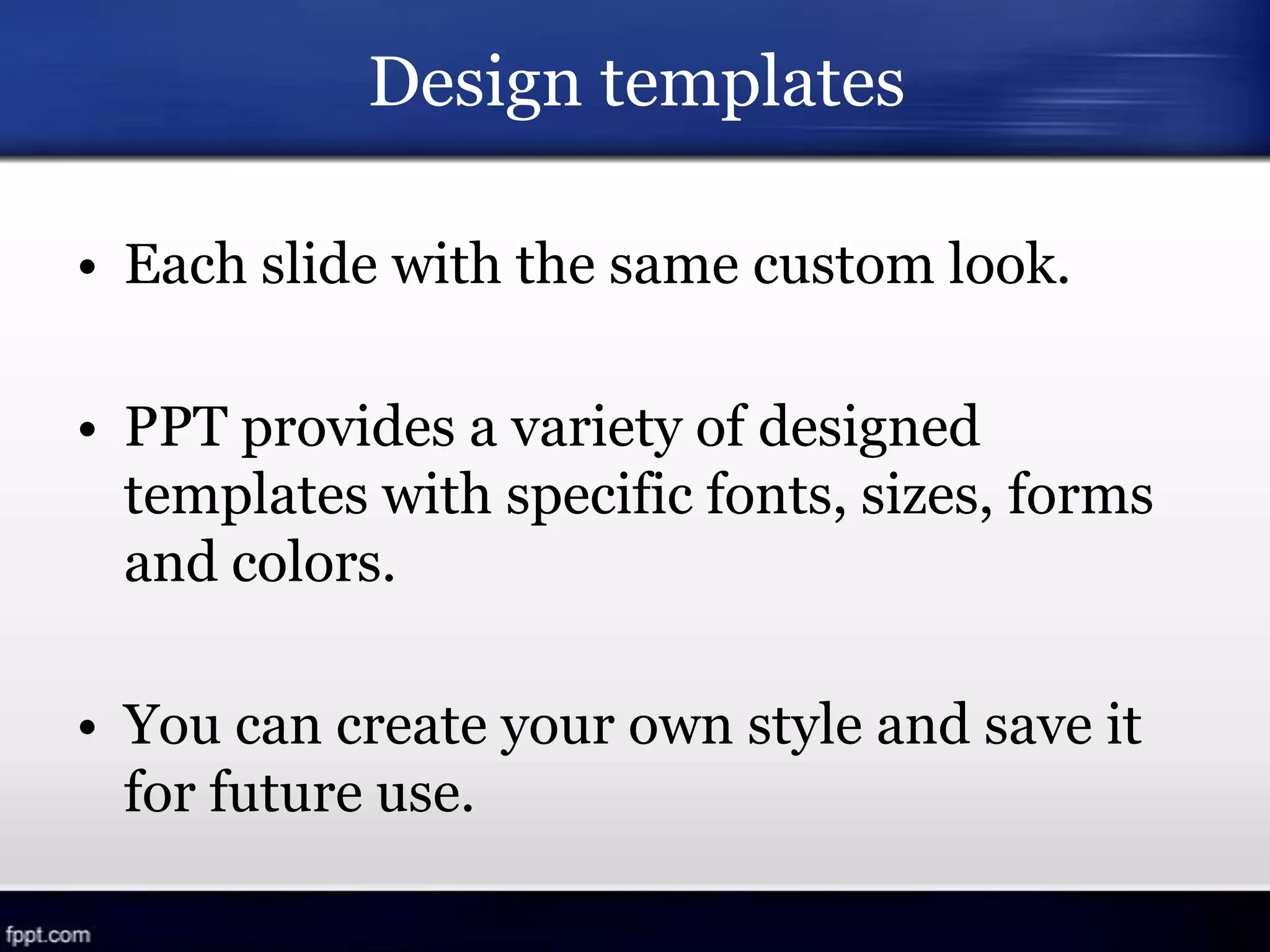
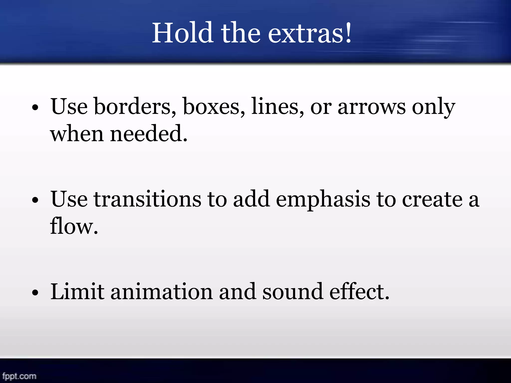
Power Point
Design Keys
Astrid Aquino
Carné: 6076-10-13094
April 26, 2013
Nowadays, most presenters
produce stuff like this…
People don’t pay attention to boring things…
that is why… PPT design does matter!
Let’s start…!!!
Serif vs. Sans Serif
• Serif fonts: personal, humanistic character
They “involve” readers with the body of the
text.
• Sans Serif fonts: technical, impersonal
character
They lend authority to the text.
Recommended
Serif: large amounts of text
Sans Serif: headlines and labels
COMBO!
Arial bold: headlines
Times New Roman Bold: body text
Specialized Fonts
• Use basic fonts found on most computers:
Arial Times New Roman
Tahoma Verdana Georgia
• If the host computer doesn’t have the font
you used, it will be replaced with its
default and the format will change.
Match the tone of your content
• Times New Roman: conservative audiences
or serious messages
• Verdana – Tahoma: technology topics or
related to the future
Consistency is Key
• Use no more than 2 or 3 fonts.
• Use bold and italic typeface for emphasis.
The text size shouldn’t be smaller
than 28 but not bigger than 36.
Mixed case
• Normal upper and lower case is
always easier to read than all
CAPITALS.
• Text color should contrast with the
background.
• Text color should contrast with the
background.
• Text color should contrast with the
background.
• Text color should contrast with the
background.
• Avoid using a lot of colors.
• Consider varying the color scheme to
make “old” schemes as “new” ones to
students.
Limited color version
• Colors easily recognizable and that
maximize the effect of the PPT.
• Use bright texts and objects over dark
backgrounds, and viceversa.
• Use bold fonts and objects as thick or big
as possible.
• Avoid using red characters on black
backgrounds.
How much text?
7 & 7 Rule
7 words per line
7 lines per slide
25 words per slide
Remember…
• Keep text to the essential.
• KISS: Keep It Short and Simple.
• Charts and graphics from 3 to 6 bullet
points and a single, simple graphic that
illustrates the slide title.
Background Color
• It’s best to use a dark background
with light text for projection.
• The key is contrast.
Cool colors = better backgrounds
Hot colors = worst backgrounds
There are exceptions to every rule.
The key is learning when to break them.
Good news…
Design templates
• Each slide with the same custom look.
• PPT provides a variety of designed
templates with specific fonts, sizes, forms
and colors.
• You can create your own style and save it
for future use.
Hold the extras!
• Use borders, boxes, lines, or arrows only
when needed.
• Use transitions to add emphasis to create a
flow.
• Limit animation and sound effect.
Keep it simple
• Don’t overuse effects or overcrowded
slides.
FOCUS = CONTENT
• Use the slides to illustrate your speech, not
to replace your handouts.
Be aware of your audience!
Use images…
• To capture attention and clarify points.
• In most cases, one image per slide and
vary the location.
• Take into account how the audience will
perceive the images included in the PPT.
And what about animation?
Animating texts and objects
Ask yourself if the slide can be explained
without it.
Pedagogical uses for animation
• Helps students remember a part of your
PPT.
• Represents connections between concepts
and emphasizes key points.
• Add visual representation to different
concepts.
Animating text or pictures with a variety of
speeds and visual effects adds little but
distraction, delay, and a frivolous feel.
Using these keys and adding animation to
your presentation can have a great impact
if used effectively.
Let’s start practicing and helping not only
your students but yourself to do things
better!
E-graphy
• PPT Hot Tips.pdf
• Animation for your PPT.pdf
• http://www.slideshare.net/dkuropatwa/d
esign-matters-v2
Power Point Design Keys

Power Point Design Keys

  • 1.
    Power Point Design Keys AstridAquino Carné: 6076-10-13094 April 26, 2013
  • 2.
  • 4.
    People don’t payattention to boring things… that is why… PPT design does matter!
  • 6.
  • 7.
    Serif vs. SansSerif • Serif fonts: personal, humanistic character They “involve” readers with the body of the text. • Sans Serif fonts: technical, impersonal character They lend authority to the text.
  • 8.
    Recommended Serif: large amountsof text Sans Serif: headlines and labels COMBO! Arial bold: headlines Times New Roman Bold: body text
  • 9.
    Specialized Fonts • Usebasic fonts found on most computers: Arial Times New Roman Tahoma Verdana Georgia • If the host computer doesn’t have the font you used, it will be replaced with its default and the format will change.
  • 10.
    Match the toneof your content • Times New Roman: conservative audiences or serious messages • Verdana – Tahoma: technology topics or related to the future
  • 11.
    Consistency is Key •Use no more than 2 or 3 fonts. • Use bold and italic typeface for emphasis. The text size shouldn’t be smaller than 28 but not bigger than 36.
  • 12.
    Mixed case • Normalupper and lower case is always easier to read than all CAPITALS.
  • 13.
    • Text colorshould contrast with the background. • Text color should contrast with the background. • Text color should contrast with the background. • Text color should contrast with the background.
  • 14.
    • Avoid usinga lot of colors.
  • 15.
    • Consider varyingthe color scheme to make “old” schemes as “new” ones to students.
  • 16.
    Limited color version •Colors easily recognizable and that maximize the effect of the PPT. • Use bright texts and objects over dark backgrounds, and viceversa.
  • 17.
    • Use boldfonts and objects as thick or big as possible. • Avoid using red characters on black backgrounds.
  • 18.
    How much text? 7& 7 Rule 7 words per line 7 lines per slide 25 words per slide
  • 19.
    Remember… • Keep textto the essential. • KISS: Keep It Short and Simple. • Charts and graphics from 3 to 6 bullet points and a single, simple graphic that illustrates the slide title.
  • 20.
  • 21.
    • It’s bestto use a dark background with light text for projection. • The key is contrast.
  • 22.
    Cool colors =better backgrounds
  • 23.
    Hot colors =worst backgrounds
  • 24.
    There are exceptionsto every rule. The key is learning when to break them. Good news…
  • 25.
    Design templates • Eachslide with the same custom look. • PPT provides a variety of designed templates with specific fonts, sizes, forms and colors. • You can create your own style and save it for future use.
  • 26.
    Hold the extras! •Use borders, boxes, lines, or arrows only when needed. • Use transitions to add emphasis to create a flow. • Limit animation and sound effect.
  • 27.
    Keep it simple •Don’t overuse effects or overcrowded slides. FOCUS = CONTENT • Use the slides to illustrate your speech, not to replace your handouts. Be aware of your audience!
  • 28.
    Use images… • Tocapture attention and clarify points. • In most cases, one image per slide and vary the location. • Take into account how the audience will perceive the images included in the PPT.
  • 29.
    And what aboutanimation?
  • 30.
    Animating texts andobjects Ask yourself if the slide can be explained without it.
  • 31.
    Pedagogical uses foranimation • Helps students remember a part of your PPT.
  • 32.
    • Represents connectionsbetween concepts and emphasizes key points.
  • 33.
    • Add visualrepresentation to different concepts.
  • 34.
    Animating text orpictures with a variety of speeds and visual effects adds little but distraction, delay, and a frivolous feel.
  • 35.
    Using these keysand adding animation to your presentation can have a great impact if used effectively. Let’s start practicing and helping not only your students but yourself to do things better!
  • 36.
    E-graphy • PPT HotTips.pdf • Animation for your PPT.pdf • http://www.slideshare.net/dkuropatwa/d esign-matters-v2