Handout 2 for POW! Your Point: Better Presentations for a Happier Audience given at the Arizona Library Association Annual Conference November 19, 2015.
9 Tips for Creating an Excellent PowerPoint Presentation Workforce Group
To create an exceptional PowerPoint presentation, you need to have design skills, technical literacy, and a good sense of creativity. These 9 tips should help you prepare for your next presentation.
9 Tips for Creating an Excellent PowerPoint Presentation Workforce Group
To create an exceptional PowerPoint presentation, you need to have design skills, technical literacy, and a good sense of creativity. These 9 tips should help you prepare for your next presentation.
The following 37 slides present guidelines and suggestions f.docxoreo10
The following 37 slides present guidelines and suggestions for the use of fonts, colors, and graphics when preparing PowerPoint presentations for
Sessions and Seminars.
This media (PPT) is designed to ENHANCE your presentation, not BE the presentation.
Remember, only you can prevent
“Death by PowerPoint”
PowerPoint Presentation Guidelines
Highlight key points or reinforce what the facilitator is saying
Should be short and to the point, include only key words and phases for visual, reinforcement
In order for your presentation to fit on most screens, text and images should be placed within 95% of the PowerPoint slide. This “action safe” area is seen in the next slide.
PowerPoint Slide
*
Layout continuity from frame to frame conveys a sense of completenessHeadings, subheadings, and logos should show up in the same spot on each frameMargins, fonts, font size, and colors should be consistent with graphics located in the same general position on each frameLines, boxes, borders, and open space also should be consistent throughout
PowerPoint Layout
Fonts Font Style Should be ReadableRecommended fonts: Arial, Tahoma, VerandaStandardize the Font ThroughoutThis presentation is in Tahoma
Do !
This is a good title size Verdana 40 point
A good subtitle or bullet point size Verdana 32 point
Content text should be no smaller than
Verdana 24 point
This font size is not recommended for content. Verdana 12 point.
Font SizeThe larger, the better. Remember, your slides must be readable, even at the back of the room.
TIPS Presentation: 3/8/2004
Dawn Thomas, CRM
Font Size
What does this say? Garamond Font, Italic, Bold 12pt.
This is very difficult to read. Times Font, Bold, 12pt.
This point could be lost. Century Gothic Font, Bold, Italic, 14pt.
No one will be able to read this. Gill Sans Font, Condensed Bold, 12pt Combining small font sizes with bold or italics is not recommended:Small fonts are okay for a footer, such as:
Don’t !
FontsDon’t Sacrifice Readability for StyleDon’t Sacrifice Readability for StyleDon’t Sacrifice Readability for StyleDon’t Sacrifice Readability for Style
Don’t !
Caps and ItalicsDO NOT USE ALL CAPITAL LETTERSMakes text hard to readConceals acronymsDenies their use for EMPHASISItalicsUsed for “quotes”Used to highlight thoughts or ideasUsed for book, journal, or magazine titles
Use a TemplateUse a set font and color scheme.Different styles are disconcerting to the audience.You want the audience to focus on what you present, not the way you present.
Use the Same Background
on Each Slide
Do !!
Don’t use multiple backgrounds in your presentation
Changing the style is distracting
Don’t!
ColorsReds and oranges are high-energy but can be difficult to stay focused on.
Greens, blues, and browns are mellower, but not as attention grabbing.
Reds and Greens can be difficult to see for those who are color blind.
Avoid These Combinations
Examples:Green on BlueDark Yellow on GreenPurple on ...
Reaching Out Closer to Home: Turning Coworkers into Library ChampionsMesaPublicLibrary
No library is an island. You work with people who are community experts, dedicated to public service, and don’t work in a library. Do they know what you do?
Presented by Cherise Mead at the Arizona Library Association Annual Conference on November 20, 2015.
Handout 1 for POW! Your Point: Better Presentations for a Happier Audience given at the Arizona Library Association Annual Conference November 19, 2015.
Pow! Your Point: Better Presentations for a Happier AudienceMesaPublicLibrary
Creating an eye-pleasing presentation is easier than you think, strengthens your message, and keeps your audience engaged. Every decision you make, from color schemes to the content you include on your slides, can help or hinder the delivery of your message. Presented at the Arizona Library Association Annual Conference on November 19, 2015.
0x01 - Newton's Third Law: Static vs. Dynamic AbusersOWASP Beja
f you offer a service on the web, odds are that someone will abuse it. Be it an API, a SaaS, a PaaS, or even a static website, someone somewhere will try to figure out a way to use it to their own needs. In this talk we'll compare measures that are effective against static attackers and how to battle a dynamic attacker who adapts to your counter-measures.
About the Speaker
===============
Diogo Sousa, Engineering Manager @ Canonical
An opinionated individual with an interest in cryptography and its intersection with secure software development.
This presentation, created by Syed Faiz ul Hassan, explores the profound influence of media on public perception and behavior. It delves into the evolution of media from oral traditions to modern digital and social media platforms. Key topics include the role of media in information propagation, socialization, crisis awareness, globalization, and education. The presentation also examines media influence through agenda setting, propaganda, and manipulative techniques used by advertisers and marketers. Furthermore, it highlights the impact of surveillance enabled by media technologies on personal behavior and preferences. Through this comprehensive overview, the presentation aims to shed light on how media shapes collective consciousness and public opinion.
This presentation by Morris Kleiner (University of Minnesota), was made during the discussion “Competition and Regulation in Professions and Occupations” held at the Working Party No. 2 on Competition and Regulation on 10 June 2024. More papers and presentations on the topic can be found out at oe.cd/crps.
This presentation was uploaded with the author’s consent.
Have you ever wondered how search works while visiting an e-commerce site, internal website, or searching through other types of online resources? Look no further than this informative session on the ways that taxonomies help end-users navigate the internet! Hear from taxonomists and other information professionals who have first-hand experience creating and working with taxonomies that aid in navigation, search, and discovery across a range of disciplines.
Acorn Recovery: Restore IT infra within minutesIP ServerOne
Introducing Acorn Recovery as a Service, a simple, fast, and secure managed disaster recovery (DRaaS) by IP ServerOne. A DR solution that helps restore your IT infra within minutes.
Sharpen existing tools or get a new toolbox? Contemporary cluster initiatives...Orkestra
UIIN Conference, Madrid, 27-29 May 2024
James Wilson, Orkestra and Deusto Business School
Emily Wise, Lund University
Madeline Smith, The Glasgow School of Art
María Carolina Martínez - eCommerce Day Colombia 2024
POW! Your Point Handout 2: Design Basics
1. POW! Your Point: Better Presentations for a Happier Audience
Sara Lipich and Cherise Mead
Mesa Public Library
AzLA 2015 Conference
Design Basics
Form follows function. Don't sacrifice getting your point across for the sake of
design. Make sure your design is harmonious and the design decisions you make
facilitate the central message of your presentation.
Layout/Composition
When you look at a slide, does your eye bounce around, looking all over, trying to find a place to rest?
Use design elements to lead the viewer's eye to the "aha" moment on the slide, to the part of the image
that reinforces your message.
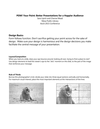
Rule of Thirds
Borrow this photographer's trick: divide your slide into three equal sections vertically and horizontally.
For maximum visual interest, place the most important elements at the intersections of the lines.
2. Scale
Scale creates relationships between objects on the slide, and helps the audience navigate visually.
Big things can have a big impact…
Contrast
Color
Color
Colors have emotional impact. Each color can impart a mood or feeling; each color has both positive
and negative associations (ex. red is exciting, but is also associated with anger). Be aware of your own
personal preferences towards color, and make sure you are using colors that are appropriate to
reinforce your message, not just colors you like.
…so can small things.
Dark text
on a light background
is easy to read It needs to be heavier weight
and a larger point size.
Light text on a dark background
is more difficult to read.
Space
Don't be afraid to leave some empty
space on your slide. Used effectively, it
can make your message stand out, and
increase the impact of an image.
The eye is drawn to the active space.
3. Text & Font
Is it Legible? This is the most important rule when it comes to text and font!
Above all, make sure the text on your slides is easy to read.
Emphasis
Heirarchy: Display vs. Body
Font styles are designed for different reasons. Some fonts are created for big emphasis, but do not look
good when shrunk down (the detail gets lost and they become difficult to read). "Body" fonts are meant
for bigger blocks of text – they remain legible at smaller sizes.
ALL CAPS
Slows reading and there is a loss of legibility. Use only for attention-getting headlines.
Italics
Also slows reading but legibility is usually well maintained. Use for emphasis (when you want the viewer
to slow down and absorb a point).
Bold
Use for emphasis, legibility and readability is well maintained. But be careful, font that is very big and
bold can be difficult on the eyes.
Underlined
Underlined text on a screen usually signifies a hyperlink, so this can be confusing. Best to avoid in PPT.
Alignment
Flush Left
This is how most typewritten text is set,
so it's familiar to people and easy to read.
Flush Right
Because it is less common, it's a little more difficult to read,
but can also be used to make an impact.
Centered
If you just have a few words on the slide, centered can look nice.
But if there's a lot of text centered,
it's more difficult for the eye and brain to track.
4. Serif vs. Sans Serif
In typography, a serif is a small finishing stoke attached to the beginning and/or end of the main stroke
of a letter or symbol in some fonts. "Sans" is French for "without," - sans serif fonts do not have these
finishing stokes. Serif fonts are easier to read in print. Sans Serif fonts are easier to read on screens.
This font, Times New Roman, is a serif font.
This font, Segoe UI, is a sans serif font.
Kerning
The horizontal spacing between letters. Kerning can be adjusted so that words stretch out to take up
more horizontal space or compact together to take up less. This can be helpful for fine-tuning the
design of a slide, but too much adjustment in either direction can make text more difficult to read.
Thes e le tter s a r e s pa ced to o wide ly .
Theselettersarespacedtooclose.
These letters are just right.
Line Spacing
The vertical distance between lines of text. If lines are spaced inadequately or too widely, it makes the
text more difficult to read.
What Font Should You Use?
Remember fonts have personalities. Choose the appropriate personality for your message.
Stick to 2-3 font types and font sizes throughout your PPT.
Size Matters
Font size in a PPT slide should not be smaller than 28 points. Ever. Generally bigger is better (but a font
that is very bold and then made very large size can be overwhelming to the eye, so be careful – 96 pt is
listed as the maximum in PPT for a reason!).
How Much Text?
Ideally no more than 7-10 words across on a slide (10-14 is also acceptable, but remember that your
font size will decrease).
Bullets
If you have to do bullet points on a slide, 3 is the ideal number. 5 maximum.
If you have more points to make, it warrants being made into a separate slide(s).
Generally, save your bullets for your handouts.