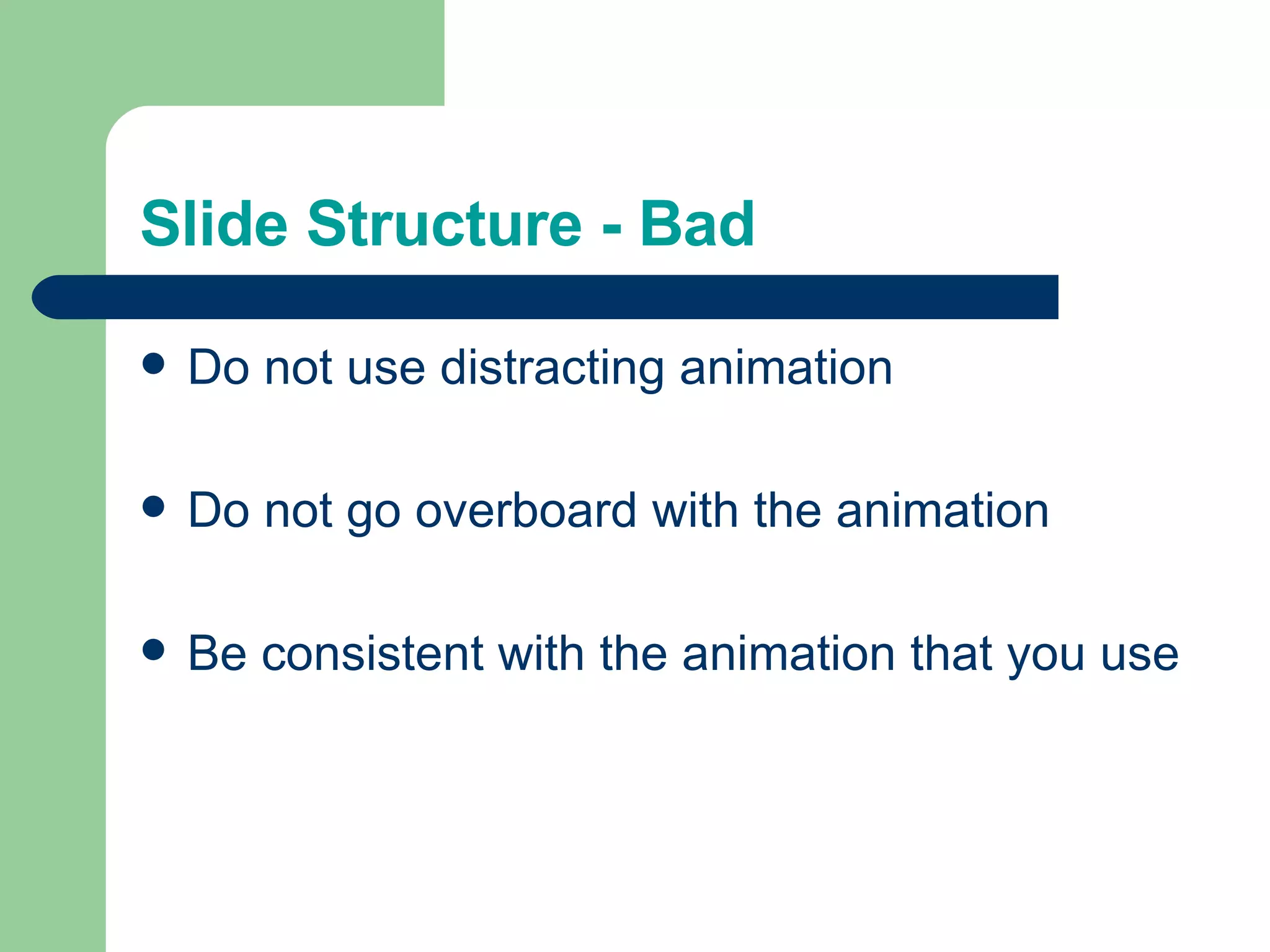
The document provides tips for creating effective PowerPoint slides by avoiding common pitfalls:
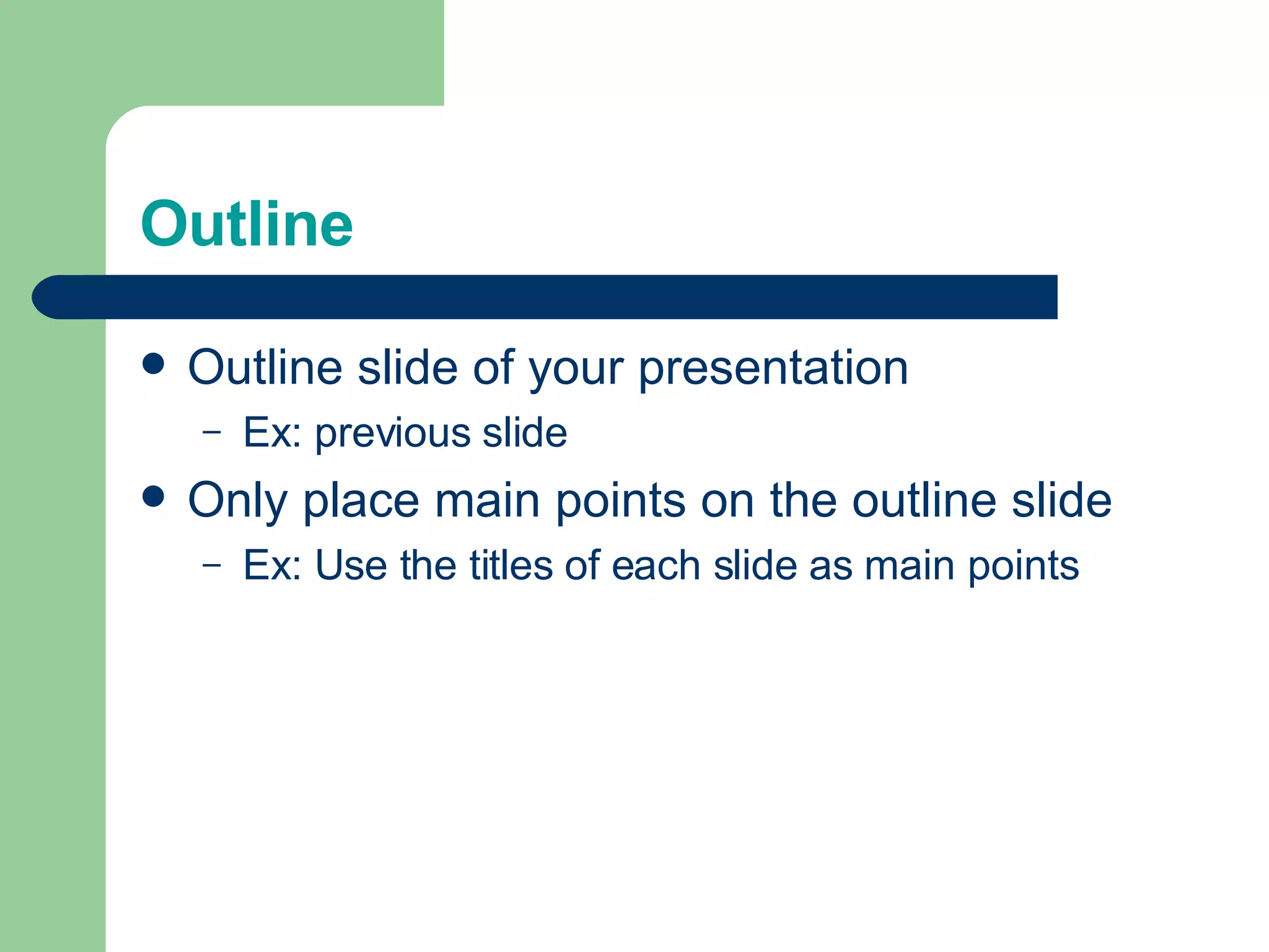
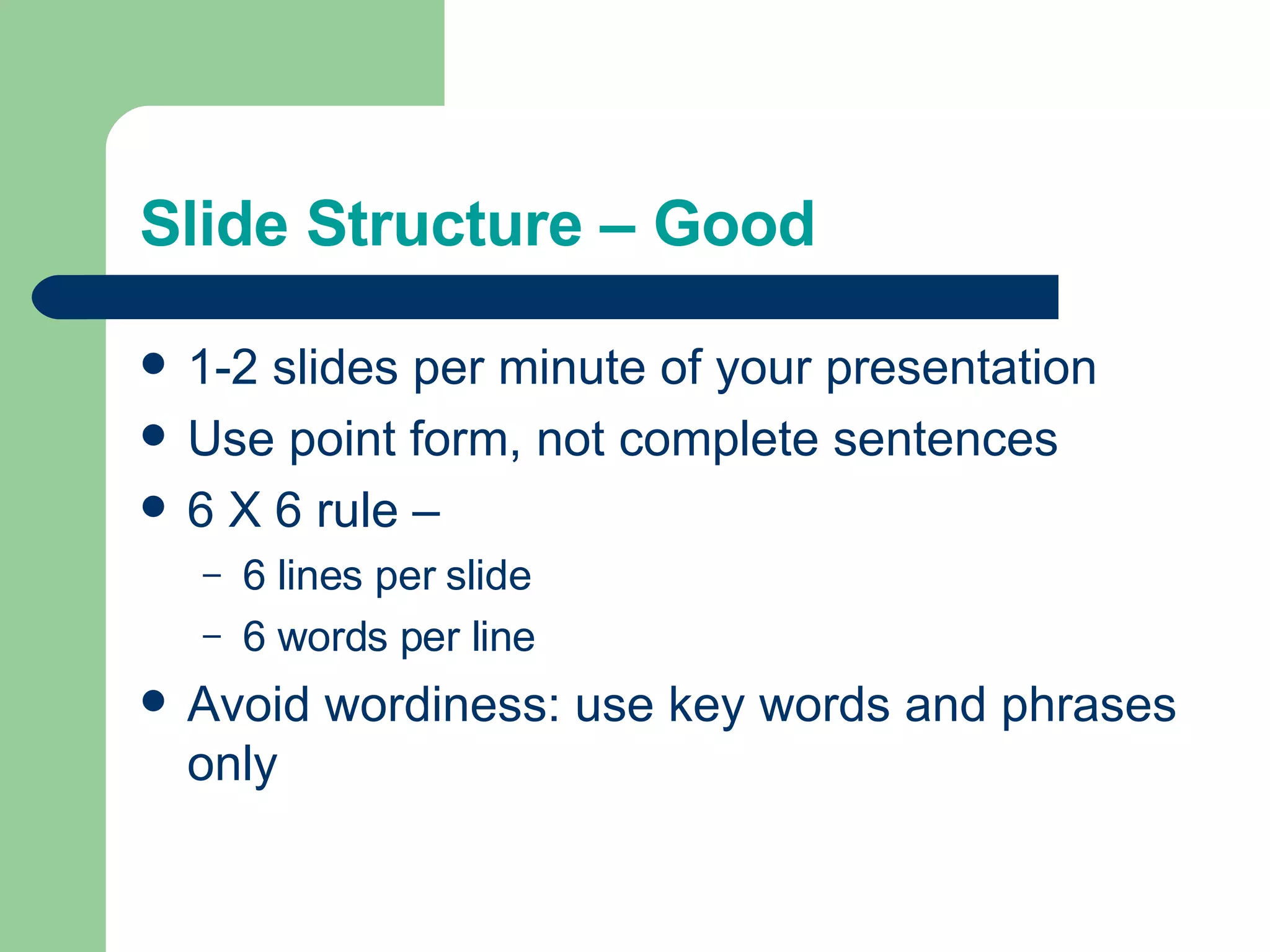
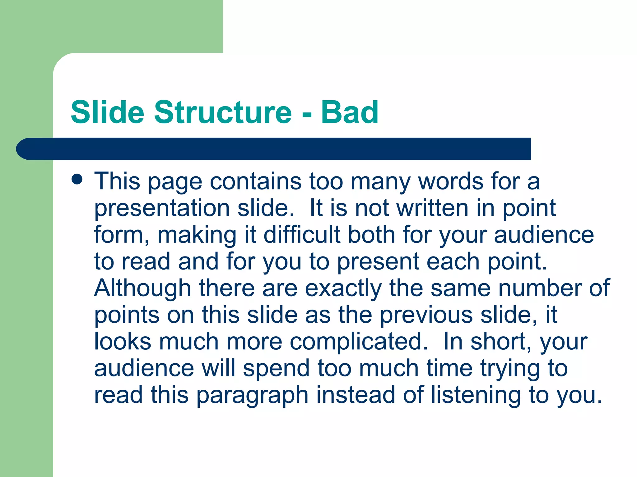
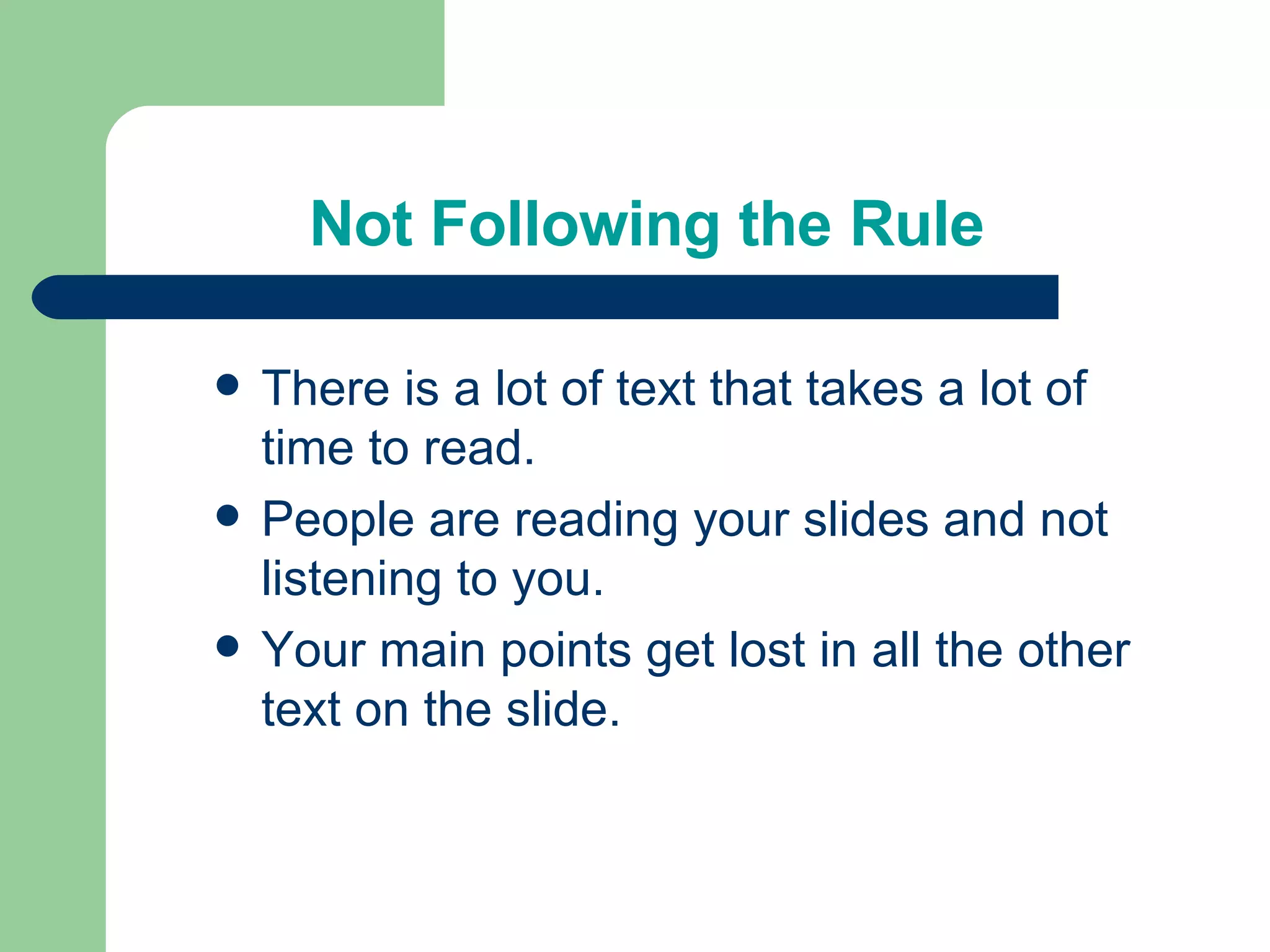
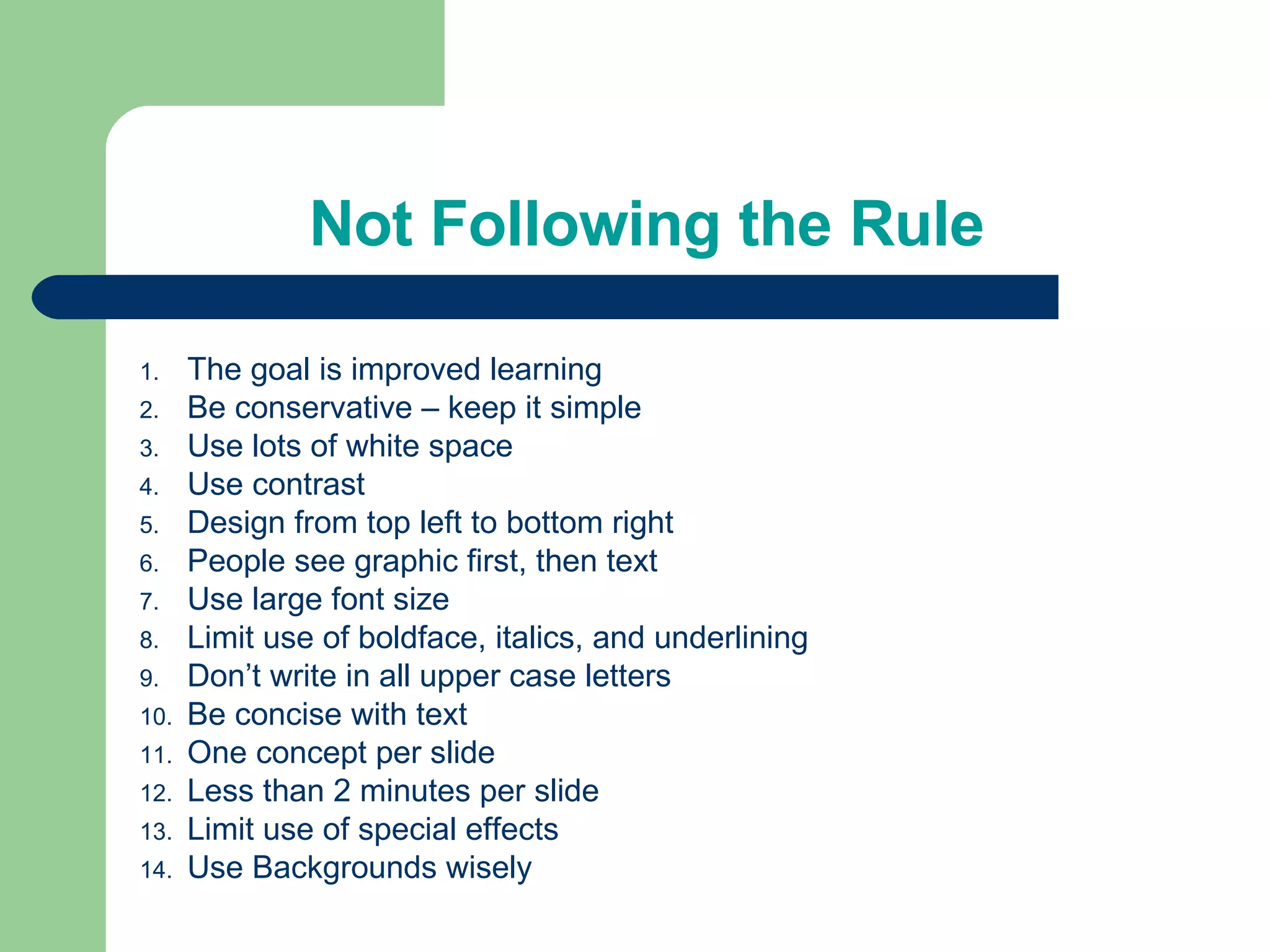
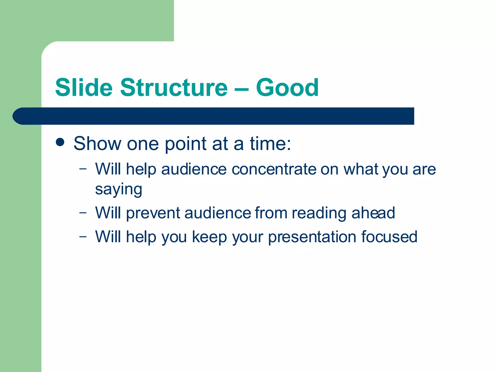
1) Outlines the structure and content of slides, recommending using point form, 6 lines per slide with 6 words per line.
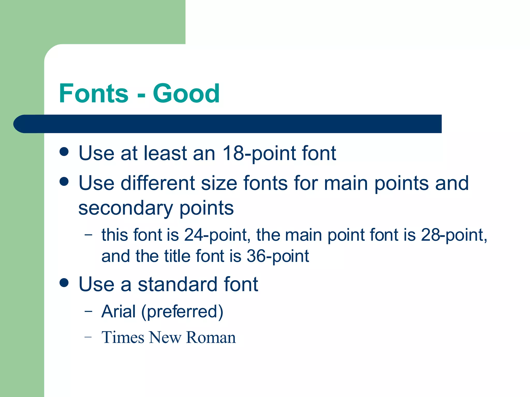
2) Discusses font choices, recommending a minimum 18-point font size and standard fonts like Arial for readability.
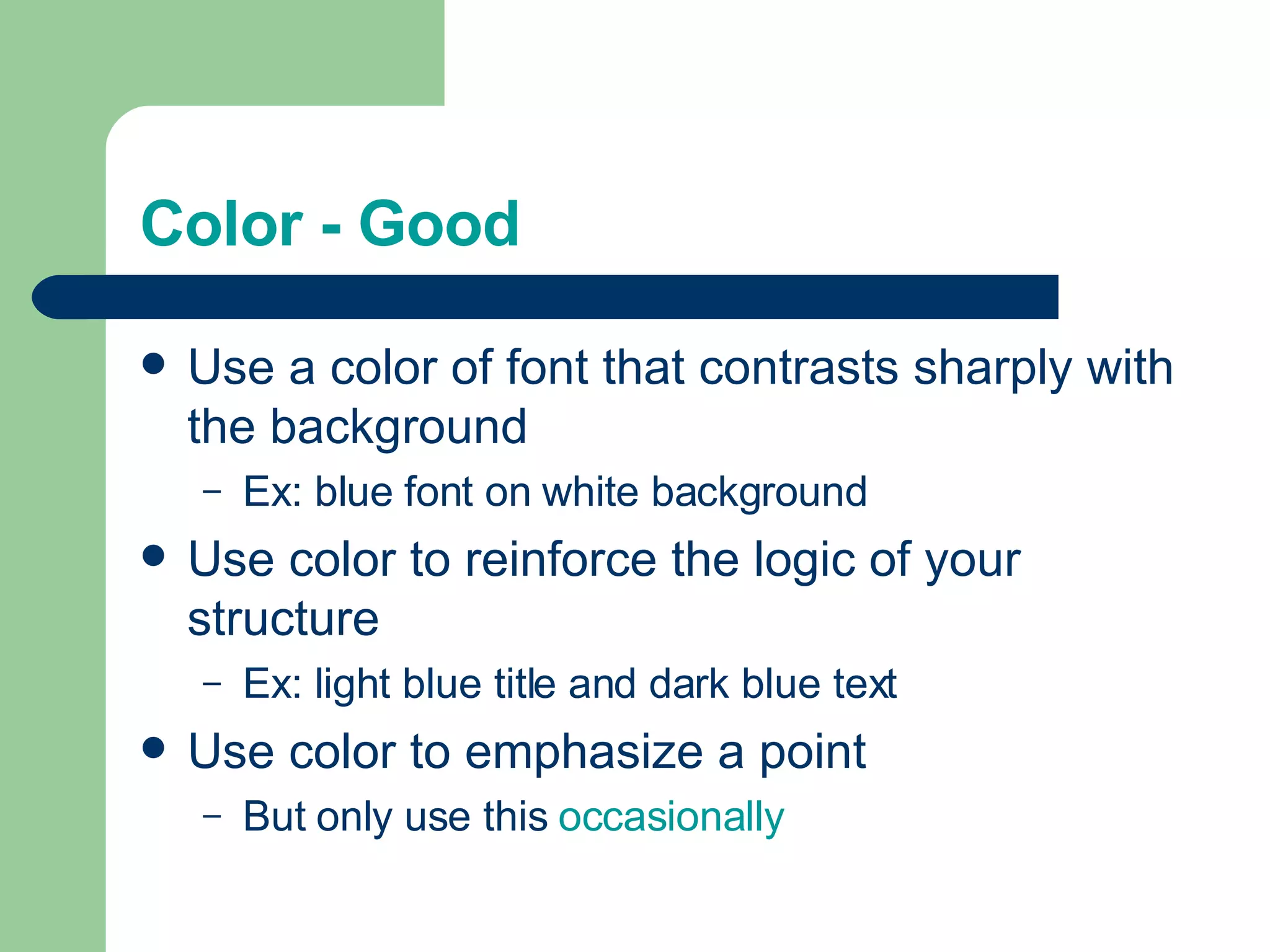
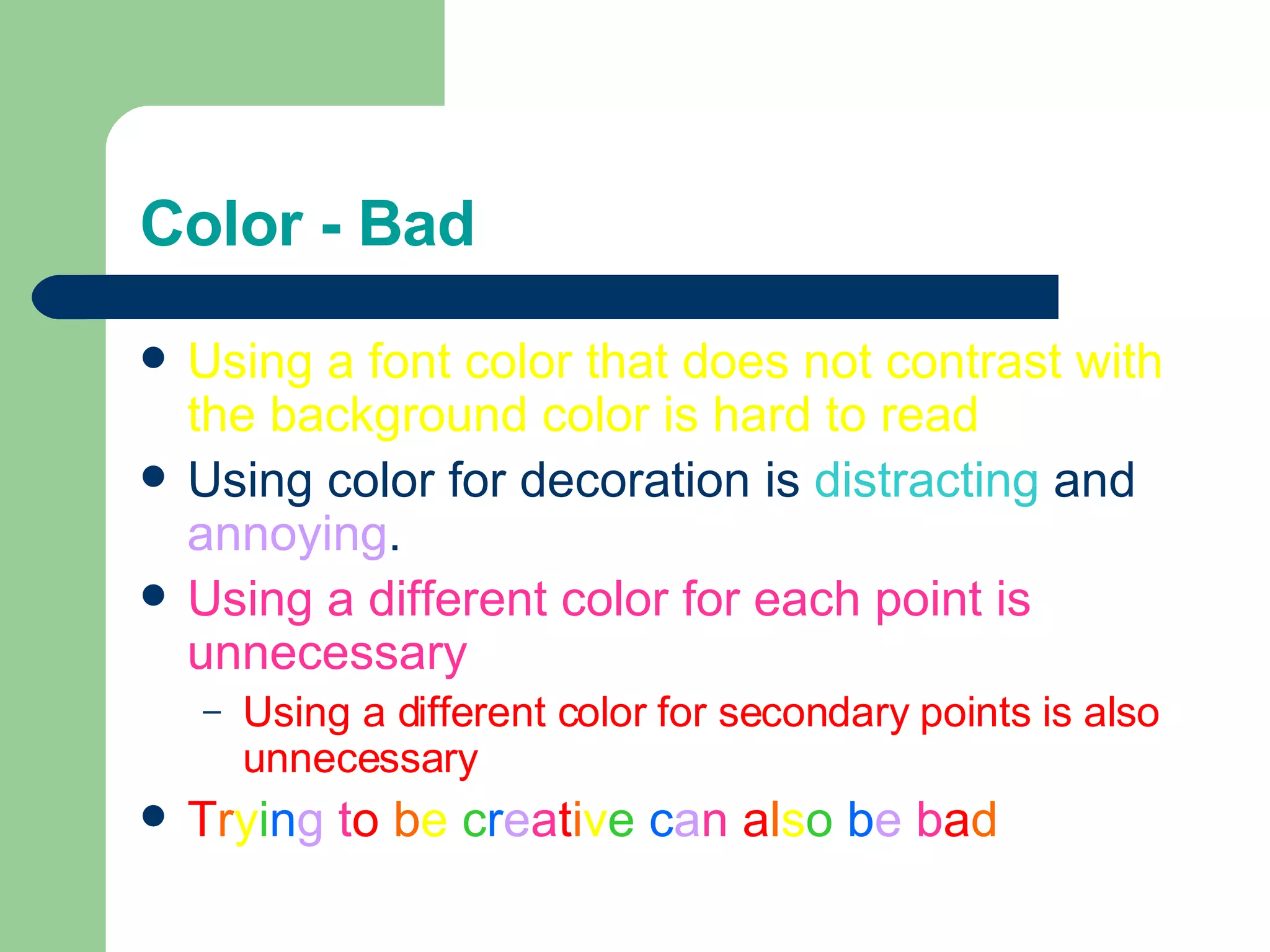
3) Advises using color and backgrounds that contrast with text for visibility, and limiting formatting to avoid distraction.