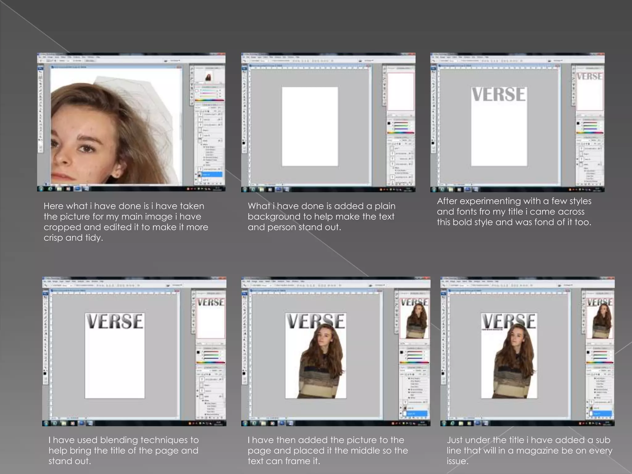
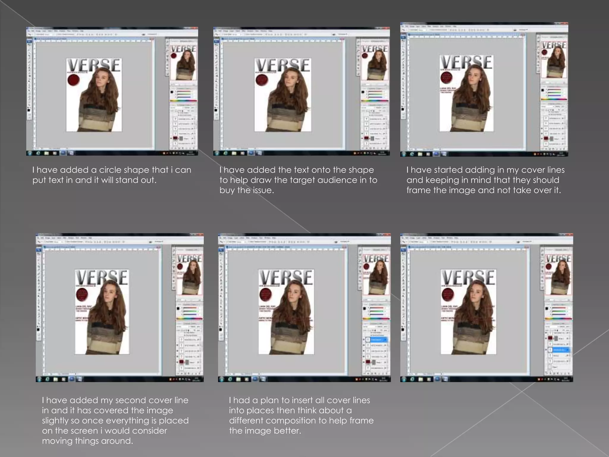
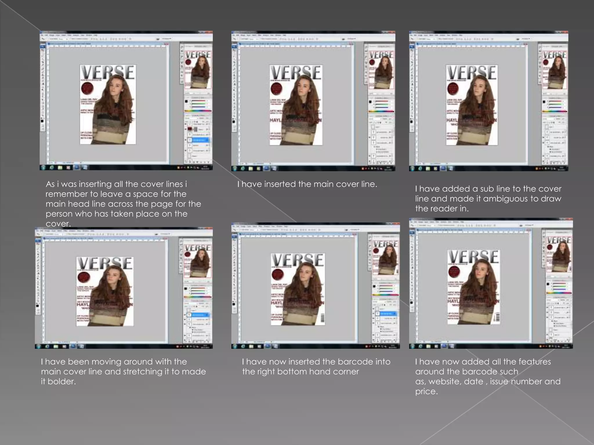
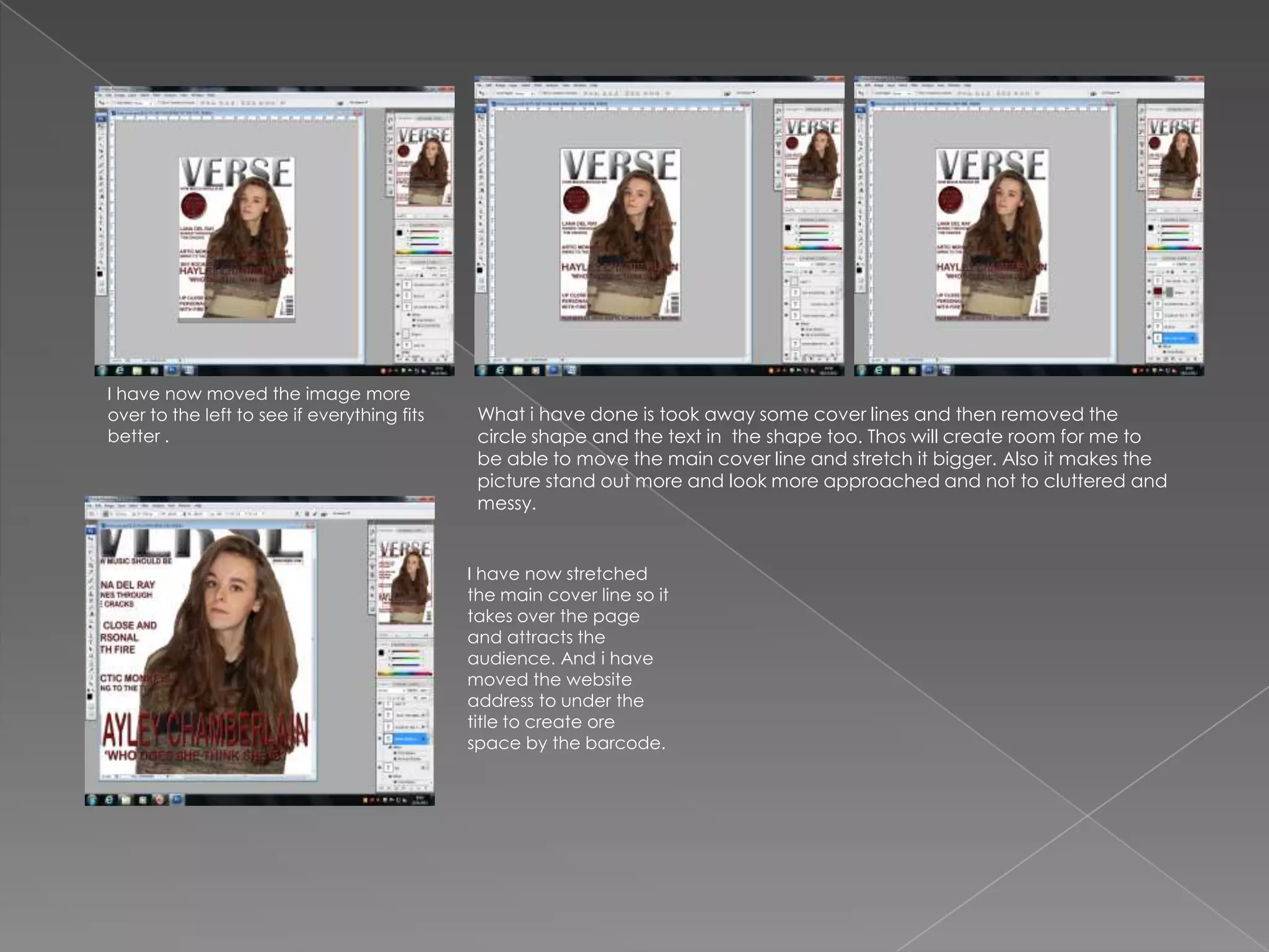
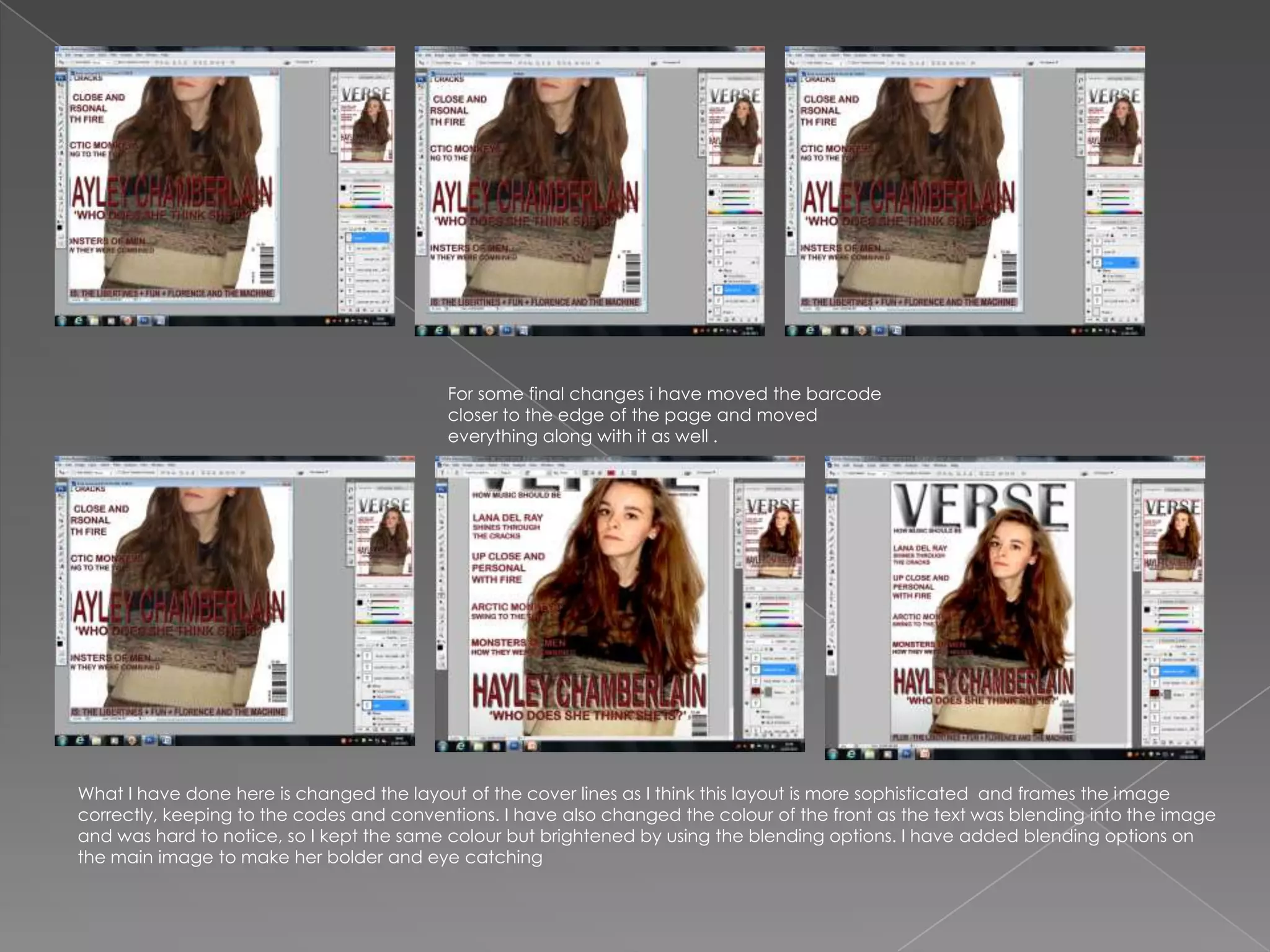
After experimenting with a few styles
Here what i have done is i have taken   What i have done is added a plain
                                                                               and fonts fro my title i came across
the picture for my main image i have    background to help make the text
                                                                               this bold style and was fond of it too.
cropped and edited it to make it more   and person stand out.
crisp and tidy.


 I have used blending techniques to     I have then added the picture to the     Just under the title i have added a sub
 help bring the title of the page and   page and placed it the middle so the     line that will in a magazine be on every
 stand out.                             text can frame it.                       issue.
I have added a circle shape that i can    I have added the text onto the shape       I have started adding in my cover lines
put text in and it will stand out.        to help draw the target audience in to     and keeping in mind that they should
                                          buy the issue.                             frame the image and not take over it.


  I have added my second cover line         I had a plan to insert all cover lines
  in and it has covered the image           into places then think about a
  slightly so once everything is placed     different composition to help frame
  on the screen i would consider            the image better.
  moving things around.
As i was inserting all the cover lines i   I have inserted the main cover line.
                                                                                    I have added a sub line to the cover
 remember to leave a space for the
                                                                                    line and made it ambiguous to draw
 main head line across the page for the
                                                                                    the reader in.
 person who has taken place on the
 cover.


I have been moving around with the           I have now inserted the barcode into   I have now added all the features
main cover line and stretching it to made    the right bottom hand corner           around the barcode such
it bolder.                                                                          as, website, date , issue number and
                                                                                    price.
I have now moved the image more
over to the left to see if everything fits    What i have done is took away some cover lines and then removed the
better .                                      circle shape and the text in the shape too. Thos will create room for me to
                                              be able to move the main cover line and stretch it bigger. Also it makes the
                                              picture stand out more and look more approached and not to cluttered and
                                              messy.


                                             I have now stretched
                                             the main cover line so it
                                             takes over the page
                                             and attracts the
                                             audience. And i have
                                             moved the website
                                             address to under the
                                             title to create ore
                                             space by the barcode.
For some final changes i have moved the barcode
                                          closer to the edge of the page and moved
                                          everything along with it as well .


What I have done here is changed the layout of the cover lines as I think this layout is more sophisticated and frames the image
correctly, keeping to the codes and conventions. I have also changed the colour of the front as the text was blending into the image
and was hard to notice, so I kept the same colour but brightened by using the blending options. I have added blending options on
the main image to make her bolder and eye catching

Production of front cover

  • 2.
    After experimenting witha few styles Here what i have done is i have taken What i have done is added a plain and fonts fro my title i came across the picture for my main image i have background to help make the text this bold style and was fond of it too. cropped and edited it to make it more and person stand out. crisp and tidy. I have used blending techniques to I have then added the picture to the Just under the title i have added a sub help bring the title of the page and page and placed it the middle so the line that will in a magazine be on every stand out. text can frame it. issue.
  • 3.
    I have addeda circle shape that i can I have added the text onto the shape I have started adding in my cover lines put text in and it will stand out. to help draw the target audience in to and keeping in mind that they should buy the issue. frame the image and not take over it. I have added my second cover line I had a plan to insert all cover lines in and it has covered the image into places then think about a slightly so once everything is placed different composition to help frame on the screen i would consider the image better. moving things around.
  • 4.
    As i wasinserting all the cover lines i I have inserted the main cover line. I have added a sub line to the cover remember to leave a space for the line and made it ambiguous to draw main head line across the page for the the reader in. person who has taken place on the cover. I have been moving around with the I have now inserted the barcode into I have now added all the features main cover line and stretching it to made the right bottom hand corner around the barcode such it bolder. as, website, date , issue number and price.
  • 5.
    I have nowmoved the image more over to the left to see if everything fits What i have done is took away some cover lines and then removed the better . circle shape and the text in the shape too. Thos will create room for me to be able to move the main cover line and stretch it bigger. Also it makes the picture stand out more and look more approached and not to cluttered and messy. I have now stretched the main cover line so it takes over the page and attracts the audience. And i have moved the website address to under the title to create ore space by the barcode.
  • 6.
    For some finalchanges i have moved the barcode closer to the edge of the page and moved everything along with it as well . What I have done here is changed the layout of the cover lines as I think this layout is more sophisticated and frames the image correctly, keeping to the codes and conventions. I have also changed the colour of the front as the text was blending into the image and was hard to notice, so I kept the same colour but brightened by using the blending options. I have added blending options on the main image to make her bolder and eye catching