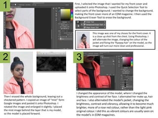
The document describes the process of designing a magazine cover in Photoshop. Key steps include:
1. Selecting an image for the cover and removing the background using selection and eraser tools.
2. Editing the cover image by changing colors and fixing hair to make it look more professional.
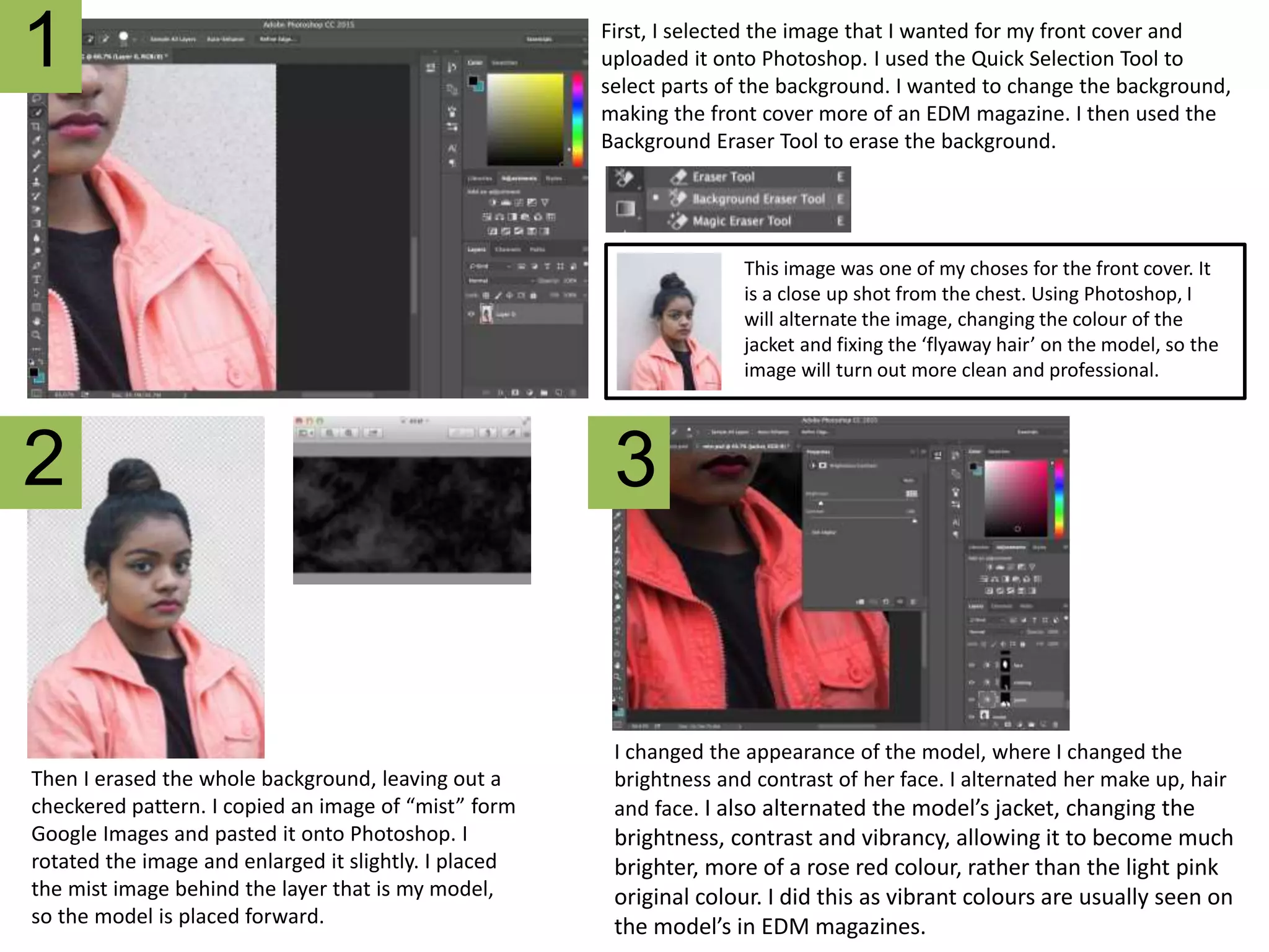
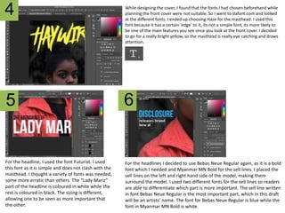
3. Realizing the chosen fonts did not work and selecting new fonts from an online library for elements like the masthead and headlines.
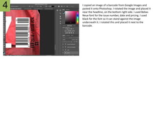
4. Adding elements like a barcode, issue details, and pricing information to complete the design.