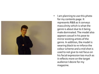
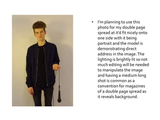
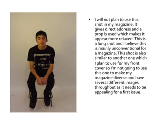
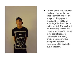
Original Photos
• I am planning to use this photo
for my contents page. It
represents R&B as it conveys
masculinity which is what the
genre is about due to it being
male dominated.The model also
appears casual in his pose to
mirror existing artists of the
genre. In addition, the model is
wearing black to re-inforce the
colour scheme and a mid shot is
used to not give to not focus on
his facial expression too much as
it reflects more on the target
audience I desire for my
magazine.
• I don’t plan to use these
photos as they don’t reflect
my genre itself. Neither
appear natural or edgy like
R&B shows.The prop of the
mic helps as it establishes a
pose for the model but there is
no direct address in the
bottom image and appears
too happy for my genre and
more for Pop. Not aggressive
enough as normally artists
appear intense to maintain an
image they uphold as an artist
of that genre.
• I don’t plan to use this photo as
direct address is lacked.As a
first issue magazine, I don’t plan
to stray much from conventions
to attract my audience to full
potential.The stance and facial
expression of this photo help
highlight my genre as they
appear manly to reflect not only
singers and rappers in the genre
already but the target audience
I want to attract of young
males. Besides dark clothing,
the image having a mic
emphasises connotations of the
R&B genre.
• I am not planning to use
these two photos as there’s
a lack of direct address in
them. I want to be able to
engage the audience fully as
it’s my first issue and so I
don’t feel this pose would be
effective in doing so.
Despite this, the pose
doesn’t convey aggression
or happiness which reflects
the genre and so clearly links
to R&B along with them
looking spontaneous and
casual like existing artists
convey too.
• I will not be using either of
these photos within my
magazine.The first image is
a long shot and so I think
draws too much attention
away from the model
himself and the second shot
doesn’t appear to have the
right composition in order
for the focus to be on the
model himself also. Both
shots have a different
background making it more
natural and less intense but
this makes it hard for the
attention to be on the model
if positioned wrongly.
• I’m planning to use this
photo for my double page
spread at it’d fit nicely onto
one side with it being
portrait and the model is
demonstrating direct
address in the image.The
lighting is brightly lit so not
much editing will be needed
to manipulate the image
and having a medium long
shot is common as a
convention for magazines
of a double page spread as
it reveals background.
• I will not plan to use this
shot in my magazine. It
gives direct address and a
prop is used which makes it
appear more relaxed.This is
a long shot and I believe this
is mainly unconventional for
a magazine.This shot is also
similar to another one which
I plan to use for my front
cover so I’m not going to use
this one to make my
magazine diverse and have
several different images
throughout as it needs to be
appealing for a first issue.
• I intend to use this photo for
my front cover as the mid
shot is conventional for an
image on this page and
direct address will be an
advantage for the audience
to feel invited.The black and
white clothing follows my
colour scheme and his hands
in his pockets connote
relaxation that existing
artists in this genre have
along with his facial
expression which is visible
due to the shot.

Original Photos

  • 1.
  • 2.
    • I amplanning to use this photo for my contents page. It represents R&B as it conveys masculinity which is what the genre is about due to it being male dominated.The model also appears casual in his pose to mirror existing artists of the genre. In addition, the model is wearing black to re-inforce the colour scheme and a mid shot is used to not give to not focus on his facial expression too much as it reflects more on the target audience I desire for my magazine.
  • 3.
    • I don’tplan to use these photos as they don’t reflect my genre itself. Neither appear natural or edgy like R&B shows.The prop of the mic helps as it establishes a pose for the model but there is no direct address in the bottom image and appears too happy for my genre and more for Pop. Not aggressive enough as normally artists appear intense to maintain an image they uphold as an artist of that genre.
  • 4.
    • I don’tplan to use this photo as direct address is lacked.As a first issue magazine, I don’t plan to stray much from conventions to attract my audience to full potential.The stance and facial expression of this photo help highlight my genre as they appear manly to reflect not only singers and rappers in the genre already but the target audience I want to attract of young males. Besides dark clothing, the image having a mic emphasises connotations of the R&B genre.
  • 5.
    • I amnot planning to use these two photos as there’s a lack of direct address in them. I want to be able to engage the audience fully as it’s my first issue and so I don’t feel this pose would be effective in doing so. Despite this, the pose doesn’t convey aggression or happiness which reflects the genre and so clearly links to R&B along with them looking spontaneous and casual like existing artists convey too.
  • 6.
    • I willnot be using either of these photos within my magazine.The first image is a long shot and so I think draws too much attention away from the model himself and the second shot doesn’t appear to have the right composition in order for the focus to be on the model himself also. Both shots have a different background making it more natural and less intense but this makes it hard for the attention to be on the model if positioned wrongly.
  • 7.
    • I’m planningto use this photo for my double page spread at it’d fit nicely onto one side with it being portrait and the model is demonstrating direct address in the image.The lighting is brightly lit so not much editing will be needed to manipulate the image and having a medium long shot is common as a convention for magazines of a double page spread as it reveals background.
  • 8.
    • I willnot plan to use this shot in my magazine. It gives direct address and a prop is used which makes it appear more relaxed.This is a long shot and I believe this is mainly unconventional for a magazine.This shot is also similar to another one which I plan to use for my front cover so I’m not going to use this one to make my magazine diverse and have several different images throughout as it needs to be appealing for a first issue.
  • 9.
    • I intendto use this photo for my front cover as the mid shot is conventional for an image on this page and direct address will be an advantage for the audience to feel invited.The black and white clothing follows my colour scheme and his hands in his pockets connote relaxation that existing artists in this genre have along with his facial expression which is visible due to the shot.