2. The first point I would like
to make is that the front of
this digipak is incredibly
unusual and because of
that striking. It is very
clever how they have used
the first letter from each
word for the bad and use it
as their logo.
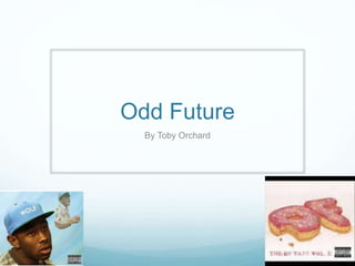
The trademark bright
pink ‘OF donuts’ are
used across all of
their albums and
songs, they have
done that so when
people see the bright
pink ‘OF donuts they
will know it is the
group Odd Future.
The use of the 3D “OF
donuts” really make makes
the name stand out and
makes it eye catching to the
audience and will make them
want to by the album.
Also by using the icing and
the sprinkles and possibly
chosen to target a young
audience in and make them
want to listen to their music.
This group has
thought outside of
the box and instead
of just writing Odd
Future across the
album cover. They
have instead opted
to visualise their
group name by a
drawing.
Again if we link back
to the title it would not
be for a old audience
and they have made
sure that happens by
using a youthful and
immature pictures.