The document analyzes the digipacks of three albums:
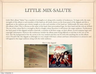
1) Little Mix's "Salute" album, which clearly shows each band member and uses the bright color red throughout. However, the album name is difficult to read.
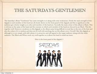
2) The Saturdays' "Gentlemen" album, which also clearly shows each band member. It uses black and white colors which work well together but the album name is hard to read.
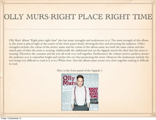
3) Olly Murs' "Right Place Right Time" album places Olly central and uses matching colors. However, the text is difficult to read due to the font and spacing of the album name.


![[투자론]주식시장관찰 2008 11-24](https://cdn.slidesharecdn.com/ss_thumbnails/2008-11-24-110120093112-phpapp01-thumbnail.jpg?width=640&height=640&fit=bounds)


