
Recommended
More Related Content
What's hot
What's hot (19)
Similar to Digipak analysis (artic monkeys)
Similar to Digipak analysis (artic monkeys) (20)
More from Guypolo
More from Guypolo (20)
Recently uploaded
Recently uploaded (20)
Digipak analysis (artic monkeys)
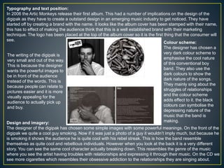
- 1. Typography and text position: In 2006 the Artic Monkeys release their first album. This had a number of implications on the design of the digipak as they have to create a outstand design in an emerging music industry to get noticed. They have started off by creating a brand with the name. It looks like the album cover has been stamped with their name, this has to effect of making the audience think that this is a well established brand with their marketing technique. The logo has been placed at the top of the album cover so it is the first thing that the consumer will see. Colour scheme: The designer has chosen a very dark colour scheme to emphasise the cool nature of this conventional boy band. They also use the dark colours to show the dark nature of the songs. They mainly sing about the struggles of relationships and the colour scheme adds effect to it. the black colours can symbolise the depressing nature of the music that the band is making.Design and imagery: The designer of the digipak has chosen some simple images with some powerful meanings. On the front of the digipak we quite a cool guy smoking. Now if it was just a photo of a guy it wouldn’t imply much, but because he is smoking it shows the audience he is quite cool with his rebel streak. This is how the band resemble themselves as quite cool and rebellious individuals. However when you look at the back it is a very different story. You can see the same cool character actually breaking down. This resembles the genre of the music where you see the artist having troubles with relationships and expressing it through their music. On the CD we see more cigarettes which resembles their obsessive addiction to the relationships they are singing about. The writing of the digipak is very small and out of the way. This is because the designer wants the powerful images to be in front of the audience instead of the words. This is because people can relate to pictures easier and it is more visually appealing for the audience to actually pick up and buy.