
Recommended
More Related Content
What's hot
What's hot (19)
Viewers also liked
Similar to Frank Ocean -Channel Orange
Similar to Frank Ocean -Channel Orange (20)
More from Tobias_Orchard1998
More from Tobias_Orchard1998 (17)
Recently uploaded
Recently uploaded (20)
Frank Ocean -Channel Orange
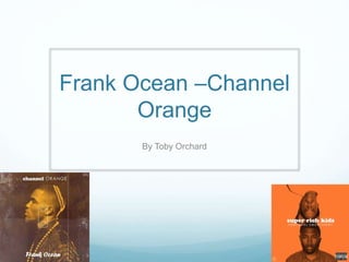
- 1. Frank Ocean –Channel Orange By Toby Orchard
- 2. As you can see from the typography of this digipak the artist has decided to use to different font. This could mean that the artist what to show to the audience that they are two different words and they mean two different things. The use and position of the picture are done very well. I will start with the position of the picture, they have made sure that this is the main piece of the digipak and draws the audience eyes straight to the picture. Now on to the use of the picture. To start will the have used to TV and a picture for the artist to may to show that he has a message and is brodcasting it cross the world, through this album. To continue on the idea of the TV in the centre of the Digipak. The picture that is on the TV screen, as you can see from the picture the artist has a chain up against his mouth this could represent an angle of that he was not allow to speak his word or no one would listen, now he has had he chance through his album and music. They have include parental Advisory stick at the bottom right hand corner. They have to include this to make sure that the audience and the people that buy this album are aware of what this album contains and make sure under age people don’t buy it as it contains swearing. This digipak is well design in the respect that it does not give to much away to the audience in respect to what the songs are about.