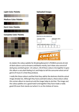
1. As stated, the colour palette for Breaking Benjamin’s PHOBIA consists of a lot
of dark colours such as browns and blacks mostly, but it does also consistof
dark greys and dark green- ish colours. All of these colours mix together to give
this album a very dark feeling to it and helps to tell the consumer what sortof
genre of music it is that they produce.
I really like these colours and feel that they add to the darkness thatthe actual
image already has. Although they haveused dark colours, thesecolours allow
this certain album to stand out and the image helps to do that. The image and
the colour palette are a good match and together they have made a really
good CD cover that stands out when it is on the shelves of stores.