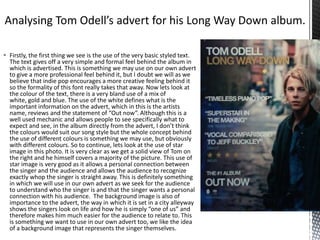
1. Firstly, the first thing we see is the use of the very basic styled text.
The text gives off a very simple and formal feel behind the album in
which is advertised. This is something we may use on our own advert
to give a more professional feel behind it, but I doubt we will as we
believe that indie pop encourages a more creative feeling behind it
so the formality of this font really takes that away. Now lets look at
the colour of the text, there is a very bland use of a mix of
white, gold and blue. The use of the white defines what is the
important information on the advert, which in this is the artists
name, reviews and the statement of “Out now”. Although this is a
well used mechanic and allows people to see specifically what to
expect and see, in the album directly from the advert, I don’t think
the colours would suit our song style but the whole concept behind
the use of different colours is something we may use, but obviously
with different colours. So to continue, lets look at the use of star
image in this photo. It is very clear as we get a solid view of Tom on
the right and he himself covers a majority of the picture. This use of
star image is very good as it allows a personal connection between
the singer and the audience and allows the audience to recognize
exactly whop the singer is straight away. This is definitely something
in which we will use in our own advert as we seek for the audience
to understand who the singer is and that the singer wants a personal
connection with his audience. The background image is also of
importance to the advert, the way in which it is set in a city alleyway
shows the singers look on life and how he is simply “one of us” and
therefore makes him much easier for the audience to relate to. This
is something we want to use in our own advert too, we like the idea
of a background image that represents the singer themselves.