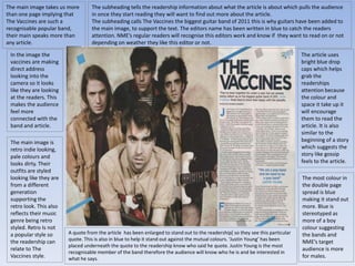
The document discusses the layout and design of a double page magazine spread about the band The Vaccines. The main image takes up one full page to draw attention to the band. It shows the members looking directly at the viewer to create a connection. The spread uses blue text and graphics to stand out against the muted color scheme. It provides information about the band's style and genre to interest readers and tie it to their retro, indie image. The spread follows conventions to engage readers with its visual design.
We all have good and bad thoughts from time to time and situation to situation. We are bombarded daily with spiraling thoughts(both negative and positive) creating all-consuming feel , making us difficult to manage with associated suffering. Good thoughts are like our Mob Signal (Positive thought) amidst noise(negative thought) in the atmosphere. Negative thoughts like noise outweigh positive thoughts. These thoughts often create unwanted confusion, trouble, stress and frustration in our mind as well as chaos in our physical world. Negative thoughts are also known as “distorted thinking”.
The Roman Empire A Historical Colossus.pdfkaushalkr1407
The Roman Empire, a vast and enduring power, stands as one of history's most remarkable civilizations, leaving an indelible imprint on the world. It emerged from the Roman Republic, transitioning into an imperial powerhouse under the leadership of Augustus Caesar in 27 BCE. This transformation marked the beginning of an era defined by unprecedented territorial expansion, architectural marvels, and profound cultural influence.
The empire's roots lie in the city of Rome, founded, according to legend, by Romulus in 753 BCE. Over centuries, Rome evolved from a small settlement to a formidable republic, characterized by a complex political system with elected officials and checks on power. However, internal strife, class conflicts, and military ambitions paved the way for the end of the Republic. Julius Caesar’s dictatorship and subsequent assassination in 44 BCE created a power vacuum, leading to a civil war. Octavian, later Augustus, emerged victorious, heralding the Roman Empire’s birth.
Under Augustus, the empire experienced the Pax Romana, a 200-year period of relative peace and stability. Augustus reformed the military, established efficient administrative systems, and initiated grand construction projects. The empire's borders expanded, encompassing territories from Britain to Egypt and from Spain to the Euphrates. Roman legions, renowned for their discipline and engineering prowess, secured and maintained these vast territories, building roads, fortifications, and cities that facilitated control and integration.
The Roman Empire’s society was hierarchical, with a rigid class system. At the top were the patricians, wealthy elites who held significant political power. Below them were the plebeians, free citizens with limited political influence, and the vast numbers of slaves who formed the backbone of the economy. The family unit was central, governed by the paterfamilias, the male head who held absolute authority.
Culturally, the Romans were eclectic, absorbing and adapting elements from the civilizations they encountered, particularly the Greeks. Roman art, literature, and philosophy reflected this synthesis, creating a rich cultural tapestry. Latin, the Roman language, became the lingua franca of the Western world, influencing numerous modern languages.
Roman architecture and engineering achievements were monumental. They perfected the arch, vault, and dome, constructing enduring structures like the Colosseum, Pantheon, and aqueducts. These engineering marvels not only showcased Roman ingenuity but also served practical purposes, from public entertainment to water supply.
Ethnobotany and Ethnopharmacology:
Ethnobotany in herbal drug evaluation,
Impact of Ethnobotany in traditional medicine,
New development in herbals,
Bio-prospecting tools for drug discovery,
Role of Ethnopharmacology in drug evaluation,
Reverse Pharmacology.
Instructions for Submissions thorugh G- Classroom.pptxJheel Barad
This presentation provides a briefing on how to upload submissions and documents in Google Classroom. It was prepared as part of an orientation for new Sainik School in-service teacher trainees. As a training officer, my goal is to ensure that you are comfortable and proficient with this essential tool for managing assignments and fostering student engagement.
How to Make a Field invisible in Odoo 17Celine George
It is possible to hide or invisible some fields in odoo. Commonly using “invisible” attribute in the field definition to invisible the fields. This slide will show how to make a field invisible in odoo 17.
This is a presentation by Dada Robert in a Your Skill Boost masterclass organised by the Excellence Foundation for South Sudan (EFSS) on Saturday, the 25th and Sunday, the 26th of May 2024.
He discussed the concept of quality improvement, emphasizing its applicability to various aspects of life, including personal, project, and program improvements. He defined quality as doing the right thing at the right time in the right way to achieve the best possible results and discussed the concept of the "gap" between what we know and what we do, and how this gap represents the areas we need to improve. He explained the scientific approach to quality improvement, which involves systematic performance analysis, testing and learning, and implementing change ideas. He also highlighted the importance of client focus and a team approach to quality improvement.
The Indian economy is classified into different sectors to simplify the analysis and understanding of economic activities. For Class 10, it's essential to grasp the sectors of the Indian economy, understand their characteristics, and recognize their importance. This guide will provide detailed notes on the Sectors of the Indian Economy Class 10, using specific long-tail keywords to enhance comprehension.
For more information, visit-www.vavaclasses.com
Sectors of the Indian Economy - Class 10 Study Notes pdf
Double Page Spread Analysis
1. The main image takes us more
than one page implying that
The Vaccines are such a
recognisable popular band,
their main speaks more than
any article.
In the image the
vaccines are making
direct address
looking into the
camera so it looks
like they are looking
at the readers. This
makes the audience
feel more
connected with the
band and article.
The main image is
retro indie looking,
pale colours and
looks dirty. Their
outfits are styled
looking like they are
from a different
generation
supporting the
retro look. This also
reflects their music
genre being retro
styled. Retro Is not
a popular style so
the readership can
relate to The
Vaccines style.
The subheading tells the readership information about what the article is about which pulls the audience
in once they start reading they will want to find out more about the article.
The subheading calls The Vaccines the biggest guitar band of 2011 this is why guitars have been added to
the main image, to support the text. The editors name has been written in blue to catch the readers
attention. NME’s regular readers will recognise this editors work and know if they want to read on or not
depending on weather they like this editor or not.
The article uses
bright blue drop
caps which helps
grab the
readerships
attention because
the colour and
space it take up it
will encourage
them to read the
article. It is also
similar to the
beginning of a story
which suggests the
story like gossip
feels to the article.
The most colour in
the double page
spread is blue
making it stand out
more. Blue is
stereotyped as
more of a boy
colour suggesting
the bands and
NME’s target
audience is more
for males.
A quote from the article has been enlarged to stand out to the readership[ so they see this particular
quote. This is also in blue to help it stand out against the mutual colours. ‘Justin Young’ has been
placed underneath the quote to the readership know who said he quote. Justin Young is the most
recognisable member of the band therefore the audience will know who he is and be interested in
what he says.
2. NME uses a simple sans serif font for the title of the article ‘The Vaccines’ which gives the
article a simple straight forward feel. Which is appealing for NME’s and The Vaccines target
audience. The heading is in large font to it stands out to the readership as it is the only
large writing on the double page spread. Furthermore The Vaccines being the only large
font on the page suggests that is all the attention need as they are so known and popular.
In the main
image the lead
singer is placed
at the front of
the band. He is
the lead singer
making him the
most
recognisable
and appealing to
their target
audience. It
makes the
article more
obvious who it is
about.
The article cant
be too long
because the
target audience
of both NME and
The Vaccines are
more interested
in the images
than the text
3. This double page spread
inside NME follows
general conventions of a
double page spread
making the layout similar
to other magazines
double page spreads.
The header of the page
‘RADAR’ is in a blue box
with white writing to
grab the reader
attention and show it is
not just a boring article.
The main headline of the double page spread is in bold
display fonts. The black against the blue box makes it easier
and clear for the readers to see it. It tells the readership
what the article is about and the fans of ‘The Teenagers’
will be eager to read the article. The font of the headline
isn’t plain and boring and this is more attractive for the
readership to get their attention.
NME has used drop caps for
their double page spread
article. The drop caps
attract the readerships
attention and will
encourage them to read the
article.
Including the ‘NME loves’ starburst
will encourage other readers that
aren’t already fans of the band to
give them a chance to like them
after reading the article. It tells
them that if NME loves them then
the readers will
The boxed text includes
information that the
fans of the band would
enjoy or information
that readers finding out
about this band for the
first time would find
helpful and would
appreciate.
The main image takes up one page out of the double page spread. The image is simple
yet effective. It is very simple ‘The Teenagers’ band are lying in bed looking into the
camera.
Behind the boys there are lots of pictures and posters you would typically find in a
teenagers bedroom. They are mostly teenage girls or women showing flesh. This
related to the article and the pull quote saying ‘of course we’re a sexual band’. The
typical teenagers posters in the background behind the boys links to the name of the
band and headline of the article. The band is a typical indie band suitable for the
magazines genre.
The smaller related Images
within the text shows a
member of ‘The Teenagers’
performing on stage. This
iconography of the
performance relates to the
indie genre of the music
magazine. The image is
placed within the text to
show how they link
together and relate.
The smaller related images along the side
show the bands that ‘Everyone’s talking about’
letting the readership know who to look out
for. These images simply show who the band
or artists are.
4. The main colour that stands out on the double page
spread is blue. This could emphasise the target
audience being mostly boys. Also blue stands out
from the other colours black and white. Blue grabs
the readerships attention.
Along the side of the
contents page it includes
more information
underneath the title radar.
It is showing the
readership more upcoming
artists and indie bands that
they might enjoy and
become a fan of. It reveals
a little information about
each artist.
It even has the review
from Alex Turner, the lead
singer of Arctic Monkeys,
sharing with the
readership what his
favourite band. This helps
influence the target
audiences opinions of the
band also.
The main article on
the double page
spread is an article
about information
about the band and
the bands style of
music. This is also
shown trough the pull
quote within the
article saying they are
a sexual band
suggesting their music
is too.
The main article is
based on how the
indie band has been
accused of being sex
orientated and the
band is admitting this
and it is natural.
This attracts the target
audience of NME as
they are the age of
relating to the article.
Because the audience
feel they can relate to
the band and their
music they would find
the music appealing
to them and
interested to read
more.
The stand first underneath the headline also
relates to the article. ‘young, dumb and full of
filthy tunes’. The standfirst and pull quote
together easily give away the main theme of the
article which is how the band are sex based.
The main image is placed on the first
page taking up the whole page is
because they need to be noticed. It is
placed this way in every issue. This is
because the double page spread is
mainly about that band therefore
attention needs to be on them.
The main text is placed on the second
page next to the main image because
they should clearly be recognised to the
readers that they are linked and related to
each other.