Saket, (-DELHI )+91-9654467111-(=)CHEAP Call Girls in Escorts Service Saket C...
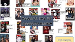
Uk magazine market
1.
2. Reader Profile
• The mean age of readers is 22.
• Kerrang! readers on average buy over 6 albums a month.
• 87% of Kerrang! readers buy every issue.
• 54.7% of readers are male and 45.3% are female.
• Along with their passion for music, readers have a high interest in
technology, computer games, media and fashion.
3. • The total circulation figures for Kerrang! from June 2015 till December 2015
was 24,207.
• Kerrang! has an estimated readership of 378,000.
• The target audience for Kerrang! is rock music fans. It appeals to this
audience by including stories and interviews on bands that fall into this
genre. The graphology of the magazine also appeals to fans of rock in the
way it portrays stereotypical rock images through the use of colours and
fashion.
• The magazine pitches itself with the following mission statement: "Kerrang!
will ensure that we are constantly appealing to or spectrum of readers.
From the younger teenager readers who are more open to different genres
of rock music – from emo to thrash etc, to the readers who respect
Kerrang! as an authority when it comes to our scene’s heritage bands. Each
issue will include a balance of bands and scenes to guarantee that we’re
providing for our readers’ need for variety and their passionate appetite for
their favourite bands as well as their desire to be introduced to new music
within our world."
4. The masthead is bold, and the use of red
writing makes it stand out against the white
background. The masthead is featured at
the top of the cover. The use of
onomatopoeia with the title Kerrang which
is similar to the sound of an electric guitar
reflects the fact that if it's a rock music
magazine. It is written in the typical Kerrang!
font making it easily recognisable to the
audience even when parts of it is covered by
the main image. The font also has cracks in
it which could suggest rebellion which is
associated with rock.
A pull quote is used to give an ideas of what the
story will be about, it also intrigues people to read
the article.
The header gives more details of the contents of the
magazine. The number 6 is written in yellow to
emphasise the high amount of posters you will
receive which could be an incentive for buying.
The main image is of the band Fall Out
Boy, they are a well known band and are
associated with the rock genre. The use
of this image will attract Fall Out Boy
fans but also people who are interested
in rock. The members are spread over
the cover which gives the impression
that they are taking over the magazine.
A strapline is used to highlight other bands that will
feature.
The barcode shows the price of the
magazine, the date it was released
and what number issue it is.
The main cover line has ‘FALL OUT
BOY’ written in bold so that it is clear
who it will be about, as not all people
may know who the main image is of.
It also follows the same colour
scheme as the rest of the page
5. The use of page numbers along with
the name of the artist featured on
that page makes it easier for readers
to find pages with specific interests
on. The numbers are in red whilst the
rest of the writing is in black so they
stand out.
The main image is of the artist that is also
featured on the front cover, the lead singer of
'We are in the Crowd'. In the photo her arms
are outstretched, which could show how she
is welcoming and drawing in the reader to
read the article she features in.
There is an advertisement
used already on the
contents page, this could be
seen as encouraging the
reader to buy things before
they have even read the
magazine.
Subheadings are used to
break the articles into
different categories,
therefore making it easier
for the audience to find
specific articles.
A banner is used behind the masthead which
makes it stand out more with the contrast of
blue and yellow.
Issue number and date
Smaller images are used to show
other articles featured, this gives
a visual overview of the magazine
and also shows off the other
main articles which could be of
interest.
A section on the editor is
included, this creates a
personal connection for the
reader.
6. Orange lettering is used
for ‘Mark Hoppus’ and
‘Blink-182’, this makes
the words stand out
meaning readers can
quickly find out who the
article is about. Also the
scratched font gives a
punk rock vibe.
Page numbers
A long shot of Mark
Hoppus is used, he is
staring out to the camera
with a crazed expression
and is crouching down,
almost giving the image
that he cant fit onto the
page. Graphics of a
height chart has also
been used to his right to
emphasise his height.
The use of this image
could show that the
article has a comedic
approach.
The title ‘MY DINOSAUR LIFE’ is written in a
font that is similar to the style of scribbling
writing, this gives a carefree feel to the
article from the start.
A pull quote from the
article is used, this
gives the reader an
insight as to what the
article will contain,
this can help them
decide if they want to
read the article or
not.
7. Reader profile
• 69% of NME readers are male and 31% are female.
• The average age of readers is 24.
• 52% or readers work full time.
• NME also have a high interest in technology with readers spending on
average 19 hours on the internet per week.
8. • NME's circulation figures are 40,948.
• NME has a readership of 369,000.
• NME is aimed at people interested in a range of different music
genres and discovering new artists.
9. The logo is written in the usual NME font,
meaning it can be recognised, even
though the colour has changed to white
from the usual red. This could be because
the colour scheme or the cover already
has a lot of red, so white was used for the
font to avoid a colour clash.
The slogan informs the reader what
NME stands for.
The cover image is a close up shot of the
singer Florence Welch, in the shot she is
staring out at the reader, this could create a
personal feeling to someone who sees it
therefore they may be more likely to buy it.
The main cover line is simply the cover
artists name, this informs people who she
is as they may not know from the image.
The use of black writing makes ‘Florence’
stand out as it contrasts with the white
background.
A pull quote is used to show what the main
story will be about, it also creates interest
for the article.
The barcode shows the price of
the magazine, the date it was
released and what number
issue it is.
The cover line tells the reader about
other features of the magazine, this
means more people will be attracted to
buy the magazine as they could
something else they are interested in
apart from the main story.
10. An index of bands
alphabetically organised
is provided, with page
numbers they appear on
to the right. This makes
finding articles very easy
as readers can simply
just look for the names
of the artist they are
interested in.
A subscription is advertised,
because this is at the start of
the magazine the reader will
have the though of the offer
on subscriptions and may feel
interested in subscribing after
reading the magazine.
The date shows
when the issue
was released.
Sub-titles are used to split up
articles into different
categories.
A long shot of the band Kasabian is
used, along with some information
about a performance they did. This
could create interest for the reader
and make them look at the
contents page for a while longer
as some readers may just skip it for
the actual articles.
The three main colours of
NME are used here: red, white
and black. This maintains unity
In the magazine style and creates
familiarity for the reader.
11. The title is written in a font that looks like
newspaper clippings, which could create
interest for the reader. It is also a pull
quote from the article, therefore showing
the reader what will be featured.
A medium shot of Lily Allen
is used, she takes up the
whole of the right page. In
the photo she is simply
looking out at the reader.
This shows how the focus
on the article is solely on
her. Her clothing style and
makeup could show to the
reader that she comes
from a rock/ grunge music
background.
The NME colour scheme (red,
black and white) is also used
here keeping it unified with
the rest of the magazine.
Page numbers
The layout of the page puts
focus on the photo and title,
these are the things that stand
out the much and therefore
would catch peoples eyes when
they are flicking through.
The artists name ‘Lily Allen’ is written in a
different colour and font to the rest of the text,
this could be to inform people who were
unaware of the who the article is about.
12. Reader Profile
• 72% of mixmag readers are male and 28% are female.
• The average age of mixmag readers is 24.
• 80% of readers don’t read other music magazines and spend little
time watching television, especially at weekends.
• Mixmag readers enjoy going out to clubs and keep up to date with
the latest DJ’s.
• Readers tend to spend lots of money on clothes, nights out and the
latest technology.
13. • Mixmag’s circulation from 1st January 2011 to 31st January 2011 was
20,053.
• Mixmag is aimed at young adults who are interested in dance music.
• They meet this target audience by including articles on a variety of
different dance artists.
14. The masthead is the mixmag logo, the
font is written in orange, this contrasts
with the cover image which mainly
consists of grey and black.
Barcode/ issue number/
price
The slogan states that mixmag is the ‘world’s biggest
dance music and clubbing magazine’, this shows to
the reader how great of a magazine it is therefore
people may be encouraged to buy it.
The main cover line tells the
audience who the main article is
about, the use of the name
‘Annie Mac’ could attract people
as it is recognisable to many
people. Also the use of white
and orange colouring for the
font makes the writing standout.
It is also written in a bigger size
than the rest of the cover lines,
showing how it is important.
The cover image is a medium close
up shot of Annie Mac, in the photo
she is seriously staring out at the
reader, this could show that the
article she features in will be
formal.
The cover lines give information
for other articles so readers have
enough information as possible to
help them decide whether to buy
the magazine or not.
An advertisement for the
free album is featured, this
could act as an incentive
for readers.
15. The date shows when the issue was
released.
The title of articles
is displayed in a
column along with
the page number,
this allows readers
to find specific
articles. It also
shows the reader
the contents of the
magazine as soon
as they open the
magazine.
Information about the free CD
that comes with the magazine is
given. Free gifts are often
incentives for buying a magazine
so many people may not know the
album artist previously, so by
explaining in a dedicated
A medium long shot is
used of a woman at a
music event. She is
dressed in a sparkly
leotard, this could
represent the type of
event she is at because
the reader would
associate this type of
dress with dance and
techno music.
The colour scheme of black
and white gives a simple
look, letting the focus be on
the photo which provides
colour.
16. The header of ‘The Big 3’
could be confusing to the
reader as to what the big
three are, however
underneath it explains that
the article is on ‘the best
parties of the last month’.
The main image is of two women at a party, one is looking
at the reader in the shot and is smiling holding up a peace
sign, this shows how she is happy and enjoying herself.
The other woman is looking away from the camera which
could show how she is too distracted by the party.
This image is a medium shot
of a man holding alcoholic
drink, this could suggest that
he is carefree and could
therefore reflect that Mixmag
readers often spend time
going to clubs and on nights
out.
This medium close up shows a
women dancing, the image is
slightly blurred which suggests
movement. The women has
her hands up and is not looking
at the camera suggesting her
enjoyment and immersion.
The article has a colour
scheme of yellow and pink.
The colour yellow suggests
happiness, energy and joy.
These colours reflect a
nightclub theme, and
therefore represents the
type of music presented in
Mixmag.
A pull quote is used to give
information to the reader about the
article before they have read it, this
could create interest for someone
who is just flicking through the
magazine or help someone decide if
they want to read the article or not.
Five different images are used, these
balance out the text and also show
what the article is about.
The headers are written in the typical
Mixmag font, this creates unity
between the magazine articles.