This document describes the design elements used on the front cover, contents page, and double page spread of a magazine.
On the front cover, direct address is used with the main image showing a musician holding a guitar. Additional elements include the magazine name, strapline, barcode, price, issue number, cover lines advertising interior articles, and an album cover advertisement.
The contents page continues the color scheme and font from the cover. It features direct address photos, subheadings indicating article topics, page numbers, and brief descriptions.
The double page spread also maintains consistency with subheadings, varied fonts to distinguish paragraphs, direct address images including a younger photo in black and white, and a featured quote. Throughout,
AS Level Media Music Magazine Production Treatmentmarkodjuricic
Music Magazine Production Treatment:
- Introduction
- Existing Music Magazines That Inspire Me
- Front Cover Inspiration
- Content Page Inspiration
- Double Spread Article Inspiration
- Potential Magazine Names
- Magazine Name Tally Chart
- Magazine Name
- Magazine Font Research
- Font Inspiration
- Potential Fonts Research
- Chosen Font
- Potential Main Image Research
Dare to express your inner whims at a home that understands your daily mood. Feel free to cuddle in life's colorful spectra and dance your days in splendor.
The Fast Fish Forum is an opportunity for challengers of convention and drivers of progress to come together for the benefit of South African business and society. The forum consists of purposeful, committed and open-minded people across industries, organisations and roles who collaborate and learn together; creating a critical mass that drives innovative change in our country.
At the second event, held at the BSG offices on 16 November 2016, we discussed two highly topical subjects:
1. Enhancing customer value using big data and actionable insights.
2. Driving innovation through customer insights.
To find out more and join the conversation follow us @FastFishForum and http://bit.ly/fastfishforum.
Divisions Council - Education Committee (Summer 2011)
Introduction
This report provides a description of existing services, both external and in-house, available to APA divisions for hosting and broadcasting webcasts to their members and other interested professionals, and specifically looks at the external Planning Webcast series. In addition, it includes an analysis of options for expanding these services. The report was produced in response to a request from the APA Divisions Council (DC), as follows:
Mission Statement *
To develop DC’s recommendations for educational programs, professional development and mentoring to be provided by divisions.
1. To seek opportunities for complementary efforts among divisions, and with APA's component groups, including the Chapter Presidents Council (CPC), Student Representative Council (SRC), and American Institute of Certified Planners (AICP).
2. The committee will also consider collaboration opportunities with external organizations where it serves APA's interests and furthers the adopted Development Plan.
“In addition to its standing mission, the DC Education Committee (EC) shall develop one or more models through which Divisions may both deliver Certification Maintenance (CM) content and also generate additional sources of revenue for Divisions. The Committee shall consider current APA policies regarding access to Webinar software and the pricing of such access. Also, in building a revenue or business model, consider the pricing of other CM offerings, especially Webinars.”
Towards these objectives, key team members were recruited at the National Conference in Boston. Refer to Appendix 2 for committee composition.
(Tags: aicp, american, association, chapter, committee, conference, council, education, external, goto, internal, meeting, planning, revenue, series, service, sponsor, training, utah, webcast)
Reston Transportation Funding Plan: July 15, 2016Fairfax County
This presentation was delivered to stakeholder on July 15, 2016, covering the purpose of the plan, improvements to be funded, preliminary cost estimates, and overview of the funding plan.
2137ad - Characters that live in Merindol and are at the center of main storiesluforfor
Kurgan is a russian expatriate that is secretly in love with Sonia Contado. Henry is a british soldier that took refuge in Merindol Colony in 2137ad. He is the lover of Sonia Contado.
Explore the multifaceted world of Muntadher Saleh, an Iraqi polymath renowned for his expertise in visual art, writing, design, and pharmacy. This SlideShare delves into his innovative contributions across various disciplines, showcasing his unique ability to blend traditional themes with modern aesthetics. Learn about his impactful artworks, thought-provoking literary pieces, and his vision as a Neo-Pop artist dedicated to raising awareness about Iraq's cultural heritage. Discover why Muntadher Saleh is celebrated as "The Last Polymath" and how his multidisciplinary talents continue to inspire and influence.
2137ad Merindol Colony Interiors where refugee try to build a seemengly norm...luforfor
This are the interiors of the Merindol Colony in 2137ad after the Climate Change Collapse and the Apocalipse Wars. Merindol is a small Colony in the Italian Alps where there are around 4000 humans. The Colony values mainly around meritocracy and selection by effort.
Hadj Ounis's most notable work is his sculpture titled "Metamorphosis." This piece showcases Ounis's mastery of form and texture, as he seamlessly combines metal and wood to create a dynamic and visually striking composition. The juxtaposition of the two materials creates a sense of tension and harmony, inviting viewers to contemplate the relationship between nature and industry.
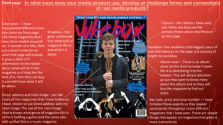
1. Front page
Direct address and main image - just like
many of the magazines that I have looked at,
I have chosen to use direct address with my
main image. The use of the main image
clearly shows what genre of magazine this is
as he is holding a guitar and the name also
tells us that this is a music magazine.
Strapline – this
gives a little look
into what kind of
magazine this is
and what's it
about.
Bar code, price and issue number – I have
included these aspects as they appear
consistently throughout many different
magazines that I have seen. These are simple
things that appear on magazines that gives it
more authenticity.
Cover lines – I have
incorporated different cover
lines onto my front page.
Like many magazines that I
have done market research
on, it consists of a title, then
just a short sentence on
what that page will include.
It gives a little of if
information to the reader
about what will be in the
magazine so if they like the
look of it, then they can buy
it and will know what it will
be about.
Album cover – There is an album
cover on the front to make it seem
like it is advertising it to the
readers. This will attract attention
as buy may want to know more
about this album and so they will
buy the magazine to find out
more.
Colours – the colours I have used,
red, white and blue are the
primary three colours that feature
on this page.
Headline – the headline is the biggest piece of
text that features on the page and consists of
bright red and blue.
In what ways does your media product use, develop or challenge forms and conventions
of real media products?
2. Contents
page
Direct address – I
have taken this
photo specifically so
the two characters
are looking at the
camera.
Font – this font
continues from the front
page, which shows
consistency between
pages. It is also in the
same colours.
Colours – the red, white and blue
theme that symbolises the British flag
follows onto this page to show synergy
throughout the pages. The background
is the British flag to also show that this
magazine is based on British singers.
Layout – just like many of the
magazines that I have looked at,
my one has pictures on it
corresponding to the text and
page numbers. The page numbers
next to the text are bigger then
the subheading, but the
subheadings are in a bigger font
that the short sentence
underneath. The short sentence is
just a brief explanation of what
will feature on the page. The
colours of the text match with the
background as well.
Subheadings – these are a little
subheading telling the reader
what the text underneath is going
to be about. They are in black
and white to make them stand
out more.
In what ways does your media product use, develop or challenge forms and conventions
of real media products?
3. Double
page spread
Subheading – like on my
contents page, I have
subheading on this page, it
helps to separate the
different paragraphs and lets
the reader know what
features on the page. It is in
red and white to follow the
colour scheme but also to
help it stands out the page.
Font – again, I have
made this font continue
onto the third page to
give all three pages
synergy. Also, all the
different paragraphs are
written in to different
font to make them look
like they aren’t about
the same thing.
Direct address – this image also has direct address.
Images – my main image
is of my main character
when he was younger
and him now. On is in
black and white to give
the impression that it
was taken in the
eighties. The
background is also of my
main character.
Quote – after
looking at
different
magazines, I
have seen that
some of them
have quotes on
them.
In what ways does your media product use, develop or challenge forms and conventions
of real media products?