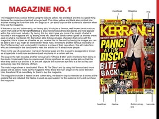
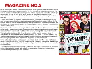
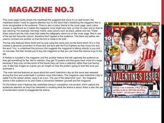
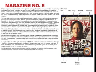
1) The document summarizes several magazine cover designs and contents pages. It analyzes design elements like colors, images, text features and organization to see how they attract audiences and highlight key information.
2) Common colors used across magazines are yellow, red and black to make text bold and catch readers' attention. Covers typically feature famous bands and celebrities as well as freebies and competitions to increase interest and sales.
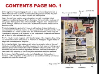
3) Contents pages organize articles under headings, include images next to listings, and provide short descriptions to entice readers without revealing too much. Editors' messages personalize the magazine and promote giveaways.