SlideShare a Scribd company logo
1 of 25
Main Features of a Magazine Front Cover Plugs Buzz words Sky line Masthead Main Image Price Model Credit Lead article Main cover line Barcode Date Line Teaser
Analysing magazine pages
Front Cover Analysis Nylon tends to use very large fonts which give it a very simple and smooth effect. The masthead is in large black capital letters giving it its obvious importance especially with the sterile white background. Curved fonts are used for the other text which, stereotypically, would give the sense that this is a women’s magazine. The text interacts well with the main image of model and actress, Megan Fox. The clothes she is wearing in the photograph have broad shoulders and put emphasis on the top half of her body which corresponds with the text at the top of the page where the writing is at its biggest, brightest and boldest. She is wearing less clothing towards the bottom of the image where the writing becomes smaller. The colour works similarly, the masthead at the top, near Fox’s dark hair, is black and there is more colour towards the middle of the page, on either side of the bright red and blue shirt. Other than the black masthead, most of the colours seem to be very feminine, with the majority being pink or purple.  This  suits the target audience who are women between the age of 18 and 34. most of whom are single, university educated and employed. The teasers around the main image are very short and snappy, intriguing the reader but not giving too much away so that they still feel the need to buy the magazine.
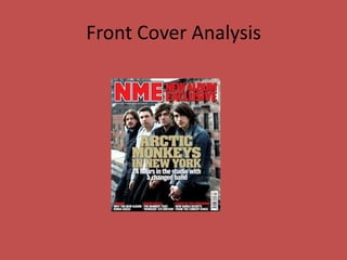
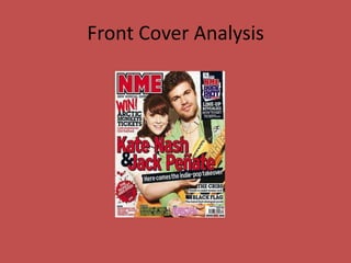
Front Cover Analysis The masthead is the biggest font on the page, making it stand out to the audience and lets people who are not familiar with the brand, NME, know, immediately that this is their magazine. The fact that the artists, Alex Turner and Miles Kane are staring straight into the camera, creates a very striking first impression on new and potential readers. The articles that will feature in this issue are all shown on the left of the front cover on a white background to make them stand out. Overall, NME is a very bold, confident and raw magazine and their use of colour, agrees with this idea. The bold font used for the headline, lets readers who do not know the featured artist is, know who they are and also attracts attention to the fact that The Last Shadow Puppets are the main focus in this issue of NME.
Front Cover Analysis NME typically uses a mid to long shot on their cover page. This allows the reader to see both the facial expression and the body language presented in the shot. The cover shot is usually the first part of the magazine that the readers will create a connection with, and therefore, it must be effective. The angle of the shot is also important as it created the tone of the article inside. Here, the cover image is set on the same level as the audience, the gaze of the two band members is directed at the camera lens, cementing a bond with the readers. The bold, yellow sky line attracts the reader’s attention and contributes to NME’s house style. The yellow used here connotes to a hazardous idea, particularly with the use of black, mirroring a hazard or danger signs. This is supported by the word ‘shock’, being used, promoting controversial headliners with colours that connote to warning and danger.  The teaser in the blue circle is used to present a secondary article. The bright blue background allows the article to stand out against the neutral tones of the cover. Three colours are used in the circle to maintain the magazine’s house style. The headline font and colours are typically used to reflect the style and genre of the artist. This allows the reader to instantly recognise the logo of their favourite band and have their eye drawn to the cover in the shop, convincing fans of The Wombats to buy the NME.
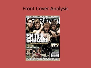
Front Cover Analysis NME’s masthead follows the codes and conventions of magazines by being placed at the top and taking up the entire width of the page. The large size and black and bold font  against the white background also agrees with this. However, the main image is overlapping the masthead, distracting attention from the title and to the singer. This could be because Kerrang has already established it’s identity and therefore, their primary audience do not need to see the whole masthead in order to recognise the magazine. The skyline  makes the reader want to buy the magazine because it advertises something that Kerrang’s target audience would be interested in. It also indicates that the prize is ‘massive’ and therefore worth the reader’s time and money and the last two words, ‘give away’, give the impression that the reader wouldn’t have to do anything to earn the ticket and that it is easy to win, making them want to purchase the magazine.  The mode of address used is particularly obvious and straight to the point, a one adjective is used to make the magazine appear more desirable, ‘massive’, but apart from that, the magazine is very basic, indicating that their target audience are definitely not intellectuals.  Kerrang follows the codes and convention of music magazines by having a list of bands (plugs) that are featured inside the magazine. This gives the audience a clue as to what kind of bands and what genre of music Kerrang focuses itself around.
Front Cover Analysis This teaser, ‘BLUR REUNION?’ is very intriguing because it gives the audience the facts, that Blur are reuniting but the question mark gives a sense of questionability and makes the reader want to know everything.  Also, the part in black, ‘DAMON SPEAKS TO NME’ would lead the audience  to believe that this is an exclusive interview and that buying the NME  magazine is the only way that they can find out the information that they need.   This plug about V Festival is displayed in a bright yellow box, easily attracting the eye of the audience. By using the word ‘revealed’, the audience are able to assume that this is brand new, never before seen information and that NME are the only one who can provide it. The headline, Gossip, has one of the largest font on the front cover, second only to the masthead. This inclines the reader to believe that this is the biggest feature in the magazine. In the case of this cover, I would say that the Gossip headline is more prominent than the masthead itself because the main image is over lapping the masthead. This indicates that The Gossip are more important than anything else and are NME’s main headline, they are even more important than the magazine itself. NME agrees with the codes and conventions by placing the barcode in the bottom right hand corner along with the price and issue number. Their website address is also displayed here letting the reader know, even if they only pick the magazine up in a shop, that they can visit the NME website to experience more of NME for free.
Front Cover Analysis
Front Cover Analysis NME use the same font type, colour and size consistently, mainly using red, white and black. This therefore contributes to NME’s identity and persona because readers will then associate these colours with this magazine. These three colours are also very bold and are often associated with darkness and youth,  consequently young adults are  NME’s target audience. This plug would interest the audience because it  allows them to give their own opinion, to decide on what they think so therefore, the y will feel like they can contribute to the production of the magazine, making them feel involved. The  mise en scene of the main image adapts well to the genre of the magazine because the main  image is mainly black and brown, fitting with the magazine’s dark rock and indie genre of music. It also works well because of the clean white background which allows the band to stand out and therefore the audience notice them quicker and easier. The headline, The Horrors, is in a white font, linking it to the main image but also, the bright colours around it, automatically attract  attention and letting the reader know that The Horrors are the main feature. The cover line forces the reader to think that they will be reading exclusive information if they buy the magazine. By using the phrase ‘inside story’, the audience will assume that they will find out every detail about The Horrors in NME’s article. This would make them want to buy the magazine.  Buzz words help to convince people into buying the magazine because they persuade them that there are so many things that the reader would like.
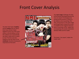
Front Cover Analysis This main image challenges the idea of the female stereotype because the men are stood in the background, posing and the woman is shown to be violent as she is punching. This idea, of the person in the main image punching forward, toward the screen is suitable for this magazine because Karen is punching  at the  reader and consequently, this creates interaction  between NME and the reader. The Yeah Yeah Yeahs’ headline and the teasers that are about them have all been linked together by the use of the same colours, red and yellow, so that the audience can automatically see what is what and it is easier to read. The font used also happens to be the same as the masthead, therefore showing the importance of the band. The teaser, ‘Live report’, makes the reader want
Front Cover Analysis
Contents Page Analysis By separating the new ‘features’ and the ‘regulars’, it makes it simpler for the reader to understand and quicker for them to find a specific page or subject that they would like to find. The font of the titles is very jagged and broken which relates to the tough conditions that people experience during extreme sports, specifically mountain climbing which then applies to the masthead and also the image in the background. However, the font is clearer in the lists of page titles in order to make it easier to read. I like how the main image is placed behind the text to again make it easier to read but also how the images fades into the grey background. This is effective because it draws attention to the text first but gives the idea that sports people are very brave as the woman in the image appears to be running into, what seems a grey cloud, creating a sense of danger. The colours on this contents page are very simple and discrete apart from the red and orange in the titles. This show that s it is necessary for the reader to look at the titles before anything else.
Contents Page Analysis Headings to show the reader the different sections in the magazine and to make it clearer and easier for them to access the specific page that they want to read. Everything is about speed now as magazine institutions are finding it difficult to increase the circulation of magazines as people tend to use their website and ezines as these are quicker and cheaper. If people can access the same information for free, why  would they need to buy the hard copy of the magazine? NME have stuck to using the colours black, white and red and the occasional use of yellow but this is only used to make the page look interesting and to attract attention to a particular teaser. There are five sections in this magazine; News, Radars, Reviews, Live!, and Features.  This helps the audience to get involved, allowing them to win prizes which will make them want to buy the magazine. It will also allow them to feel more involved in the production of the magazine. Contents page image and a brief introduction of one of the articles that is going to feature in this issue.
Contents Page Analysis This contents page is very different to the previous two but is still very effective. The idea that NME have used here with placing different articles in different boxes ranging in size is interesting. They have still managed to focus on one main article though by placing it in the centre of the page, just under the title and with the largest image on the page. This agrees with the familiar conventions of music magazine contents pages. The images on the contents page tend to be quite small and very simple, usually being mid shots. This is so that it is, again, simpler for the audience to look at and understand. A small quote is used under each image from each article to intrigue the audience and to give them a sense of what the entire article is about. However, NME will have chosen especially the best quotes and most exiting ones so that the readers fell that they must buy the magazine so that they can read this article. There are large numbers in each box, linking to the page reference of that particular article. The numbers are very large and bold making them easier for readers to identify and therefore quicker for them to find the specific information that they are looking for or are interested in.
Contents Page Analysis Again, NME have used the same format as Kasabian issue in the way that the headline is at the top of the page with the main article image directly underneath and slightly off centre. The summary of the article is shown underneath the image with an advertisement beneath that. On the far left, a very small and thin column is featured, named as the ‘band index’. And the actual ‘contents’ are on the right hand side. Everything is arranged so that it is slightly wonky which gives it the grunge style that NME are known for. The same five headings are used to separate the contents showing consistency and therefore allowing their readers to easily recognise the NME format and therefore, regular readers can quickly find the page/s that they are looking for because they NME is usually structured in the same way in every issue. Buzz words such as ‘No 1’ to make NME appear to be the best of everything related to music. It shows that they know what their target audience want and always give them what they are interested in.
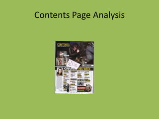
Contents Page Analysis There is a main article shown on this page which is obviously laid out because of the huge image on the left. It is structured quite similarly to NME’s usual format with the boxes to separate the different smaller articles. However, when NME write a small paragraph underneath each image, Kerrang only write a small and basic sentence. Kerrang is structured quite similarly to  NME.  They use the same header, ‘THIS WEEK’ but it is used as the title for the actual contents rather than the headline of the page. Kerrang’s headline, ‘Contents’ is much smaller than NME’s, leaving room for much more text and images. This page focus’ on the two colours, yellow and black. These colours connote to danger and warning signs, indicating that Kerrang is a very masculine and hazardous magazine. The large numbers that show each page reference are very bold and clear, making it easy for the audience to understand and to quickly find the page that they want to read.
Contents Page Analysis
Double Page Analysis
Double Page Spread Analysis The title of the article is black with a blue background, making it stand out to target audiences and making it very eye catching. The name of the band and consequently, the title of the article is in the largest and boldest font on the page, therefore making it the first thing that the reader sees. The colours have changed from red black and white found on the front cover and contents page to blue black and white to make this double page spread appear more interesting and different but not too different that a regular reader would not be able to identify it as from an NME magazine. The main image is of the band, The Teenagers, lying on a bed. With the band being called, The Teenagers, the photograph symbolises the stereotypical view of teenagers as they appear to be very lazy in this image.  The writer chooses the best and most interesting facts about the article and chooses to repeat them to make them stand out and so that, at first glance, the reader will want to know what these comments are about. The article only has two columns and the main image has an entire page. This shows that the image is the main part of the article.
Double Page Spread Analysis The black and white text is eye catching as it is different and it stands out against the red of Lily Allen’s black and white top. Lily Allen wears a neutral expression to show that she is very serious about this interview and what she is saying in it. This page is interesting as the headline is not the title of the singer but is a quote from her.  It is an insight straight into the interview between Lily Allen and NME and makes the audience want to read the article immediately. The writer of this article’s name is in red to make it stand out, like Lily Allen’s, showing that they are of equal importance. The summary of the interview suggests that it will be honest, direct and interesting to capture the reader’s interest.  A capital letter is used to start the main text o the articles. This is common in both magazines and newspapers and helps to create interest and so that the article is less monotonous.
Double Page Analysis In this double page spread, there does not seem to be a main image, just two large ones and three smaller ones. This, again, is surprising. There is a lot of text in this article which is surprising when compared to other double page spreads that I have analysed. There are four columns of text, plus, the two note pad pages.
Double Page Analysis

More Related Content

What's hot

Music Magazine Analysis
Music Magazine AnalysisMusic Magazine Analysis
Music Magazine Analysislaurencowey
 
NME Music magazine analysis
NME Music magazine analysisNME Music magazine analysis
NME Music magazine analysisNajat Hachem
 
Music magazine annotations presentation.
Music magazine annotations presentation.Music magazine annotations presentation.
Music magazine annotations presentation.carasearle
 
Analysis' of magazines
Analysis' of magazines Analysis' of magazines
Analysis' of magazines chloenugget
 
Music Magazine Analysis
Music Magazine AnalysisMusic Magazine Analysis
Music Magazine Analysislaurencowey
 
Music magazine analysis
Music magazine analysisMusic magazine analysis
Music magazine analysisAidan_Jervis
 
Mojo magazine analysis
Mojo magazine analysis Mojo magazine analysis
Mojo magazine analysis Najat Hachem
 
Magazine analysis
Magazine analysisMagazine analysis
Magazine analysislsuttie9
 
Music magazine research
Music magazine researchMusic magazine research
Music magazine researchbroganlan
 
NME magazine analysis
NME magazine analysisNME magazine analysis
NME magazine analysiskiera0white
 
Magazine Analysis
Magazine AnalysisMagazine Analysis
Magazine AnalysisJessDruett
 
Double pages spread analysis one
Double pages spread analysis oneDouble pages spread analysis one
Double pages spread analysis oneKirstyMaeHarragan
 
Market Research / Magazine Analysis
Market Research / Magazine AnalysisMarket Research / Magazine Analysis
Market Research / Magazine Analysislucypywell
 
Analysing Magazine Cover
Analysing Magazine CoverAnalysing Magazine Cover
Analysing Magazine Coverernest16
 

What's hot (19)

Music Magazine Analysis
Music Magazine AnalysisMusic Magazine Analysis
Music Magazine Analysis
 
NME Music magazine analysis
NME Music magazine analysisNME Music magazine analysis
NME Music magazine analysis
 
Music magazine annotations presentation.
Music magazine annotations presentation.Music magazine annotations presentation.
Music magazine annotations presentation.
 
MOJO
MOJOMOJO
MOJO
 
Rocksound analysis
Rocksound analysisRocksound analysis
Rocksound analysis
 
Analysis' of magazines
Analysis' of magazines Analysis' of magazines
Analysis' of magazines
 
Music Magazine Analysis
Music Magazine AnalysisMusic Magazine Analysis
Music Magazine Analysis
 
Cover research
Cover researchCover research
Cover research
 
Music magazine analysis
Music magazine analysisMusic magazine analysis
Music magazine analysis
 
Classic Rock
Classic Rock Classic Rock
Classic Rock
 
Mojo magazine analysis
Mojo magazine analysis Mojo magazine analysis
Mojo magazine analysis
 
Magazine analysis
Magazine analysisMagazine analysis
Magazine analysis
 
Music magazine research
Music magazine researchMusic magazine research
Music magazine research
 
NME magazine analysis
NME magazine analysisNME magazine analysis
NME magazine analysis
 
Magazine Analysis
Magazine AnalysisMagazine Analysis
Magazine Analysis
 
Magazine analysis
Magazine analysisMagazine analysis
Magazine analysis
 
Double pages spread analysis one
Double pages spread analysis oneDouble pages spread analysis one
Double pages spread analysis one
 
Market Research / Magazine Analysis
Market Research / Magazine AnalysisMarket Research / Magazine Analysis
Market Research / Magazine Analysis
 
Analysing Magazine Cover
Analysing Magazine CoverAnalysing Magazine Cover
Analysing Magazine Cover
 

Similar to Magazine Analysis

Magazine Conventions
Magazine ConventionsMagazine Conventions
Magazine Conventionslucycoates1
 
NME magazine analysis
NME magazine analysisNME magazine analysis
NME magazine analysisellyyyxxx
 
Nme music magazine filtered
Nme music magazine filteredNme music magazine filtered
Nme music magazine filteredaaronb258
 
Music magazine research
Music magazine researchMusic magazine research
Music magazine researchbroganl4
 
Magazine Comparison
Magazine ComparisonMagazine Comparison
Magazine Comparisonguest924bb5c
 
Format research of music magazines
Format research of music magazinesFormat research of music magazines
Format research of music magazinesellisputnam
 
Uk magazine market
Uk magazine marketUk magazine market
Uk magazine marketsara ali
 
Music Magazine Analysis
Music Magazine AnalysisMusic Magazine Analysis
Music Magazine Analysislaurencowey
 
Contents page analysis
Contents page analysis Contents page analysis
Contents page analysis Nattayaday11
 
Magazine Comparison
Magazine ComparisonMagazine Comparison
Magazine Comparisonguestc740a47
 
Analyzing magazines
Analyzing magazinesAnalyzing magazines
Analyzing magazinesMegan Allen
 
textual analysis
textual analysistextual analysis
textual analysisbroganl4
 
Front Covers - Research Task
Front Covers - Research TaskFront Covers - Research Task
Front Covers - Research Taskbeckyjay26
 
Magazine anaylisis
Magazine anaylisisMagazine anaylisis
Magazine anaylisissineadjen
 
Magazine anaylisis
Magazine anaylisisMagazine anaylisis
Magazine anaylisissineadjen
 
Analyising music magazines
Analyising music magazinesAnalyising music magazines
Analyising music magazinesJess Stafford
 

Similar to Magazine Analysis (20)

Magazine Conventions
Magazine ConventionsMagazine Conventions
Magazine Conventions
 
NME magazine analysis
NME magazine analysisNME magazine analysis
NME magazine analysis
 
Nme music magazine filtered
Nme music magazine filteredNme music magazine filtered
Nme music magazine filtered
 
Music magazine research
Music magazine researchMusic magazine research
Music magazine research
 
Magazine Comparison
Magazine ComparisonMagazine Comparison
Magazine Comparison
 
Format research of music magazines
Format research of music magazinesFormat research of music magazines
Format research of music magazines
 
Uk magazine market
Uk magazine marketUk magazine market
Uk magazine market
 
Music Magazine Analysis
Music Magazine AnalysisMusic Magazine Analysis
Music Magazine Analysis
 
Contents page analysis
Contents page analysis Contents page analysis
Contents page analysis
 
Magazine Comparison
Magazine ComparisonMagazine Comparison
Magazine Comparison
 
Analyzing magazines
Analyzing magazinesAnalyzing magazines
Analyzing magazines
 
textual analysis
textual analysistextual analysis
textual analysis
 
Front Covers - Research Task
Front Covers - Research TaskFront Covers - Research Task
Front Covers - Research Task
 
Magazine anaylisis
Magazine anaylisisMagazine anaylisis
Magazine anaylisis
 
Magazine anaylisis
Magazine anaylisisMagazine anaylisis
Magazine anaylisis
 
Analyising music magazines
Analyising music magazinesAnalyising music magazines
Analyising music magazines
 
Magazine anaylisis
Magazine anaylisisMagazine anaylisis
Magazine anaylisis
 
Magazine anaylisis
Magazine anaylisisMagazine anaylisis
Magazine anaylisis
 
NME Front Cover Analysis
NME Front Cover AnalysisNME Front Cover Analysis
NME Front Cover Analysis
 
Nme case study
Nme case studyNme case study
Nme case study
 

More from Ellicia

Organisation
OrganisationOrganisation
OrganisationEllicia
 
Personal learning and reflection
Personal learning and reflectionPersonal learning and reflection
Personal learning and reflectionEllicia
 
Contents page draft
Contents page draftContents page draft
Contents page draftEllicia
 
Front cover draft
Front cover draftFront cover draft
Front cover draftEllicia
 
My flat plan
My flat planMy flat plan
My flat planEllicia
 
Flat Plan
Flat PlanFlat Plan
Flat PlanEllicia
 
Manipulation of photographs
Manipulation of photographsManipulation of photographs
Manipulation of photographsEllicia
 
My photographs
My photographsMy photographs
My photographsEllicia
 
Double page spread
Double page spreadDouble page spread
Double page spreadEllicia
 
My flat plan
My flat planMy flat plan
My flat planEllicia
 
Audience Research Mood Board
Audience Research Mood BoardAudience Research Mood Board
Audience Research Mood BoardEllicia
 
Evaluation
EvaluationEvaluation
EvaluationEllicia
 
Evaluation
EvaluationEvaluation
EvaluationEllicia
 
Evaluation
EvaluationEvaluation
EvaluationEllicia
 
Contents page 11
Contents page 11Contents page 11
Contents page 11Ellicia
 
Front cover
Front coverFront cover
Front coverEllicia
 
Contents Page
Contents PageContents Page
Contents PageEllicia
 
Double page spread draft
Double page spread draftDouble page spread draft
Double page spread draftEllicia
 
Who - Front Cover
Who - Front CoverWho - Front Cover
Who - Front CoverEllicia
 
Questionnaire
QuestionnaireQuestionnaire
QuestionnaireEllicia
 

More from Ellicia (20)

Organisation
OrganisationOrganisation
Organisation
 
Personal learning and reflection
Personal learning and reflectionPersonal learning and reflection
Personal learning and reflection
 
Contents page draft
Contents page draftContents page draft
Contents page draft
 
Front cover draft
Front cover draftFront cover draft
Front cover draft
 
My flat plan
My flat planMy flat plan
My flat plan
 
Flat Plan
Flat PlanFlat Plan
Flat Plan
 
Manipulation of photographs
Manipulation of photographsManipulation of photographs
Manipulation of photographs
 
My photographs
My photographsMy photographs
My photographs
 
Double page spread
Double page spreadDouble page spread
Double page spread
 
My flat plan
My flat planMy flat plan
My flat plan
 
Audience Research Mood Board
Audience Research Mood BoardAudience Research Mood Board
Audience Research Mood Board
 
Evaluation
EvaluationEvaluation
Evaluation
 
Evaluation
EvaluationEvaluation
Evaluation
 
Evaluation
EvaluationEvaluation
Evaluation
 
Contents page 11
Contents page 11Contents page 11
Contents page 11
 
Front cover
Front coverFront cover
Front cover
 
Contents Page
Contents PageContents Page
Contents Page
 
Double page spread draft
Double page spread draftDouble page spread draft
Double page spread draft
 
Who - Front Cover
Who - Front CoverWho - Front Cover
Who - Front Cover
 
Questionnaire
QuestionnaireQuestionnaire
Questionnaire
 

Magazine Analysis

  • 1. Main Features of a Magazine Front Cover Plugs Buzz words Sky line Masthead Main Image Price Model Credit Lead article Main cover line Barcode Date Line Teaser
  • 3. Front Cover Analysis Nylon tends to use very large fonts which give it a very simple and smooth effect. The masthead is in large black capital letters giving it its obvious importance especially with the sterile white background. Curved fonts are used for the other text which, stereotypically, would give the sense that this is a women’s magazine. The text interacts well with the main image of model and actress, Megan Fox. The clothes she is wearing in the photograph have broad shoulders and put emphasis on the top half of her body which corresponds with the text at the top of the page where the writing is at its biggest, brightest and boldest. She is wearing less clothing towards the bottom of the image where the writing becomes smaller. The colour works similarly, the masthead at the top, near Fox’s dark hair, is black and there is more colour towards the middle of the page, on either side of the bright red and blue shirt. Other than the black masthead, most of the colours seem to be very feminine, with the majority being pink or purple. This suits the target audience who are women between the age of 18 and 34. most of whom are single, university educated and employed. The teasers around the main image are very short and snappy, intriguing the reader but not giving too much away so that they still feel the need to buy the magazine.
  • 4. Front Cover Analysis The masthead is the biggest font on the page, making it stand out to the audience and lets people who are not familiar with the brand, NME, know, immediately that this is their magazine. The fact that the artists, Alex Turner and Miles Kane are staring straight into the camera, creates a very striking first impression on new and potential readers. The articles that will feature in this issue are all shown on the left of the front cover on a white background to make them stand out. Overall, NME is a very bold, confident and raw magazine and their use of colour, agrees with this idea. The bold font used for the headline, lets readers who do not know the featured artist is, know who they are and also attracts attention to the fact that The Last Shadow Puppets are the main focus in this issue of NME.
  • 5. Front Cover Analysis NME typically uses a mid to long shot on their cover page. This allows the reader to see both the facial expression and the body language presented in the shot. The cover shot is usually the first part of the magazine that the readers will create a connection with, and therefore, it must be effective. The angle of the shot is also important as it created the tone of the article inside. Here, the cover image is set on the same level as the audience, the gaze of the two band members is directed at the camera lens, cementing a bond with the readers. The bold, yellow sky line attracts the reader’s attention and contributes to NME’s house style. The yellow used here connotes to a hazardous idea, particularly with the use of black, mirroring a hazard or danger signs. This is supported by the word ‘shock’, being used, promoting controversial headliners with colours that connote to warning and danger. The teaser in the blue circle is used to present a secondary article. The bright blue background allows the article to stand out against the neutral tones of the cover. Three colours are used in the circle to maintain the magazine’s house style. The headline font and colours are typically used to reflect the style and genre of the artist. This allows the reader to instantly recognise the logo of their favourite band and have their eye drawn to the cover in the shop, convincing fans of The Wombats to buy the NME.
  • 6. Front Cover Analysis NME’s masthead follows the codes and conventions of magazines by being placed at the top and taking up the entire width of the page. The large size and black and bold font against the white background also agrees with this. However, the main image is overlapping the masthead, distracting attention from the title and to the singer. This could be because Kerrang has already established it’s identity and therefore, their primary audience do not need to see the whole masthead in order to recognise the magazine. The skyline makes the reader want to buy the magazine because it advertises something that Kerrang’s target audience would be interested in. It also indicates that the prize is ‘massive’ and therefore worth the reader’s time and money and the last two words, ‘give away’, give the impression that the reader wouldn’t have to do anything to earn the ticket and that it is easy to win, making them want to purchase the magazine. The mode of address used is particularly obvious and straight to the point, a one adjective is used to make the magazine appear more desirable, ‘massive’, but apart from that, the magazine is very basic, indicating that their target audience are definitely not intellectuals. Kerrang follows the codes and convention of music magazines by having a list of bands (plugs) that are featured inside the magazine. This gives the audience a clue as to what kind of bands and what genre of music Kerrang focuses itself around.
  • 7. Front Cover Analysis This teaser, ‘BLUR REUNION?’ is very intriguing because it gives the audience the facts, that Blur are reuniting but the question mark gives a sense of questionability and makes the reader want to know everything. Also, the part in black, ‘DAMON SPEAKS TO NME’ would lead the audience to believe that this is an exclusive interview and that buying the NME magazine is the only way that they can find out the information that they need. This plug about V Festival is displayed in a bright yellow box, easily attracting the eye of the audience. By using the word ‘revealed’, the audience are able to assume that this is brand new, never before seen information and that NME are the only one who can provide it. The headline, Gossip, has one of the largest font on the front cover, second only to the masthead. This inclines the reader to believe that this is the biggest feature in the magazine. In the case of this cover, I would say that the Gossip headline is more prominent than the masthead itself because the main image is over lapping the masthead. This indicates that The Gossip are more important than anything else and are NME’s main headline, they are even more important than the magazine itself. NME agrees with the codes and conventions by placing the barcode in the bottom right hand corner along with the price and issue number. Their website address is also displayed here letting the reader know, even if they only pick the magazine up in a shop, that they can visit the NME website to experience more of NME for free.
  • 9. Front Cover Analysis NME use the same font type, colour and size consistently, mainly using red, white and black. This therefore contributes to NME’s identity and persona because readers will then associate these colours with this magazine. These three colours are also very bold and are often associated with darkness and youth, consequently young adults are NME’s target audience. This plug would interest the audience because it allows them to give their own opinion, to decide on what they think so therefore, the y will feel like they can contribute to the production of the magazine, making them feel involved. The mise en scene of the main image adapts well to the genre of the magazine because the main image is mainly black and brown, fitting with the magazine’s dark rock and indie genre of music. It also works well because of the clean white background which allows the band to stand out and therefore the audience notice them quicker and easier. The headline, The Horrors, is in a white font, linking it to the main image but also, the bright colours around it, automatically attract attention and letting the reader know that The Horrors are the main feature. The cover line forces the reader to think that they will be reading exclusive information if they buy the magazine. By using the phrase ‘inside story’, the audience will assume that they will find out every detail about The Horrors in NME’s article. This would make them want to buy the magazine. Buzz words help to convince people into buying the magazine because they persuade them that there are so many things that the reader would like.
  • 10. Front Cover Analysis This main image challenges the idea of the female stereotype because the men are stood in the background, posing and the woman is shown to be violent as she is punching. This idea, of the person in the main image punching forward, toward the screen is suitable for this magazine because Karen is punching at the reader and consequently, this creates interaction between NME and the reader. The Yeah Yeah Yeahs’ headline and the teasers that are about them have all been linked together by the use of the same colours, red and yellow, so that the audience can automatically see what is what and it is easier to read. The font used also happens to be the same as the masthead, therefore showing the importance of the band. The teaser, ‘Live report’, makes the reader want
  • 13. Contents Page Analysis By separating the new ‘features’ and the ‘regulars’, it makes it simpler for the reader to understand and quicker for them to find a specific page or subject that they would like to find. The font of the titles is very jagged and broken which relates to the tough conditions that people experience during extreme sports, specifically mountain climbing which then applies to the masthead and also the image in the background. However, the font is clearer in the lists of page titles in order to make it easier to read. I like how the main image is placed behind the text to again make it easier to read but also how the images fades into the grey background. This is effective because it draws attention to the text first but gives the idea that sports people are very brave as the woman in the image appears to be running into, what seems a grey cloud, creating a sense of danger. The colours on this contents page are very simple and discrete apart from the red and orange in the titles. This show that s it is necessary for the reader to look at the titles before anything else.
  • 14. Contents Page Analysis Headings to show the reader the different sections in the magazine and to make it clearer and easier for them to access the specific page that they want to read. Everything is about speed now as magazine institutions are finding it difficult to increase the circulation of magazines as people tend to use their website and ezines as these are quicker and cheaper. If people can access the same information for free, why would they need to buy the hard copy of the magazine? NME have stuck to using the colours black, white and red and the occasional use of yellow but this is only used to make the page look interesting and to attract attention to a particular teaser. There are five sections in this magazine; News, Radars, Reviews, Live!, and Features. This helps the audience to get involved, allowing them to win prizes which will make them want to buy the magazine. It will also allow them to feel more involved in the production of the magazine. Contents page image and a brief introduction of one of the articles that is going to feature in this issue.
  • 15. Contents Page Analysis This contents page is very different to the previous two but is still very effective. The idea that NME have used here with placing different articles in different boxes ranging in size is interesting. They have still managed to focus on one main article though by placing it in the centre of the page, just under the title and with the largest image on the page. This agrees with the familiar conventions of music magazine contents pages. The images on the contents page tend to be quite small and very simple, usually being mid shots. This is so that it is, again, simpler for the audience to look at and understand. A small quote is used under each image from each article to intrigue the audience and to give them a sense of what the entire article is about. However, NME will have chosen especially the best quotes and most exiting ones so that the readers fell that they must buy the magazine so that they can read this article. There are large numbers in each box, linking to the page reference of that particular article. The numbers are very large and bold making them easier for readers to identify and therefore quicker for them to find the specific information that they are looking for or are interested in.
  • 16. Contents Page Analysis Again, NME have used the same format as Kasabian issue in the way that the headline is at the top of the page with the main article image directly underneath and slightly off centre. The summary of the article is shown underneath the image with an advertisement beneath that. On the far left, a very small and thin column is featured, named as the ‘band index’. And the actual ‘contents’ are on the right hand side. Everything is arranged so that it is slightly wonky which gives it the grunge style that NME are known for. The same five headings are used to separate the contents showing consistency and therefore allowing their readers to easily recognise the NME format and therefore, regular readers can quickly find the page/s that they are looking for because they NME is usually structured in the same way in every issue. Buzz words such as ‘No 1’ to make NME appear to be the best of everything related to music. It shows that they know what their target audience want and always give them what they are interested in.
  • 17. Contents Page Analysis There is a main article shown on this page which is obviously laid out because of the huge image on the left. It is structured quite similarly to NME’s usual format with the boxes to separate the different smaller articles. However, when NME write a small paragraph underneath each image, Kerrang only write a small and basic sentence. Kerrang is structured quite similarly to NME. They use the same header, ‘THIS WEEK’ but it is used as the title for the actual contents rather than the headline of the page. Kerrang’s headline, ‘Contents’ is much smaller than NME’s, leaving room for much more text and images. This page focus’ on the two colours, yellow and black. These colours connote to danger and warning signs, indicating that Kerrang is a very masculine and hazardous magazine. The large numbers that show each page reference are very bold and clear, making it easy for the audience to understand and to quickly find the page that they want to read.
  • 21. Double Page Spread Analysis The title of the article is black with a blue background, making it stand out to target audiences and making it very eye catching. The name of the band and consequently, the title of the article is in the largest and boldest font on the page, therefore making it the first thing that the reader sees. The colours have changed from red black and white found on the front cover and contents page to blue black and white to make this double page spread appear more interesting and different but not too different that a regular reader would not be able to identify it as from an NME magazine. The main image is of the band, The Teenagers, lying on a bed. With the band being called, The Teenagers, the photograph symbolises the stereotypical view of teenagers as they appear to be very lazy in this image. The writer chooses the best and most interesting facts about the article and chooses to repeat them to make them stand out and so that, at first glance, the reader will want to know what these comments are about. The article only has two columns and the main image has an entire page. This shows that the image is the main part of the article.
  • 22. Double Page Spread Analysis The black and white text is eye catching as it is different and it stands out against the red of Lily Allen’s black and white top. Lily Allen wears a neutral expression to show that she is very serious about this interview and what she is saying in it. This page is interesting as the headline is not the title of the singer but is a quote from her. It is an insight straight into the interview between Lily Allen and NME and makes the audience want to read the article immediately. The writer of this article’s name is in red to make it stand out, like Lily Allen’s, showing that they are of equal importance. The summary of the interview suggests that it will be honest, direct and interesting to capture the reader’s interest. A capital letter is used to start the main text o the articles. This is common in both magazines and newspapers and helps to create interest and so that the article is less monotonous.
  • 23. Double Page Analysis In this double page spread, there does not seem to be a main image, just two large ones and three smaller ones. This, again, is surprising. There is a lot of text in this article which is surprising when compared to other double page spreads that I have analysed. There are four columns of text, plus, the two note pad pages.