This newspaper targets working class, middle-aged local residents. The front page focuses on a local political issue and the struggles of a woman with drug abuse, aiming to garner sympathy from the audience. While the paper discusses political and local issues, it's unclear where it stands ideologically from the front page alone.
Analysis of music magazine contents & dpsmarwasaroya
The document analyzes the contents pages of two music magazines - Vibe and XXL. Both magazines use large prominent images and minimal text on their contents pages. Vibe uses darker backgrounds and colors for male artists to convey dominance, while brighter colors are used for female artists. XXL also employs bold images and a simple color scheme of red, black, and white to make the images and text easily visible. The structure and layout of the contents pages across the two magazines are similar in emphasizing large images over text to immediately grab readers' attention.
Music magazine anaylsis for double page spreadAidan_Penzo
The main image spans two pages showing the artist reaching out to capture audience attention. The text is laid out with the image in the middle and writing around it, using floating quotes to link the image and text. The writing style tells the artist's story in a narrative format incorporating their quotes. The genre portrayed matches the artist's quirky personality and explosive music style. The double page spread effectively promotes the upcoming artist through its appealing layout and in-depth profile.
This document provides details about a student's media coursework project to design magazine pages for a new music magazine. It includes research conducted on existing magazines, indie music genres and artists, fonts, and the writing style for a double-page feature article. The student has chosen to create pages for an indie music magazine called "Indignant." Research covered magazine layouts, covers, contents pages, and photo styles. The treatment describes planned photoshoots and designs for the front cover, contents page, and double-page spread featuring an upcoming female indie artist.
1) The front cover of the pop music magazine analyzes uses bright pink and red colors along with images of popular artists like Justin Bieber to target their young female audience and promote a fun lifestyle.
2) The NME magazine cover uses bold pink colors and the image of Rihanna to attract readers' attention while addressing their older teen audience in standard English.
3) The Billboard magazine cover features pop artist Miley Cyrus prominently to draw viewers in and inform them of stories across various music genres in a professionally laid out design.
This document provides information about the target audiences and conventions of two different music magazines - a jazz magazine and a pop/indie magazine.
The jazz magazine targets 30+ adults and uses a serious color scheme and straightforward layout that matches its mature audience. In contrast, the pop/indie magazine aims for teenagers and young adults, employing bold colors, varied fonts, and many images to attract its younger demographic in a lively, unconventional manner.
The document also outlines plans to combine elements from both magazines - focusing on jazz music but using bright colors, varied typefaces and a young person as the main image to modernize the genre and attract a youthful audience, filling a gap in the market.
The document provides an analysis of magazine front covers and contents pages from NME magazine issues. It examines various design elements like the masthead, cover lines, images, and page layout. Specific covers and contents pages are broken down in detail, analyzing how elements like colors, fonts, images and positioning are used to target the magazine's intended audience and convey the right tone or message. The purpose is to understand how magazine covers and contents pages are planned and designed to effectively engage and inform readers.
This article provides a behind-the-scenes look at rapper Dizzie Rascal's photo shoot with NME magazine. It describes his arrival with entourage and discusses his successful past year, having won several awards including from GQ and NME. The article aims to give readers insight into his personality through informal descriptions of the shoot atmosphere and his interactions, appealing to its audience through an intimate tone that balances humor with celebrating his music career achievements.
1) The front cover of the Q magazine uses bold red colors and fonts to make the masthead stand out and convey that the magazine is exclusive and superior.
2) The main image is of Florence Welch with seductive eyes to appeal to the target audience. Her name is emphasized to grab their attention.
3) Consistent modern themes, fonts, and layouts are used throughout the magazine to portray an up-to-date, sharp style and keep the reader engaged. Formatting like rules of thirds, colors, and minimal text with eye-catching images are employed.
The double page spread features two images of the artist being discussed. The main image shows the artist looking happy and engaged in his work, while not making eye contact with the audience. This could intrigue readers to learn more about what is distracting him. The text provides an in-depth article about the artist in paragraph form. Visual and written elements maintain consistency with the magazine's style to reinforce its brand identity.
The document deconstructs the front covers of several British regional newspapers.
1) Common elements across newspapers included mastheads with clear fonts and consistent colors to aid brand recognition, essential date/price information, and advertisements to engage readers.
2) Layouts prominently featured one or two main stories alongside smaller articles, with images and captions to accompany pieces.
3) Regional relevance was emphasized through local interest stories, celebrity news, and landmark images familiar to the readership.
4) Eye-catching elements like bright colors, large fonts and play on words in headlines aimed to attract readers' attention amid competing elements on the crowded front pages.
The document summarizes the design elements of a music magazine content page. Large images and quotes are used under each musician to draw the reader in. Different fonts and layouts create an individual feel reflecting the intended indie audience. Bright colors highlight important information like the subscription box to increase readership. Overall, the design emphasizes musicians' images and grabs attention to feature important artists and articles.
The document provides analysis of magazine cover and content page design elements. It discusses how various visual elements are used to attract readers' attention and convey information about the musicians featured. Large images and a bold color scheme are used to draw the eye. Musician names and most important text are in red to make them stand out. Photograph placement and sizing are designed to associate images with corresponding articles. Font styles, eye contact and clothing choices in images aim to reflect musicians' personas and appeal to the intended audience. Overall the document examines how visual design strategically communicates information and brands to engage readers.
The magazine cover features a large, bold masthead in black font that stands out against the rest of the page. Below this is an image of a guitarist playing live, suggesting a link to the main article about the "100 Greatest Gigs Ever!" as voted on by readers. Additional band images and names in yellow boxes on the side also relate to the featured article. A secondary cover line in a differently colored text box promotes an article comparing two band tours. Together, the visual elements draw attention to and promote the key articles in the magazine.
The document analyzes the design elements of an NME magazine cover featuring Jay-Z. It summarizes that the cover is designed to draw attention to Jay-Z through the placement of elements. The masthead uses a large, blocky font in red to stand out. Kickers on the cover relate to Jay-Z and use his logo font in red. The language and terms used on the cover appeal to indie music fans and associate the magazine with rebellion through music. Black, red, and white are prominently used to connote rebellion and the music genre. Jay-Z is prominently featured as the main model, looking directly at the reader while wearing black glasses in line with his musical heritage.
This document provides a summary of the cover and contents pages of Vibe Magazine.
The cover features Chris Brown asking "R U STILL DOWN?" in bold white letters against a black background to engage readers. Inside, Kanye West is featured in a serious pose taking up most of the page.
The contents page uses a 'V' shape and calm colors to focus on images over text. It lists columns on music, fashion and more.
A spread profiles J. Cole reflecting while wearing a black hoodie and glasses to challenge stereotypes. His quotation is highlighted in white and gold to stand out from the black and gold theme.
Task 1, 2, 3 Analysing Music Magazine Pages [G321]GRACEASMEDIA
The document provides an analysis of magazine layout elements including covers, contents pages, and articles. Key points analyzed include mastheads, images, fonts, colors, page numbers, and section headings. Strategic placement of elements is discussed to attract audiences and guide readers through the magazine in a logical flow. Specific examples from NME magazine issues are referenced to demonstrate conventions used across music and culture-focused publications.
The document provides an analysis of magazine front covers and articles layouts. It examines elements like the masthead, cover lines, images, and target audiences. Specific magazines analyzed include NME and their covers and articles focusing on artists like Dizzee Rascal and Florence and the Machine. Key elements summarized include color schemes, fonts, image placement and sizing, and how elements are designed to attract intended audiences.
This article profiles British rapper Dizzie Rascal and his recent success. It describes the scene before his photo shoot for NME magazine, where he arrives with an entourage. The article then discusses Dizzie's winning numerous awards in the past year, including awards from GQ, NME and MOBOs. By providing details about both Dizzie's personality and his professional accomplishments, the article gives readers insight into his rise in the music industry.
The magazine cover uses a simple layout with a medium shot of two artists facing away from each other to imply rivalry in the music industry. Red is prominently used to connote the rock genre. Questions are asked under subheadings to encourage reading the articles. The masthead is bright yellow to catch the eye, and the main image overlaps it for regular readers.
The document analyzes the design elements and conventions used on the cover of a magazine. Key elements include:
1) The masthead is large and bold to grab attention, positioned in the top third as is typical.
2) The main cover line and image dominate the page, with the line positioned above to maintain prominence over the image.
3) Additional lines like the date, skyline, and buzz words are used to inform readers of content and attract potential buyers.
The document summarizes the layout and design elements of a magazine double page spread. It notes that the spread uses limited color, mainly pink and yellow, to appeal to its target female audience. It also uses a large image of the featured artist on one side of the spread to draw attention. The text is laid out clearly in a conventional format without being cluttered so it appeals to an older readership than typical music magazines.
Analysis of music magazines front coversmarwasaroya
The document analyzes two music magazine covers from the magazine Vibe.
[1] The first cover features Lil Wayne. Its bold colors, large images, and cramped text create an aggressive style befitting hip hop. Lil Wayne's tattoos, outfit, and body language project masculinity and power.
[2] The second cover features Trey Songz. Its classy organization focuses attention on Trey Songz' powerful gaze. Both covers employ eye-catching colors and prominent artists to attract audiences. Overall, the analysis shows how magazine design reflects the represented music genres.
The document summarizes a magazine cover featuring Jennifer Lopez. Key details include:
- Jennifer Lopez is the main cover image in the center, drawing readers in with her direct gaze.
- The masthead and cover lines are in red and other colors, coordinating with Lopez's red dress.
- The layout follows the rule of thirds, with cover lines on the left, image center, and right.
- The target audience is affluent, fashion-interested women seeking inspiration from Lopez.
The magazine cover uses bold colors, large fonts, and intriguing images and text to attract its target rock music audience. A disorganized layout with exclamation points creates a lively, rebellious feel. The main image of a rock star holding a guitar emphasizes rock music, while large text advertising Green Day's tour promotes a popular band. Strategic placement of cover lines around the image draws attention to stories and bands mentioned. Together these design elements position the magazine as the best source for exclusive rock news appealing to teenage and young adult fans.
The document provides an analysis of the design elements of different magazine covers and how they attract their target audiences. It discusses aspects like the masthead, main image, model credit, cover lines, colors, typefaces, photography lighting, and design principles used. Key points made include that bright colors like yellow and pink attract younger audiences; revealing images and celebrities appeal to both female and male readers; and formal layouts but informal language can target both adults and teenagers.
The student created a local newspaper, website, and poster based on conventions they observed from researching existing newspapers and advertisements. They received feedback from an audience on their creations. Based on this feedback, the student made revisions, such as adding a search bar to the website for easier navigation and focusing newspaper stories on issues relevant to the target audience. Throughout the projects, the student linked the different media using consistent branding elements like color scheme.
This presentation summarizes Targeted Demand Creation's services in stimulating interest and demand for clients' propositions through intensive research, identification of unique selling points, and effective outreach. They help digital and tech businesses engage more potential customers through senior-level introductions. Their approach focuses on sales intelligence rather than traditional telemarketing, employing graduates paid on results and overseen daily by directors to ensure quality.
We've grown the PET (Product Engineering and Technology) team at Vend massively in the past 18 months, while retaining a strong culture and fast pace. Here's some insights about how we did it, and what we've learned from others.
This document profiles and compares two role models of the author: Angelina Jolie and Queen Latifah. It summarizes their backgrounds, including that Angelina Jolie is an actress and model born in Los Angeles who has received accolades for her acting and humanitarian work, while Queen Latifah is a rapper, singer and actress from New Jersey who has won a Grammy and been nominated for others. It notes that the author admires them both for their families and influence, with Angelina Jolie having adopted children and Queen Latifah inspiring plus-sized women.
This document summarizes a sales lead generation service that generates quality leads through creative emails, phone calls, attention to detail, and persistence. They only target senior level contacts and book meetings with major brands. Clients only pay for qualified leads and replacements are free if not satisfied.
Apresentação Câmara Técnica Áreas Verdes 2016copelli
O documento descreve o Programa de Monitoramento da Cobertura Vegetal do Rio de Janeiro, que mapeia as áreas de floresta remanescente na cidade utilizando sensoriamento remoto e levantamentos de campo. O programa identificou que 29% da área da cidade ainda possui cobertura vegetal nativa, enquanto as áreas urbanizadas correspondem a 66% do território. As principais transformações entre 2010-2014 incluíram a conversão de florestas e brejos para uso urbano e solo exposto.
A lot of research has gone into processes to deal with large, rapidly scaling teams working on complex problems. So why do we keep failing? In this session, we will compare idealism to reality from two angles: Agile processes applied in the real world; and famous examples (Spotify, GitHub, Netflix) in the real world. Following this, we'll cover what's worked for Vend while scaling teams, some theories for team constraints, and why you should understand, but ignore most of it.
The document appears to be a portfolio from an architecture firm called Carbondale. It includes summaries and photos of various high-end retail and residential projects the firm has completed around the world, including stores for Louis Vuitton in cities like Paris, Tokyo, and London, as well as luxury apartments and museums. Contact information is provided at the end for Carbondale in Paris.
The document discusses the history of shtetls (small Jewish towns) and shtots (larger Jewish towns) in Central and Eastern Europe from the 16th century until World War II. It describes how the partitioning of Poland led to millions of Jews living within the Pale of Settlement in the Russian Empire. Thousands of shtetls existed across Poland, Lithuania, Ukraine and surrounding areas until the vast majority of their Jewish populations were killed in the Holocaust.
The european product safety system and the supply chainjackwind
1) The European product safety system was launched over 20 years ago to support the free movement of goods within the EU single market through prevention of new trade barriers, mutual recognition, and technical harmonization.
2) However, the system faces challenges in effectively ensuring product safety for increasingly complex electric and electronic products made through global supply chains. Studies show high rates of non-compliant products in certain sectors.
3) Third-party certification provides a proactive approach to prevent injuries and provides more compliance, coherence and confidence than a supplier's self-declaration of conformity alone.
Roger Kasper has become editor of the Sevenoaks Chronicle, which is owned by The Daily Mail and General Trust. The newspaper seems to target local middle-aged readers and focuses on community and political issues relevant to the area, such as a local festival and MP expenses.
The document summarizes the key design elements of a magazine contents page. It notes that the titles are in bright colors to stand out, and images are placed creatively to look dynamic. Active language in the contents appeals to the target audience. The layout lists content on the right in a neat, simple way to provide information easily. Color schemes, fonts, and formal/informal styles are used to engage both sophisticated and casual readers.
This double page spread from a magazine features interviews with two rappers, 50 Cent and Soulja Boy. There are large images of the two rappers occupying the entire left page to highlight them as the main focus of the article. The language used includes slang and swear words, indicating the target audience is young fans of rap and hip hop music. The simple layout of the magazine makes the content easily accessible to its intended audience.
This magazine content page is designed for an audience aged 30-40. It uses a simple black and white aesthetic with red accents to appeal to this older demographic. The layout is clean and uncluttered, focusing attention on the key articles and musicians through varied font sizes. A large central image draws the reader in while quotes and short descriptive passages provide context without distraction. Overall, the page prioritizes conveying relevant musical information to its target audience in an elegant, reader-focused manner.
This content page from a music magazine is designed to appeal to its target audience of 30-40 year olds. It uses a simple black and white design with minimal images and fonts to engage readers interested in facts about musicians rather than flashy graphics. The large central image and quote are meant to draw readers in while the varied text sizes prioritize important information. Overall, the straightforward layout and classic aesthetic aim to provide an informative experience for the magazine's sophisticated, music-focused demographic.
1) The document analyzes magazine covers and identifies various design elements used across different magazines.
2) Key elements discussed include prominent images and titles to draw attention, consistent color schemes and fonts for brand recognition, and clear section labels to aid navigation.
3) Summaries and quotes from articles are also examined, noting how they preview content and entice readers without being too text-heavy.
The magazine cover uses various techniques to attract its target audience of teenagers and fans of grime music. It features the names of popular grime artists at the top to pique readers' interest. The masthead is prominent but simplistic in font and color scheme, reflecting the genre's focus on music over image. Layering is used to make the cover visually interesting without being overly designed.
The document analyzes and compares the design elements of magazines from different eras. It summarizes the mastheads, main images, cover lines, and layouts of a modern Rolling Stone magazine cover featuring Taylor Swift and an older Country Music magazine cover featuring Faith Hill. Key differences noted include fonts, image quality, and use of color. The document also examines contents pages and double page spreads, noting similarities and differences in elements like columns, images, and language.
The document provides an analysis of NME Music Magazine's Dizzee Rascal edition from 2009. It examines the front cover design including the main image of Dizzee Rascal, use of colors and fonts, and placement of elements. It also analyzes the contents page layout, a double page article spread, and concludes with background information about NME magazine. The document conducts a thorough visual and textual analysis of key magazine pages and elements to understand how they are designed to attract NME's target audience of 16-25 year old music fans.
The magazine aims to appeal to an older country music audience. It has a simple, straightforward design with a dull red font and title that does not seem flashy or pretentious. The cover star has a nostalgic expression, representing the tough lifestyle of country artists that older fans can relate to. The contents and feature pages also have a simple, clean layout and consistent color scheme to appeal to the target audience who want straightforward information on country music without frills.
Vibe is a magazine focused on R&B and hip-hop music, launched in 1993 by Quincy Jones. While it shut down print production in 2009, it was purchased by a private equity firm and continues online. The magazine features artists and entertainers predominantly from the hip-hop world. Its target audience is between ages 18-34, especially those interested in hip-hop culture.
This document contains a mock magazine layout with various pages including a masthead, front cover, contents page, and double page article spread. The masthead introduces the magazine name "PULSE" and motto. The front cover features an image and headline to grab attention. The contents page lists the stories and gives an overview of what to expect each month to appeal to a young audience. The double page spread focuses on an artist interview to introduce a new musician through images, a brief bio, and Q&A section using an informal tone.
Summary of audience research spider diagramMatthewFire2
The target audience for the local newspaper is adults and the elderly aged 20 years and older. Teenagers and children have less interest in local newspapers, as the style and content tends to be more formal and wordy than what appeals to younger readers. Factors like vocabulary level, image usage, color scheme, and topics discussed like politics are better suited to older readers than children and teenagers. Audience research of other local newspapers informed choices about font, layout, and content to match the interests and needs of the target demographic.
The magazine is designed to attract a readership aged 15-25 years old. Several design elements target this age group, including a gritty font, informal language, images of young people, and a neutral color scheme. The £3 price point was chosen based on research showing its affordability for students. Content focuses on young artists and bands to maintain interest across the full magazine.
This document provides a summary of the contents page of a magazine. It describes the layout and design elements, including the use of color, fonts, and images to identify sections. The features column lists content in ascending order to help readers scan quickly. The intended audience seems to be 18+ university students, as bands like Oasis and topics like Strictly Come Dancing are mentioned. Overall the layout is well organized with a large central image and content grouped on the left and bottom to guide readers from right to left.
Music magazines provide information about musicians and artists. They have been published since the 1960s, with Billboard being the first in 1961. The top 5 music magazines currently are Billboard, Electronic Musician, Entertainment Weekly, Guitar Player, and M. The magazines utilize images, layouts, colors and fonts to effectively communicate information to readers in an appealing way.
The magazine aims to appeal to an older country music audience. It has a simple, straightforward design with a dull red color scheme and sans serif font that does not look vibrant. The cover star has a nostalgic expression representing the tough lifestyle of country artists. The contents page and feature pages also have a simple, clean, regimented layout reinforcing the magazine's non-pretentious nature aimed at older fans.
The magazine aims to appeal to an older country music audience. It has a simple, straightforward design with a plain font and dull color that does not seem vibrant. The cover star has a nostalgic expression, representing the tough lifestyle of country artists that older fans can relate to. The articles are laid out in a simple, unpretentious manner with consistent formatting and colors to match the target audience.
Strategies for Effective Upskilling is a presentation by Chinwendu Peace in a Your Skill Boost Masterclass organisation by the Excellence Foundation for South Sudan on 08th and 09th June 2024 from 1 PM to 3 PM on each day.
Chapter wise All Notes of First year Basic Civil Engineering.pptxDenish Jangid
Chapter wise All Notes of First year Basic Civil Engineering
Syllabus
Chapter-1
Introduction to objective, scope and outcome the subject
Chapter 2
Introduction: Scope and Specialization of Civil Engineering, Role of civil Engineer in Society, Impact of infrastructural development on economy of country.
Chapter 3
Surveying: Object Principles & Types of Surveying; Site Plans, Plans & Maps; Scales & Unit of different Measurements.
Linear Measurements: Instruments used. Linear Measurement by Tape, Ranging out Survey Lines and overcoming Obstructions; Measurements on sloping ground; Tape corrections, conventional symbols. Angular Measurements: Instruments used; Introduction to Compass Surveying, Bearings and Longitude & Latitude of a Line, Introduction to total station.
Levelling: Instrument used Object of levelling, Methods of levelling in brief, and Contour maps.
Chapter 4
Buildings: Selection of site for Buildings, Layout of Building Plan, Types of buildings, Plinth area, carpet area, floor space index, Introduction to building byelaws, concept of sun light & ventilation. Components of Buildings & their functions, Basic concept of R.C.C., Introduction to types of foundation
Chapter 5
Transportation: Introduction to Transportation Engineering; Traffic and Road Safety: Types and Characteristics of Various Modes of Transportation; Various Road Traffic Signs, Causes of Accidents and Road Safety Measures.
Chapter 6
Environmental Engineering: Environmental Pollution, Environmental Acts and Regulations, Functional Concepts of Ecology, Basics of Species, Biodiversity, Ecosystem, Hydrological Cycle; Chemical Cycles: Carbon, Nitrogen & Phosphorus; Energy Flow in Ecosystems.
Water Pollution: Water Quality standards, Introduction to Treatment & Disposal of Waste Water. Reuse and Saving of Water, Rain Water Harvesting. Solid Waste Management: Classification of Solid Waste, Collection, Transportation and Disposal of Solid. Recycling of Solid Waste: Energy Recovery, Sanitary Landfill, On-Site Sanitation. Air & Noise Pollution: Primary and Secondary air pollutants, Harmful effects of Air Pollution, Control of Air Pollution. . Noise Pollution Harmful Effects of noise pollution, control of noise pollution, Global warming & Climate Change, Ozone depletion, Greenhouse effect
Text Books:
1. Palancharmy, Basic Civil Engineering, McGraw Hill publishers.
2. Satheesh Gopi, Basic Civil Engineering, Pearson Publishers.
3. Ketki Rangwala Dalal, Essentials of Civil Engineering, Charotar Publishing House.
4. BCP, Surveying volume 1
বাংলাদেশের অর্থনৈতিক সমীক্ষা ২০২৪ [Bangladesh Economic Review 2024 Bangla.pdf] কম্পিউটার , ট্যাব ও স্মার্ট ফোন ভার্সন সহ সম্পূর্ণ বাংলা ই-বুক বা pdf বই " সুচিপত্র ...বুকমার্ক মেনু 🔖 ও হাইপার লিংক মেনু 📝👆 যুক্ত ..
আমাদের সবার জন্য খুব খুব গুরুত্বপূর্ণ একটি বই ..বিসিএস, ব্যাংক, ইউনিভার্সিটি ভর্তি ও যে কোন প্রতিযোগিতা মূলক পরীক্ষার জন্য এর খুব ইম্পরট্যান্ট একটি বিষয় ...তাছাড়া বাংলাদেশের সাম্প্রতিক যে কোন ডাটা বা তথ্য এই বইতে পাবেন ...
তাই একজন নাগরিক হিসাবে এই তথ্য গুলো আপনার জানা প্রয়োজন ...।
বিসিএস ও ব্যাংক এর লিখিত পরীক্ষা ...+এছাড়া মাধ্যমিক ও উচ্চমাধ্যমিকের স্টুডেন্টদের জন্য অনেক কাজে আসবে ...
Walmart Business+ and Spark Good for Nonprofits.pdfTechSoup
"Learn about all the ways Walmart supports nonprofit organizations.
You will hear from Liz Willett, the Head of Nonprofits, and hear about what Walmart is doing to help nonprofits, including Walmart Business and Spark Good. Walmart Business+ is a new offer for nonprofits that offers discounts and also streamlines nonprofits order and expense tracking, saving time and money.
The webinar may also give some examples on how nonprofits can best leverage Walmart Business+.
The event will cover the following::
Walmart Business + (https://business.walmart.com/plus) is a new shopping experience for nonprofits, schools, and local business customers that connects an exclusive online shopping experience to stores. Benefits include free delivery and shipping, a 'Spend Analytics” feature, special discounts, deals and tax-exempt shopping.
Special TechSoup offer for a free 180 days membership, and up to $150 in discounts on eligible orders.
Spark Good (walmart.com/sparkgood) is a charitable platform that enables nonprofits to receive donations directly from customers and associates.
Answers about how you can do more with Walmart!"
Main Java[All of the Base Concepts}.docxadhitya5119
This is part 1 of my Java Learning Journey. This Contains Custom methods, classes, constructors, packages, multithreading , try- catch block, finally block and more.
ISO/IEC 27001, ISO/IEC 42001, and GDPR: Best Practices for Implementation and...PECB
Denis is a dynamic and results-driven Chief Information Officer (CIO) with a distinguished career spanning information systems analysis and technical project management. With a proven track record of spearheading the design and delivery of cutting-edge Information Management solutions, he has consistently elevated business operations, streamlined reporting functions, and maximized process efficiency.
Certified as an ISO/IEC 27001: Information Security Management Systems (ISMS) Lead Implementer, Data Protection Officer, and Cyber Risks Analyst, Denis brings a heightened focus on data security, privacy, and cyber resilience to every endeavor.
His expertise extends across a diverse spectrum of reporting, database, and web development applications, underpinned by an exceptional grasp of data storage and virtualization technologies. His proficiency in application testing, database administration, and data cleansing ensures seamless execution of complex projects.
What sets Denis apart is his comprehensive understanding of Business and Systems Analysis technologies, honed through involvement in all phases of the Software Development Lifecycle (SDLC). From meticulous requirements gathering to precise analysis, innovative design, rigorous development, thorough testing, and successful implementation, he has consistently delivered exceptional results.
Throughout his career, he has taken on multifaceted roles, from leading technical project management teams to owning solutions that drive operational excellence. His conscientious and proactive approach is unwavering, whether he is working independently or collaboratively within a team. His ability to connect with colleagues on a personal level underscores his commitment to fostering a harmonious and productive workplace environment.
Date: May 29, 2024
Tags: Information Security, ISO/IEC 27001, ISO/IEC 42001, Artificial Intelligence, GDPR
-------------------------------------------------------------------------------
Find out more about ISO training and certification services
Training: ISO/IEC 27001 Information Security Management System - EN | PECB
ISO/IEC 42001 Artificial Intelligence Management System - EN | PECB
General Data Protection Regulation (GDPR) - Training Courses - EN | PECB
Webinars: https://pecb.com/webinars
Article: https://pecb.com/article
-------------------------------------------------------------------------------
For more information about PECB:
Website: https://pecb.com/
LinkedIn: https://www.linkedin.com/company/pecb/
Facebook: https://www.facebook.com/PECBInternational/
Slideshare: http://www.slideshare.net/PECBCERTIFICATION
BÀI TẬP DẠY THÊM TIẾNG ANH LỚP 7 CẢ NĂM FRIENDS PLUS SÁCH CHÂN TRỜI SÁNG TẠO ...
Newspapers
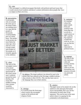
1. G – enre
This newspaper is a tabloid newspaper that deals with political and local issues that
would concern local residents and doesn’t contain information about people that have
no impact on their own lives.
R- epresentation.
Local people, I – nstitution
who are around It is unclear
the same age as where this
the target reader, paper stands
are standing next from just
to a sign that the looking at the
people of front page but
Sevenoaks we do see a
would probably small article on
pass on a daily MP’s and the
basis. The people big expenses
in the picture are scandal that
most likely the went on, so we
same age, class can see that the
and race as the paper is
average reader interested in
and resident of political issues.
Sevenoaks so it
instantly appeals
to the audience.
L - angauge
The blue in the
title represents
V – alues calm and
The style of the inviting and the
newspaper seems page is very
to be aimed white so its not
towards middle- demanding your
aged people as attention towards
the issues raised any particular
A- udience: The target audience can almost be seen in the article.
aren’t celebrity
picture they have placed on the first page, middle/working
gossip but more
class citizens in their 20-30’s. This can also been seen in
dealing with
the language they use in their articles.
issues that
middle/working
class citizens N – arrative
would be The paper seems to be aimed o be on the
interested in. I – deology audiences side and argue their point
It is unclear from the front page across and probably don’t give all the
where exactly this newspaper information for both sides of the
stands on the political and argument. This can be seen in the main
religious fronts. article where it is arguing for the
community to be heard more.
2. G – enre
This newspaper is a tabloid newspaper that deals with political and local issues that
would concern local residents and doesn’t contain information about people that have
no impact on their own lives.
L - angauge
The blue in the
title represents
A- udience: calm and
The inviting and,
audiences are apart from the
residents of bold, red
Bromley and numbers that
most likely grab your
working attention, the rest
class people of the page isn’t
in their seeking
middle ages.
This is
V – alues
shown by the
The style of the
main article
newspaper seems
on the front
to be aimed
page which
towards middle-
is all about
aged people as
politics and
the issues raised
is unlikely
aren’t celebrity
going to
gossip but more
interest
dealing with
teenagers .
issues that
middle/working
class citizens
R- epresentation. would be
This newspaper is trying to interested in.
represent the working class I – deology
people as it has a catchy It is unclear from the front page
where exactly this newspaper I – nstitution
title that is a line from a It is unclear where this
famous song (so it already stands on the political and
religious fronts. paper stands from just
makes the audience feel looking at the front page but
intelligent and relate to the the main article is on the
paper as they get the title) N – arrative MP’s and the big expenses
and it talks about a subject Again the newspaper is taking the side of scandal that went on, so we
that everyone is on about at the public and defending them and re- can see that the paper is
the time of this issues enforcing what they already believe in interested in political issues.
release. so it is most likely that the paper doesn’t
express both sides of the story, mediating
what the audience is being told
3. G – enre
This newspaper is a tabloid newspaper that deals with local issues that would concern
local residents and doesn’t contain information about people that have no impact on
their own lives.
L - angauge
There are lots of
adverts on the
A- udience: front page and
The audience two main articles
here is again that are all trying
middle class to grab your
citizens but attention at the
unlike the same time but
other two not much colour
this so we don’t get a
newspaper is positive or
probably negative reaction
aimed to this
towards a newspaper
slightly
younger
audience,
V – alues
this can be
The style of the
seen via the
newspaper seems
advert at the
to be aimed
top of the
towards middle-
page.
aged people as
the issues raised
aren’t celebrity
gossip but more
dealing with
issues that
middle/working
class citizens
R- epresentation. would be
The people in the picture are interested in.
most likely representations I – deology
of the kind of person who It is unclear from the front page
where exactly this newspaper I – nstitution
would read this magazine. It is unclear what political
Maybe mid 20’s early 30’s stands on the political and
religious fronts. group this newspaper
living with a partner, maybe affiliates itself with just
a child of young age, both from the front page
working class citizens N – arrative
The newspaper is trying to get sympathy
from the audience so it is probably
withholding information that might make
the person who died from looking like a
decent person
4. G – enre
This newspaper is a tabloid newspaper that deals with political and local issues that
would concern local residents and doesn’t contain information about people that have
no impact on their own lives.
I – deology
A- udience: It is unclear from the front page
The where exactly this newspaper
audiences are stands on the political and
residents the religious fronts.
local area L - angauge
and are The blue in the
working title represents
class people calm and the rest
in their of the page isn’t
middle ages. seeking
This is attention.
shown by the
main article
on the front
page which
is all about
some ones
struggles V – alues
with drug The style of the
abuse newspaper seems
to be aimed
towards middle-
aged people as
R- epresentation.
the issues raised
This newspaper is
aren’t celebrity
trying to represent
gossip but more
the average Joe, a
dealing with
working class
issues that
person in their
middle/working
middle age who
class citizens
has most likely
would be
encountered the
interested in.
same problems as
the one being
represented in the
main article or
have known some
one who has gone
through the same
issues. I – nstitution
It is unclear where this
paper stands from just
N – arrative looking at the front page.
The newspaper is trying to win sympathy
for the girl shown in the picture so they
are likely only going to to tell the best
parts about her to try and win her votes
with the audience