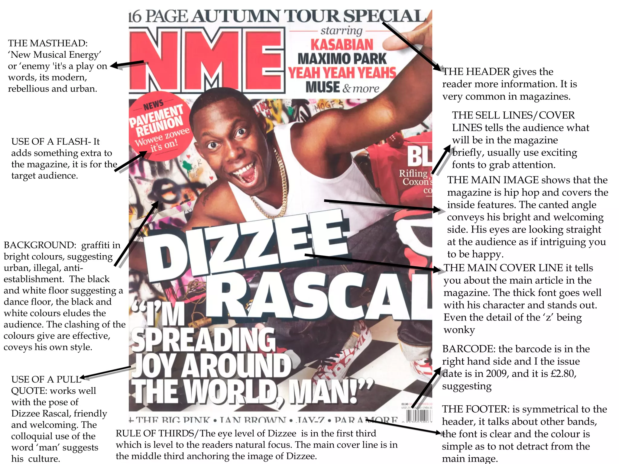
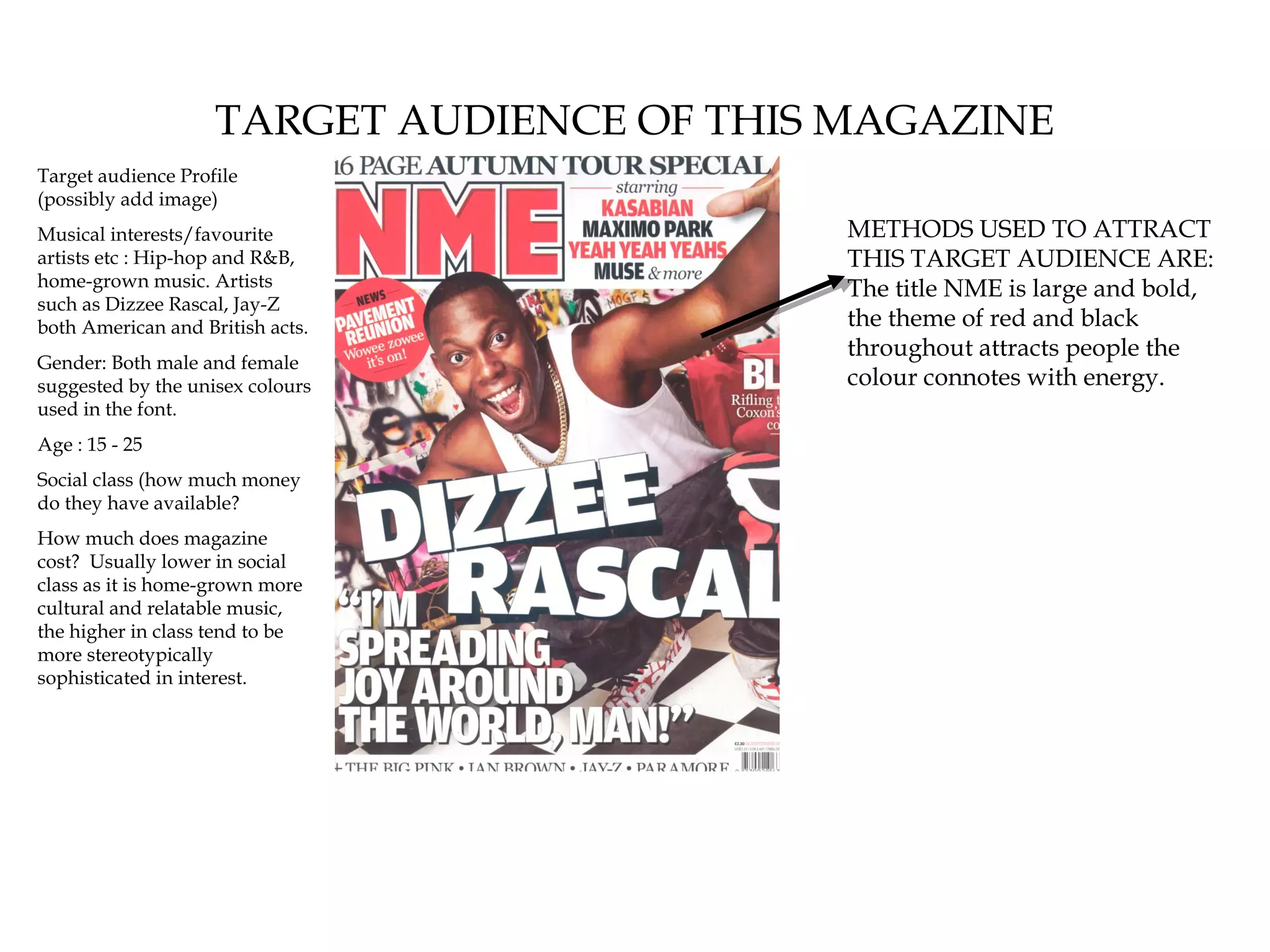
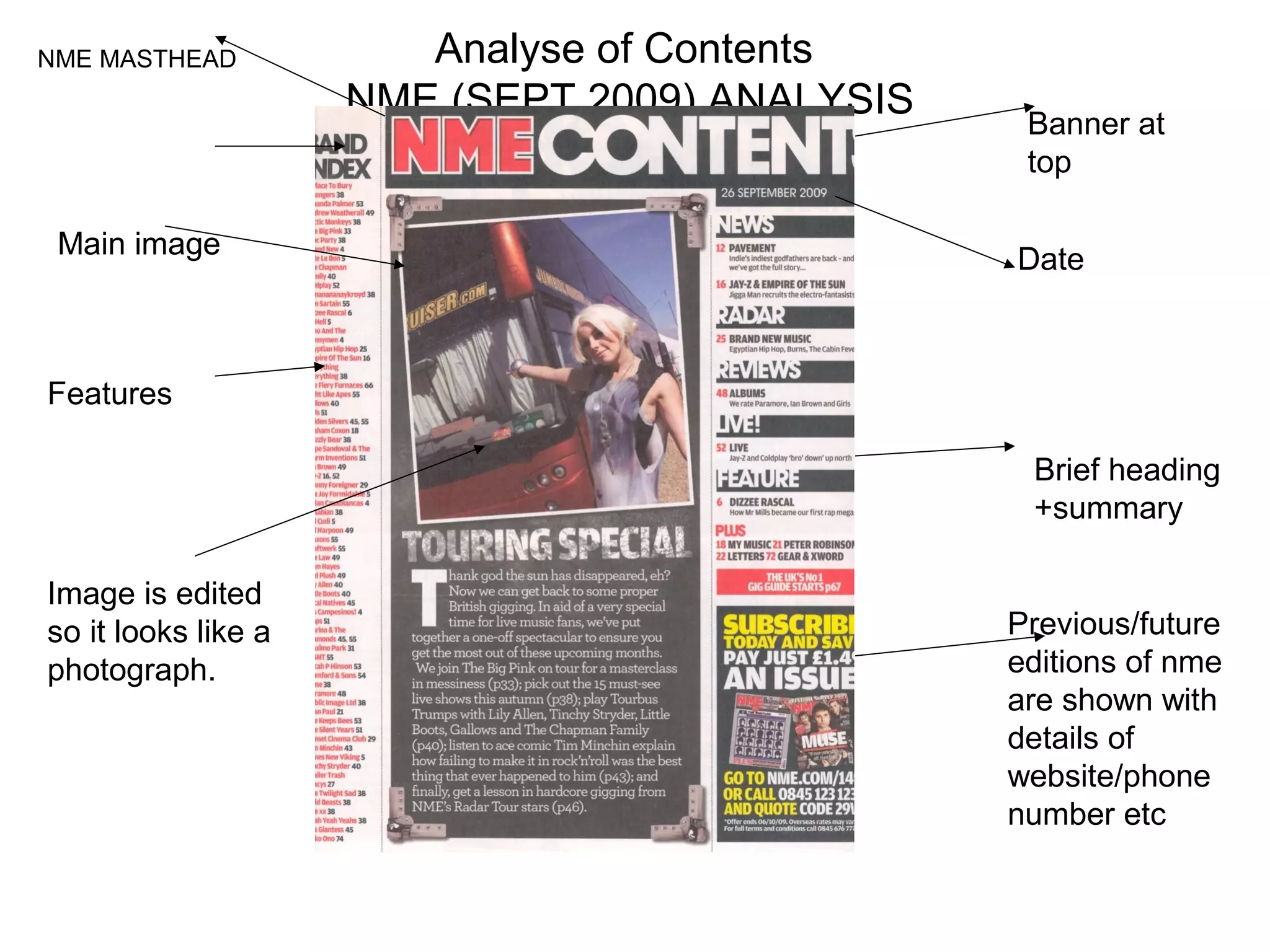
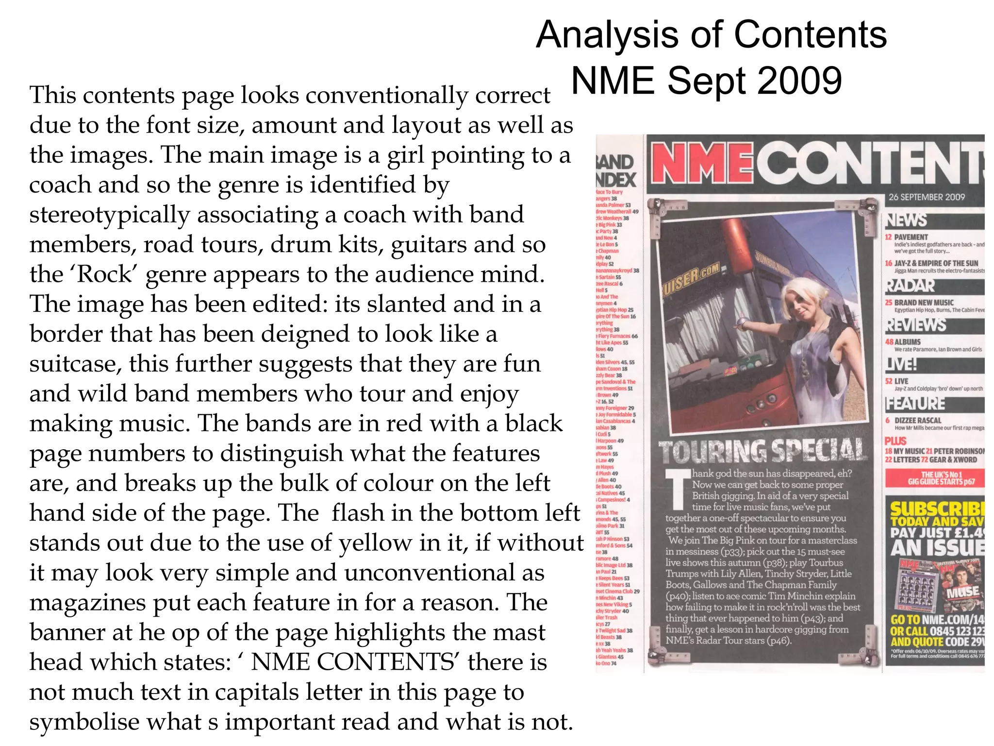
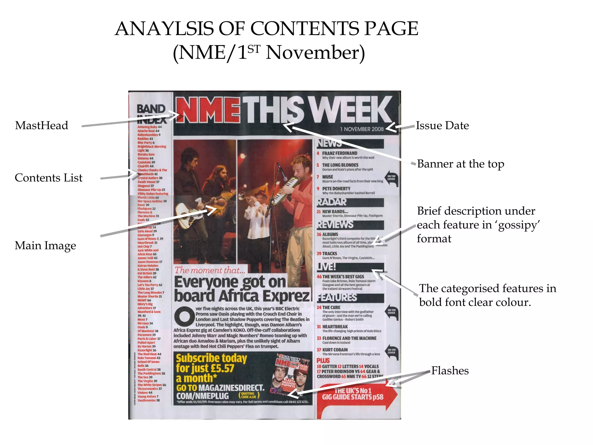
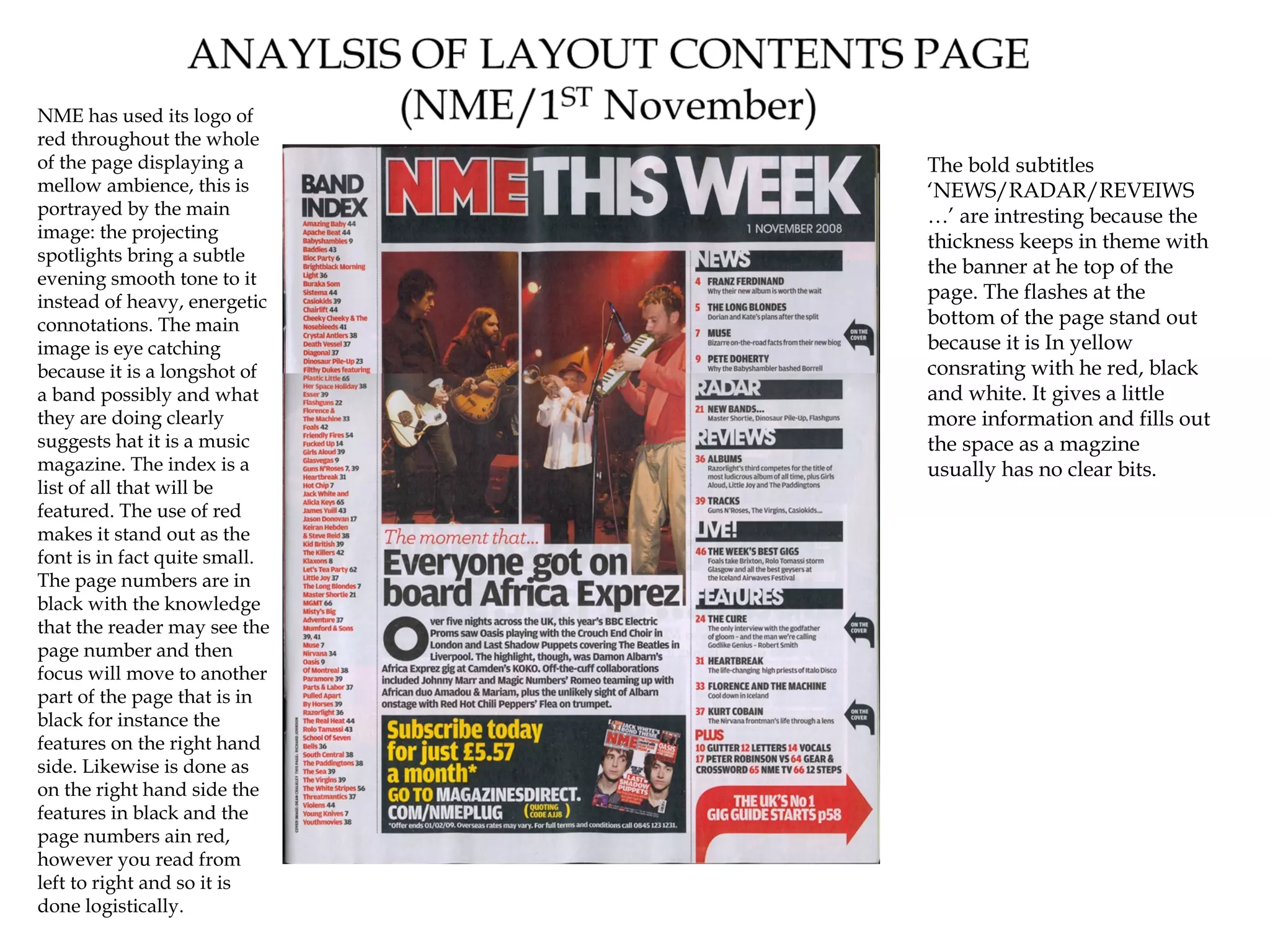
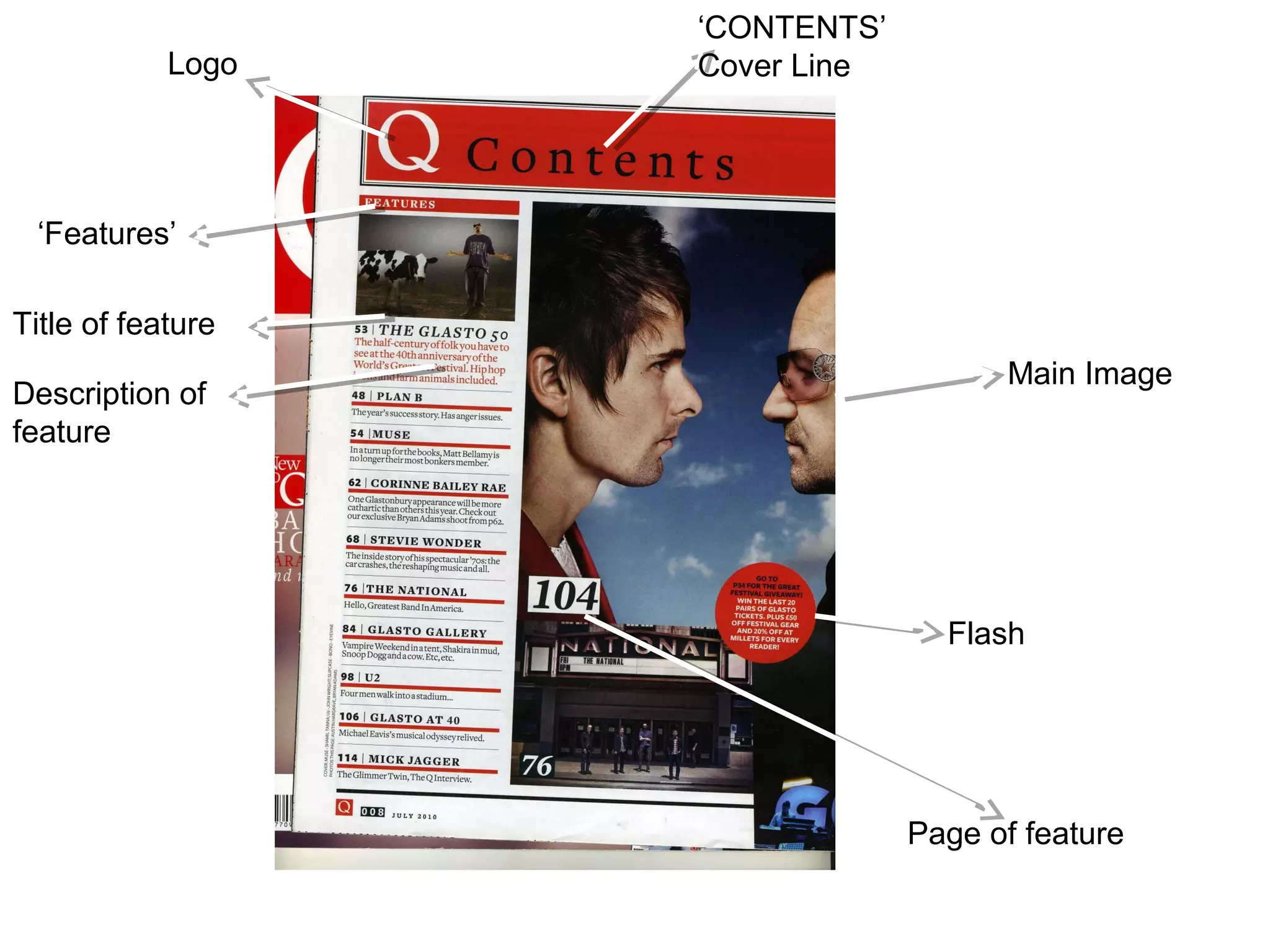
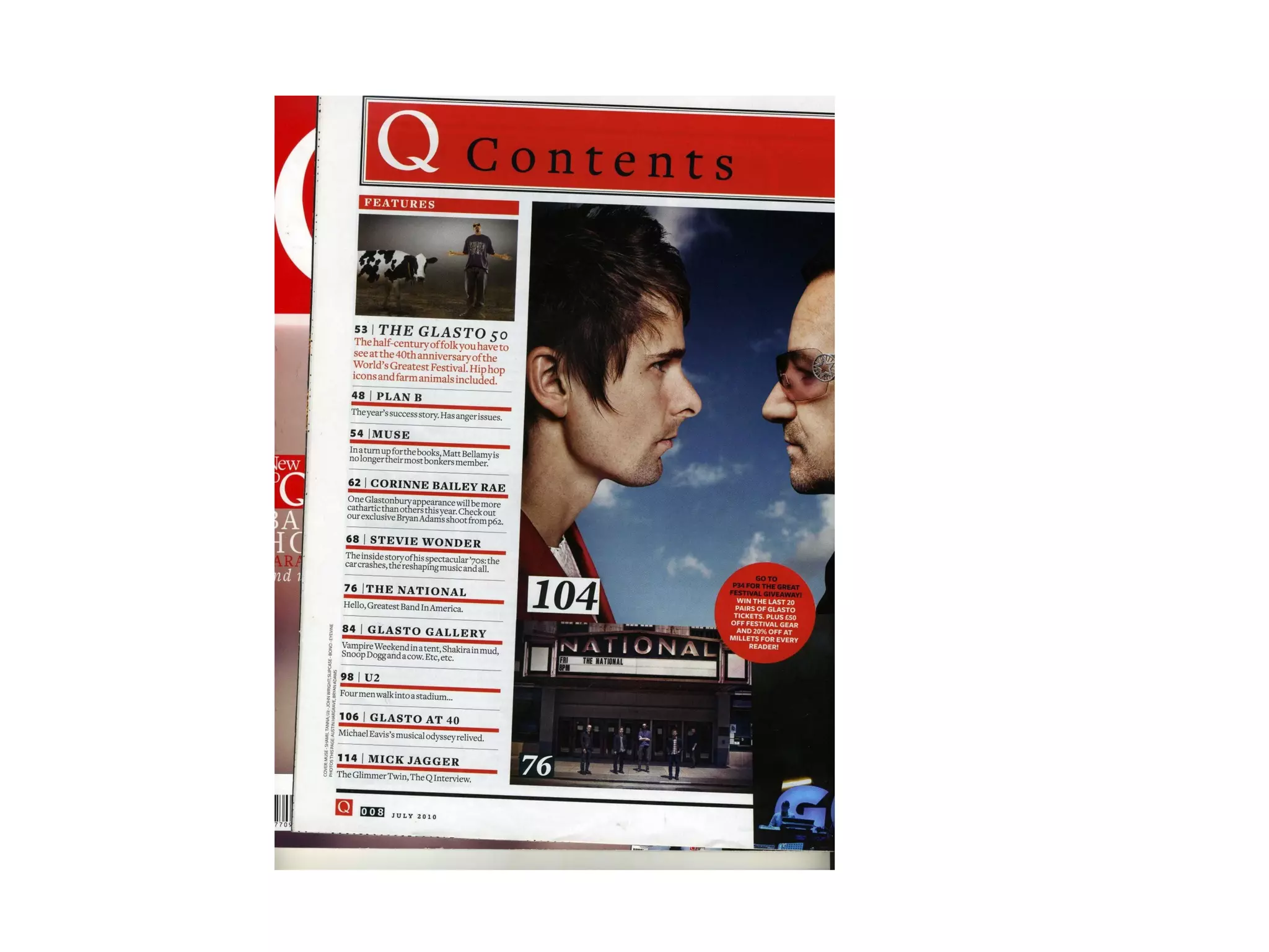
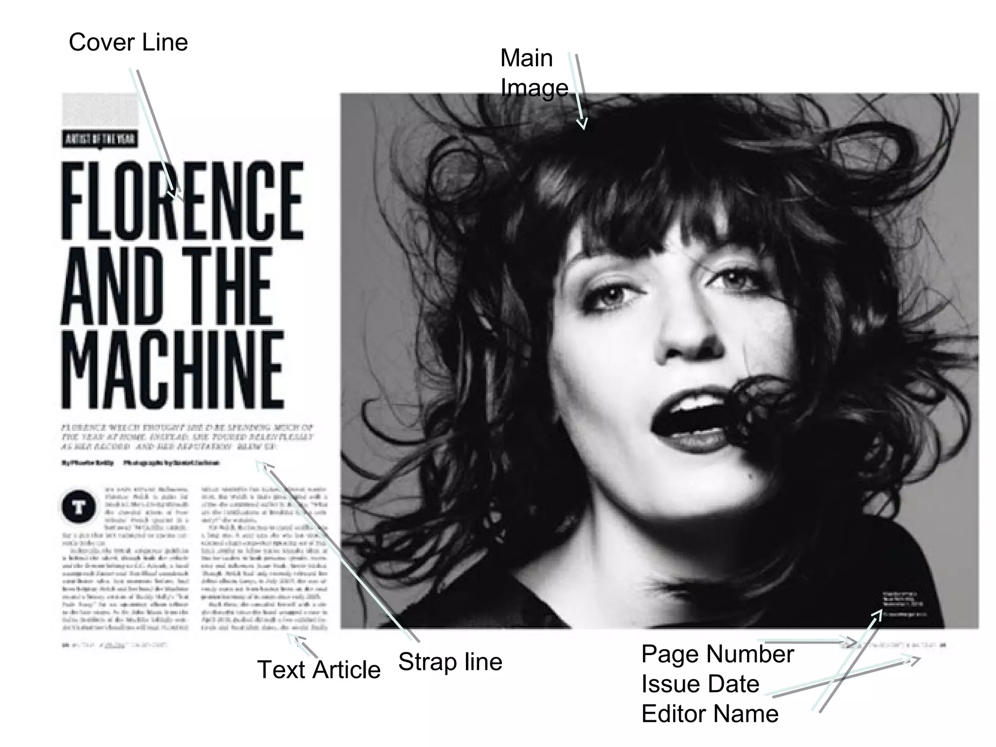
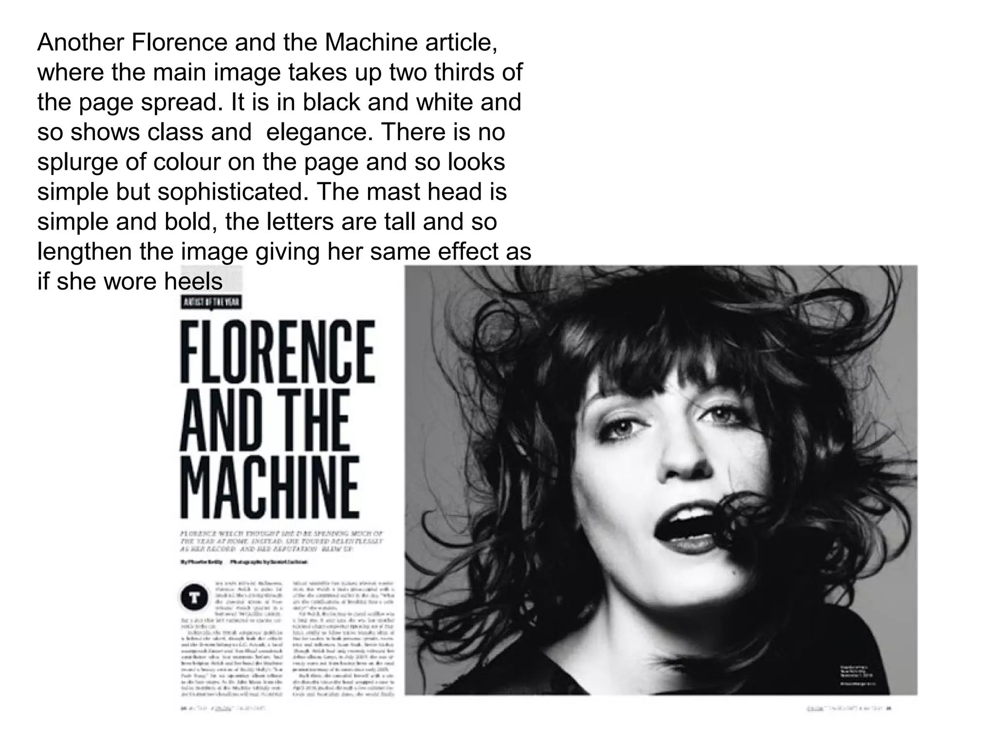
ANALYSIS OF FRONT
     COVER
     PLANNING
   GRACE WILLIAMS
Analysis of magazine front covers
    Cover 1.NME Sept 2009
     Dizzee Rascal Edition
THE MASTHEAD:
 ‘New Musical Energy’
 or ‘enemy 'it's a play on
                                                                                                  THE HEADER gives the
 words, its modern,
 rebellious and urban.                                                                            reader more information. It is
                                                                                                  very common in magazines.
                                                                                                    THE SELL LINES/COVER
                                                                                                    LINES tells the audience what
 USE OF A FLASH- It                                                                                 will be in the magazine
 adds something extra to                                                                            briefly, usually use exciting
 the magazine, it is for the                                                                        fonts to grab attention.
 target audience.                                                                                  THE MAIN IMAGE shows that the
                                                                                                   magazine is hip hop and covers the
                                                                                                   inside features. The canted angle
                                                                                                   conveys his bright and welcoming
                                                                                                   side. His eyes are looking straight
BACKGROUND: graffiti in                                                                            at the audience as if intriguing you
bright colours, suggesting                                                                         to be happy.
urban, illegal, anti-                                                                             THE MAIN COVER LINE it tells
establishment. The black                                                                          you about the main article in the
and white floor suggesting a                                                                      magazine. The thick font goes well
dance floor, the black and                                                                        with his character and stands out.
white colours eludes the                                                                          Even the detail of the ‘z’ being
audience. The clashing of the
                                                                                                  wonky
colours give are effective,
coveys his own style.                                                                             BARCODE: the barcode is in the
                                                                                                  right hand side and I the issue
                                                                                                  date is in 2009, and it is £2.80,
 USE OF A PULL
 QUOTE: works well                                                                                suggesting
 with the pose of
 Dizzee Rascal, friendly                                                                          THE FOOTER: is symmetrical to the
 and welcoming. The                                                                               header, it talks about other bands,
 colloquial use of the   RULE OF THIRDS/The eye level of Dizzee is in the first third             the font is clear and the colour is
 word ‘man’ suggests     which is level to the readers natural focus. The main cover line is in   simple as to not detract from the
 his culture.            the middle third anchoring the image of Dizzee.                          main image.
TARGET AUDIENCE OF THIS MAGAZINE
Target audience Profile
(possibly add image)
Musical interests/favourite                 METHODS USED TO ATTRACT
artists etc : Hip-hop and R&B,              THIS TARGET AUDIENCE ARE:
home-grown music. Artists                   The title NME is large and bold,
such as Dizzee Rascal, Jay-Z
both American and British acts.             the theme of red and black
                                            throughout attracts people the
Gender: Both male and female
suggested by the unisex colours             colour connotes with energy.
used in the font.
Age : 15 - 25
Social class (how much money
do they have available?
How much does magazine
cost? Usually lower in social
class as it is home-grown more
cultural and relatable music,
the higher in class tend to be
more stereotypically
sophisticated in interest.
ANALYSIS OF CONTENTS
        PAGE
      PLANNING
    GRACE WILLIAMS
NME MASTHEAD            Analyse of Contents
                     NME (SEPT 2009) ANALYSIS    Banner at
                                                 top

 Main image                                     Date


Features

                                                 Brief heading
                                                 +summary

Image is edited
so it looks like a                              Previous/future
photograph.                                     editions of nme
                                                are shown with
                                                details of
                                                website/phone
                                                number etc
Analysis of Contents
This contents page looks conventionally correct NME Sept 2009
due to the font size, amount and layout as well as
the images. The main image is a girl pointing to a
coach and so the genre is identified by
stereotypically associating a coach with band
members, road tours, drum kits, guitars and so
the ‘Rock’ genre appears to the audience mind.
The image has been edited: its slanted and in a
border that has been deigned to look like a
suitcase, this further suggests that they are fun
and wild band members who tour and enjoy
making music. The bands are in red with a black
page numbers to distinguish what the features
are, and breaks up the bulk of colour on the left
hand side of the page. The flash in the bottom left
stands out due to the use of yellow in it, if without
it may look very simple and unconventional as
magazines put each feature in for a reason. The
banner at he op of the page highlights the mast
head which states: ‘ NME CONTENTS’ there is
not much text in capitals letter in this page to
symbolise what s important read and what is not.
ANAYLSIS OF CONTENTS PAGE
                    (NME/1ST November)


MastHead                                Issue Date


                                        Banner at the top
Contents List

                                        Brief description under
                                        each feature in ‘gossipy’
                                        format
Main Image


                                            The categorised features in
                                            bold font clear colour.


                                              Flashes
NME has used its logo of
red throughout the whole
of the page displaying a       The bold subtitles
mellow ambience, this is       ‘NEWS/RADAR/REVEIWS
portrayed by the main          …’ are intresting because the
image: the projecting
                               thickness keeps in theme with
spotlights bring a subtle
                               the banner at he top of the
evening smooth tone to it
instead of heavy, energetic    page. The flashes at the
connotations. The main         bottom of the page stand out
image is eye catching          because it is In yellow
because it is a longshot of    consrating with he red, black
a band possibly and what       and white. It gives a little
they are doing clearly         more information and fills out
suggests hat it is a music     the space as a magzine
magazine. The index is a       usually has no clear bits.
list of all that will be
featured. The use of red
makes it stand out as the
font is in fact quite small.
The page numbers are in
black with the knowledge
that the reader may see the
page number and then
focus will move to another
part of the page that is in
black for instance the
features on the right hand
side. Likewise is done as
on the right hand side the
features in black and the
page numbers ain red,
however you read from
left to right and so it is
done logistically.
‘CONTENTS’
            Logo   Cover Line


 ‘Features’

Title of feature
                                      Main Image
Description of
feature


                                  Flash


                                Page of feature
ANALYSIS OF DOUBLE
 PAGE SPREADS AND
     ARTICLES
     PLANNING
   GRACE WILLIAMS
ANALYSIS OF LAYOUT ARTICLE
                 (NME/30th November)

Masthead


                                          ‘UPFRONT’ specific
                                          section of the
Text
                                          magazine, perhaps a
                                          weekly feature
                                          attracts viewers.


Main Image


                                            Images

Issue Date
ANALYSIS OF LAYOUT ARTICLE
MASTHEAD is in a black (NME/30th November)    There are other pictures
colour plain and simple.
The main image of Annie                       In the article that relate
Mac consists of only two                      to the main article so
colours which aren't                          this grouping method
particularly bold and so if                   wont confuse the
the mast head was bright                      audience. The page
and eccentric it would                        number is at the bottom
detract from the image                        of the page and also
therefor unbalanced or                        provides clarity and
unconventional. The use of                    direction. The NME sign
font is interesting because                   and the due date is at
‘PIECES OF ME’ is in a                        the bottom also. Here it
sophisticated and classical                   is out the way but looks
font while ‘ANNIE MAC’                        professional as well.
although in capitals also is                  There is a caption
more standard showing                         underneath the third
that her character is a mix                   picture on he right hand
of both typical and                           side which introduces
refreshing, modern                            the images. There is a
expression. It also breaks                    theme of strangeness in
up the motif of classical                     this article as the people
hand writing because the                      in the images are all
text in the article in written                looking away and not
in the same font. The use                     directly towards you.
of black and white is                         This indicates that it is
cleverly picked because of                    not the main cover as
the white backdrop in the                     they would most likely
image and shadow. The                         be looking toward you
text is split into subtitles so               to grab attention, the use
that if a reader scans                        of avoidable eye content
through the article they                      suggests that it’s a
can pick out the most eye-                    thought provoking
catching part instead of                      piece.
losing interest.
fdfcsv
             MastHead           Editor


Main Image              Article Page no. Issue Date
Main Image is dominant taking up two thirds of the double page spread. It is powerful because of the
colours used. The strong red suggests power and strength , desire and love further portrayed in her hair
colour that is fiery and bold. Her leather black dress with tall heels stand outs strongly which shows
mysterious and also power. The table on the has red and blue lines on them which show national heraldry
and so power once again. The text on the right hand side is small but looks classy as the ‘D’ stand out and
looks very professional as the theme runs throughout. There is no white space on the double page spread
as a giant watermark of ‘USA’ runs behind. The page number is in bottom right hand side of the page and
the editor name is underneath ‘got the love’, which realliterates what Florence and the Machine is known
for.
Cover Line
                                   Main
                                   Image


                                           Page Number
             Text Article Strap line
                                           Issue Date
                                           Editor Name
Another Florence and the Machine article,
where the main image takes up two thirds of
the page spread. It is in black and white and
so shows class and elegance. There is no
splurge of colour on the page and so looks
simple but sophisticated. The mast head is
simple and bold, the letters are tall and so
lengthen the image giving her same effect as
if she wore heels

Analysing mgazine pages

  • 1.
    ANALYSIS OF FRONT COVER PLANNING GRACE WILLIAMS
  • 2.
    Analysis of magazinefront covers Cover 1.NME Sept 2009 Dizzee Rascal Edition
  • 3.
    THE MASTHEAD: ‘NewMusical Energy’ or ‘enemy 'it's a play on THE HEADER gives the words, its modern, rebellious and urban. reader more information. It is very common in magazines. THE SELL LINES/COVER LINES tells the audience what USE OF A FLASH- It will be in the magazine adds something extra to briefly, usually use exciting the magazine, it is for the fonts to grab attention. target audience. THE MAIN IMAGE shows that the magazine is hip hop and covers the inside features. The canted angle conveys his bright and welcoming side. His eyes are looking straight BACKGROUND: graffiti in at the audience as if intriguing you bright colours, suggesting to be happy. urban, illegal, anti- THE MAIN COVER LINE it tells establishment. The black you about the main article in the and white floor suggesting a magazine. The thick font goes well dance floor, the black and with his character and stands out. white colours eludes the Even the detail of the ‘z’ being audience. The clashing of the wonky colours give are effective, coveys his own style. BARCODE: the barcode is in the right hand side and I the issue date is in 2009, and it is £2.80, USE OF A PULL QUOTE: works well suggesting with the pose of Dizzee Rascal, friendly THE FOOTER: is symmetrical to the and welcoming. The header, it talks about other bands, colloquial use of the RULE OF THIRDS/The eye level of Dizzee is in the first third the font is clear and the colour is word ‘man’ suggests which is level to the readers natural focus. The main cover line is in simple as to not detract from the his culture. the middle third anchoring the image of Dizzee. main image.
  • 4.
    TARGET AUDIENCE OFTHIS MAGAZINE Target audience Profile (possibly add image) Musical interests/favourite METHODS USED TO ATTRACT artists etc : Hip-hop and R&B, THIS TARGET AUDIENCE ARE: home-grown music. Artists The title NME is large and bold, such as Dizzee Rascal, Jay-Z both American and British acts. the theme of red and black throughout attracts people the Gender: Both male and female suggested by the unisex colours colour connotes with energy. used in the font. Age : 15 - 25 Social class (how much money do they have available? How much does magazine cost? Usually lower in social class as it is home-grown more cultural and relatable music, the higher in class tend to be more stereotypically sophisticated in interest.
  • 5.
    ANALYSIS OF CONTENTS PAGE PLANNING GRACE WILLIAMS
  • 6.
    NME MASTHEAD Analyse of Contents NME (SEPT 2009) ANALYSIS Banner at top Main image Date Features Brief heading +summary Image is edited so it looks like a Previous/future photograph. editions of nme are shown with details of website/phone number etc
  • 7.
    Analysis of Contents Thiscontents page looks conventionally correct NME Sept 2009 due to the font size, amount and layout as well as the images. The main image is a girl pointing to a coach and so the genre is identified by stereotypically associating a coach with band members, road tours, drum kits, guitars and so the ‘Rock’ genre appears to the audience mind. The image has been edited: its slanted and in a border that has been deigned to look like a suitcase, this further suggests that they are fun and wild band members who tour and enjoy making music. The bands are in red with a black page numbers to distinguish what the features are, and breaks up the bulk of colour on the left hand side of the page. The flash in the bottom left stands out due to the use of yellow in it, if without it may look very simple and unconventional as magazines put each feature in for a reason. The banner at he op of the page highlights the mast head which states: ‘ NME CONTENTS’ there is not much text in capitals letter in this page to symbolise what s important read and what is not.
  • 8.
    ANAYLSIS OF CONTENTSPAGE (NME/1ST November) MastHead Issue Date Banner at the top Contents List Brief description under each feature in ‘gossipy’ format Main Image The categorised features in bold font clear colour. Flashes
  • 9.
    NME has usedits logo of red throughout the whole of the page displaying a The bold subtitles mellow ambience, this is ‘NEWS/RADAR/REVEIWS portrayed by the main …’ are intresting because the image: the projecting thickness keeps in theme with spotlights bring a subtle the banner at he top of the evening smooth tone to it instead of heavy, energetic page. The flashes at the connotations. The main bottom of the page stand out image is eye catching because it is In yellow because it is a longshot of consrating with he red, black a band possibly and what and white. It gives a little they are doing clearly more information and fills out suggests hat it is a music the space as a magzine magazine. The index is a usually has no clear bits. list of all that will be featured. The use of red makes it stand out as the font is in fact quite small. The page numbers are in black with the knowledge that the reader may see the page number and then focus will move to another part of the page that is in black for instance the features on the right hand side. Likewise is done as on the right hand side the features in black and the page numbers ain red, however you read from left to right and so it is done logistically.
  • 10.
    ‘CONTENTS’ Logo Cover Line ‘Features’ Title of feature Main Image Description of feature Flash Page of feature
  • 12.
    ANALYSIS OF DOUBLE PAGE SPREADS AND ARTICLES PLANNING GRACE WILLIAMS
  • 13.
    ANALYSIS OF LAYOUTARTICLE (NME/30th November) Masthead ‘UPFRONT’ specific section of the Text magazine, perhaps a weekly feature attracts viewers. Main Image Images Issue Date
  • 14.
    ANALYSIS OF LAYOUTARTICLE MASTHEAD is in a black (NME/30th November) There are other pictures colour plain and simple. The main image of Annie In the article that relate Mac consists of only two to the main article so colours which aren't this grouping method particularly bold and so if wont confuse the the mast head was bright audience. The page and eccentric it would number is at the bottom detract from the image of the page and also therefor unbalanced or provides clarity and unconventional. The use of direction. The NME sign font is interesting because and the due date is at ‘PIECES OF ME’ is in a the bottom also. Here it sophisticated and classical is out the way but looks font while ‘ANNIE MAC’ professional as well. although in capitals also is There is a caption more standard showing underneath the third that her character is a mix picture on he right hand of both typical and side which introduces refreshing, modern the images. There is a expression. It also breaks theme of strangeness in up the motif of classical this article as the people hand writing because the in the images are all text in the article in written looking away and not in the same font. The use directly towards you. of black and white is This indicates that it is cleverly picked because of not the main cover as the white backdrop in the they would most likely image and shadow. The be looking toward you text is split into subtitles so to grab attention, the use that if a reader scans of avoidable eye content through the article they suggests that it’s a can pick out the most eye- thought provoking catching part instead of piece. losing interest.
  • 15.
    fdfcsv MastHead Editor Main Image Article Page no. Issue Date
  • 16.
    Main Image isdominant taking up two thirds of the double page spread. It is powerful because of the colours used. The strong red suggests power and strength , desire and love further portrayed in her hair colour that is fiery and bold. Her leather black dress with tall heels stand outs strongly which shows mysterious and also power. The table on the has red and blue lines on them which show national heraldry and so power once again. The text on the right hand side is small but looks classy as the ‘D’ stand out and looks very professional as the theme runs throughout. There is no white space on the double page spread as a giant watermark of ‘USA’ runs behind. The page number is in bottom right hand side of the page and the editor name is underneath ‘got the love’, which realliterates what Florence and the Machine is known for.
  • 17.
    Cover Line Main Image Page Number Text Article Strap line Issue Date Editor Name
  • 18.
    Another Florence andthe Machine article, where the main image takes up two thirds of the page spread. It is in black and white and so shows class and elegance. There is no splurge of colour on the page and so looks simple but sophisticated. The mast head is simple and bold, the letters are tall and so lengthen the image giving her same effect as if she wore heels