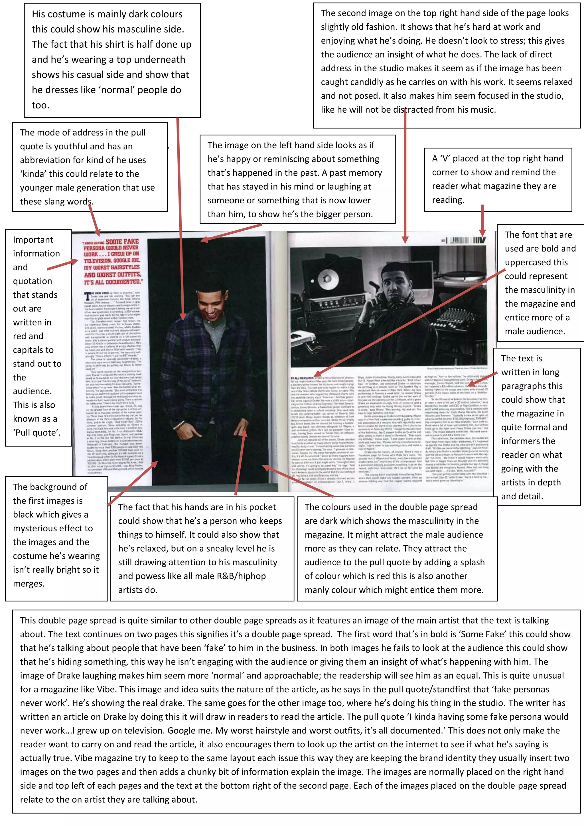
His costume is mainly dark colours                                        The second image on the top right hand side of the page looks
     this could show his masculine side.                                       slightly old fashion. It shows that he’s hard at work and
     The fact that his shirt is half done up                                   enjoying what he’s doing. He doesn’t look to stress; this gives
                                                                               the audience an insight of what he does. The lack of direct
     and he’s wearing a top underneath
                                                                               address in the studio makes it seem as if the image has been
     shows his casual side and show that
                                                                               caught candidly as he carries on with his work. It seems relaxed
     he dresses like ‘normal’ people do
                                                                               and not posed. It also makes him seem focused in the studio,
     too.                                                                      like he will not be distracted from his music.

  The mode of address in the pull
  quote is youthful and has the studios.
                when he’s in an                   The image on the left hand side looks as if
  abbreviation for kind of he uses                he’s happy or reminiscing about something                A ‘V’ placed at the top right hand
  ‘kinda’ this could relate to the                that’s happened in the past. A past memory               corner to show and remind the
  younger male generation that use                that has stayed in his mind or laughing at               reader what magazine they are
  these slang words.                              someone or something that is now lower                   reading.
                                                  than him, to show he’s the bigger person.

                                                                                                                              The font that are
Important
                                                                                                                              used are bold and
information
                                                                                                                              uppercased this
and
                                                                                                                              could represent
quotation
                                                                                                                              the masculinity in
that stands
                                                                                                                              the magazine and
out are
                                                                                                                              entice more of a
written in
red and                                                                                                                       male audience.
capitals to
                                                                                                                             The text is
stand out to
                                                                                                                             written in long
the
                                                                                                                             paragraphs this
audience.
                                                                                                                             could show that
This is also
                                                                                                                             the magazine in
known as a
                                                                                                                             quite formal and
‘Pull quote’.
                                                                                                                             informers the
                                                                                                                             reader on what
                                                                                                                             going with the
The background of                                                                                                            artists in depth
the first images is                                                                                                          and detail.
                            The fact that his hands are in his pocket     The colours used in the double page spread
black which gives a
                            could show that he’s a person who keeps       are dark which shows the masculinity in the
mysterious effect to
                            things to himself. It could also show that    magazine. It might attract the male audience
the images and the
                            he’s relaxed, but on a sneaky level he is     more as they can relate. They attract the
costume he’s wearing
                            still drawing attention to his masculinity    audience to the pull quote by adding a splash
isn’t really bright so it
                            and powess like all male R&B/hiphop           of colour which is red this is also another
merges.
                            artists do.                                   manly colour which might entice them more.


  This double page spread is quite similar to other double page spreads as it features an image of the main artist that the text is talking
  about. The text continues on two pages this signifies it’s a double page spread. The first word that’s in bold is ‘Some Fake’ this could show
  that he’s talking about people that have been ‘fake’ to him in the business. In both images he fails to look at the audience this could show
  that he’s hiding something, this way he isn’t engaging with the audience or giving them an insight of what’s happening with him. The
  image of Drake laughing makes him seem more ‘normal’ and approachable; the readership will see him as an equal. This is quite unusual
  for a magazine like Vibe. This image and idea suits the nature of the article, as he says in the pull quote/standfirst that ‘fake personas
  never work’. He’s showing the real drake. The same goes for the other image too, where he’s doing his thing in the studio. The writer has
  written an article on Drake by doing this it will draw in readers to read the article. The pull quote ‘I kinda having some fake persona would
  never work...I grew up on television. Google me. My worst hairstyle and worst outfits, it’s all documented.’ This does not only make the
  reader want to carry on and read the article, it also encourages them to look up the artist on the internet to see if what he’s saying is
  actually true. Vibe magazine try to keep to the same layout each issue this way they are keeping the brand identity they usually insert two
  images on the two pages and then adds a chunky bit of information explain the image. The images are normally placed on the right hand
  side and top left of each pages and the text at the bottom right of the second page. Each of the images placed on the double page spread
  relate to the on artist they are talking about.
They keep a symbiotic link              The background colour is a plain white            The font they use looks like a ‘graffiti’ style; by the
between the front cover and             colour which gives out a look of innocence        magazine doing this they are attracting a more
double page spread. You can             and matches the theme of the magazine.            male audience. But because of the slimness and the
tell this because the three main        It is a colour that will keep the audience        slight of the font could also be seen as feminine.
colours keep popping up which           wondering.
are black, white and red.
                                                                                             ‘Life of a shooting
                                   The mode of the address for this                          star’ this could also
 The image on the                  double page spread is a more laid                         been seen as a pull
 left hand side of                 back approach, they try to attract                        quote explain what
 the page takes up                 the younger generation. You can tell                      the text is going to        They keep a ‘V’ in the
 the whole of the                  this by the image on the left hand                        be about. The               top right hand side of
 page it shows an                  side where is whole face is covered                       pullqoute could             the page so that the
 image of the artist               by the phrase ‘swag’ which only                           suggest that the            reader can be
 they are talking                  youths will understand the meaning                        article is about him        reminded of what
 about in the text.                of. Also the term ‘swag surf’ they                        wishing about the           magazine they are
                                   use on the second page under the                          life he wants.              reading.
                                   pull quotation.
The
tattoos
suggest a
rebellious
and ‘from                                                                                                                    The headline of this
                                                                                                                             double page spread
the street’
                                                                                                                             is also a pull quote
star
                                                                                                                             which indicates to
image.                                                                                                                       the nature of the
                                                                                                                             article this is
                                                                                                                             effective because it
                                                                                                                             allows the
                                                                                                                             readership to
                                                                                                                             acknowledge what
                                                                                                                             the article is about.


In the main image of the page it looks as if he’s joyful and is enjoying what he’s doing.         Graffiti font- rebellious, masculine,
The fact that he isn’t facing the audience and he isn’t making eye contact could show that        suggestive of the need to make a
he’s hiding something or could be distracted. This might disengage the audience by not            statement and get a message across. It
making direct eye contact but it could also make them want to read more into the article          also indicates that the article is going to
to find out what he’s looking at and why it’s making him so happy and cheerful.                   give us a personal insight into Soulja
                                                                                                  Boy’s thoughts and feelings.

 This double page spread goes across both pages and the fact that Soulja Boy has his face looking toward the second page could attract
 the audience to read on. This particular double page spread is very similar to many of VIBE’s double page spread as they have an image
 on the left hand side and on the top right hand side, with the text being the last thing the reader reads. The title of this piece is also the
 pull quote and it’s showing the reader that he’s going up in his career. The mode of address is very informal and connects with the
 younger generation as they use words such as ‘swag’ which only younger kids will understand. The font is readable as it is bold and in
 uppercase letting which could be seen as manly. The image on the page could be seen as masculine as Soulja Boy is showing his bare
 shoulder, they look very broad. This could encourage the male audience to become more like, look up to him like a role model. He has
 many tattoos on his face and body which is a general code and convention to R&B artists. His tattoos match the colour scheme of the
 page as they are black and red. The main body of the text is an article about Soulja Boy the text is presented in paragraph form. They
 start the article of with his name this way it’s easier for the audience to work out who the artist is. The fact that the double page spread
 is consistent in every issue maintains the brand identity. The image on the left page is the first thing the audience see’s and the text is
 the last thing the audience reads so it should stay in their heads. The colours used help maintain a brand identity.

Double page analysis

  • 1.
    His costume ismainly dark colours The second image on the top right hand side of the page looks this could show his masculine side. slightly old fashion. It shows that he’s hard at work and The fact that his shirt is half done up enjoying what he’s doing. He doesn’t look to stress; this gives the audience an insight of what he does. The lack of direct and he’s wearing a top underneath address in the studio makes it seem as if the image has been shows his casual side and show that caught candidly as he carries on with his work. It seems relaxed he dresses like ‘normal’ people do and not posed. It also makes him seem focused in the studio, too. like he will not be distracted from his music. The mode of address in the pull quote is youthful and has the studios. when he’s in an The image on the left hand side looks as if abbreviation for kind of he uses he’s happy or reminiscing about something A ‘V’ placed at the top right hand ‘kinda’ this could relate to the that’s happened in the past. A past memory corner to show and remind the younger male generation that use that has stayed in his mind or laughing at reader what magazine they are these slang words. someone or something that is now lower reading. than him, to show he’s the bigger person. The font that are Important used are bold and information uppercased this and could represent quotation the masculinity in that stands the magazine and out are entice more of a written in red and male audience. capitals to The text is stand out to written in long the paragraphs this audience. could show that This is also the magazine in known as a quite formal and ‘Pull quote’. informers the reader on what going with the The background of artists in depth the first images is and detail. The fact that his hands are in his pocket The colours used in the double page spread black which gives a could show that he’s a person who keeps are dark which shows the masculinity in the mysterious effect to things to himself. It could also show that magazine. It might attract the male audience the images and the he’s relaxed, but on a sneaky level he is more as they can relate. They attract the costume he’s wearing still drawing attention to his masculinity audience to the pull quote by adding a splash isn’t really bright so it and powess like all male R&B/hiphop of colour which is red this is also another merges. artists do. manly colour which might entice them more. This double page spread is quite similar to other double page spreads as it features an image of the main artist that the text is talking about. The text continues on two pages this signifies it’s a double page spread. The first word that’s in bold is ‘Some Fake’ this could show that he’s talking about people that have been ‘fake’ to him in the business. In both images he fails to look at the audience this could show that he’s hiding something, this way he isn’t engaging with the audience or giving them an insight of what’s happening with him. The image of Drake laughing makes him seem more ‘normal’ and approachable; the readership will see him as an equal. This is quite unusual for a magazine like Vibe. This image and idea suits the nature of the article, as he says in the pull quote/standfirst that ‘fake personas never work’. He’s showing the real drake. The same goes for the other image too, where he’s doing his thing in the studio. The writer has written an article on Drake by doing this it will draw in readers to read the article. The pull quote ‘I kinda having some fake persona would never work...I grew up on television. Google me. My worst hairstyle and worst outfits, it’s all documented.’ This does not only make the reader want to carry on and read the article, it also encourages them to look up the artist on the internet to see if what he’s saying is actually true. Vibe magazine try to keep to the same layout each issue this way they are keeping the brand identity they usually insert two images on the two pages and then adds a chunky bit of information explain the image. The images are normally placed on the right hand side and top left of each pages and the text at the bottom right of the second page. Each of the images placed on the double page spread relate to the on artist they are talking about.
  • 2.
    They keep asymbiotic link The background colour is a plain white The font they use looks like a ‘graffiti’ style; by the between the front cover and colour which gives out a look of innocence magazine doing this they are attracting a more double page spread. You can and matches the theme of the magazine. male audience. But because of the slimness and the tell this because the three main It is a colour that will keep the audience slight of the font could also be seen as feminine. colours keep popping up which wondering. are black, white and red. ‘Life of a shooting The mode of the address for this star’ this could also The image on the double page spread is a more laid been seen as a pull left hand side of back approach, they try to attract quote explain what the page takes up the younger generation. You can tell the text is going to They keep a ‘V’ in the the whole of the this by the image on the left hand be about. The top right hand side of page it shows an side where is whole face is covered pullqoute could the page so that the image of the artist by the phrase ‘swag’ which only suggest that the reader can be they are talking youths will understand the meaning article is about him reminded of what about in the text. of. Also the term ‘swag surf’ they wishing about the magazine they are use on the second page under the life he wants. reading. pull quotation. The tattoos suggest a rebellious and ‘from The headline of this double page spread the street’ is also a pull quote star which indicates to image. the nature of the article this is effective because it allows the readership to acknowledge what the article is about. In the main image of the page it looks as if he’s joyful and is enjoying what he’s doing. Graffiti font- rebellious, masculine, The fact that he isn’t facing the audience and he isn’t making eye contact could show that suggestive of the need to make a he’s hiding something or could be distracted. This might disengage the audience by not statement and get a message across. It making direct eye contact but it could also make them want to read more into the article also indicates that the article is going to to find out what he’s looking at and why it’s making him so happy and cheerful. give us a personal insight into Soulja Boy’s thoughts and feelings. This double page spread goes across both pages and the fact that Soulja Boy has his face looking toward the second page could attract the audience to read on. This particular double page spread is very similar to many of VIBE’s double page spread as they have an image on the left hand side and on the top right hand side, with the text being the last thing the reader reads. The title of this piece is also the pull quote and it’s showing the reader that he’s going up in his career. The mode of address is very informal and connects with the younger generation as they use words such as ‘swag’ which only younger kids will understand. The font is readable as it is bold and in uppercase letting which could be seen as manly. The image on the page could be seen as masculine as Soulja Boy is showing his bare shoulder, they look very broad. This could encourage the male audience to become more like, look up to him like a role model. He has many tattoos on his face and body which is a general code and convention to R&B artists. His tattoos match the colour scheme of the page as they are black and red. The main body of the text is an article about Soulja Boy the text is presented in paragraph form. They start the article of with his name this way it’s easier for the audience to work out who the artist is. The fact that the double page spread is consistent in every issue maintains the brand identity. The image on the left page is the first thing the audience see’s and the text is the last thing the audience reads so it should stay in their heads. The colours used help maintain a brand identity.