Downloaded 13 times

![The Challenge…
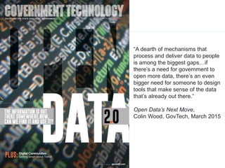
“Big data is sending ripples through
all sectors of society. We track
everything…this trend is leading to a
critical need for [people] who can
mine and interpret…”](https://image.slidesharecdn.com/qxemrbxzr66x6xwys1yg-signature-216e7d5de18b0be9803ce97f63f17dc3c700ee608e4e928b41b67b4ab6f07f38-poli-150412175338-conversion-gate01/85/Share-Information-Change-the-World-Big-Data-Small-Apps-Smart-Dashboards-the-New-Intelligence-Ecosystem-4-320.jpg)

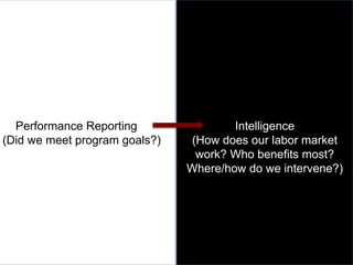
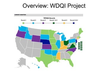
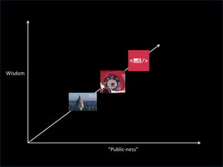


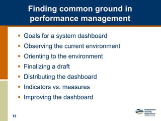
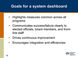
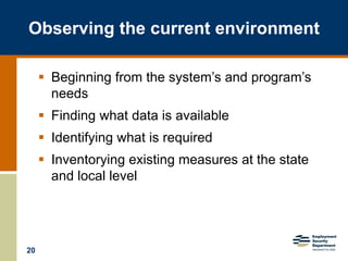
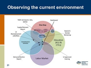
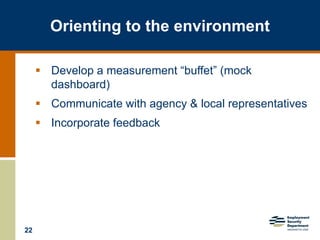
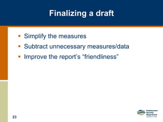
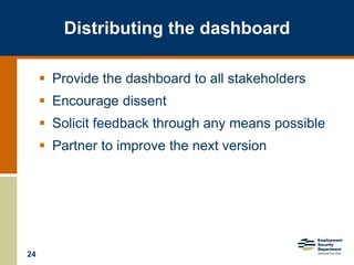
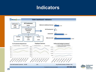
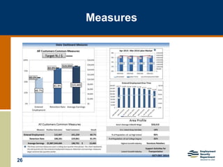
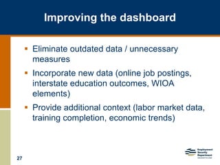


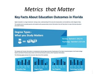
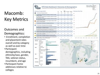
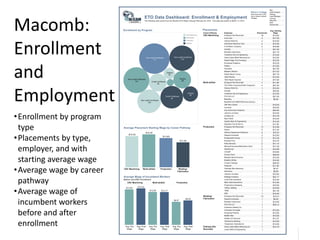
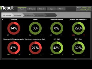

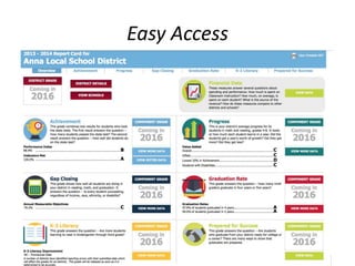
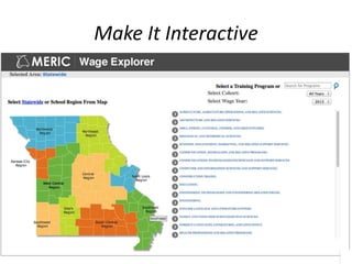
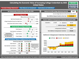
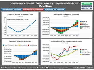
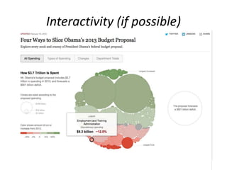


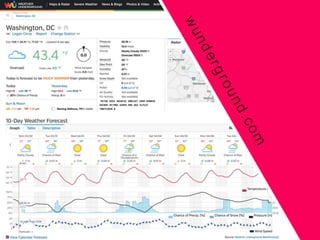


The NAWB Annual Forum on March 30, 2015, focused on utilizing big data to enhance performance reporting and decision-making in government sectors. Presenters emphasized the importance of developing effective dashboards that communicate key metrics, drive continuous improvement, and facilitate public access to data. The forum highlighted challenges in data processing and the need for innovative tools to interpret existing datasets for better community and workforce outcomes.


![Where does Data Democracy begin? [Segment-Synapse, 2019]](https://cdn.slidesharecdn.com/ss_thumbnails/sunbasketsynapse2019agfinal-190928134248-thumbnail.jpg?width=640&height=640&fit=bounds)


