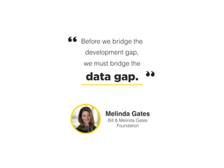
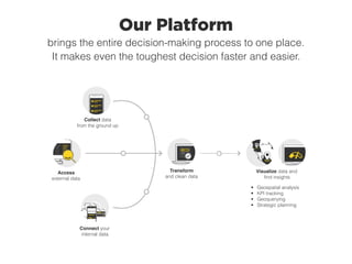
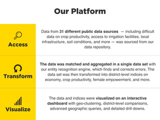
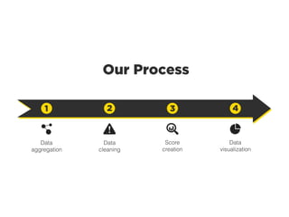
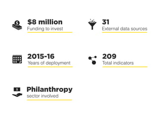
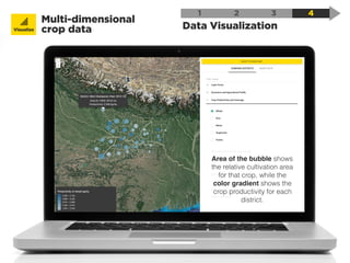
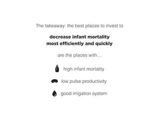
Data-Driven Investments
Using data intelligence to invest $8
million in agriculture in rural India
with
| case study
The
Problem1
Reducing extreme poverty for India’s
small and marginal farmers
Before we bridge the
development gap,
we must bridge the
data gap.
Melinda Gates
Bill & Melinda Gates
Foundation
Our
Solution2
Creating a complete data-driven
picture of agriculture in India
The Gates Foundation
partnered with SocialCops to
create a data-driven way for
teams at the Gates Foundation
to target their investments.
Our data intelligence platform
was deployed to aggregate
agriculture data from public
sources, clean and structure
the data, and visualize the data
in an intuitive, useful
dashboard.
Overview
The absence of unintended changes or errors in some data. Integrity implies
that the data is an exact copy of some original version, e.g. that it has not been
corrupted in the process of being written to, and read back from, a hard disk or
during transmission via some communications channel.
data jack (ˈdadǝ jak) n.
1. A wall-mounted or desk-mounted connector (frequently a wide telephone-style
8-pin RJ-45 ) for connecting to data cabling in a building.
Data Intelligence
data intelligence (ˈdadǝ inˈtelǝjǝns) n.
1. The process of transforming all available data — collected from the ground up,
sourced from external data sets, and extracted from elaborate internal systems —
into intelligent insights that make the best decision crystal clear.
2. The only logical way to make a decision in the twenty-first century.
data link layer (ˈdadǝ lingk ˈlāər) n.
1. Layer two, the second lowest layer in the OSI seven layer model. The data link
layer splits data into frames (see fragmentation ) for sending on the physical
layer and receives acknowledgement frames. It performs error checking and re-
transmits frames not received correctly. It provides an error-free virtual channel
to the network layer. The data link layer is split into an upper sublayer, Logical
Our Platform
brings the entire decision-making process to one place.
It makes even the toughest decision faster and easier.
Access
external data
Collect data
from the ground up
Connect your
internal data
Visualize data and
find insights
Transform
and clean data
• Geospatial analysis
• KPI tracking
• Geoquerying
• Strategic planning
Our Platform
Data from 31 different public data sources — including difficult
data on crop productivity, access to irrigation facilities, local
infrastructure, soil conditions, and more — was sourced from our
data repository.
The data was matched and aggregated in a single data set with
our entity recognition engine, which finds and corrects errors. The
data set was then transformed into district-level indices on
economy, crop productivity, female empowerment, and more.
The data and indices were visualized on an interactive
dashboard with geo-clustering, district-level comparisons,
advanced geographic queries, and detailed drill downs.
Access
Visualize
Transform
Our Process
1 2 3 4
Data
cleaning
Data
aggregation
Score
creation
Data
visualization
Funding to invest
31
External data sources
$8 million
2015-16
Years of deployment
209
Total indicators
Philanthropy
Sector involved
The
Story3
31 data sources, 209 indicators, and
9 indices… all in 1 dashboard
Data from 31 sources was
pulled from Access. The
data covered 209 indicators in 9
layers:
Economic and agricultural profile
ICT and infrastructure
Crop productivity and coverage
Horticulture productivity and coverage
Financial services
Livestock services
Nutrition
Women’s empowerment and services
Policy and advocacy
Data Aggregation
1 2 3 4
Access
Data Aggregation
1 2 3 4
Access
Our data goes through
extensive verification and
cleaning before being added to
Access.
Data from everywhere
Data was sourced from PDF files, web
pages, text files, images, and Excel files in
the most obscure corners of the internet.
Data triangulation
Complex algorithms were used to match
data across many disparate, inconsistent
data sets, all to zoom in on the right data
points.
Trustworthy data
Every data set was cleaned, checked for
completeness and accuracy, and
prioritized based on its relevance.
Data Cleaning
1 2 3 4
After all the data was
aggregated, it was cleaned
and verified on Transform.
Transform
Consistency checks
Includes intra-variable checks (checking
each variable for incorrect values) and
inter-variable checks (ensuring that data
across variables and geographies is
consistent).
Data quality assurance
All other checks needed to ensure
complete accuracy, including vertical
aggregations, missing value checks, and
external validations.
Geographic aggregation
Each data point needed to be matched with
the correct district (using a master list of
geographic standards), then all the data for
each district had to be merged into a single
data set.
Score Creation
1 2 3 4
For easier insights, a score
was calculated for each of
the 9 layers (crop productivity and
coverage, livestock services, etc.)
in each district.
The score provides a simple way
to…
assess the status of each
topic in a given district
quickly compare each layer
across multiple districts
Transform
Data Visualization
1 2 3 4
Visualize
Using Visualize, all of the
cleaned, verified data was
visualized in an interactive
dashboard with…
district comparisons
state-level view
access to raw data
intelligent query engine
Data Visualization
Identify clusters
for investmentVisualize
1 2 3 4
Data Visualization
Query and identify
focus areasVisualize
1 2 3 4
productivity of maize < 1,500 x land with assured irrigation = No x
Data Visualization
Zoom into any
geographyVisualize
1 2 3 4
Data Visualization
Multi-dimensional
crop dataVisualize
1 2 3 4
Area of the bubble shows
the relative cultivation area
for that crop, while the
color gradient shows the
crop productivity for each
district.
Use

Case4An example of how this dashboard
helps drive better investments
India has a problem with
high infant mortality rates.
Can we tackle that through agricultural investments?
India has a pulse problem. While the production of rice and wheat has
grown consistently since Independence, pulse production has stagnated.
This has contributed to severe undernourishment, since rice and wheat are
less nutrient-rich than pulses. By increasing pulse production, agricultural
families’ nourishment improves as they can add more pulses to their diet.
(“Pulse” refers to dried peas, beans, lentils, chickpeas, and other legumes.)
pulse
productivity
We know
that increasing
infant
mortality.
helps
decrease
Why are pulses less common?
Pulse cultivation requires more water than rice or wheat.
Efficient pulse production needs a
good irrigation system.
The takeaway: the best places to invest to
decrease infant mortality
most efficiently and quickly
are the places with…
high infant mortality
low pulse productivity
good irrigation system
The best place to
invest in urad (black
lentil) productivity
for improving infant
mortality
About
SocialCops5
Recognition
We’ve garnered widespread support since our start in 2013.
2015 and 2016 “40 Under 40” list
- Forbes India: 2015 “30 Under 30” list
- Forbes Asia: 2016 “30 Under 30” list
- Recognized as one of the top 10 emerging startups
by Prime Minister Modi
- Selected as one of the 35 startups to visit Silicon
Valley with Prime Minister Narendra Modi for the
India-U.S. Startup Konnect in 2015
and more…
- United Nations World Youth Summit Award
- Global Social Entrepreneurship Competition
- IBM/IEEE Smart Planet Challenge
- Singapore International Foundation
- Young Social Entrepreneurs
- Aseanpreneurs Idea Canvas
Press and Media
We’ve garnered widespread support since our start in 2013.
Data intelligence can be used to confront the
world’s most critical problems and make a
truly data-driven decision.
Indian Management
Tracking data that solves problems is their
mission.
Economic Times
I am thrilled with the pioneering work that
SocialCops is doing. We are limited only by
our imagination in terms of how technology
can address the challenges facing humanity.
Manoj Menon, managing director (Southeast Asia) of
Frost & Sullivan
SocialCops is taking big data in a direction
that very few companies have been able to
do: providing data and insights that can help
solve real problems for most of the planet.
Pankaj Jain, Partner at 500 Startups
Thank You!
For more information or to request
a demo of our platform, check out
www.socialcops.com.

Case Study: SocialCops + Bill & Melinda Gates Foundation

  • 1.
    Data-Driven Investments Using dataintelligence to invest $8 million in agriculture in rural India with | case study
  • 2.
    The Problem1 Reducing extreme povertyfor India’s small and marginal farmers
  • 3.
    Before we bridgethe development gap, we must bridge the data gap. Melinda Gates Bill & Melinda Gates Foundation
  • 6.
    Our Solution2 Creating a completedata-driven picture of agriculture in India
  • 7.
    The Gates Foundation partneredwith SocialCops to create a data-driven way for teams at the Gates Foundation to target their investments. Our data intelligence platform was deployed to aggregate agriculture data from public sources, clean and structure the data, and visualize the data in an intuitive, useful dashboard. Overview
  • 8.
    The absence ofunintended changes or errors in some data. Integrity implies that the data is an exact copy of some original version, e.g. that it has not been corrupted in the process of being written to, and read back from, a hard disk or during transmission via some communications channel. data jack (ˈdadǝ jak) n. 1. A wall-mounted or desk-mounted connector (frequently a wide telephone-style 8-pin RJ-45 ) for connecting to data cabling in a building. Data Intelligence data intelligence (ˈdadǝ inˈtelǝjǝns) n. 1. The process of transforming all available data — collected from the ground up, sourced from external data sets, and extracted from elaborate internal systems — into intelligent insights that make the best decision crystal clear. 2. The only logical way to make a decision in the twenty-first century. data link layer (ˈdadǝ lingk ˈlāər) n. 1. Layer two, the second lowest layer in the OSI seven layer model. The data link layer splits data into frames (see fragmentation ) for sending on the physical layer and receives acknowledgement frames. It performs error checking and re- transmits frames not received correctly. It provides an error-free virtual channel to the network layer. The data link layer is split into an upper sublayer, Logical
  • 9.
    Our Platform brings theentire decision-making process to one place. It makes even the toughest decision faster and easier. Access external data Collect data from the ground up Connect your internal data Visualize data and find insights Transform and clean data • Geospatial analysis • KPI tracking • Geoquerying • Strategic planning
  • 10.
    Our Platform Data from31 different public data sources — including difficult data on crop productivity, access to irrigation facilities, local infrastructure, soil conditions, and more — was sourced from our data repository. The data was matched and aggregated in a single data set with our entity recognition engine, which finds and corrects errors. The data set was then transformed into district-level indices on economy, crop productivity, female empowerment, and more. The data and indices were visualized on an interactive dashboard with geo-clustering, district-level comparisons, advanced geographic queries, and detailed drill downs. Access Visualize Transform
  • 11.
    Our Process 1 23 4 Data cleaning Data aggregation Score creation Data visualization
  • 12.
    Funding to invest 31 Externaldata sources $8 million 2015-16 Years of deployment 209 Total indicators Philanthropy Sector involved
  • 13.
    The Story3 31 data sources,209 indicators, and 9 indices… all in 1 dashboard
  • 14.
    Data from 31sources was pulled from Access. The data covered 209 indicators in 9 layers: Economic and agricultural profile ICT and infrastructure Crop productivity and coverage Horticulture productivity and coverage Financial services Livestock services Nutrition Women’s empowerment and services Policy and advocacy Data Aggregation 1 2 3 4 Access
  • 15.
    Data Aggregation 1 23 4 Access Our data goes through extensive verification and cleaning before being added to Access. Data from everywhere Data was sourced from PDF files, web pages, text files, images, and Excel files in the most obscure corners of the internet. Data triangulation Complex algorithms were used to match data across many disparate, inconsistent data sets, all to zoom in on the right data points. Trustworthy data Every data set was cleaned, checked for completeness and accuracy, and prioritized based on its relevance.
  • 16.
    Data Cleaning 1 23 4 After all the data was aggregated, it was cleaned and verified on Transform. Transform Consistency checks Includes intra-variable checks (checking each variable for incorrect values) and inter-variable checks (ensuring that data across variables and geographies is consistent). Data quality assurance All other checks needed to ensure complete accuracy, including vertical aggregations, missing value checks, and external validations. Geographic aggregation Each data point needed to be matched with the correct district (using a master list of geographic standards), then all the data for each district had to be merged into a single data set.
  • 17.
    Score Creation 1 23 4 For easier insights, a score was calculated for each of the 9 layers (crop productivity and coverage, livestock services, etc.) in each district. The score provides a simple way to… assess the status of each topic in a given district quickly compare each layer across multiple districts Transform
  • 18.
    Data Visualization 1 23 4 Visualize Using Visualize, all of the cleaned, verified data was visualized in an interactive dashboard with… district comparisons state-level view access to raw data intelligent query engine
  • 19.
    Data Visualization Identify clusters forinvestmentVisualize 1 2 3 4
  • 20.
    Data Visualization Query andidentify focus areasVisualize 1 2 3 4 productivity of maize < 1,500 x land with assured irrigation = No x
  • 21.
    Data Visualization Zoom intoany geographyVisualize 1 2 3 4
  • 22.
    Data Visualization Multi-dimensional crop dataVisualize 12 3 4 Area of the bubble shows the relative cultivation area for that crop, while the color gradient shows the crop productivity for each district.
  • 23.
    Use
 Case4An example ofhow this dashboard helps drive better investments
  • 24.
    India has aproblem with high infant mortality rates. Can we tackle that through agricultural investments?
  • 25.
    India has apulse problem. While the production of rice and wheat has grown consistently since Independence, pulse production has stagnated. This has contributed to severe undernourishment, since rice and wheat are less nutrient-rich than pulses. By increasing pulse production, agricultural families’ nourishment improves as they can add more pulses to their diet. (“Pulse” refers to dried peas, beans, lentils, chickpeas, and other legumes.) pulse productivity We know that increasing infant mortality. helps decrease
  • 26.
    Why are pulsesless common? Pulse cultivation requires more water than rice or wheat. Efficient pulse production needs a good irrigation system.
  • 27.
    The takeaway: thebest places to invest to decrease infant mortality most efficiently and quickly are the places with… high infant mortality low pulse productivity good irrigation system
  • 28.
    The best placeto invest in urad (black lentil) productivity for improving infant mortality
  • 29.
  • 30.
    Recognition We’ve garnered widespreadsupport since our start in 2013. 2015 and 2016 “40 Under 40” list - Forbes India: 2015 “30 Under 30” list - Forbes Asia: 2016 “30 Under 30” list - Recognized as one of the top 10 emerging startups by Prime Minister Modi - Selected as one of the 35 startups to visit Silicon Valley with Prime Minister Narendra Modi for the India-U.S. Startup Konnect in 2015 and more… - United Nations World Youth Summit Award - Global Social Entrepreneurship Competition - IBM/IEEE Smart Planet Challenge - Singapore International Foundation - Young Social Entrepreneurs - Aseanpreneurs Idea Canvas
  • 31.
    Press and Media We’vegarnered widespread support since our start in 2013. Data intelligence can be used to confront the world’s most critical problems and make a truly data-driven decision. Indian Management Tracking data that solves problems is their mission. Economic Times I am thrilled with the pioneering work that SocialCops is doing. We are limited only by our imagination in terms of how technology can address the challenges facing humanity. Manoj Menon, managing director (Southeast Asia) of Frost & Sullivan SocialCops is taking big data in a direction that very few companies have been able to do: providing data and insights that can help solve real problems for most of the planet. Pankaj Jain, Partner at 500 Startups
  • 32.
    Thank You! For moreinformation or to request a demo of our platform, check out www.socialcops.com.