The document provides an analysis of various magazine covers and contents pages. Key points include:
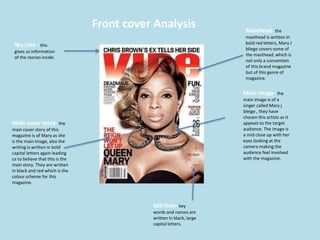
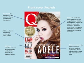
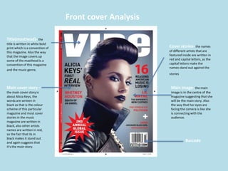
- Mastheads, main images, and cover lines are used prominently to grab readers' attention and indicate the main stories.
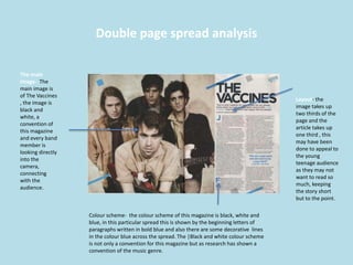
- Color schemes, layouts, and graphic elements follow conventions for each magazine and the music genre. Black, white, and bold text are often used.
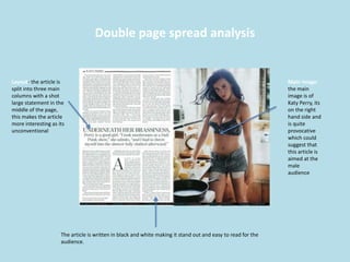
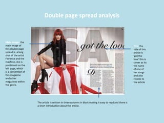
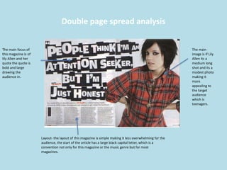
- Images usually make eye contact with the viewer and are placed in the center or on the left page to be the focal point.
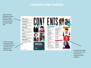
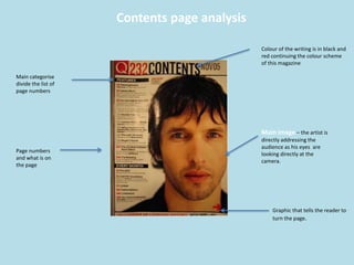
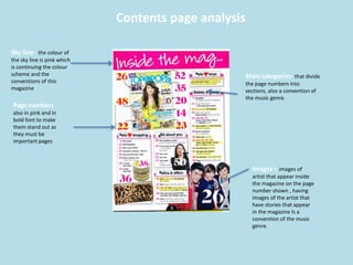
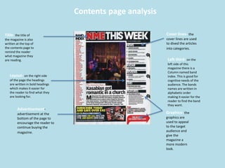
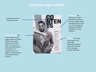
- Contents pages list stories and artists with images, page numbers, and brief descriptions for easy navigation.
- Double page spreads employ large central images and short columns of text in an engaging format