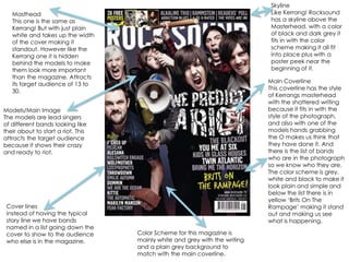
This document provides a summary of the key elements and design features of the RockSound magazine cover and interior pages:
1. The cover features models who are lead singers of bands looking ready to start a riot, attracting the target audience of 13-30 year olds.
2. Inside, articles are introduced with large colorful photos of bands positioned to look powerful, with backgrounds contrasting their normal lives.
3. Color schemes, fonts, and graphic elements are used consistently throughout to clearly present content and brand the magazine for its target rock music fans.
2. Skyline Like Kerrang! Rocksound has a skyline above the Masterhead, with a color of black and dark grey it fits in with the color scheme making it all fit into place plus with a poster peek near the beginning of it. Masthead This one is the same as Kerrang! But with just plain white and takes up the width of the cover making it standout. However like the Kerrang one it is hidden behind the models to make them look more important than the magazine. Attracts its target audience of 13 to 30. Main Coverline This coverline has the style of Kerrangs masterhead with the shattered writing because it fits in with the style of the photograph, and also with one of the models hands grabbing the O makes us think that they have done it. And there is the list of bands who are in the photograph so we know who they are. The color scheme is grey, white and black to make it look plain and simple and below the list there is in yellow ‘Brits On The Rampage’ making it stand out and making us see what is happening. Models/Main Image The models are lead singers of different bands looking like their about to start a riot. This attracts the target audience because it shows their crazy and ready to riot. Cover lines Instead of having the typical story line we have bands named in a list going down the cover to show to the audience who else is in the magazine. Color Scheme for this magazine is mainly white and grey with the writing and a plain grey background to match with the main coverline.
3. Name of the magazine, with the date it was issued and the issue number below it. Model is Matt Skiba from Alkaline Trio. We have him dressed in a school uniform pulling his inside lip like a rude school boy with the hat and watch, we’re suppose to laugh at this image of a full grown man still acting like a young school boy, but he is out of control and unique like his band. Simple color scheme, black, red and white. A typical color scheme for the target audience not to flashy just the right color scheme. The contents page acts as a navigation for the magazine so we know what is on what page. Underneath each title is a little paragraph of what the page contains. A quote is used that is said by the model as a way of laughing at what he says because it’s almost silly like the way he is posing in this photo.
4. The band are positioned in a certain way with the lead singer at the front and we have the rest of the band members sitting behind her because she is more important. They are all looking down at the camera to make them seem more in power. The background is a staircase but with some skyline of the city they are in. This is to contrast that they are normal people in a normal environment instead of being in a studio. The headline ‘PARAMORE’ is the name of the band and it is in orange to stand out from the rest of the magazine, also to match the lead singers hair which is orange/blonde. It is also in a print stamp style to make it more rockier and heavy to make it fit in with the style of magazine. It is also going up the side of the bassist Jeremy's body to make it look more impressive. Credits to the photographers and the writer so we see who made this article happen. The first introduction of the page is in a bluey green color to stand out from the black and white background so we can read it more clearly. The font is in white to stand out from the background image so we can read more clearly. The style of text is formal describing the bands comeback and what is to be expected from them. The lead singer Hayley Williams is in color however her band members are in black and white because she is the front woman of the band so she is more important.