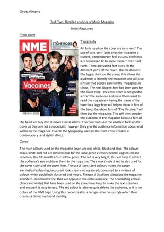
The document provides an analysis of the design elements of the front cover and contents page of an indie music magazine. On the front cover, sans-serif fonts in varied sizes are used to draw attention to key information. Red, black, and white are used to create a contemporary style aligned with the genre. The cover image depicts the band in stereotypical rock poses. On the contents page, a mix of serif and sans-serif fonts and bold/plain text are used, along with images of famous artists, to attract readers' attention. The double page spread employs serif fonts, columns, and images of the artist to present information in a conventional magazine format.


![Music Mag Mood Board =]](https://cdn.slidesharecdn.com/ss_thumbnails/musicmagmoodboard-091119153226-phpapp02-thumbnail.jpg?width=640&height=640&fit=bounds)


