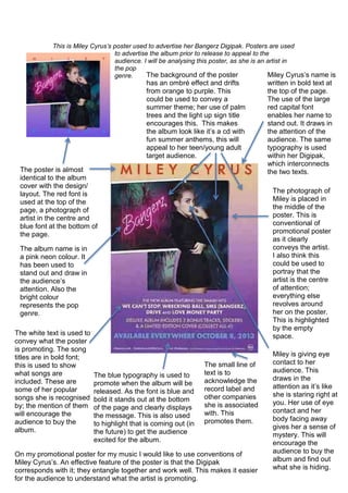
1. This is Miley Cyrus’s poster used to advertise her Bangerz Digipak. Posters are used
to advertise the album prior to release to appeal to the
audience. I will be analysing this poster, as she is an artist in
the pop
genre. Miley Cyrus’s name is
written in bold text at
the top of the page.
The use of the large
red capital font
enables her name to
stand out. It draws in
the attention of the
audience. The same
typography is used
within her Digipak,
which interconnects
the two texts.The poster is almost
identical to the album
cover with the design/
layout. The red font is
used at the top of the
page, a photograph of
artist in the centre and
blue font at the bottom of
the page.
The photograph of
Miley is placed in
the middle of the
poster. This is
conventional of
promotional poster
as it clearly
conveys the artist.
I also think this
could be used to
portray that the
artist is the centre
of attention;
everything else
revolves around
her on the poster.
This is highlighted
by the empty
space.The white text is used to
convey what the poster
is promoting. The song
titles are in bold font;
this is used to show
what songs are
included. These are
some of her popular
songs she is recognised
by; the mention of them
will encourage the
audience to buy the
album.
The blue typography is used to
promote when the album will be
released. As the font is blue and
bold it stands out at the bottom
of the page and clearly displays
the message. This is also used
to highlight that is coming out (in
the future) to get the audience
excited for the album.
The small line of
text is to
acknowledge the
record label and
other companies
she is associated
with. This
promotes them.
The background of the poster
has an ombré effect and drifts
from orange to purple. This
could be used to convey a
summer theme; her use of palm
trees and the light up sign title
encourages this. This makes
the album look like it’s a cd with
fun summer anthems, this will
appeal to her teen/young adult
target audience.
Miley is giving eye
contact to her
audience. This
draws in the
attention as it’s like
she is staring right at
you. Her use of eye
contact and her
body facing away
gives her a sense of
mystery. This will
encourage the
audience to buy the
album and find out
what she is hiding.
The album name is in
a pink neon colour. It
has been used to
stand out and draw in
the audience’s
attention. Also the
bright colour
represents the pop
genre.
On my promotional poster for my music I would like to use conventions of
Miley Cyrus’s. An effective feature of the poster is that the Digipak
corresponds with it; they entangle together and work well. This makes it easier
for the audience to understand what the artist is promoting.