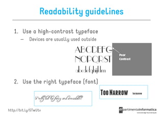
Download as PDF, PPTX
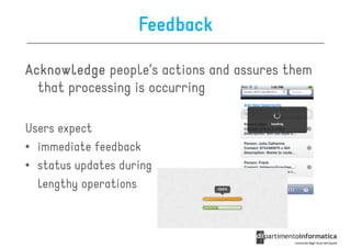
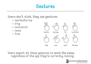
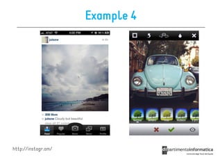
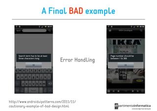
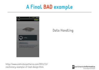
![Some apps are just so
shiny you want to lick them
[cit.]](https://image.slidesharecdn.com/lecture05-120326112051-phpapp02/85/UI-Design-2-320.jpg)
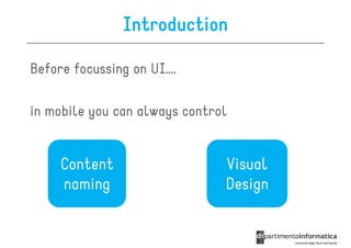
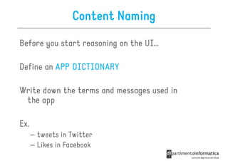
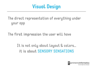
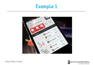
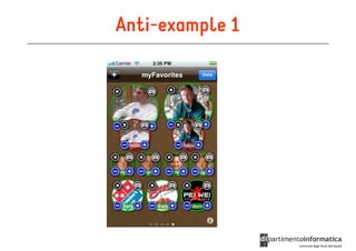
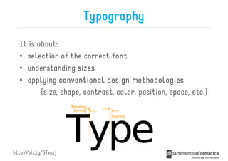
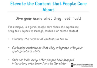
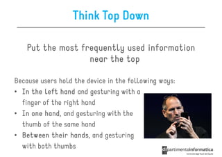
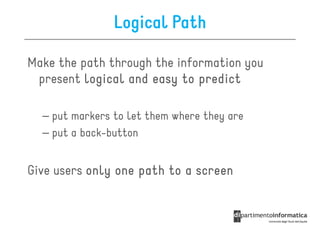
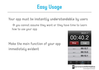
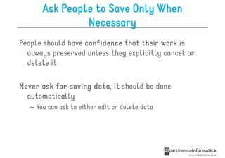
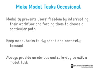
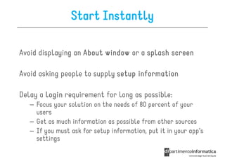
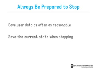

This document outlines key principles for user interface (UI) design, emphasizing the importance of aesthetic integrity, consistency, user feedback, and intuitive navigation. It highlights the need for user-centric terminology, appropriate use of color and typography, and the significance of minimizing user input effort. The guidelines also stress the necessity for adaptable designs that enhance user experiences across mobile devices, ensuring that interfaces are understandable and engaging.


![How Maintainability Issues of Android Apps Evolve [ICSME 2018]](https://cdn.slidesharecdn.com/ss_thumbnails/icsme2018-180928081558-thumbnail.jpg?width=640&height=640&fit=bounds)


![Modeling objects interaction via UML sequence diagrams [Software Design] [Com...](https://cdn.slidesharecdn.com/ss_thumbnails/06sequencediagrams-180314152521-thumbnail.jpg?width=640&height=640&fit=bounds)
![Modeling behaviour via UML state machines [Software Design] [Computer Science...](https://cdn.slidesharecdn.com/ss_thumbnails/05statemachines-180306225932-thumbnail.jpg?width=640&height=640&fit=bounds)
![Object-oriented design patterns in UML [Software Design] [Computer Science] [...](https://cdn.slidesharecdn.com/ss_thumbnails/04designpatterns-180228160652-thumbnail.jpg?width=640&height=640&fit=bounds)
![Structure modeling with UML [Software Design] [Computer Science] [Vrije Unive...](https://cdn.slidesharecdn.com/ss_thumbnails/03structuremodeling-180219151135-thumbnail.jpg?width=640&height=640&fit=bounds)
![Requirements engineering with UML [Software Design] [Computer Science] [Vrije...](https://cdn.slidesharecdn.com/ss_thumbnails/02requirements-180213083117-thumbnail.jpg?width=640&height=640&fit=bounds)
![Modeling and abstraction, software development process [Software Design] [Com...](https://cdn.slidesharecdn.com/ss_thumbnails/01intro-180206151252-thumbnail.jpg?width=640&height=640&fit=bounds)
![[2017/2018] Agile development](https://cdn.slidesharecdn.com/ss_thumbnails/ivano05agiledevelopment-171123214423-thumbnail.jpg?width=640&height=640&fit=bounds)

![[2017/2018] AADL - Architecture Analysis and Design Language](https://cdn.slidesharecdn.com/ss_thumbnails/ivano04saaadl-171122165132-thumbnail.jpg?width=640&height=640&fit=bounds)
![[2017/2018] Architectural languages](https://cdn.slidesharecdn.com/ss_thumbnails/ivano03salanguages-171122083931-thumbnail.jpg?width=640&height=640&fit=bounds)
![[2017/2018] Introduction to Software Architecture](https://cdn.slidesharecdn.com/ss_thumbnails/ivano02softwarearchitecture-171120182731-thumbnail.jpg?width=640&height=640&fit=bounds)


