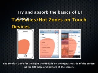
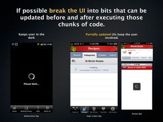
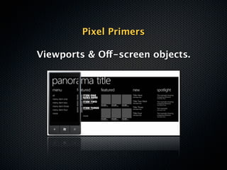
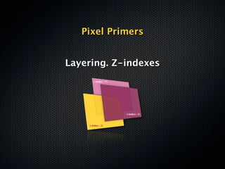
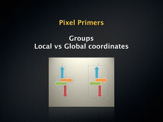
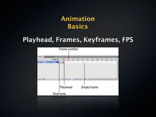
10 Commandments
of Mobile Design*

Jigyasa Makkar
10 Commandments
of Mobile Design*
*for developers


Jigyasa Makkar
Erm, did I say Commandments?
            Actually..
Erm, did I say Commandments?
            Actually..

            NO.
Mobile App design 101?
         No.
Mobile App design 101?
          No.
Ten holy tenets of Mobile
     development?
Mobile App design 101?
          No.
Ten holy tenets of Mobile
     development?
          No.
Mobile App design 101?
           No.
Ten holy tenets of Mobile
     development?
           No.

Ten thumb rules to live by?
Mobile App design 101?
           No.
Ten holy tenets of Mobile
     development?
           No.

Ten thumb rules to live by?

           No.
then


 Well, its
Learnings.
then


       Well, its
     Learnings. :)
10 of them to be precise
TL;DR
            Version


Mobile Application Development is
  more DESIGN than technology
             stacks.

     Get ‘with’ the program.
Now,


The Elaborate Version:
What is the leap like?

     From developer to
Mobile Application Developer?
Confusing.
Apparently, whether you Like it or
               not
          (and I did’nt),
    Mobile app development
       is about DESIGN.
But, but.. what about..


  Beautiful code,
DRY Principles? BDD?
Magical SQL queries?
NO.
None of those.
Turns out..
   It’s all about making
something Pretty. Fast. And
            useful.
The user should WANT to use it.
Im going to try and make
 commandments now :p
1
Thou shalt acknowledge
  the role of Design.
Design isn’t just about aesthetics or
      Prettifying mock-ups.


Not how it looks. It’s how it works.
Cliche’d as it sounds,
there really IS a lot more to
design than meets the eye.

Specially the untrained eye.
Don’t
“mail me the screens when you are
              done”
          your designer

Mobile Application Design needs to
         be collaborative.
Graphics can make or break
  your app. Get involved.


 Learning to communicate
with your designer is crucial.
Try and absorb the basics of UI
design:
        File formats.
Jpg, tiff, png, psd, gif, eps,
            svg, ai
Try and absorb the basics of UI
design:
   Vector vs Raster Graphics
Try and absorb the basics of UI
design:
 Alpha Channels (Transparency)


                   Black = transparent
Try and absorb the basics of UI
design:
   Color Codes, Palettes, Tools


Hex color codes   http://kuler.adobe.com/
Try and absorb the basics of UI
         design:
       Tap Zones/Hot Zones on Touch
       Devices


The comfort zone for the right thumb falls on the opposite side of the screen.
                 At the left edge and bottom of the screen.
Pixelate, anti-aliasing, dpi, ppi


Understand a designer’s workflow.
        Learn the lingo.


        Pixelate            Anti-Aliasing
2
Thou shalt optimize for speed.
Optimize for performance.

Two broad areas to go after:

   - Drawing (Rendering)
        - Scrolling
Two step process.
A. Speed up ‘Perceived performance’
“The perception of performance is
based on start-up time, page-loading
 behavior, smoothness of transitions
 and animations, errors, and waiting
               times”
Application Launch.

Design app for quick launch
      and short use.
 Load data lazily, load only
   images/assets needed
Optimizing individual
   screens, flows and UI
   elements will reduce
  waiting times and keep
 users from thinking that
they’re wasting their time.
Feedback!
                                   Android Marketplace
                                           App


         iOS Messaging App

                                   iPhone Homescreen


Keep the user in the loop at all times.
 Let the app announce – visually or
 otherwise - what it is upto at any
             given time.
Design can help
       communicate justified/
          expected delays.
                   Loading food menu


Identify chunks of code that are
    likely to consume time.
(Retreiving data from a server, Extensive Calculations/
                       parsing.)
If possible break the UI into bits that can be
  updated before and after executing those
               chunks of code.
Keeps user in the       Partially updated UIs keep the user
      dark                           involved.


                                                       Zomato App
   Bookmyshow App       Sugar n Spice App
Use descriptive Preloaders.
 and Progress Indicators.
  Don’t say.             DO say.


                    “Downloading restaurant
  “Please Wait..”
                           details”
B. Optimize Individual UI Elements.
Every UI element contributes to
             performance.
      Key aspects to look for are..


         Elements on Screen.

Ration the number and type of elements
          on screen at a time.
  Media items for example, are heavy!
Element Characteristics:

Image Resolution      Color Depth
Recently a ‘Google Insider’ posted on Google
  + about why he thought the Android OS
 would NEVER be as fluid and responsive as
   iOS. He pinned it down to the fact that
 Android handles UI rendering in the main
  thread and at Normal Priority, while iOS
 handles UI rendering in a separate thread
           with real-time priority.

         Over-simplified Learning?
                 UI first.
3
Thou shalt embrace pixels.
Games and other Interactivity rich
 applications have the potency to
  push you to the edge of your
    comfort zone and beyond.
Fight back.
Get your basics in place.
Pixel Primers

  Pixel level placement
Your X’s and Y’s (Z’s too)
Pixel Primers

Cartesian coordinate systems
Pixel Primers

Viewports & Off-screen objects.
Pixel Primers


Layering. Z-indexes
Pixel Primers

          Groups
Local vs Global coordinates
Keep Snippets handy!

 For eg, this is what you would do to center a graphic
             element on screen horizontally:


element.x = screen.width – element.width/2
Animation
 Basics

Timeline
Animation
            Basics

Playhead, Frames, Keyframes, FPS
Animation
 Basics

 Tweens
Animation
  Basics

Sprite Sheets
4
Thou shalt Optimize.
Probably the most important skillset to
 strive for. An armour of Memory/Filesize
optimization tips & tricks and Workarounds.
Learn to emulate basic design
       effects via code.

             * Drop shadow
             * Text outlines


Lorem Ipsum                  Lorem Ipsum
   (Sample Text)
                       +               (Shadow)


             Lorem Ipsum

               Vector shadow created
Use tiled images for
        backgrounds.


Image Tile
Spot graphic elements in your UI which could
be satisfactorily reproduced via native shapes
   and design primitives in the framework.


         Rescue as many rasters as
      possible to Native Vector shapes
And optimize for battery usage too.


Try and not access peripherals when not required.

Cache data that doesn’t need to be downloaded
        again. Save on network calls.

   Use Wifi whenever available instead of 3G.
5
Thou shalt bounce.
Test your hunches.


Bounce your idea off your potential
              users.
        Identify your TG.
Validate your ideas/beliefs of what
                 is:
           Intriguin
     Fun              Obvious
               g
       Interactiv Challengin
            e          g
             Intuitive
Talk less. Hear more.


Be open to criticism and suggestions.
      Value negative feedback.
My app started out as a
 word jumble in my head


Ended up as much more fun
Movies & Dialogues game :)
6
Thou shalt be byte wise.
File-size is key.


  A friend owns an HTC Chacha. When phones like
 those run out of space (and they do real quick), the
user sorts a list of installed apps by file size and the
perperators at the top are uninstalled to make space.
Don’t top that list, bro.


       Okay?
Optimize for file size.
7
Thou shalt be more forgiving.
Design to allow for errors.
Keep your errors soft and friendly.


Selection errors on mobile phones are
   higher than on desktops because
fingers can be clumsy, people are often
distracted during use and some people
           have large hands
Account for an Offline Experience


Unlike the web, the mobile isn’t always
      connected to the Internet.

        Design for Offline Use.
In case the app relies heavily on
 pulling content over the internet,
         Cache data offline.


       Flipboard App for iPhone in Offline Mode


So the user experience isn’t broken.
       It’s just stale, at best.
8
Thou shalt not make me type
Minimize Text Input

 Typing is a pain!
Y U NO LEMME
Modern day smartphones are touch and gesture
             optimized devices.


  Use buttons, sliders, radio boxes, menus and
picker wheels whenever possible instead of text
                     inputs.
More Touch Controls. Less
                     typing.


Pre-populate oft-repeated data or values that can be
  predicted based on previous recordedbehavior or
                     intuition.
9
Thou shalt design for the device.
Consider the capabilites of a
 device before programming
            for it.

 Utilize capabilites like multi-
touch gestures, Accelerometer,
 GPS, NFC etc wherever it fits
            the bill.

 Be judicous. Dont overdo it.
10
Thou shalt not sin.
Dont use Comic Sans.
Dont put drop shadow on everything.
      Dont do yellow on white.
    Dont make the logo bigger.
   DO feel empowered to design.
Thanks :)

10 Design Commandments for Mobile App Developers

  • 1.
    10 Commandments of MobileDesign* Jigyasa Makkar
  • 2.
    10 Commandments of MobileDesign* *for developers Jigyasa Makkar
  • 3.
    Erm, did Isay Commandments? Actually..
  • 4.
    Erm, did Isay Commandments? Actually.. NO.
  • 5.
  • 6.
  • 7.
    Mobile App design101? No. Ten holy tenets of Mobile development?
  • 8.
    Mobile App design101? No. Ten holy tenets of Mobile development? No.
  • 9.
    Mobile App design101? No. Ten holy tenets of Mobile development? No. Ten thumb rules to live by?
  • 10.
    Mobile App design101? No. Ten holy tenets of Mobile development? No. Ten thumb rules to live by? No.
  • 11.
  • 12.
    then Well, its Learnings. :) 10 of them to be precise
  • 13.
    TL;DR Version Mobile Application Development is more DESIGN than technology stacks. Get ‘with’ the program.
  • 14.
  • 15.
    What is theleap like? From developer to Mobile Application Developer?
  • 16.
  • 18.
    Apparently, whether youLike it or not (and I did’nt), Mobile app development is about DESIGN.
  • 19.
    But, but.. whatabout.. Beautiful code, DRY Principles? BDD? Magical SQL queries?
  • 20.
  • 21.
    Turns out.. It’s all about making something Pretty. Fast. And useful. The user should WANT to use it.
  • 22.
    Im going totry and make commandments now :p
  • 23.
    1 Thou shalt acknowledge the role of Design.
  • 24.
    Design isn’t justabout aesthetics or Prettifying mock-ups. Not how it looks. It’s how it works.
  • 25.
    Cliche’d as itsounds, there really IS a lot more to design than meets the eye. Specially the untrained eye.
  • 26.
    Don’t “mail me thescreens when you are done” your designer Mobile Application Design needs to be collaborative.
  • 27.
    Graphics can makeor break your app. Get involved. Learning to communicate with your designer is crucial.
  • 28.
    Try and absorbthe basics of UI design: File formats. Jpg, tiff, png, psd, gif, eps, svg, ai
  • 29.
    Try and absorbthe basics of UI design: Vector vs Raster Graphics
  • 30.
    Try and absorbthe basics of UI design: Alpha Channels (Transparency) Black = transparent
  • 31.
    Try and absorbthe basics of UI design: Color Codes, Palettes, Tools Hex color codes http://kuler.adobe.com/
  • 32.
    Try and absorbthe basics of UI design: Tap Zones/Hot Zones on Touch Devices The comfort zone for the right thumb falls on the opposite side of the screen. At the left edge and bottom of the screen.
  • 33.
    Pixelate, anti-aliasing, dpi,ppi Understand a designer’s workflow. Learn the lingo. Pixelate Anti-Aliasing
  • 34.
  • 35.
    Optimize for performance. Twobroad areas to go after: - Drawing (Rendering) - Scrolling
  • 36.
  • 37.
    A. Speed up‘Perceived performance’
  • 38.
    “The perception ofperformance is based on start-up time, page-loading behavior, smoothness of transitions and animations, errors, and waiting times”
  • 39.
    Application Launch. Design appfor quick launch and short use. Load data lazily, load only images/assets needed
  • 40.
    Optimizing individual screens, flows and UI elements will reduce waiting times and keep users from thinking that they’re wasting their time.
  • 41.
    Feedback! Android Marketplace App iOS Messaging App iPhone Homescreen Keep the user in the loop at all times. Let the app announce – visually or otherwise - what it is upto at any given time.
  • 42.
    Design can help communicate justified/ expected delays. Loading food menu Identify chunks of code that are likely to consume time. (Retreiving data from a server, Extensive Calculations/ parsing.)
  • 43.
    If possible breakthe UI into bits that can be updated before and after executing those chunks of code. Keeps user in the Partially updated UIs keep the user dark involved. Zomato App Bookmyshow App Sugar n Spice App
  • 44.
    Use descriptive Preloaders. and Progress Indicators. Don’t say. DO say. “Downloading restaurant “Please Wait..” details”
  • 45.
  • 46.
    Every UI elementcontributes to performance. Key aspects to look for are.. Elements on Screen. Ration the number and type of elements on screen at a time. Media items for example, are heavy!
  • 47.
  • 48.
    Recently a ‘GoogleInsider’ posted on Google + about why he thought the Android OS would NEVER be as fluid and responsive as iOS. He pinned it down to the fact that Android handles UI rendering in the main thread and at Normal Priority, while iOS handles UI rendering in a separate thread with real-time priority. Over-simplified Learning? UI first.
  • 49.
  • 50.
    Games and otherInteractivity rich applications have the potency to push you to the edge of your comfort zone and beyond.
  • 51.
    Fight back. Get yourbasics in place.
  • 52.
    Pixel Primers Pixel level placement Your X’s and Y’s (Z’s too)
  • 53.
  • 54.
    Pixel Primers Viewports &Off-screen objects.
  • 55.
  • 56.
    Pixel Primers Groups Local vs Global coordinates
  • 57.
    Keep Snippets handy! For eg, this is what you would do to center a graphic element on screen horizontally: element.x = screen.width – element.width/2
  • 58.
  • 59.
    Animation Basics Playhead, Frames, Keyframes, FPS
  • 60.
  • 61.
  • 62.
  • 63.
    Probably the mostimportant skillset to strive for. An armour of Memory/Filesize optimization tips & tricks and Workarounds.
  • 64.
    Learn to emulatebasic design effects via code. * Drop shadow * Text outlines Lorem Ipsum Lorem Ipsum (Sample Text) + (Shadow) Lorem Ipsum Vector shadow created
  • 65.
    Use tiled imagesfor backgrounds. Image Tile
  • 66.
    Spot graphic elementsin your UI which could be satisfactorily reproduced via native shapes and design primitives in the framework. Rescue as many rasters as possible to Native Vector shapes
  • 67.
    And optimize forbattery usage too. Try and not access peripherals when not required. Cache data that doesn’t need to be downloaded again. Save on network calls. Use Wifi whenever available instead of 3G.
  • 68.
  • 69.
    Test your hunches. Bounceyour idea off your potential users. Identify your TG.
  • 70.
    Validate your ideas/beliefsof what is: Intriguin Fun Obvious g Interactiv Challengin e g Intuitive
  • 71.
    Talk less. Hearmore. Be open to criticism and suggestions. Value negative feedback.
  • 72.
    My app startedout as a word jumble in my head Ended up as much more fun Movies & Dialogues game :)
  • 73.
    6 Thou shalt bebyte wise.
  • 74.
    File-size is key. A friend owns an HTC Chacha. When phones like those run out of space (and they do real quick), the user sorts a list of installed apps by file size and the perperators at the top are uninstalled to make space.
  • 75.
    Don’t top thatlist, bro. Okay? Optimize for file size.
  • 76.
    7 Thou shalt bemore forgiving.
  • 77.
    Design to allowfor errors. Keep your errors soft and friendly. Selection errors on mobile phones are higher than on desktops because fingers can be clumsy, people are often distracted during use and some people have large hands
  • 78.
    Account for anOffline Experience Unlike the web, the mobile isn’t always connected to the Internet. Design for Offline Use.
  • 79.
    In case theapp relies heavily on pulling content over the internet, Cache data offline. Flipboard App for iPhone in Offline Mode So the user experience isn’t broken. It’s just stale, at best.
  • 80.
    8 Thou shalt notmake me type
  • 81.
    Minimize Text Input Typing is a pain!
  • 82.
    Y U NOLEMME
  • 83.
    Modern day smartphonesare touch and gesture optimized devices. Use buttons, sliders, radio boxes, menus and picker wheels whenever possible instead of text inputs.
  • 84.
    More Touch Controls.Less typing. Pre-populate oft-repeated data or values that can be predicted based on previous recordedbehavior or intuition.
  • 85.
    9 Thou shalt designfor the device.
  • 86.
    Consider the capabilitesof a device before programming for it. Utilize capabilites like multi- touch gestures, Accelerometer, GPS, NFC etc wherever it fits the bill. Be judicous. Dont overdo it.
  • 87.
  • 88.
    Dont use ComicSans. Dont put drop shadow on everything. Dont do yellow on white. Dont make the logo bigger. DO feel empowered to design.
  • 89.

Editor's Notes

  • #2 Developers. Emphasis.\n
  • #3 \n
  • #4 \n
  • #5 \n
  • #6 \n
  • #7 \n
  • #8 \n
  • #9 \n
  • #10 \n
  • #11 \n
  • #12 \n
  • #13 \n
  • #14 \n
  • #15 \n
  • #16 \n
  • #17 \n
  • #18 \n
  • #19 \n
  • #20 Flow. User Experience.\n
  • #21 I remember about 2-3 weeks back, I was driving back home in my car from a late night party with two other friends – who were both from Advertising backgrounds. It was rather dark and we were barelling down MG Road to Gurgaon. The female friend in the back seat was in “high spirits” :p. Suddenly she jumped up and started pointing at the rear of a car ahead of us going ‘Look! Look! That car is smiling!”. Then she pointed to another car a few minutes later, ‘Look! That one is not too happy. But Its smirking!”. She was making out faces in the rear ends of the cars. The bright red brake lights were eyes and the boot lids were the mouth. And while I sat there shaking my head in amusement and bewilderment, I saw the other two agreeing with each other and seeing the same faces in every car ahead of us. As I squinted and struggled to see a face in what were just rear ends of cars to me. ‘I have done research on cars like this! Its called Non Verbal Communication’ she announced casually. The other two egged me on and described what to look for. And then I saw it. And in the next. Until I saw faces behind every car we overtook. Happy. Sad. Even a trollFace. I saw them all \n\nWe all percive design. But we need someone to describe it to be able to communicate\n
  • #22 Whenever possible. Try and work with specialized Mobile App Designers instead of Visualizers. Visualizers are traditional, web and print guys. Mobile designers take care of minimum hit areas, multiple resolutions, file size etc.\n
  • #23 Strike a fine balance. Platforms give native controls. Use them. Dnt go overboard with graphic customizations\n
  • #24 Svg -> scalabale vector graphic -> format of the future -> browsersa are beginning to support svg in html5\nPng -> highest quality , supports transparency\nGif – can contain frames, animations. Not used much now\nJpeg -> when u don’t need transparency n want to save size. Lossy compressions\nVectors -> stored as mathematical formulas, needs lots of CPU. Not good for animations\n
  • #25 \n
  • #26 \n
  • #27 \n
  • #28 \n
  • #29 Strike a fine balance. Platforms give native controls. Use them. Dnt go overboard with graphic customizations\n
  • #30 \n
  • #31 \n
  • #32 \n
  • #33 \n
  • #34 \n
  • #35 \n
  • #36 \n
  • #37 \n
  • #38 \n
  • #39 The user needs the perception of control at all times.The power to interrupt and/or abort anytime.\n
  • #40 \n
  • #41 \n
  • #42 \n
  • #43 Web n desktops traditionally -> 72 dpi\nIphone 4 -> 326 ppi . Android devices – 250-300 ppi. Ipad 132 ppi\n\nColor depth -> colr info per pixel\n
  • #44 Eg. Fb in browser on android vs ios. Put thumb on screen while loading. Progress bar stops in iOS n UI responsiveness is max. HTC Desire HD sluggish UI update but progress bar went on. All this happens at a kernel level but key learning is : UI first. Update what u can.\n
  • #45 \n
  • #46 \n
  • #47 \n
  • #48 \n
  • #49 Every framework might have its own.\n
  • #50 Off screen objects/graphics are abstract concepts. But they come in handy sometimes to implent even simple things like flip screens or swipes.\n
  • #51 Simple Send Backwards and Bring to Front becomes Z-Indexing in most frameworks. Objects have a Z-Index. The ones on the top of the stack have a higher Z-Index. And the ones below have lower Z-Indexes.\n\nSometimes Groups of objects can have complicated Layering structures. Watch out.\n
  • #52 Groups let you modularize your design flexibly. Be careful. Some frameworks have Local Coordinate system within groups too. Much source of anguish.\n
  • #53 \n
  • #54 Just the basics!\nFrame is a state in an animation\nTimeline – collection of frames\n\n
  • #55 Playhead – concept. The frame in the animation that is being displayed right now.\nFPS: frames per sec. higher fps, higher cpu.\nKeyframes – most modern softwares these days don’t need you to define every frame. Just defining the frames which have substantial change – keyframe. The software fills in the rest – tween\n
  • #56 Motion tween. Shape tween.\n\nAnimator defines two keyframes and creates a tween. THe software fills in the intermediate transient frames.\n\n
  • #57 Sprite sheets are 2D animations packed as multiple frames into a single texture image. This allows a much more efficient use of texture memory, which is highly limited on mobile devices, and also minimizes loading time.\n
  • #58 \n
  • #59 \n
  • #60 This way you avoid png.\nDrop shadow: shade of light grey of the same text, 5 px down n right\nOutline: text of slightly large size at same location layered below\nGradient: \n
  • #61 Image tiling saves precious file size.\n
  • #62 \n
  • #63 \n
  • #64 \n
  • #65 TG - Target audience. \nBe open to criticism.\nTalk less. Listen More.\nValue negative feedback. Don’t dig for validations.\n
  • #66 \n
  • #67 You never know where your idea goes if you listen to people. And you make less mistakes making assumptions about others.\n\n
  • #68 Give examples about SayWhat app.\n
  • #69 \n
  • #70 \n
  • #71 \n
  • #72 \n
  • #73 \n
  • #74 \n
  • #75 \n
  • #76 \n
  • #77 \n
  • #78 \n
  • #79 \n
  • #80 \n
  • #81 \n
  • #82 \n
  • #83 \n
  • #84 \n
  • #85 \n