Download as PDF, PPTX


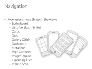
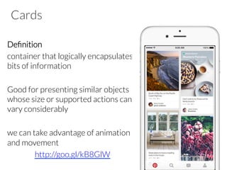
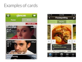
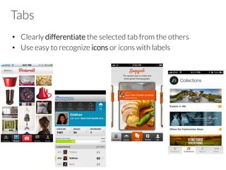
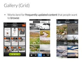
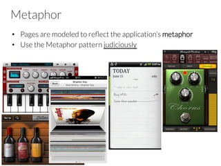
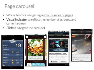
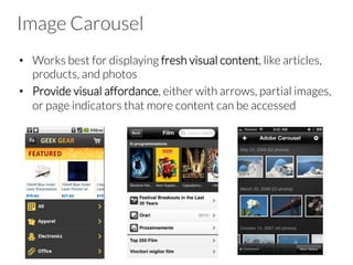
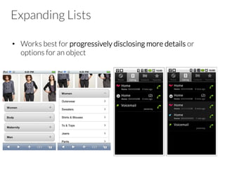
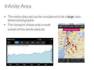
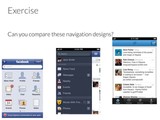

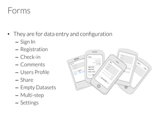
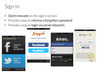
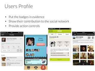
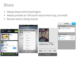
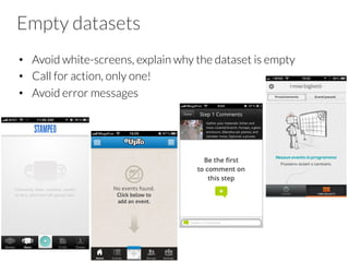
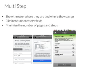
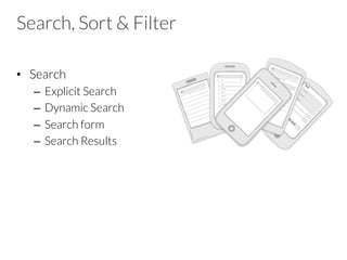
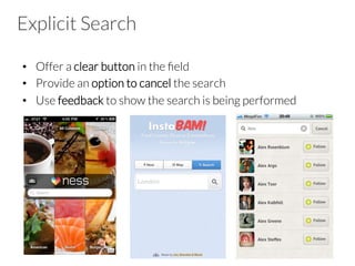
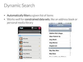
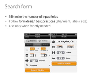
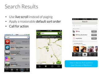
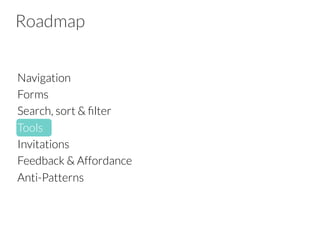
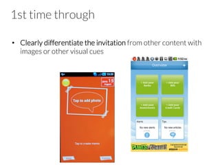
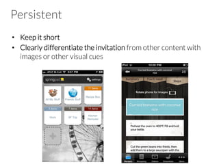
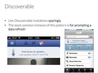
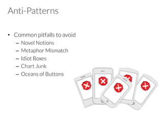
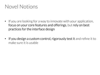
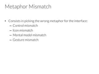
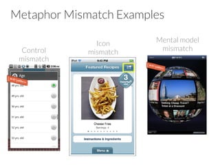
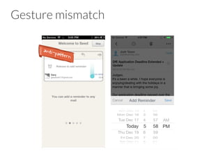
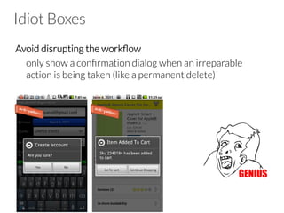

The document outlines best practices and design patterns for mobile app navigation, forms, search, and filtering tools, emphasizing the importance of user experience. It covers various navigation styles like cards, tabs, and carousels, as well as design considerations for elements like forms and feedback mechanisms. Additionally, common anti-patterns to avoid in app design are highlighted to enhance usability and efficiency.


![[2015/2016] Modern development paradigms](https://cdn.slidesharecdn.com/ss_thumbnails/08moderndevelopment-151209170018-lva1-app6892-thumbnail.jpg?width=640&height=640&fit=bounds)

![[2015/2016] HTML5 and CSS3 Refresher](https://cdn.slidesharecdn.com/ss_thumbnails/03html5css3-160311182004-thumbnail.jpg?width=640&height=640&fit=bounds)

![[2015/2016] User experience design of mobil apps](https://cdn.slidesharecdn.com/ss_thumbnails/02userexperience-160304170558-thumbnail.jpg?width=640&height=640&fit=bounds)
![[2015/2016] Mobile thinking](https://cdn.slidesharecdn.com/ss_thumbnails/01courseintromobilethinking-160226191522-thumbnail.jpg?width=640&height=640&fit=bounds)
![[2015/2016] Apache Cordova](https://cdn.slidesharecdn.com/ss_thumbnails/05cordova-160401161537-thumbnail.jpg?width=640&height=640&fit=bounds)


![How Maintainability Issues of Android Apps Evolve [ICSME 2018]](https://cdn.slidesharecdn.com/ss_thumbnails/icsme2018-180928081558-thumbnail.jpg?width=640&height=640&fit=bounds)


![Modeling objects interaction via UML sequence diagrams [Software Design] [Com...](https://cdn.slidesharecdn.com/ss_thumbnails/06sequencediagrams-180314152521-thumbnail.jpg?width=640&height=640&fit=bounds)
![Modeling behaviour via UML state machines [Software Design] [Computer Science...](https://cdn.slidesharecdn.com/ss_thumbnails/05statemachines-180306225932-thumbnail.jpg?width=640&height=640&fit=bounds)
![Object-oriented design patterns in UML [Software Design] [Computer Science] [...](https://cdn.slidesharecdn.com/ss_thumbnails/04designpatterns-180228160652-thumbnail.jpg?width=640&height=640&fit=bounds)
![Structure modeling with UML [Software Design] [Computer Science] [Vrije Unive...](https://cdn.slidesharecdn.com/ss_thumbnails/03structuremodeling-180219151135-thumbnail.jpg?width=640&height=640&fit=bounds)
![Requirements engineering with UML [Software Design] [Computer Science] [Vrije...](https://cdn.slidesharecdn.com/ss_thumbnails/02requirements-180213083117-thumbnail.jpg?width=640&height=640&fit=bounds)
![Modeling and abstraction, software development process [Software Design] [Com...](https://cdn.slidesharecdn.com/ss_thumbnails/01intro-180206151252-thumbnail.jpg?width=640&height=640&fit=bounds)
![[2017/2018] Agile development](https://cdn.slidesharecdn.com/ss_thumbnails/ivano05agiledevelopment-171123214423-thumbnail.jpg?width=640&height=640&fit=bounds)

![[2017/2018] AADL - Architecture Analysis and Design Language](https://cdn.slidesharecdn.com/ss_thumbnails/ivano04saaadl-171122165132-thumbnail.jpg?width=640&height=640&fit=bounds)
![[2017/2018] Architectural languages](https://cdn.slidesharecdn.com/ss_thumbnails/ivano03salanguages-171122083931-thumbnail.jpg?width=640&height=640&fit=bounds)
![[2017/2018] Introduction to Software Architecture](https://cdn.slidesharecdn.com/ss_thumbnails/ivano02softwarearchitecture-171120182731-thumbnail.jpg?width=640&height=640&fit=bounds)


