Downloaded 197 times
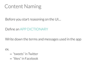
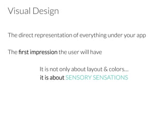
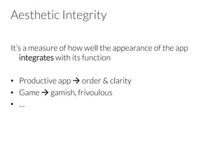
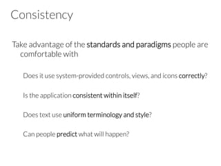
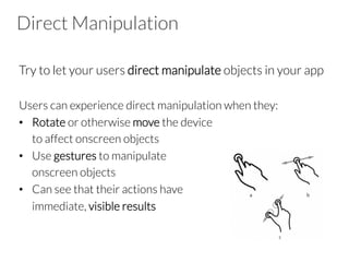
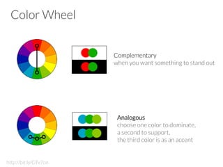
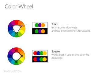
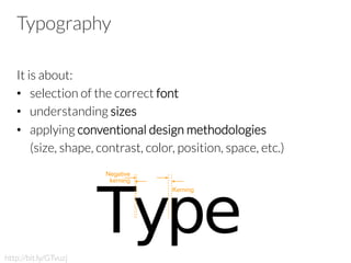
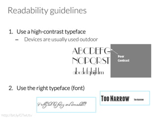
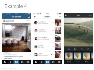

El documento presenta directrices para el diseño de interfaces de usuario (UI) y experiencia de usuario (UX) en aplicaciones móviles, enfatizando la importancia de la estética, la consistencia y la interacción intuitiva. Se destacan principios como la manipulación directa, el control del usuario y la claridad en la presentación, junto con recomendaciones sobre el uso de colores, tipografía y diseño de elementos táctiles. Además, se subraya la necesidad de minimizar la entrada de datos y facilitar la colaboración entre usuarios en un entorno móvil.


![How Maintainability Issues of Android Apps Evolve [ICSME 2018]](https://cdn.slidesharecdn.com/ss_thumbnails/icsme2018-180928081558-thumbnail.jpg?width=640&height=640&fit=bounds)


![Modeling objects interaction via UML sequence diagrams [Software Design] [Com...](https://cdn.slidesharecdn.com/ss_thumbnails/06sequencediagrams-180314152521-thumbnail.jpg?width=640&height=640&fit=bounds)
![Modeling behaviour via UML state machines [Software Design] [Computer Science...](https://cdn.slidesharecdn.com/ss_thumbnails/05statemachines-180306225932-thumbnail.jpg?width=640&height=640&fit=bounds)
![Object-oriented design patterns in UML [Software Design] [Computer Science] [...](https://cdn.slidesharecdn.com/ss_thumbnails/04designpatterns-180228160652-thumbnail.jpg?width=640&height=640&fit=bounds)
![Structure modeling with UML [Software Design] [Computer Science] [Vrije Unive...](https://cdn.slidesharecdn.com/ss_thumbnails/03structuremodeling-180219151135-thumbnail.jpg?width=640&height=640&fit=bounds)
![Requirements engineering with UML [Software Design] [Computer Science] [Vrije...](https://cdn.slidesharecdn.com/ss_thumbnails/02requirements-180213083117-thumbnail.jpg?width=640&height=640&fit=bounds)
![Modeling and abstraction, software development process [Software Design] [Com...](https://cdn.slidesharecdn.com/ss_thumbnails/01intro-180206151252-thumbnail.jpg?width=640&height=640&fit=bounds)
![[2017/2018] Agile development](https://cdn.slidesharecdn.com/ss_thumbnails/ivano05agiledevelopment-171123214423-thumbnail.jpg?width=640&height=640&fit=bounds)

![[2017/2018] AADL - Architecture Analysis and Design Language](https://cdn.slidesharecdn.com/ss_thumbnails/ivano04saaadl-171122165132-thumbnail.jpg?width=640&height=640&fit=bounds)
![[2017/2018] Architectural languages](https://cdn.slidesharecdn.com/ss_thumbnails/ivano03salanguages-171122083931-thumbnail.jpg?width=640&height=640&fit=bounds)
![[2017/2018] Introduction to Software Architecture](https://cdn.slidesharecdn.com/ss_thumbnails/ivano02softwarearchitecture-171120182731-thumbnail.jpg?width=640&height=640&fit=bounds)


