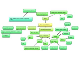
This document provides summaries and feedback on different design ideas for a membership form for Surfers Against Sewage.
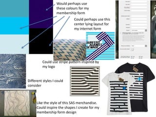
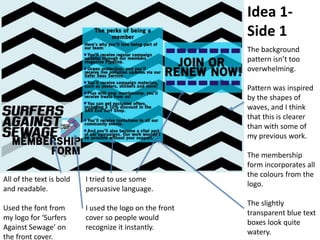
Idea 1 summarizes feedback on the first design idea, noting the use of colors and fonts from the logo, a water-inspired background pattern, and persuasive language. It also notes the inclusion of important information.
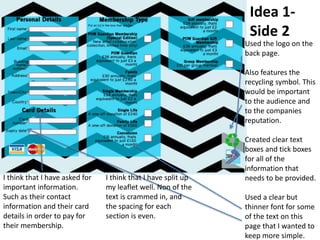
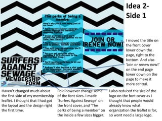
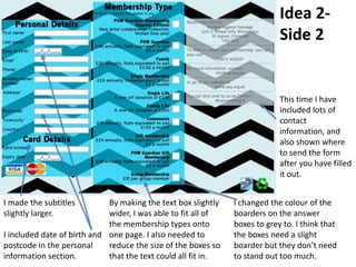
Idea 2 discusses minor changes to the first design, such as increasing some font sizes and repositioning some text. Feedback is also provided on improvements to the second side, such as adding additional member details and contact information.
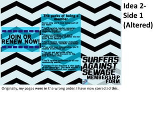
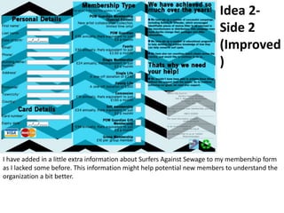
The document concludes by acknowledging that the original pages were in the wrong order and providing an updated second side with more information about Surfers Against Sewage.
April Edwards, lead Digital Strategist + Designer + Owner of { ae } Design Co. walks you through the basic principles of positioning, creating engaging, goal-oriented designs, establishing brand guidelines for consistency and efficiency, email marketing fundamentals and helpful resources to help you truly nail your next project!
Read| The latest issue of The Challenger is here! We are thrilled to announce that our school paper has qualified for the NATIONAL SCHOOLS PRESS CONFERENCE (NSPC) 2024. Thank you for your unwavering support and trust. Dive into the stories that made us stand out!
Synthetic Fiber Construction in lab .pptxPavel ( NSTU)
Synthetic fiber production is a fascinating and complex field that blends chemistry, engineering, and environmental science. By understanding these aspects, students can gain a comprehensive view of synthetic fiber production, its impact on society and the environment, and the potential for future innovations. Synthetic fibers play a crucial role in modern society, impacting various aspects of daily life, industry, and the environment. ynthetic fibers are integral to modern life, offering a range of benefits from cost-effectiveness and versatility to innovative applications and performance characteristics. While they pose environmental challenges, ongoing research and development aim to create more sustainable and eco-friendly alternatives. Understanding the importance of synthetic fibers helps in appreciating their role in the economy, industry, and daily life, while also emphasizing the need for sustainable practices and innovation.
Francesca Gottschalk - How can education support child empowerment.pptxEduSkills OECD
Francesca Gottschalk from the OECD’s Centre for Educational Research and Innovation presents at the Ask an Expert Webinar: How can education support child empowerment?
A workshop hosted by the South African Journal of Science aimed at postgraduate students and early career researchers with little or no experience in writing and publishing journal articles.
Introduction to AI for Nonprofits with Tapp NetworkTechSoup
Dive into the world of AI! Experts Jon Hill and Tareq Monaur will guide you through AI's role in enhancing nonprofit websites and basic marketing strategies, making it easy to understand and apply.
Operation “Blue Star” is the only event in the history of Independent India where the state went into war with its own people. Even after about 40 years it is not clear if it was culmination of states anger over people of the region, a political game of power or start of dictatorial chapter in the democratic setup.
The people of Punjab felt alienated from main stream due to denial of their just demands during a long democratic struggle since independence. As it happen all over the word, it led to militant struggle with great loss of lives of military, police and civilian personnel. Killing of Indira Gandhi and massacre of innocent Sikhs in Delhi and other India cities was also associated with this movement.
2. Would perhaps use
these colours for my
membership form
Could perhaps use this
center lying layout for
my internet form
Could use stripe pattern inspired by
my logo
Like the style of this SAS merchandise.
Could inspire the shapes I create for my
membership form design
Different styles I could
consider
5. Could use font from my logo for a small
amount of text, such as the title
Better for large amounts of text as its
simple and readable
Also could be good for large amounts of text. Thinner
and not so square but still would be readable.
Another suitable font for larger amounts of text. Would be
better than the pervious 2 as its not too bold, not too thin, and
isn’t in all caps.
This one could be part of the title
along with Sufrimeda
6. “Here’s why you’ll love being part of our team:
You’ll receive regular campaign updates through out members magazine Pipeline.
Ocean protection, and you’ll receive live pollution updates via our Safer Seas Service.
You’ll receive campaign materials, such as posters, stickers and more!
Plus with your membership, you’ll receive treats from us!
You can get exclusive offers, including a 10% discount in the SAS Eco Surf Shop.
You’ll receive invitations to our community events.
And you’ll also become a vital part of our campaigns. Our work wouldn’t be possible without your support.”
“Join or renew now”
Copy Ideas
7. Idea 1-
Side 1
The background
pattern isn’t too
overwhelming.
Pattern was inspired
by the shapes of
waves, and I think
that this is clearer
than with some of
my previous work.
The membership
form incorporates all
the colours from the
logo.
The slightly
transparent blue text
boxes look quite
watery.
All of the text is bold
and readable.
Used the font from
my logo for ‘Surfers
Against Sewage’ on
the front cover.
I tried to use some
persuasive language.
I used the logo on the front
cover so people would
recognize it instantly.
8. Idea 1-
Side 2
Used the logo on the
back page.
Also features the
recycling symbol. This
would be important
to the audience and
to the companies
reputation.
Created clear text
boxes and tick boxes
for all of the
information that
needs to be provided.
Used a clear but
thinner font for some
of the text on this
page that I wanted to
keep more simple.
I think that I have asked for
important information.
Such as their contact
information and their card
details in order to pay for
their membership.
I think that I have split up
my leaflet well. Non of the
text is crammed in, and
the spacing for each
section is even.
9. Idea 2-
Side 1
Haven’t changed much about
the first side of my membership
leaflet. I thought that I had got
the layout and the design right
the first time.
I did however change some
of the font sizes. I made
‘Surfers Against Sewage’ on
the front cover, and ‘The
perks of being a member’ on
the inside a few sizes bigger.
I also reduced the size of the
logo on the font cover as I
thought that people would
already know what
organization the leaflet is for,
so wont need a large logo.
I moved the title on
the front cover
lower down the
page, right to the
bottom. And also
‘Join or renew now!’
on the end page
lower down on the
page to make it
more central.
10. Idea 2-
Side 2
I made the subtitles
slightly larger.
I included date of birth and
postcode in the personal
information section.
By making the text box slightly
wider, I was able to fit all of
the membership types onto
one page. I also needed to
reduce the size of the boxes so
that the text could all fit in.
I changed the colour of the
boarders on the answer
boxes to grey to. I think that
the boxes need a slight
boarder but they don’t need
to stand out too much.
This time I have
included lots of
contact
information, and
also shown where
to send the form
after you have filled
it out.
12. Idea 2-
Side 2
(Improved
)
I have added in a little extra information about Surfers Against Sewage to my membership form
as I lacked some before. This information might help potential new members to understand the
organization a bit better.