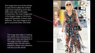
The document analyzes and compares the design of content pages from three magazines. For each magazine's content page:
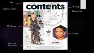
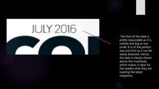
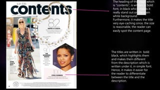
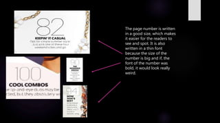
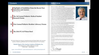
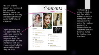
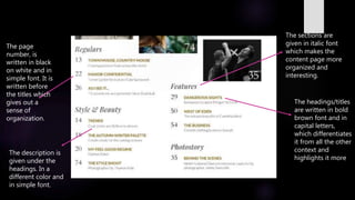
1) Font sizes, styles and colors are used consistently to clearly display key information like dates, headings, titles, and page numbers in a visually appealing and readable manner.
2) Images are included to make the pages more visually interesting and add color compared to all black text.
3) Standard layouts are used with headings, titles, and page numbers separated from descriptions to organize the information clearly for readers.


![Prelimarytak [1]](https://cdn.slidesharecdn.com/ss_thumbnails/prelimarytak1-110321061106-phpapp02-thumbnail.jpg?width=640&height=640&fit=bounds)


