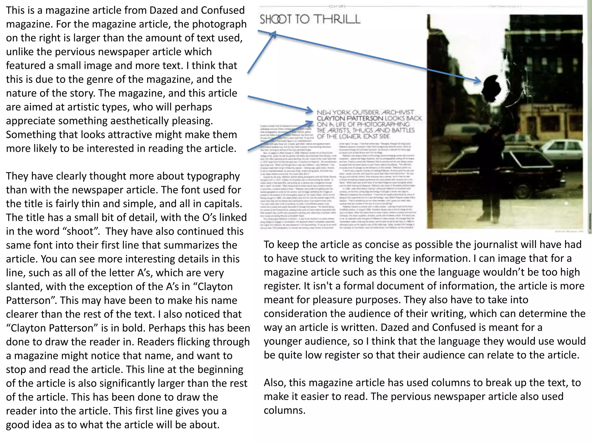
2. Factual writing is used to inform people of events or raise awareness of their company or cause. It can also be used to
instruct people on how to do a certain thing. There are many different formats in which factual writing can be presented.
Magazines, newspapers, leaflets, packaging and instruction manuals are all ways in which factual writing is used.
Magazines and Newspapers-
Magazines and newspapers write to inform people of events that have happened. Journalists are bound by the editors code
of practice. These are strict regulations that control what can and cannot be written. Its rules have been put in place in
order to protect people from any damage that could be done by a journalist. In order to make their writing as factual as
possible, journalists must make sure that all their information is as accurate as possible. This means checking that all of the
information used is completely correct. Another thing that newspapers
have to consider is typography. This is the colour, font, font size and
effects that they use for their text. It is important to chose the right text
style for the purpose of your writing. For example, if you want to draw
attention to a particular part of your writing you could put
the text in bold, or a striking colour. This is a newspaper
article. They have clearly thought about
typography for their article. The title of the article is in bold,
and is significantly larger than the rest of the text, drawing
attention to it, and drawing the readers in. All of the text is
in black, making it appear a bit more formal. The font is also
very straight forward, making the small parts of the text
easier to read. Journalists also need to consider the register
in which they write their article in. Journalists would adapt
the register they write in depending on the genre of the
magazine or newspaper that they are writing for and their
target audience. Looking at the first line of the article, they
have used the word “you’re” rather than the more formal
“you are”. This means that the journalist has written this in a
lower register. This could be to connect with their audience
more. Magazines and newspapers will often add in an image to show to the audience what or who the article is about. In
this article they have included an image of the person the article is about. In the image she is holding a pair of roller-skates,
further demonstrating that the article is about.
3. Below the image they have anchored it. They give a short summery
of the article to show what they are looking at in the image. They
have also given credit to the photographer who took the picture.
The copy in newspapers and magazines is often laid out in columns.
They do this in order to break up the text a bit making it readable.
When writing a magazine or newspaper article, the journalist has to take the law into consideration. Newspapers in
particular cover lots of stories to do with crime. Journalists can face restrictions from things such as gagging orders, which
legally prevent certain information from becoming public for the safety of an individual or group of people. Some magazines
or newspapers can come across slightly bias politically, or on a certain story. Journalists need to ensure that they are not
bias by putting across both sides of the story equally. In order to make sure that they avoid ambiguity, they must put
evidence for their arguments as well, and source all information. This makes their facts more legitimate.
4. This is a magazine article from Dazed and Confused
magazine. For the magazine article, the photograph
on the right is larger than the amount of text used,
unlike the pervious newspaper article which
featured a small image and more text. I think that
this is due to the genre of the magazine, and the
nature of the story. The magazine, and this article
are aimed at artistic types, who will perhaps
appreciate something aesthetically pleasing.
Something that looks attractive might make them
more likely to be interested in reading the article.
They have clearly thought more about typography
than with the newspaper article. The font used for
the title is fairly thin and simple, and all in capitals.
The title has a small bit of detail, with the O’s linked
in the word “shoot”. They have also continued this
same font into their first line that summarizes the
article. You can see more interesting details in this
line, such as all of the letter A’s, which are very
slanted, with the exception of the A’s in “Clayton
Patterson”. This may have been to make his name
clearer than the rest of the text. I also noticed that
“Clayton Patterson” is in bold. Perhaps this has been
done to draw the reader in. Readers flicking through
a magazine might notice that name, and want to
stop and read the article. This line at the beginning
of the article is also significantly larger than the rest
of the article. This has been done to draw the
reader into the article. This first line gives you a
good idea as to what the article will be about.
To keep the article as concise as possible the journalist will have had
to have stuck to writing the key information. I can image that for a
magazine article such as this one the language wouldn’t be too high
register. It isn't a formal document of information, the article is more
meant for pleasure purposes. They also have to take into
consideration the audience of their writing, which can determine the
way an article is written. Dazed and Confused is meant for a
younger audience, so I think that the language they would use would
be quite low register so that their audience can relate to the article.
Also, this magazine article has used columns to break up the text, to
make it easier to read. The pervious newspaper article also used
columns.
5. I think that the design for this article is quite
minimalist. On the left page, featuring the text for
the article, there is a lot of empty white space. All of
the copy has been pushed down to the bottom of
the page. This is quite unusual as typically the text
would go at the top of the page, directly under the
title. They have also featured a lot of thin lines,
which I think adds to the minimalist look. The font is
all very thin, even the artists name in bold. Also,
there is a thin line running along the top of both
pages. I think that the minimalist design has been
used in order to appeal to the audience. As I said
before, I think that the audience for this magazine,
and for this particular article would be artistic types
who have an appreciation for aesthetically pleasing
design.
6. Leaflets-
Leaflets are often used by companies to inform people of their services, to raise awareness, or to advertise. Due to the size
of a leaflet, it doesn’t allow that much text so all of their information needs to be condensed down. Writers need to make
sure that their writing is as concise as possible, to allow they to use a few words in an effective way to save space, and to
make the text easier to read. Writers also need to make sure that all of their facts are accurate. If the facts they have
provided are found to be untrue then it could damage the cause. It is also important for writers to refer to sources where
they obtained facts. This gives makes the facts seem more legitimate. This is a leaflet raising awareness of puppy farming.
For this type of leaflet the writers will need to be careful to not appear bias. Like with the news article, they have thought
about typology. They have used red boarders
around the text that they wanted to draw
attention to. The colour red often has
connotations of danger, or death. This could
Have been the reason why it was used for
this particular article. They have also used
the colour green for their subtitles to draw
attention to them. Green and red are
contrasting colours, so using them together
makes them stand out from each other.
Green is also associated with goodness, so it
may have been used to balance out the red
and also make people thing of the cause as
good. They have also put a black boarder
around one particular fact to show how
shocking and important it is. The fact that has
been placed in the black box is quite
ambiguous, and isn’t backed up with a
source. Writers must avoid being too
Ambiguous. All of their facts must be solid, as
this will make them seem more legitimate. For the leaflet, a lot of imagery has been used. These images have been used to
back up the claims made in the leaflet. There is a danger that their bias could have affected the images used for the leaflet.
They could be showing images of the dogs found in the most extreme cases, rather than the typical, in order for the images
to impact the audience more. They have anchored the images, explaining what the audience is looking at.
7. This is the other side to the leaflet. It gives you
the important contact information inside the red
boxes. This makes them easy to find, and
encourages you to get in contact, or to look on
their website. They have used an image on the
front cover of their leaflet. This will be the first
thing that the reader sees. It will show them what
the leaflet is about. I think it is also quite a
shocking image, and may encourage people to
take notice and read the leaflet. In one of the
paragraphs they used the work “you’ll” instead of
“you will”. This shows that they are speaking to
the audience in a low register. By doing this, they
could be trying to connect with the audience.
Throughout the leaflet, their company name is
always written in red. I feel that this has been
done to make it stand out from the rest of the
text, perhaps making it more memorable. The
font that they have used is pretty standard and
readable, though throughout they have put
certain parts of the text in bold. This has been
done to draw attention to those parts of the text.
For example right at the start of the leaflet there
is a little introduction that they have put in bold.
This is to draw the reader in.
8. Leaflets are often used by charities to raise awareness. They are a good way of giving out information to the public on their
campaign as they are quick to produce, enabling them to mass produce them and hand lots out to the public. Charities
often do not consider both sides of the argument. They are often in danger of appearing bias. The producers of the leaflets
are bound by Advertising Standards Agency (ASA) guidelines. The ASA ensures that all advertising and promotion is suitable
for the public and legal. Anything advertising that could cause offence, or be damaging to people is prevented by the ASA.
Like with magazines and newspapers, they are also bound by the law. This could mean that charities are prevented from
referring to specific people in their leaflets who are protected with a gagging order, and could be harmed in doing so. In
order to back up their argument in their leaflet they have have needed to have sourced all of their facts too.
9. This is an example of an instruction manual. They have made sure
to use short sentences in order to keep things clear and concise.
They have used a lot of images to demonstrate what is being
written, which takes away some of the need for text allowing them
to write as few words as possible. The images that they have used
appear to be illustrations, as apposed to photographs. I think that
the different buttons and options on screen may have appeared
unclear on a photograph. Doing an illustration of the camera
enables you to make everything as clear as possible. On their
images they have included a little hand that points directly to
where the reader is meant to be looking, making it completely
accurate. Like with the other instruction manual they have used
bullet points. This gives the writing a clear structure. It breaks up
what seems to be the largest piece of text. The font they have used
is very simple and readable, as it needs to be for the audience to
clearly understand what they are supposed to do. All of the text is
in black. Using other colours may have made the text slightly less
readable. They have used block capitals for the text showing you
what will be written on screen. In order to make their information
accurate, the writers will have had to have made sure that
everything that is written truly reflects what the user will see
when they use the camera. All of the fingers and lines used to label
and point to the area that they are talking about in the text must
be in the exact right place so that it is accurate, and the reader
knows clearly what they are supposed to do. I think that the text
will have to be written in quite a high register for an instruction
manual so that the instructions are very clear, and everybody can
understand what is written.
Instructional Writing-
Instructional writing is used for instructions, or how to guides. It
gives advice on how to use their product best, or on how best to
deal with a particular situation.
In this particular instruction manual they have used
“do not” instead of the shortened version “don’t”,
showing it is in fact written in a higher register. In
order to make the information given in the
instruction manual useful, writers must avoid
ambiguity. This means they must be specific about
everything they are saying.
10. This image shows a how to guide. Like the instruction manual they
have used a lot of imagery. They were made to demonstrate a few
key points in the guide, and perhaps make the article more
interesting to look at. I think the little images breaks up the text
nicely, making it seem more readable. This how to guide features
much more interesting typography than the instruction manual. The
titles font is reflective of the title itself I think. The title is “Rock your
Finals”, perhaps referring to the music genre. The edges of the text
are square and are angled at a point, and I think the font reflects the
genre of music that they are referring to. I think that the typography
that they have used is reflective of their audience. Instead of using
bullet points, they have used lines separating each bit of
information. Like with bullet points, they are used to separate the
text, allowing they to write more concisely. They also use coloured
circular boxes to put certain bits of text. In these boxes they only use
a small amount of text that sums up a certain section of the guide.
They have also put certain bits of text in bold to draw attention to
them. They have put the subtitles over each bit of information. They
have put all of the subtitles in red to draw the reader in. I think that
for a how to guide the writer will have had to have though more
about sourcing their facts in order to back them up. They will need
to make sure that their information is not ambiguous in order to
make their point stronger too. I think that how to guides can be
made slightly less formal than an instruction manual. Instruction
manuals need to give the clearest instructions possible and in order
to do so need to write extremely clearly, in a way that everyone will
understand. How to guides could perhaps be slightly less formal
depending on its purpose of course. This particular how to guide is
trying to appeal specifically to students, and in order to do so have
perhaps written it in a low register. They have made references to
things that young people may understand, such as “groupies”.