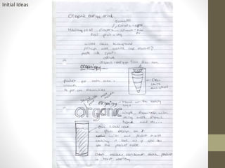
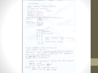
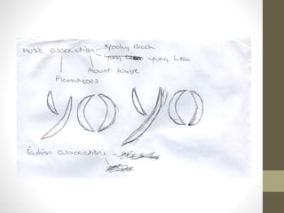
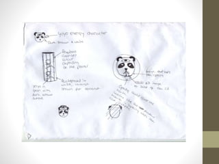
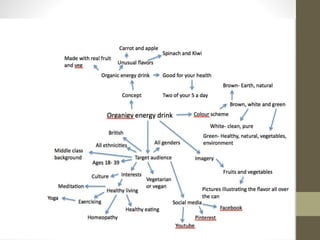
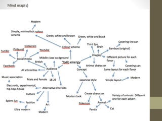
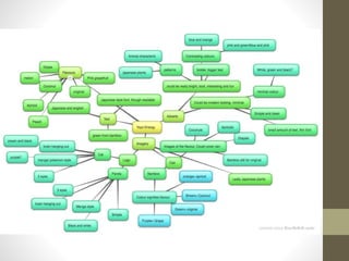
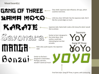
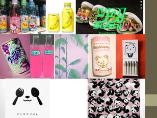
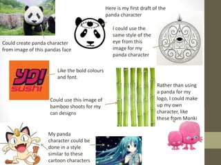
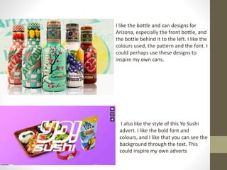
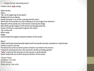
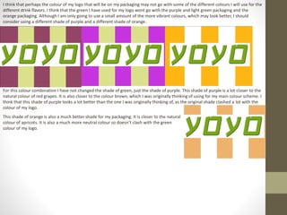
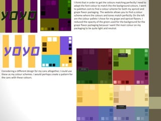
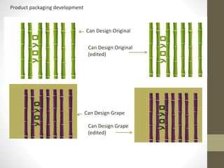
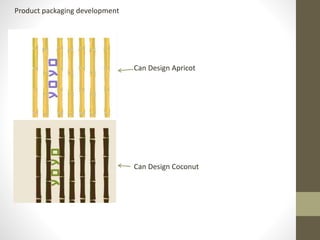
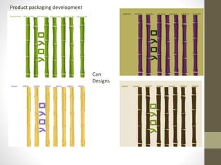
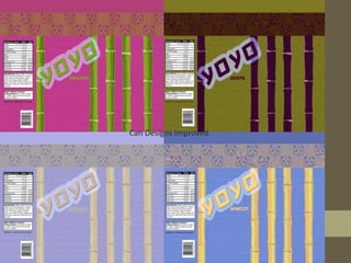
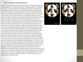
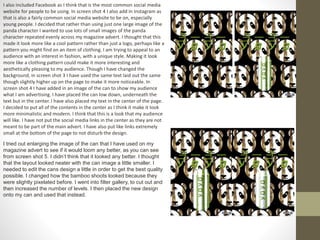
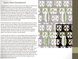
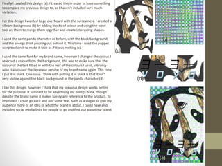
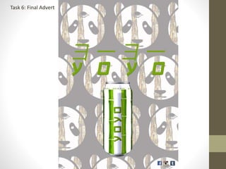
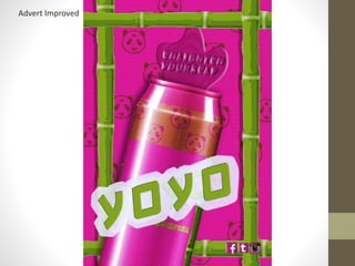
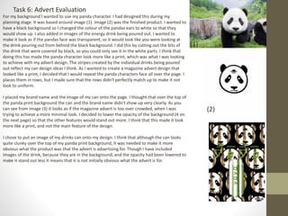
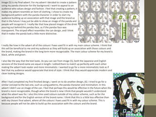
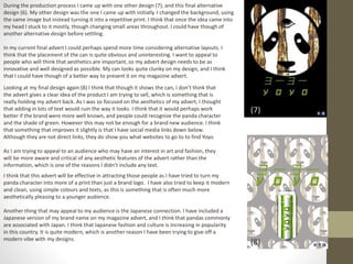
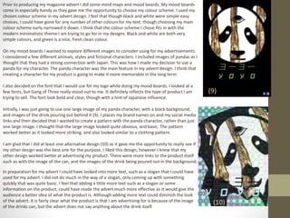
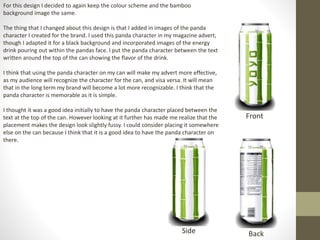
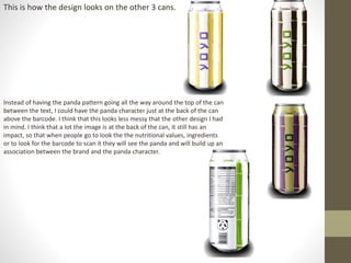
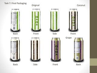
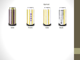
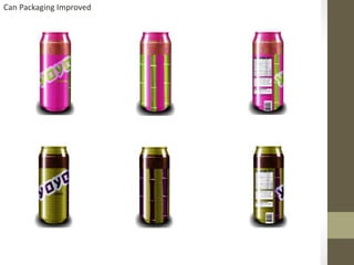
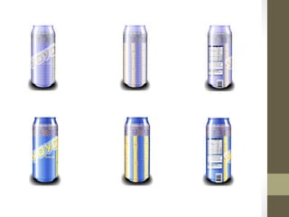
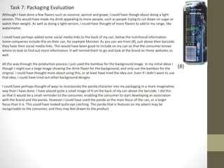
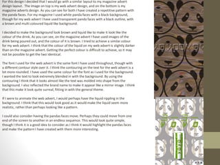
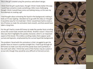
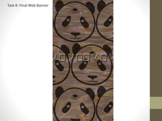
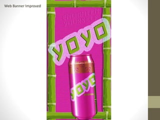
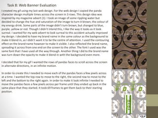
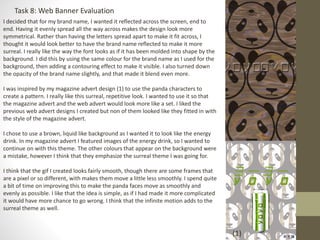
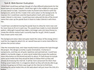
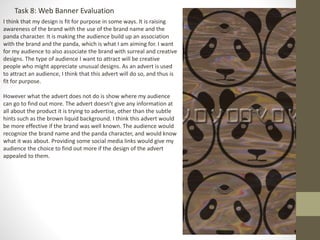
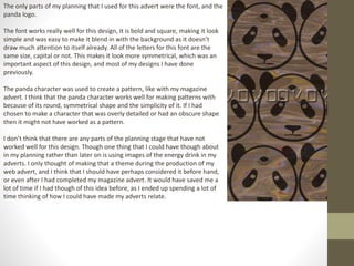
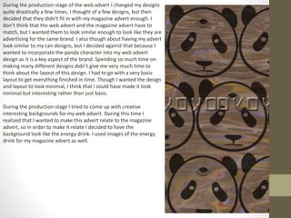
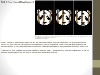
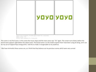
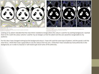
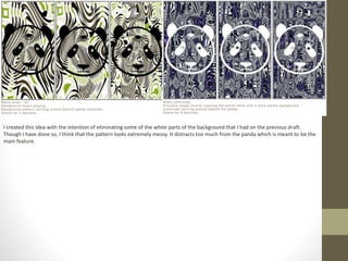
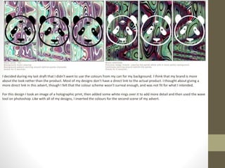
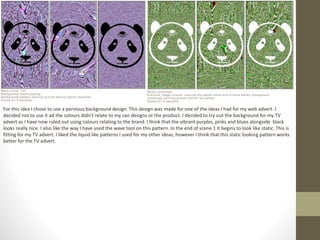
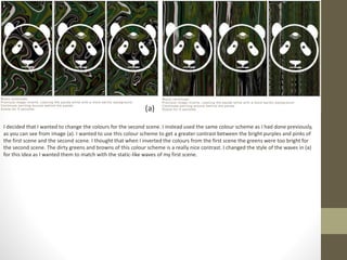
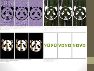
SlideShare a Scribd company logo
Design for
Advertising
Developing, producing and evaluating
Initial Ideas
Mind map(s)
Mood board(s)
YoYo
YoY
o
Final font style. Gang Of Three, in green, with contouring
Clear. Bold. Japanese style influence. All caps, which
could be restrictive.
Little less clear. Still bold. Has the Japanese style. Don’t
like the curved edges as much.
Sayonara
Gang Of Three
Similar to the font I
designed in initial ideas.
Perhaps a bit thin,
wouldn’t stand out much
Bold, clear, quite square. Has Japanese
style
Similar to font I designed in
the initial ideas. Only
outline, could look
interesting but not that
versatile.
Japanese style. Quite bold. Looks a bit messy for what I would
like to achieve
Could create panda character
from image of this pandas face
Here is my first draft of the
panda character
I could use the
same style of the
eye from this
image for my
panda character
My panda
character could be
done in a style
similar to these
cartoon characters
Rather than using
a panda for my
logo, I could make
up my own
character, like
these from Monki
Could use this image of
bamboo shoots for my
can designs
Like the bold colours
and font.
I like the bottle and can designs for
Arizona, especially the front bottle, and
the bottle behind it to the left. I like the
colours used, the pattern and the font. I
could perhaps use these designs to
inspire my own cans.
I also like the style of this Yo Sushi
advert. I like the bold font and
colours, and I like that you can see the
background through the text. This
could inspire my own adverts
Copy/Script development
Slogan Ideas:
Enlighten Yourself
Drink Energy
Keep going, stay wise
Font/Colour Scheme development
On my one of my mood boards I looked at the font Gang of Three. I decided that
this was the font I wanted to use for my logo. I already decided that I wanted to
use the colour green for my logo from my mind maps. I took some inspiration
from the colour of bamboo. I selected one of the bamboo images and took the
colour from a part of the image for my logo colour. On photoshop I contoured the
font to make it look more 3D. I originally thought I was going to put a black or a
dark brown boarder around it but I thought that contouring looked interesting.
Looking at the font without the contour effect on it I think that it doesn’t lookas
good, it looks too flat and bland. Another thing I did to my font on photoshop was
spread out the letters a little further apart. I thought that this looked much neater
and clearer. I also thought that it would fit better on a drinks can. I wanted to go
with a font that had a Japanese look to it, though I wanted it to be clear and
readable so that people would be able to read what the brand name is. I wanted a
Japanese style font to go with the Japanese theme to my energy drink. I don’t
think that it would be appropriate to use Japanese characters as I am trying to sell
the product to a British audience rather than a Japanese one. I think that this font
fits my criteria perfectly.
I also liked the font Sayonara. I did some drawings in some of my planning of what I wanted
my font to look like. The drawing I did looked similar to this font. I like it because it has a
Japanese look to it, which is what I’m looking for with all of my fonts. I did some
experiments with the font on photoshop. I decided I wasn’t going to use the font in the end.
I wanted my font to be green, though the only part of this font I could colour green was the
boarder.I thought that the logo would look better in all green. I also preferred the Gang of
Three font as it was bolder and clearer. I think it would look better on the drinks can than
Sayonara would. I don’t think that Sayonara would show up as well amongst the designs I
will but on my packaging.
I think that the font I have chosen works in a variety of different sizes.
The font is bold and clear which makes it readable, even at a small size. This makes the font quite
versatile.
I looked back at some of the fonts that I included in my mood board. I looked back at Yama Moto and Bonzai. I wont be using these
for my logo because I think that they are both too fussy. The top one, Yama Moto is almost unreadable, where as the font I have
chosen for my logo is nice and clear and readable. The bottom font, Bonzai, is too thin. Though it looks similar to some of the original
drawings I did of the font I wanted now looking at it compared to the font I have chosen, I think that the one I have chosen is much
better.
Font/Colour Scheme development
I decided while doing my mind map that I wanted to mainly use the colours green and white. However I have
been struggling to decide between using black or dark brown for my third colour. I think that both colour
combinations look clean and fresh and modern, which is the look I am trying to go for with my energy drink. The
green is quite bright and vibrant, though I think toned down with the white. I think that green black and white
may look more modern than green dark brown and white. Using black would go much better with my character I
have designed as well, as it is a panda. Though I think that using dark brown would be a much softer more subtle
look than black. I think that dark brown is also a little more unusual looking than black as black is used a lot.
Though I like the way that green, dark brown and white looks I think I will use black as the panda character
would look much better in black.
For each different flavour of my drink I would like to add in a new colour combination to represent that flavour. I
want the colours to be something recognisable to my audience, a colour that they will associate with the flavour.
The flavours I have chosen to use are coconut which I associate with brown and white, grape which I associate with
light green and purple, and apricot which I associate with orange.
This is how each colour
combination would look together
on the packaging. I think that
some of the colour look a bit too
vibrant, however the light colours
break up the vibrancy a little. I
also think that it wont look too
over the top and bright once it is
laid out properly on my packaging
design. The lighter colours will be
used for the background and the
more vibrant colours for the
bamboo.
I think that perhaps the colour of my logo that will be on my packaging may not go with some of the different colours I will use for the
different drink flavors. I think that the green I have used for my logo wont go with the purple and light green packaging and the
orange packaging. Although I am only going to use a small amount of the more vibrant colours, which may look better, I should
consider using a different shade of purple and a different shade of orange.
For this colour combination I have not changed the shade of green, just the shade of purple. This shade of purple is a lot closer to the
natural colour of red grapes. It is also closer to the colour brown, which I was originally thinking of using for my main colour scheme. I
think that this shade of purple looks a lot better than the one I was originally thinking of, as the original shade clashed a lot with the
colour of my logo.
This shade of orange is also a much better shade for my packaging. It is closer to the natural
colour of apricots. It is also a much more neutral colour so doesn’t clash with the green
colour of my logo.
I think that in order to get the colours matching perfectly I need to
adapt the font colour to match the the background colours. I went
to paletton.com to find a colour scheme for both my apricot and
grape flavor packaging. The website allows you to find a colour
scheme where the colours and tones match perfectly. On the left
are the colour pallets I chose for my grape and apricot flavors. I
reduced the opacity of the green used for the background for the
grape flavor packaging because I want the main colour on my
packaging to be quite light and neutral.
Considering a different design for my cans altogether, I could use
these as my colour schemes. I would perhaps create a pattern for
the cans with these colours.
Product packaging development
Can Design Original
Can Design Grape
Can Design Original
(edited)
Can Design Grape
(edited)
Product packaging development
Can Design Apricot
Can Design Coconut
Product packaging development
Can
Designs
Can Designs Improved
Task 6: Advert Development
I started off my design with one large large image of my panda character on
a black background. The panda character I created has black ears originally
but I had to colour them white so that they were visible. I decided that for
the magazine advert I wanted to incorporate images of the drink pouring
down into the image of my panda character. I used the pouring drink like
stripes, that makes the image reflect my can design more I think. I wanted to
use the image of my panda character for my magazine advert in order to
allow my audience to build up an association with the symbol and the brand.
In the first screen shot you can see that I included the brand name in
Japanese as well as in English. I want my brand to have a Japanese feel to it,
though I wanted it to be adapted to a British audience which is why I have
the brand name in English as well. This is also the reason I chose to use a
panda for my character, as pandas are often associated with Japan. In the
first screen shot I separated the two versions of the brand name. I decided
that I though that they should be together, so I moved the English version
underneath the Japanese version under the large panda character image. I
put the English version underneath the Japanese version to show the
importance of the Japanese influence to my audience. Another thing that I
did with the English version of the brand name was increasing the spaces
between the letters to make it even with the Japanese version. I think that
this makes it look a lot neater and more minimalist. I used the same colour
green as the green from my original drink package design. This colour I took
from the colour of bamboo. I used this colour to allow my audience to build
up an association with that shade of green and the brand. In the first screen
shot I also had the opacity down low for the English version of the brand
name.I thought that it would make the text blend in a little better with the
background, though I didn’t like the way in looked. In the second screen shot
you can see I increased the English brand name’s opacity again. In the second
screen shot you can see I had begun with just social media links for Tumblr
and Facebook. I decided to go with Tumblr, as I think my young and cool
audience will be likely to use it.
I also included Facebook as I think that is the most common social media
website for people to be using. In screen shot 4 I also add in Instagram as
that is also a fairly common social media website to be on, especially
young people. I decided that rather than using just one large image of the
panda character I wanted to use lots of small images of the panda
character repeated evenly across my magazine advert. I thought that this
made it look more like a cool pattern rather than just a logo, perhaps like a
pattern you might find on an item of clothing. I am trying to appeal to an
audience with an interest in fashion, with a unique style. Making it look
more like a clothing pattern could make it more interesting and
aesthetically pleasing to my audience. Though I have changed the
background, in screen shot 3 I have used the same text laid out the same
though slightly higher up on the page to make it more noticeable. In
screen shot 4 I have added in an image of the can to show my audience
what I am advertising. I have placed the can low down, underneath the
text but in the center. I have also placed my text in the center of the page.
I decided to put all of the contents in the center as I think it make it look
more minimalistic and modern. I think that this is a look that my audience
will like. I have not put the social media links in the center as they are not
meant to be part of the main advert. I have also put like links extremely
small at the bottom of the page to not disturb the design.
I tried out enlarging the image of the can that I have used on my
magazine advert to see if it would loom any better, as you can see
from screen shot 5. I didn’t think that it looked any better. I thought
that the layout looked neater with the can image a little smaller. I
needed to edit the cans design a little in order to get the best quality
possible. I changed how the bamboo shoots looked because they
were slightly pixelated before. I went into filter gallery, to cut out and
then increased the number of levels. I then placed the new design
onto my can and used that instead.
Task 6: Advert Development
I decided that in order to make the text on my magazine advert more
readable I needed to reduce the opacity of the panda print
background. I reduced it to 35%, which I felt was still clear enough to
see the panda but faded enough to see the text clearly. I discovered
when I reduced the opacity that some of the images didn’t match up
perfectly, as you can see from screen shot 6. I decided to place a thin
rectangle over the gaps where they didn’t match up in the same
colour as the background to cover them up. I think that doing this
was effective as you can no longer see the gaps and the rectangles I
have placed over them are not visible.
I then decided that I wanted to make some improvements to my can
design. As you can see I added in some more text around the top of
the can showing the flavor, and I altered the shine on the can so that
the design is now much clearer, where as before hand it was
obstructed by the amount of shine. As I had made these changes I
needed to replace the old can with the new can on my magazine
advert. This new can is shown in screen shot 8.
I think that the top advert is a much stronger advert compared to the
bottom which was my pervious design. Though perhaps the panda
pattern is much more striking and perhaps looks better, the brand
name and the Japanese version of the brand name appears much
more visible, which is important for my target audience to be able to
read. Lowering the opacity of the background and having the brand
name stand out shows the importance of the brand to the audience,
and will make the brand name more recognizable to my target
audience. The social media links are also slightly clearer. I also much
prefer the can design on the new magazine advert. The design is
much clearer now I have reduced the shine on the can and at the top
of the can it tells my audience the flavor of the drink. Now that the
opacity has been reduced on the background I think that the can also
looks better. It stands out much more now that it appears much
brighter than the background.
Finally I created this design (a). I created this in order to have something
to compare my previous design to, as I haven’t included very much
variation.
For this design I wanted to go overboard with the surrealness. I created a
vibrant background (b) by adding blocks of colour and using the wave
tool on them to merge them together and create interesting shapes.
I used the same panda character as before, with the black background
and the energy drink pouring out behind it. This time I used the puppet
warp tool on it to make it look as if it was melting (c).
I used the same font for my brand name, however I changed the colour. I
selected a colour from the background, this was to make sure that the
colour of the text fitted in with the rest of the colours I used, vibrancy
wise. I also used the Japanese version of my brand name again. This time
I put it in black. One issue I think with putting it in black is that it isn’t
very visible against the black background of the panda character (d).
I like this design, however I think that my previous design works better
for the purpose. It is meant to be advertising my energy drink, though
despite the brand name it makes barely any reference to the product. To
improve it I could go back and add some text, such as a slogan to give my
audience more of an idea of what the brand is about. I could have also
included social media links for people to go and find out about the brand.
(a)
(b)
(c)
(d)
Task 6: Final Advert
Advert Improved
Task 6: Advert Evaluation
(1)
(2)
For my background I wanted to use my panda character. I had designed this during my
planning stage. It was based around image (1). Image (2) was the finished product. I wanted to
have a black background so I changed the colour of the pandas ears to white so that they
would show up. I also added in images of the energy drink being poured out. I wanted to
make it look as if the pandas face was transparent, so it would look like you were looking at
the drink pouring out from behind the black background. I did this by cutting out the bits of
the drink that were covered by black, so you could only see it in the white parts. I think that
doing this has made the panda character look more like a print, which was what I was looking
to achieve with my advert design. The stripes created by the individual drinks being poured
out reflect my can design ideas I think. As I wanted to create a magazine advert design that
looked like a print, I decided that I would repeat the panda characters face all over the page. I
places them in rows, but I made sure that the rows didn't perfectly match up to make it not
look to uniform.
I placed my brand name and the image of my can onto the page. I thought that over the top of
the panda print background the can and the brand name didn't show up very clearly. As you
can see from image (3) it looks as if the magazine advert is too over crowded, when I was
trying to achieve a more minimal look. I decided to lower the opacity of the background (4 on
the next page) so that the other features would stand out more. I think that this made it look
more like a print, and not the main feature of the design.
I chose to put an image of my drinks can onto my design. I think that although the can looks
quite clunky over the top of my panda print background, it was needed to make it more
obvious what the product was that the advert is advertising for. Though I have included
images of the drink, because they are in the background, and the opacity had been lowered to
make it stand out less it means that it is not initially obvious what the advert is for.
(3)
Image (5) is my final advert. For my advert I decided to create a pattern
using my panda character for the background. I want to appeal to an
audience who values design and fashion. I feel that creating a pattern, it
makes my advert resemble an item of clothing. I chose to create my
background pattern with the panda character in order to start my
audience building up an association with that image and the brand so
that in the future I may just be able to show an image of the panda and
people will recognize it. I really like that how placed images of the drink
pouring out behind the pandas face, as if the pandas face was
transparent. The striped effect resembles the can design, and I think
that it makes the panda look a little more distinctive.
(5)
I really like how in the advert all of the colours I have used fit in with my main colour scheme. I think that
this will be beneficial to me and my audience as they will build up an association with those colours and
the brand, making the brand in the long term more recognizable. The main colour scheme for my brand is
black, white and green.
I also like the way that the text looks. As you can see from image (5), both the Japanese and English
versions of the brand name are equal in length. I edited them to match up perfectly with each other
making the advert look neater and more minimalistic. I wanted to go for a more minimalistic look as if
feel that my audience would appreciate that kind of style. I think that they would appreciate modern and
clean looking designs.
(4)
After I had completed my first finished design, I went on to do another design, (6). I tried to go for a
similar concept to the last one, such as using patterns, the panda character and minimalism. In this
advert I didn’t use an image of the can. I feel that perhaps this would be effective in the future when the
brand is more recognizable, though when the brand is new I think that people wouldn’t understand
what the advert was for. I also this time used colours outside of my colour scheme, such as for the
background and for the English version of the brand name. I think that this is a little less effective than
with my chosen final advert, where all the colours I have used fit in with my colour scheme. This is
because people will not be able to build up the association with the colours and the brand.
(6)
During the production process I came up with one other design (7), and this final alternative
design (6). My other design was the one I came up with initially. I changed the background, using
the same image but instead turning it into a repetitive print. I think that once the idea came into
my head I stuck to it mostly, though changing small areas throughout. I could have though of
another alternative design before settling.
In my current final advert I could perhaps spend more time considering alternative layouts. I
think that the placement of the can is quite obvious and uninteresting. I want to appeal to
people who will think that aesthetics are important, so my advert design needs to be as
innovative and well designed as possible. My can looks quite clunky on my design, and I think
that I could have though of a better way to present it on my magazine advert.
(7)
Looking at my final design again (8) I think that though it shows the can, I don’t think that
the advert gives a clear idea of the product I am trying to sell, which is something that is
really holding my advert back. As I was so focused on the aesthetics of my advert, I thought
that adding in lots of text would ruin the way it looks. I think that it would perhaps work
better if the brand were more well known, and people could recognize the panda character
and the shade of green. However this may not be enough for a brand new audience. I think
that something that improves it slightly is that I have social media links down below.
Although they are not direct links, they do show you what websites to go to to find Yoyo.
As I am trying to appeal to an audience who may have an interest in art and fashion, they
will be more aware and critical of any aesthetic features of the advert rather than the
information, which is one of the reasons I didn’t include any text.
I think that this advert will be effective in attracting those people as I have tried to turn my
panda character into more of a print than just a brand logo. I have also tried to keep it modern
and clean, using simple colours and texts, as this is something that is often much more
aesthetically pleasing to a younger audience.
Another thing that may appeal to my audience is the Japanese connection. I have included a
Japanese version of my brand name on my magazine advert, and I think that pandas commonly
are associated with Japan. I think that Japanese fashion and culture is increasing in popularity
in this country. It is quite modern, which is another reason I have been trying to give off a
modern vibe with my designs.
(8)
Prior to producing my magazine advert I did some mind maps and mood boards. My mood boards
come in especially handy as they gave me the opportunity to choose my colour scheme. I used my
chosen colour scheme in my advert design. I feel that though black and white were simple easy
choices, I could have gone for any number of other colours for my text, though choosing my main
colour scheme early narrowed it down. I think that the colour scheme I chose fits in with the
modern minimalistic theme I am trying to go for in my designs. Black and white are both very
simple colours, and green is a nice, fresh clean colour.
On my mood boards I wanted to explore different images to consider using for my advertisements.
I considered a few different animals, styles and fictional characters. I included images of pandas as I
thought that they had a strong connection with Japan. This was how I made my decision to use a
panda for my character. The panda character was the main feature in my advert design. I think that
creating a character for my product is going to make it more memorable in the long term.
I also decided on the font that I would use for my logo while doing my mood boards. I looked at a
few fonts, but Gang of Three really stood out to me. It definitely reflects the type of product I am
trying to sell. The font look bold and clear, though with a hint of Japanese influence.
Initially, I was just going to use one large image of my panda character, with a black background,
and images of the drink pouring out behind it (9). I places my brand names on and my social media
links and then decided that I wanted to create a pattern with the panda character, rather than just
one large image. I thought that the large image looked quite obvious, and basic. The pattern
worked better as it looked more striking, and also looked similar to a clothing pattern.
I am glad that I did at least one alternative design (10) as it gave me the opportunity to really see if
my other design was the best one for the purpose. I liked this design, however I knew that my
other design worked better at advertising my product. There were more links to the product itself
such as with the image of the can, and the images of the drink being poured out in the background.
(9)
(10)
In preparation for my advert I could have looked into more text, such as a slogan that I could have
used for my advert. I did not do much in the way of a slogan, only coming up with something
quickly that was quite basic. I feel that adding a little more text such as a slogan or some
information on the product, could have made the advert much more effective as it would give the
audience a better idea of what the product is. Although adding more text could diminish the look
of the advert. It is fairly clear what the product is that I am advertising for is because of the image
of the drinks can, but the advert does not say anything about the drink itself.
Another thing that I could have done before hand is prepare a flat plan of the advert. It would have given me a much clearer idea of
how everything would look. I found that after I had finished my final advert, I began to question whether the layout is the best it
could possibly be. I think that the can looks slightly bland, and I don’t think it adds anything beneficial to the advert, other than a link
to the product. If I had created a flat plan before hand I would have had more time to evaluate the layout and to change my mind.
I managed to come up with my final idea of the panda print background fairly quickly. However if I had spent more time on the
planning I perhaps would have known prior to production what I wanted to do. This would have left me time to rethink my layout, or
to come up with an all new idea.
I think I made quite a few alterations to my initial design during my development stage.
During development stages was when I came up with the idea of having the images of the drinks
pouring out behind the panda character, and where I decided that I wanted a black background.
These alterations I made to my panda character made up a lot of my design.
This part was also where I decided that I wanted to turn my panda character into a print, as
apposed to just an image. Initially I used the panda character design as just an image on its own
with a simple black background. I thought that creating a print would make it more appealing to
my audience. The print reflects perhaps an item of clothing, and I feel that it may be the type of
print that my audience would wear on a t-shirt.
The rest of the alterations I made during the development stage were quite minor. I wanted to
stick to my idea as much as possible as I felt strongly that it was the right one. I ended up lowering
the opacity on image (11). As you can see the print overwhelms the brand name, the can and the
social media links. All of which are important information. This was how I reached my final design
(12).
(11)
(12)
Task 7: Product Development
Right Front
Left Back
These 4 images show my first draft of my drinks packaging.
For my first draft I have gone with an extremely simple
minimalistic design. It just includes my logo with the sticks of
bamboo going almost all the way around the can, other than
at the back. The background is plain white and the only
other colours are green with a small amount of black for my
ingredients and nutritional information. This can is
specifically for my original flavor drink which is why I have
chosen to just include the colours from my main colour
scheme.
The shine on the can is quite obstructive and hides a lot of
my design. Next time I will try to reduce the amount of shine
on the can so that my design comes out clearer.
On this draft I didn’t put in any real nutritional information
or ingredients. I will need to look up how to lay out and
what to include in those parts by the time I reach my final
design.
I really like the simplicity of the design. I am trying to go for
a clean and modern look for my product and I think that the
colours and the layout of the can definitely shows this.
Another thing I would perhaps change about my packaging
is how far up and down the design goes. Next time I think I
will cut off the design at the top and the bottom as those
bits are typically left plain.
As you can see from this can of Relentless the design
is cut off at the top and the bottom. By doing this on
my next design my can will then be more typical of an
energy drinks can.
Task 7: Product Development
Left Right
Front Back
These 4 images show my second design for my drinks
can.
For this design I have tried to reduce the shine on the
can, a problem that I found with my last design. I
reduced the shine by reducing the brightness and
contrast of the blank can image. I also put an extra
layer of my design over the top so that the colours
would come out stronger.
I also cut the design off at the bottom and the top of
the can, as this would make it more typical of a
drinks can.
For this design, instead of having the bamboo going
all the way up the can, it cuts off at the top to allow
space to write the flavor all the way around the can. I
decided to do this so that it would be clear to people
what flavor the drink is. I have written the flavor in
the same colour as the logo. I did this so that the
design would be consistent. I decided to write it all
the way around as it makes the design look more
symmetrical.
I have taken my nutritional information from Google
this time. I think that for my final design I will create
my own nutritional information so that I can choose
my own font and layout.
I have kept a lot of things the same as the last design. For example the
design is still very simple and clean. I kept this the same as it is
important to the brands image.
A final thing that I changed about my design is that I added in a bar
code. I thought that this would make it more realistic. I put the barcode
at the back, right at the bottom of my can. I thought that this was quite
a typical place to put it. As you can see from this can of Monster, the bar
code is at the back of the can, although the barcode is facing upwards
rather than across like mine is. Next time I will place my barcode facing
upwards to make it more typical of an energy drinks can.
Task 7: Product Development
These 3 images show the different flavors I will made my
drink in (except original). They include Grape, Coconut
and Apricot.
I tried to match my colour schemes for each can to the
colours they represent the flavors. Like with my original
flavor can, for every other can I have used the lightest
colour for my background, my main colour that
represents the flavor for the bamboo and a matching 3rd
colour for the text. For coconut flavor I have used the
same green for the text as I did with original flavor. This
is because I think that this colour would fit with the
other neutral colour I have used which are brown and
off white. For the other 2 flavors I used different colours to the original logo as I
felt that they didn’t match the rest of the colour scheme. I tried to find other
shades and colours that would compliment the rest of my colour scheme, and I felt
that I did so. Also similarly with the original can, the text around the top showing
the flavor matching the colour of the logo, this is for consistency.
For most of my cans I needed to put two layers of my design over the can so that
the colours would show up. For grape flavor however, the colours are so vibrant to
start with that I didn’t need to do this. For my other cans I put on a second layer of
the design, though I reduced the opacity of the top one so the vibrancy wasn’t too
much. I may think about doing this for my original can as well.
For every single one of my cans I have kept the design layout the same. I like this
layout, but also I want them to look like a set. The only thing that I have changed
about each can is the colour scheme and the text written around the top showing
the flavor.
FrontBack
Side
For this design I thought that I would try to do something
new with the text.
I was inspired by magazine advert design to use the
Japanese version of the brand name, as well as the English
version of the brand name on my can. On the advert I put
both versions of the brand name in the same shade of
green, however for the can design I put the Japanese
version of the brand name in black. I thought that by
adding a little extra black to the can design would break
up all that green a little. I think that by adding too much
green to the design makes it look a little flat. I decided to
put the text inside a box this time. Again, I did this to
break up the colours a little.
I added in some proper nutritional values and ingredients
to my can. Alongside the vegetarian and vegan suitability,
volume and a barcode in the correct place. I think that this
makes my can look more official.
I kept many things the same about the design, such as the
bamboo, the font and the colour scheme. Like with the
last can I reduced the shine on the can and added two
layers of the design over the top. This time however I
reduced the opacity of the top layer of the design to make
the colours a little less intense, and to allow some of the
colour of the can to come through to make it look a little
more natural.
These three images show how my other flavors would look from the front on the can
using this design. The one thing I changed about these is that I but the flavor around the
to of the can.
For this design I decided to again keep the colour scheme and the bamboo
background image the same.
The thing that I changed about this design is that I added in images of the panda
character I created for the brand. I used this panda character in my magazine advert,
though I adapted it for a black background and incorporated images of the energy
drink pouring out within the pandas face. I put the panda character between the text
written around the top of the can showing the flavor of the drink.
I think that using the panda character on my can will make my advert more effective,
as my audience will recognize the character for the can, and visa versa. It will mean
that in the long term my brand will become a lot more recognizable. I think that the
panda character is memorable as it is simple.
I thought it was a good idea initially to have the panda character placed between the
text at the top of the can. However looking at it further has made me realize that the
placement makes the design look slightly fussy. I could consider placing it somewhere
else on the can because I think that it is a good idea to have the panda character on
there.
Front
Side Back
This is how the design looks on the other 3 cans.
Instead of having the panda pattern going all the way around the top of the can
between the text, I could have the panda character just at the back of the can
above the barcode. I think that this looks less messy that the other design I had
in mind. I think that a lot the image is at the back of the can, it still has an
impact, so that when people go to look the the nutritional values, ingredients
or to look for the barcode to scan it they will see the panda and will build up an
association between the brand and the panda character.
Task 7: Final Packaging
Back Front Side
Original Coconut
Front
Back Side
Grape
Front Back
Side Front Side
Apricot
Back
Can Packaging Improved
Task 7: Packaging Evaluation
One thing that I needed to do to create my energy drink can was to create my sticks of
bamboo that appear all the way around my can, other than on the back where the
nutritional information is. I took an image of some sticks of bamboo from Google and
cut them out on Photoshop in order to see the background colour. I found that the
image quality didn’t look all that good on Photoshop. In order to combat this, I put a
filter on them. The filter I used was called Cutout. I adjusted some of the levels so that
they would still look slightly natural. (1) is how the bamboo looked before and (2) is
how they looked after. As you can see (1) looks a little less defined than (2). Though (2)
makes them look quite unnatural which wasn’t my initial intention, I think it was worth
using the filter as it covers up how poor quality the image was.
Another thing that I did to the bamboo is change the hue and saturation. This was in
order to get the bamboo on the other cans to match the colour scheme. I chose my
colour schemes based on the different flavors I used. For my Grape flavor I needed to
change the hue of the bamboo to a deep purple. For Apricot I needed to change the
hue to an orangey yellow colour, and for coconut I needed the bamboo to be brown. I
think that the colour I chose are effective in representing the flavors. Though the
colours may not match the real colours of the flavors, I have used colours that are
strongly associated with the flavors. For example, for Grape flavor I used a really deep
and vibrant purple colour. Though grapes are not that colour in real life, a lot of
products on the market selling grape products use the colour purple, and people now
associate that colour with grape. (2.5) shows the colour scheme I used for Grape
flavor.
(1)
(2)
Though prior to beginning my product packaging design I had already made my panda
character, I needed to make all of the white parts of the pandas face appear
transparent so that it would take on the colour of all of my cans. I used the magic
wand tool to delete all of the white parts of the pandas face such as the eyes,
including the third eye, the main bit of the face and the white background around the
outside of the pandas face. Image (3) shows how it looks on the can. I think that it
looks better being transparent as it blends in with whatever background colour I use.
It makes the panda character more adaptable, which is useful because I will be using
it for a variety of different things.
I needed to mount my designs onto a drinks can so that I could see how the design
would work in real life. I used an image of a black can that was the shape I wanted. I
used the overlay tool to blend my design with the image of the can. I found that the
image of the can was quite shiny, which meant that my design wouldn’t show up very
well on the can, and some bits were not visible at all (3.5). I turned down the
brightness and contrast on the image of the can. This helped some of the colours
come through better, however it was still not enough. I decided to put 2 layers of the
design over the can image which helped the colours come through a lot better. I
turned down the opacity of the top layer to tone the colours down slightly so that
you could still see some of the colours from the can come though to make it appear
more natural.
(3)
(3.5)
For my packaging design I wanted to go for a minimalist, modern look. I think that I
achieved this by creating a simple and repetitive design. The bamboo I used goes all the
way around the can. I think that bamboo combined with a plain background looks very
simple and clean. As well as the bamboo being repeated all the way around the can, the
flavor written around the top is written all the way around. This makes the can look more
symmetrical I think.
(4)
Task 7: Packaging Evaluation
The font I used for my logo is bold and readable though with small details giving it
a more Japanese feel (4). In the same font, Gang of Three, I put the flavor of my
drink around the top of my can (5). I also used the same colour as the logo, which
depended on the flavor. I think that the font I used for my logo featured on all of
the cans definitely reflects the way I am trying to market my energy drink. I want
for it to be associated with Japan, and include some Japanese style features.
Though I want for my energy drink to be adapted for a British audience. This font
is clear and readable, though with a hint of a Japanese look to it. The font I used
for my nutritional information is very simple and clean as well. Some is in bold,
looking very square and straight forward, and other bits are very thin and neat. I
also put character spacing quite close together to make it even neater. The fonts I
chose for the nutritional information were Arial and Arial Black. Image (6) shows
the difference between Arial Black and Arial. I didn’t use the same font for the
nutritional information and ingredients as I did for my logo as I think that the
nutritional information and the ingredients are separate to the brand, and
perhaps supposed to be seen as less important.
The colour scheme I chose combined 2 bold colours with one simple colour.
(6)
(5)
On all of my designs I used the simple colour for the background so that the main
colour that the consumer sees is something simple. I didn’t want my cans to be too
bright and vibrant, I wanted them to be clean. An example of one of my colour
schemes, used for the Apricot flavor, is (7). As you can see I have used a vibrant light
purple and yellow, though with a white background. The background shows through a
lot as there isn’t much detail on the can so the white balances out the vibrant colours
used and makes it look a little more simple.
(7)
Task 7: Packaging Evaluation
Although I have done a few flavors such as coconut, apricot and grape, I could have though about doing a light
version. This would have made my drink appealing to more people, such as people trying to cut down on sugar or
watch their weight. As well as doing a light version, I could have thought of more flavors to add to my range, like
watermelon.
I could have perhaps added some social media links to the back of my can, below the nutritional information.
Some companies include this on their can, for example Monster. As you can see from (8), just above their barcode
they have their social media links. This would have been good to include on my can so that the consumer knows
where to look to find out more information. It will remind them to go and look at the brand on these websites as
well.
All the way through the production process I just used the bamboo for the background image. In my initial ideas I
though I might use a large image showing the drink flavor for the background, and only use the bamboo for the
original. I could have thought more about using this, or at least have tried the idea out. Even if I didn’t want to use
that idea, I could have tried out other background designs.
I could have perhaps thought of ways to incorporate the panda character into my packaging in a more imaginative
way than I have done. I have placed quite a small image of it on the back of my can above the barcode. I did this
so that it would be a small reminder to the consumer, enabling the consumer to start developing an association
with the brand and the panda. However I could have used the panda as the main focus of the can, or a larger
focus than it is. This could have looked quite eye catching. The panda that is features on my advert may be
recognizable to the consumer, and they may feel drawn to the product.
(8)
Task 7: Packaging Evaluation
I think that my final ideas are fit for purpose.
I was aiming for a clean and simple look. I think I achieved this with my colour schemes, fonts
and imagery. The design on the can is repetitive, making it seem quite basic. The colour
schemes include vibrant colours, but the main colours covering each can are quite neutral. All
of the fonts I have used are very clear and square looking, making the text look neat. As you
can see from image (9) that all of the letters are the same size and style, even though some
are capitals and some are not. This makes my design appear more even and tidy.
I needed for each different flavor to fit in with the original design so that they
would look like a set. As with most energy drinks cans, the basics of the design
stay the same, but some aspects are changed to show that they are different.
With my designs I kept the font and the imagery the same, though I changed the colour
scheme. I wanted the colour scheme to resemble the flavor. By doing this, the consumer can
tell that they are the same brand, though different drinks.
On every food and drinks product, the packaging is supposed to feature the nutritional
information and the ingredients. I have included this on my own packaging. I have also shown
some warnings, and the vegetarian and vegan suitability. This is shown in image (10).
(9)
(10)
Previously I had done some rough drafts and a small amount of development to my
packaging. This gave me an idea of what I wanted to from very early on. I think that this
helped me to keep within the time limits. Because I knew what I was going to do before
doing it, it meant that I could get it done quickly. I could then work back and add in
some new bits and experiment a little once the basics of my idea were completed. As
you can see from (11) even from my initial ideas I knew what I wanted to do. That
enabled me to create this idea quickly on Photoshop (12). That meant that I had time to
do some experiments in between to see if anything else would work. With (13) I tried
putting the brand name inside a white box with a black boarder. Like with my magazine
advert I also included the Japanese version of the brand name.
I perhaps could have thought more about how I could have incorporated my panda
character into my packaging. I decided to stick with a small image on the back of the
can. I think that that panda character is an important part of my brand, and I should
have spent the time that I had saved on experimenting with the panda character rather
than with the brand name. I think that the panda character should have been placed in
a more obvious area. In my planning I could have also spent more time considering
more flavors and versions of my energy drink.
(11)
(12)
(13)
I generated my ideas fairly early on in the project, as early as my initial ideas right at the
beginning. This meant that during production there was significantly less to do. Though I
did end up changing a few details during production.
I originally thought that I was going to try achieve a natural look with my bamboo by using
photographs of sticks of bamboo and placing them straight onto my can design. However
because the image quality was so bad, I needed to add a filter to combat that. (14) shows
how it looked before, and (15) shows how it looked after the filter was put on.
During my product development I also decided to add the flavor of the drink around the
top of the can. (16) shows my design with the flavor added around the top. I thought that
this would make it clear to the consumer what they are buying.
In my packaging design development I also added in the image of the panda character. I
think that this should have been the most important thing, though I only added it in at the
end. (17) shows the panda character added to my design.
(14)
(15)
(16)(17)
Task 8: Web Banner Development
This image shows my first design idea for my web advert.
In the advert I included the panda characters face, which I reflected to same the image look
symmetrical. I think that the brand name below it also emphasizes the symmetry as well, as both
halves of the word are the same.
I used really bold colours for the background, so I used black and white for the panda face and
the brand name to balance it out.
In the centre of my background the shapes almost look liquid. I like this effect as reflects the
product I am advertising. Further to the outside of the background the waves get close together
and the colours look pixelated. It almost looks like static from an old TV. I created this by
selecting a set of colours that I wanted, I chose blue, pink, grey, black and white. I placed squares
of these colours onto photoshop. I flattened the image, then I used the wave tool on it.
I used the same font for my logo as I have done all the way through, though I put it in white
instead of green which I had done previously. Using the same font makes it recognizable to the
consumer I think. I put it in white to balance out the bright colours from the background. I also
contoured the text like I have always done so that it stands out.
I have previously tried to make my designs quite minimalistic. Though my background is quite
bold and unusual, using quite bright colours and striking shapes, I think that I have balanced this
out with using black and white for the other features of my design.
I think that the problem with this design is that it doesn’t fit in with my magazine advert design. I
think that it should look similar so that they look like a set, rather than 2 completely different
adverts.
Task 8: Web Banner Development
I should consider changing the colours I used for my background. With my magazine I used images of the energy drink pouring out. To
make the web advert match the magazine advert a little more I could use the colours from the energy drink for my background.
After I created this first design, I though I would develop it a little more.
I used the same components to make up the advert and the same colour scheme, though I
used them differently.
I used the same background, though I changed the way that the panda faces look drastically.
The panda faces now look liquid like, fitting in with the liquid like background.
I kept the logo the same font, however this time I didn’t contour it. I didn’t want the brand
name to stand out so much this time, I wanted the background to be the main focus this time. I
also turned down the opacity of the brand name so out could slightly see the background
through it.
Task 8: Web Banner Development
For this idea I took into account the things I thought I could improve about the last
idea.
Last time I thought that the colours didn’t really fit in with my magazine advert, where
I had images of the drink being poured out. I thought I should have my magazine
advert and my web advert look similar to make them look like a set.
I decided to go with the liquid looking background again. This time I did not create the
background, but took an image of some pool water from the internet. Then I changed
the colours to look more brown, using the hue and saturation tool on photoshop.
Many of the colours didn’t turn brown, but blue, yellow or red. I think that this looks
really nice as it look very surreal, much like the last design idea I did.
Like with my second design, I made the panda faces look warped and liquid like using
the wave tool.
For this design I decided that I would go with a similar layout to my magazine advert
design layout. The image on top is my web advert design, and on the bottom is my
magazine adverts design. As you can see for both I have created a repetitive pattern with
the panda faces. For my magazine I used white panda faces with a black background,
though for my web advert I have used transparent panda faces with a black outline, with
a brown and multi coloured liquid like background.
I decided to make the background look brown and liquid like to make it look like the
colour of the drink. As you can see, on the magazine advert I have used images of the
drink being poured out, and the colour of it is brown. I tried to achieve a similar colour
for my web advert. I think that the colour of the liquid on my web advert is slightly darker
than on the magazine advert. Getting the perfect colour is difficult to achieve, so it may
not be possible to get the two identical.
The font I used for the web advert is the same font I have used throughout, though with
a different contour style over it. I think the contouring on the text for the web advert is a
lot more rounded. I have used the same colour for the font as I used for the background.
I wanted the text to look extremely blended in with the background. By using the
contouring I think that it looks almost like the text was molded into shape from the
background. I also reflected the brand name to make it appear like a mirror image. I think
that this make it look quite surreal, fitting in with the general theme.
If I were to animate the web advert, I would perhaps have the liquid rippling in the
background. I think that this would look good as it would make the liquid seem more
realistic, rather than perhaps looking like a pattern.
I could also consider having the pandas faces move. Perhaps they could move from one
end of the screen to another in an endless sequence. This would look quite simple,
though I think it is a good idea to consider as I think it would highlight the pandas faces
and make the pattern I have created with them more interesting.
This is the gif I created using the previous web advert design.
I think that the gif is quite basic, though I think it looks better this way.
I could have aimed to create something a little more challenging
though I think it would have come out looking messy, as this was my
first attempt at creating a gif.
I had thought about animating the liquid in the background, making it
look as if it was rippling. I decided not to go with this idea as I thought
it would be easy for it to look bad. I think I would have had to create a
lot of frames to make the animation look smooth, and that would have
taken a long time.
For this gif I had to create 69 frames to make the pandas faces scrolling
across the screen look smooth and infinite. Another reason I chose this
idea was that it highlights the pandas character, which is an important
aspect of the brand. The endless scrolling makes them appear quite
surreal and hypnotic, emphasized by the surreal liquid like background.
The problem I faced with this animation is that I struggled to get the
pandas faces to move in a perfect straight line. I had to go through all
69 frames to make sure that all of the panda faces were perfectly in
line with each other. I think that some of the frames may be a pixel or
so out still, though they would be very difficult to find and correct.
Task 8: Final Web Banner
Web Banner Improved
Task 8: Web Banner Evaluation
I created my gif using my last web design. For the web design I copied the panda
character design multiple times across the screen in 3 rows. This design idea was
inspired by my magazine advert (1). I took an image of some rippling water but
decided to change the hue and saturation of the image to turn it brown, the colour of
my energy drink. Some parts of the image didn’t turn brown, but changed to blue,
purple, yellow or red. Though I didn’t intend this, I like the way it looks as it look
surreal. I wanted for my web advert to look surreal to this accident actually improved
my design. I decided to have my brand name in the same colour as the background to
make it blend in, as I didn’t want it to be the centre of attention. I used the contouring
effect on the brand name however to make it visible. I also reflected the brand name,
spreading it across from one end on the screen to the other. The font I used was the
same font that I have used all the way through. Another thing I did to the brand name
was turn down the opacity to make it blend in with the background even more.
I decided that for my gif I wanted the rows of pandas faces to scroll across the screen
in alternate directions, in an infinite motion.
In order to create this I needed to move each of the pandas faces a few pixels across
at a time. I wanted the top row to move to the right, the second row to move to the
left and the bottom to the right again. In order to make it look infinite I needed to
move the pandas faces a few pixels across per frame until they ended up back in the
same place that they started. It took 69 frames to get them back to their starting
position.
(1)
Task 8: Web Banner Evaluation
I decided that for my brand name, I wanted it reflected across the screen, end to
end. Having it evenly spread all the way across makes the design look more
symmetrical. Rather than having the letters spread apart to make it fit across, I
thought it would look better to have the brand name reflected to make it more
surreal. I really like the way the font looks as if it has been molded into shape by the
background. I did this by using the same colour for the brand name as I used for the
background, then adding a contouring effect to make it visible. I also turned down
the opacity of the brand name slightly, and that made it blend even more.
I was inspired by my magazine advert design (1) to use the panda characters to
create a pattern. I really like this surreal, repetitive look. I wanted to use it so that
the magazine advert and the web advert would look more like a set. I liked the
previous web advert designs I created but non of them looked like they fitted in with
the style of the magazine advert.
I chose to use a brown, liquid like background as I wanted it to look like the energy
drink. In my magazine advert I featured images of the energy drink, so I wanted to
continue on with this theme. The other colours that appear on the background were
a mistake, however I think that they emphasize the surreal theme I was going for.
I think that the gif I created looks fairly smooth, though there are some frames that
are a pixel or so different, with makes them move a little less smoothly. I spend quite
a bit of time on improving this to make the panda faces move as smoothly and
evenly as possible. I like that the idea is simple, as if I had made it more complicated
it would have more chance to go wrong. I think that the infinite motion adds to the
surreal theme as well.
(1)
Task 8: Web Banner Evaluation
I think that I could have perhaps though of a few different placements for the
brand name on my web advert. I think that right in the middle of it was quite
an easy option to take. I wanted to make my brand name blend in with the
background, and to do this I made it the same colour as the background. To
improve this I could have used the liquid pattern itself, with would have
made it blend in a lot more. I could have even coloured the bits of the brand
name that cover up the panda faces in black to make it blend in with them
too.
I could have considered resizing the panda faces to allow for more rows and
for more faces to fit on in each row. This would have made it a more detailed
pattern. Although it would have taken a lot longer and a lot more frames to
create the infinite motion look I currently have for my gif, I think it would
have shown some more skill.
The background colour does not quite match the colour of the energy drink I
used for my magazine advert (1), so I would have put in some more effort to
achieve the correct colour.
I like the minimalist look, and I have mostly tried to achieve this look through
the project. This design currently is quite minimalistic. It only has 3
components, and they are all quite repetitive and symmetrical. I could have
added in my brands slogan, or some social media links to give the audience
more information on the brand and whit its about. If I had chosen to include
some social media links they would be likely to follow them as they will
already be browsing the internet. It will be more convenient for them than
finding social media links in a magazine advert as they will only be able to go
to them by going out of there way to get on the internet to find them.
Including the social media links on the web advert will just mean the click of a
button.
(1)
Task 8: Web Banner Evaluation
I think that my design is fit for purpose in some ways. It is raising
awareness of the brand with the use of the brand name and the
panda character. It is making the audience build up an association
with the brand and the panda, which is what I am aiming for. I want
for my audience to also associate the brand with surreal and creative
designs. The type of audience I want to attract will be creative
people who might appreciate unusual designs. As an advert is used
to attract an audience, I think that this advert will do so, and thus is
fit for purpose.
However what the advert does not do is show where my audience
can go to find out more. The advert doesn’t give any information at
all about the product it is trying to advertise, other than the subtle
hints such as the brown liquid background. I think this advert would
be more effective if the brand was well known. The audience would
recognize the brand name and the panda character, and would know
what it was about. Providing some social media links would give my
audience the choice to find out more if the design of the advert
appealed to them.
The only parts of my planning that I used for this advert were the font, and the
panda logo.
The font works really well for this design, it is bold and square, making it look
simple and was easy to make it blend in with the background as it doesn’t
draw much attention to itself already. All of the letters for this font are the
same size, capital or not. This makes it look more symmetrical, which was an
important aspect of this design, and most of my designs I have done
previously.
The panda character was used to create a pattern, like with my magazine
advert. I think that the panda character works well for making patterns with
because of its round, symmetrical shape and the simplicity of it. If I had
chosen to make a character that was overly detailed or had an obscure shape
then it might not have worked as a pattern.
I don’t think that there are any parts of the planning stage that have not
worked well for this design. Though one thing that I could have though about
in my planning rather than later on is using images of the energy drink in my
adverts. I only thought of making that a theme during the production of my
web advert, and I think that I should have perhaps considered it before hand,
or even after I had completed my magazine advert. It would have saved me a
lot of time if I had though of this idea before, as I ended up spending a lot of
time thinking of how I could have made my adverts relate.
During the production stage of the web advert I changed my designs
quite drastically a few times. I thought of a few designs, but then
decided that they didn’t fit in with my magazine advert enough. I
don’t think that the web advert and the magazine advert have to
match, but I wanted them to look similar enough to look like they are
advertising for the same brand. I also though about having my advert
look similar to my can designs, but I decided against that because I
wanted to incorporate the panda character into my web advert
design as it is a key aspect of the brand. Spending so much time on
making many different designs didn’t give me very much time to
think about the layout of this design. I had to go with a very basic
layout to get everything finished in time. Though I wanted the design
and layout to look minimal, I think that I could have made it look
minimal but interesting rather than just basic.
During the production stage I tried to come up with creative
interesting backgrounds for my web advert. During this time I
realized that I wanted to make this advert relate to the magazine
advert, so in order to make it relate I decided to have the
background look like the energy drink. I used images of the energy
drink for my magazine advert as well.
Task 9: Storyboard Development
The image above shows my first scene for my first advert idea. In this scene the panda characters face appears with a multi colour
background that is forming swirling shapes. The background is meant to look liquid like. A man voice says “Yo” right at the start of the
advert, and the music starts playing.
I like the colours that I have used as all of the shades are similar. I think that for my advert however I should have used more fitting
colours with my colour scheme. Perhaps I could use all of the colours from all of the different drinks flavours.
I wanted to use the panda character for the main focus of the advert as I want for my audience to build up an association between
the panda and the brand.
I know that I want music playing through my advert, and I think that I should next begin considering what song to use.
Task 9: Storyboard Development
This second scene is the same as the first scene. The panda character is the centre of attention with a swirling pattern behind it. This
time however the colours have been inverted. The background is now dark, with more earthy colours. The panda face is now in white
also. The music continues through this scene.
This scene makes it look more surreal, which is something I have been aiming to achieve throughout the project.
The colours in the background still all work really well together. I think that colours in this scene are more similar to the colours I have
used for the colour scheme of all of my cans. Perhaps I should use colours more like this more my first scene.
Task 9: Storyboard Development
Scene 3 is similar to my previous scenes in the way that the panda character is still the main feature. The music also continues
through this scene. This time the background is turned to black, and the inside of the pandas face is now white other than the
features. I wanted for the panda face to appear transparent, revealing the energy drink being poured out behind the pandas face.
I have used the same image for this as I have used for my magazine advert. I wanted for all my adverts to look like a set so that my
audience would recognise then, and begin to become more familiar with the brand.
This scene is my final scene. In this scene the music stops and the mans voice says “Yo” again. The screen turns blank, before the
brand name appears right before the advert ends. The brand name is in the shade of green that I have been using all along, and I use
for my can of original Yoyo energy drink. I did this to make it recognisable to my audience.
I like how minimalist these scenes are, as I think that they balance out my pervious scenes which were very surreal.
Looking at my advert I decided that the main think I needed to change where the colours I used for my swirling background. I wanted
them to fit in with the colour scheme I used for my can designs so that the advert and the cans would be recognisable to my
audience.
For this idea I have changed nothing but the background colours. I have still used the same type of pattern, and the panda is still the
main focus. I think that it was a good idea to use the colours from my cans. I think that I have included too many white bits in the
background, so in order to improve it I will need to get rid of some of the white bits.
I created this idea with the intention of eliminating some of the white parts of the background that I had on the previous draft.
Though I have done so, I think that the pattern looks extremely messy. It distracts too much from the panda which is meant to be the
main feature.
I decided during my last draft that I didn’t want to use the colours from my can for my background. I think that my brand is more
about the look rather than the product. Most of my designs don’t have a direct link to the actual product. I thought about giving a
more direct link in this advert, though I felt that the colour scheme wasn’t surreal enough, and was not fit for what I intended.
For this design I took an image of a holographic print, then added some white rings over it to add more detail and then used the wave
tool on photoshop. Like with all of my designs, I inverted the colours for the second scene of my advert.
For this idea I chose to use a pervious background design. This design was made for one of the ideas I had for my web advert. I
decided not to use it ad the colours didn’t relate to my can designs or the product. I decided to try out the background for my TV
advert as I have now ruled out using colours relating to the brand. I think that the vibrant purples, pinks and blues alongside black
looks really nice. I also like the way I have used the wave tool on this pattern. In the end of scene 1 it begins to look like static. This is
fitting for my TV advert. I liked the liquid like patterns I used for my other ideas, however I think that this static looking pattern works
better for the TV advert.
I decided that I wanted to change the colours for the second scene. I instead used the same colour scheme as I had done previously,
as you can see from image (a). I wanted to use this colour scheme to get a greater contrast between the bright purples and pinks of
the first scene and the second scene. I thought that when I inverted the colours from the first scene the greens were too bright for
the second scene. The dirty greens and browns of this colour scheme is a really nice contrast. I changed the style of the waves in (a)
for this idea as I wanted them to match with the static-like waves of my first scene.
(a)
Task 9: Storyboard Evaluation
Through my development stage I only considered 1 advert idea. I did experiment and tweak aspects, though the concept stayed the
same. I feel that I should have considered another idea. During my planning stages I considered another storyboard idea, I think that I
should have perhaps briefly tried out this idea. The concept was completely different to this one. I thought that perhaps that idea
would be too difficult to create simply on a story board, which was why I didn’t try it. Text (b) shows the second idea I created during
the planning stage.
I feel that I didn’t get to develop much on my idea as I stayed fixed on one concept. If I hadn’t been so fixed on one idea I may have
developed more on my idea.
I also spent a lot of time fixed on finding the perfect background colours and patterns. I feel that the storyline got neglected. I should
have limited the time I spend on thinking about the background to allow myself more time to thing about the advert as a whole and
how it would work.
The idea I used was very simple. Though that has been a theme running through all my designs throughout the project, I feel that I
could have added another element to the advert other than just the panda face to make it a little less basic.
(b)
Task 9: Storyboard Evaluation
I think that my idea is fit for purpose. A TV advert is meant to capture
the attention of the audience. I decided that my target audience would
be young people with an interest in music art, and fashion. My advert
includes a song that my audience may have heard of, and may like. I
think that the design of my logo and my background I created for the
first 2 scenes (c) (d) will appeal to people interested in contemporary
art. It looks almost glitch art like, which is quite a new form of art. I think
that the panda character, along side the background looks almost
hypnotic. After a while it almost looks as if the panda is staring at you,
and the static noises and background could be quite soothing, or maybe
unsettling. I think that this will definitely capture the attention of my
audience.
The advert is also meant to make people more aware of the brand. One
pretty obvious thing that I have done is used the brand name, this is
shown at the end of the advert (e). I have used the same font and shade
of green as I have used for my brand name throughout this project. I
think that this makes the brand more memorable.
I have been trying to make my brand more memorable by creating and
using the panda character for all of my advertising. By using it for all of
my advertising it will mean that people will quickly build up an
association with the brand and the panda. It could mean that in the
future I could use the panda character on its own without any other
reference to the brand and people will still know what the advert is
about.
(c)
(d)
(e)
Task 9: Storyboard Evaluation
In my third scene (f) I used the same image that I
used for my magazine advert. This has helped my
adverts to look like a set of adverts, advertising for
the same brand. People who have seen the magazine
advert prior to seeing the TV advert will recognize
what it is advertising for even before seeing the
brand name.
Text (g) shows my very first TV advert idea. This is the
idea that inspired me to create my advert. As you can
see I have kept some elements of this idea such as
having the panda character center screen and having
images behind it. I also kept the idea of having the
drinks pouring out behind the panda, and I kept the
idea of having music playing in the background.
These bits have made up the key elements of my
advert so without this initial plan my advert would
look very different.
Having these initial plans made it fairly simple to
make my storyboards for my advert. It gave me a
pretty clear idea of what I needed to do, and made it
so that I could develop around that idea.
(f)
(g)
Task 9: Storyboard Evaluation
I like this idea for its simplicity, yet
effectiveness. It is increasing awareness of
the brand and draws attention to itself with
its in your face design, but is extremely
simple to make. This was something that I
knew I wanted to achieve from the planning
stage.
During my development stage I changed the
background images a lot for the first 2 scenes.
I went through 4 different designs of the first
scene, and 5 different designs of the second
scene before coming to my final design. On
the right are all of the designs I came up with
prior to my final design (scene 2’s number 5
on the next page).
I liked the idea I had for my advert of having a
background pattern moving behind the
panda, however when it came to actually
creating it, it was quite difficult to get right. I
though about using the same colours for this
advert as I had used for my can designs
colour scheme. This however didn’t work out
as I though that there were too many white
bits. I could have tried out removing some of
the white parts and replacing it with more
colour,
but I thought that the colours were not surreal or eye catching enough for
my TV advert. I also tried out just my main colour scheme, green white and
black, though I had the same problem.
Coming up with so many different background design helped me to come
to the best conclusion possible. It also gave to the chance to morph all of
my ideas. Along with the change in the background, I changed the sound
effects. If I hadn’t have spend so much time on the background, I would
have never come up with the idea for the music and the sound effects that
I did.
After I had come up with my final designs, I decided to improve the audio
aspects of the advert. I began the development stage with a small amount
of dialog, and music playing in the background. I inspired by my static like
background I wanted to have some static sound effects to go with it. I
wanted to keep the music aspect of my advert as well because I think that
building up a good music association will benefit the brand. I think that my
target audience thinks that music is important, and is very particular about
the type of music he/she listens to. Building up a music association with
particular artists will entice my audience into buying the product. I decided
to incorporate the static with the music in the end. By doing this, I think
that it will portray to my audience that the brand and the music have a
strong connection. I also added in a sound effect of the drinks can being
opened and poured out. I think that this puts a little more emphasis on the
product itself without being too in your face. I also took out the dialog. I
felt that it didn’t fit in with the rest of the sound in the advert nicely. I think
that removing all dialog from the advert makes it the audio more minimal,
which had been a running theme through out the project.
I ended up spending a lot of time on the imagery for my advert. I think that perhaps
the concept of the advert, the dialog and other audio got neglected. The concept of
my idea is extremely simple. My idea was inspired by my pervious adverts where I
have incorporated the panda face and some surreal background pattern. For example
my web advert (h). Like with my web advert I have made the panda character a
repetitive feature, making it seem perhaps hypnotic. Also, one of the scenes from my
TV advert features the exact same image that I used for my magazine advert (i). I
wanted for all of my adverts to appear like a set so that people would instantly
recognize the advert and what it was for, though I think that it was perhaps quite lazy
of my to continuously use such simple ideas, and to have even used the same image
for two different adverts.
I think that during my development stages I improved the audio aspects a lot. It was
going to be fairly simple at first, with just a small amount of dialog at the beginning
and end, and the music. I think that by adding in some more detail to my audio I have
developed a stronger concept. I now have a firm theme running through my advert,
with the static like sound and the static like imagery. I also think that by adding in the
drinks can sound effects has made it more obvious what the product is I am trying to
advertise.
I made many improvements to my background pattern also. I spent the majority of
my development time on getting the perfect design. Slowly throughout the
development process my background turned from watery to glitchy and static like. I
think that using the liquid like background was a good idea. It put further emphasis on
the product I was trying to sell, and looked surreal. However in the end I found that
the stitic like background looked better, and worked well for its purpose. I think that
its more important for it to look good than anything else, as I think that it is an
important thing for my audience. I think that they would be the type of people to
judge things based more on the way they look, than the relation the imagery has to
the product.
(h)
(i)

More Related Content

What's hot

Digital graphics evaluation pro forma
Digital graphics evaluation pro formaDigital graphics evaluation pro forma
Digital graphics evaluation pro forma
Kelly Rodgers
 
Evaluation
EvaluationEvaluation
Evaluation
emilyap1
 
4. pre production(1)
4. pre production(1)4. pre production(1)
4. pre production(1)
AlicjaMorawska
 
Pro forma 2
Pro forma 2Pro forma 2
Pro forma 2
emmaataaylor
 
Evaluation
EvaluationEvaluation
Evaluation
emilyap1
 
Digital graphics Evaluation pro forma
Digital graphics Evaluation pro formaDigital graphics Evaluation pro forma
Digital graphics Evaluation pro forma
davidjhorne
 
4. pre production fmp
4. pre production fmp4. pre production fmp
4. pre production fmp
AlicjaMorawska
 
Construction Process
Construction ProcessConstruction Process
Construction ProcessNatalie
 
Construction Process
Construction ProcessConstruction Process
Construction ProcessNatalie
 
digital graphics
digital graphicsdigital graphics
digital graphics
andrew_boardy
 
Daily Reflections
Daily ReflectionsDaily Reflections
Daily Reflections
Leticia Pozze
 
Product Research (3 double page spreads) - Task 4
Product Research (3 double page spreads) - Task 4Product Research (3 double page spreads) - Task 4
Product Research (3 double page spreads) - Task 4vcolquhoun12
 
Desig pro forma 2
Desig pro forma 2Desig pro forma 2
Desig pro forma 2
OliviaBolt
 
Digital graphics evaluation pro forma
Digital graphics evaluation pro formaDigital graphics evaluation pro forma
Digital graphics evaluation pro forma
Tom-Brett
 
1. initial plans(2) (1) finished
1. initial plans(2) (1) finished1. initial plans(2) (1) finished
1. initial plans(2) (1) finished
amy foster
 
Graphic Narrative Evaluation
Graphic Narrative EvaluationGraphic Narrative Evaluation
Graphic Narrative Evaluation
Betty Sanders
 
Digital graphics evaluation pro forma
Digital graphics evaluation pro formaDigital graphics evaluation pro forma
Digital graphics evaluation pro forma
Betty Sanders
 

What's hot (19)

Mini Evaluations
Mini EvaluationsMini Evaluations
Mini Evaluations
 
Digital graphics evaluation pro forma
Digital graphics evaluation pro formaDigital graphics evaluation pro forma
Digital graphics evaluation pro forma
 
Evaluation
EvaluationEvaluation
Evaluation
 
Evaluation
EvaluationEvaluation
Evaluation
 
4. pre production(1)
4. pre production(1)4. pre production(1)
4. pre production(1)
 
Pro forma 2
Pro forma 2Pro forma 2
Pro forma 2
 
Evaluation
EvaluationEvaluation
Evaluation
 
Digital graphics Evaluation pro forma
Digital graphics Evaluation pro formaDigital graphics Evaluation pro forma
Digital graphics Evaluation pro forma
 
4. pre production fmp
4. pre production fmp4. pre production fmp
4. pre production fmp
 
Construction Process
Construction ProcessConstruction Process
Construction Process
 
Construction Process
Construction ProcessConstruction Process
Construction Process
 
digital graphics
digital graphicsdigital graphics
digital graphics
 
Daily Reflections
Daily ReflectionsDaily Reflections
Daily Reflections
 
Product Research (3 double page spreads) - Task 4
Product Research (3 double page spreads) - Task 4Product Research (3 double page spreads) - Task 4
Product Research (3 double page spreads) - Task 4
 
Desig pro forma 2
Desig pro forma 2Desig pro forma 2
Desig pro forma 2
 
Digital graphics evaluation pro forma
Digital graphics evaluation pro formaDigital graphics evaluation pro forma
Digital graphics evaluation pro forma
 
1. initial plans(2) (1) finished
1. initial plans(2) (1) finished1. initial plans(2) (1) finished
1. initial plans(2) (1) finished
 
Graphic Narrative Evaluation
Graphic Narrative EvaluationGraphic Narrative Evaluation
Graphic Narrative Evaluation
 
Digital graphics evaluation pro forma
Digital graphics evaluation pro formaDigital graphics evaluation pro forma
Digital graphics evaluation pro forma
 

Viewers also liked

Mind Map + Mood Board
Mind Map + Mood BoardMind Map + Mood Board
Mind Map + Mood Boardcloestead
 
Dita e sipermarrjes
Dita e sipermarrjesDita e sipermarrjes
Dita e sipermarrjes
Stella Plaku
 
mohd aidil hakimi
mohd aidil hakimimohd aidil hakimi
mohd aidil hakimiaidilhakimi
 
Practising Grammar: Past Simple
Practising Grammar: Past SimplePractising Grammar: Past Simple
Practising Grammar: Past Simple
AV_Smirnova
 
Discovery- Full Book
Discovery- Full BookDiscovery- Full Book
Discovery- Full Bookcloestead
 
Working to a Brief pro-forma (with improvements)
Working to a Brief pro-forma (with improvements)Working to a Brief pro-forma (with improvements)
Working to a Brief pro-forma (with improvements)cloestead
 
Merchandise Ideas
Merchandise IdeasMerchandise Ideas
Merchandise Ideas
cloestead
 
Evaluation - Question 4
Evaluation - Question 4Evaluation - Question 4
Evaluation - Question 4
beckyhamiltonmedia
 
Теория ножественных интеллектов Ховарда Гарднера
Теория ножественных интеллектов Ховарда ГарднераТеория ножественных интеллектов Ховарда Гарднера
Теория ножественных интеллектов Ховарда ГарднераAV_Smirnova
 
ReklamAction Affiliate Marketing
ReklamAction Affiliate MarketingReklamAction Affiliate Marketing
ReklamAction Affiliate MarketingReklamAction
 
Iraitz paratua power point xerach
Iraitz paratua power point xerachIraitz paratua power point xerach
Iraitz paratua power point xerachxeritxu
 
Experimental Photography Evaluations
Experimental Photography Evaluations Experimental Photography Evaluations
Experimental Photography Evaluations cloestead
 
Canon Getting Started Guide (with Improvements)
Canon Getting Started Guide (with Improvements)Canon Getting Started Guide (with Improvements)
Canon Getting Started Guide (with Improvements)cloestead
 
Mind map and Moodboard
Mind map and MoodboardMind map and Moodboard
Mind map and Moodboardcloestead
 
Final Recipe Cards (improved 2)
Final Recipe Cards (improved 2)Final Recipe Cards (improved 2)
Final Recipe Cards (improved 2)
cloestead
 
The effect of breast cancer in daily life
The effect of breast cancer in daily lifeThe effect of breast cancer in daily life
The effect of breast cancer in daily lifeVievianna Charlie
 
Evaluation 2 (with improvements)
Evaluation 2 (with improvements)Evaluation 2 (with improvements)
Evaluation 2 (with improvements)cloestead
 
Doc 3
Doc 3Doc 3
Question generating process
Question generating processQuestion generating process
Question generating processsorbieku
 

Viewers also liked (20)

Mind Map + Mood Board
Mind Map + Mood BoardMind Map + Mood Board
Mind Map + Mood Board
 
Dita e sipermarrjes
Dita e sipermarrjesDita e sipermarrjes
Dita e sipermarrjes
 
mohd aidil hakimi
mohd aidil hakimimohd aidil hakimi
mohd aidil hakimi
 
Practising Grammar: Past Simple
Practising Grammar: Past SimplePractising Grammar: Past Simple
Practising Grammar: Past Simple
 
Discovery- Full Book
Discovery- Full BookDiscovery- Full Book
Discovery- Full Book
 
Working to a Brief pro-forma (with improvements)
Working to a Brief pro-forma (with improvements)Working to a Brief pro-forma (with improvements)
Working to a Brief pro-forma (with improvements)
 
Merchandise Ideas
Merchandise IdeasMerchandise Ideas
Merchandise Ideas
 
Evaluation - Question 4
Evaluation - Question 4Evaluation - Question 4
Evaluation - Question 4
 
Теория ножественных интеллектов Ховарда Гарднера
Теория ножественных интеллектов Ховарда ГарднераТеория ножественных интеллектов Ховарда Гарднера
Теория ножественных интеллектов Ховарда Гарднера
 
Energia
EnergiaEnergia
Energia
 
ReklamAction Affiliate Marketing
ReklamAction Affiliate MarketingReklamAction Affiliate Marketing
ReklamAction Affiliate Marketing
 
Iraitz paratua power point xerach
Iraitz paratua power point xerachIraitz paratua power point xerach
Iraitz paratua power point xerach
 
Experimental Photography Evaluations
Experimental Photography Evaluations Experimental Photography Evaluations
Experimental Photography Evaluations
 
Canon Getting Started Guide (with Improvements)
Canon Getting Started Guide (with Improvements)Canon Getting Started Guide (with Improvements)
Canon Getting Started Guide (with Improvements)
 
Mind map and Moodboard
Mind map and MoodboardMind map and Moodboard
Mind map and Moodboard
 
Final Recipe Cards (improved 2)
Final Recipe Cards (improved 2)Final Recipe Cards (improved 2)
Final Recipe Cards (improved 2)
 
The effect of breast cancer in daily life
The effect of breast cancer in daily lifeThe effect of breast cancer in daily life
The effect of breast cancer in daily life
 
Evaluation 2 (with improvements)
Evaluation 2 (with improvements)Evaluation 2 (with improvements)
Evaluation 2 (with improvements)
 
Doc 3
Doc 3Doc 3
Doc 3
 
Question generating process
Question generating processQuestion generating process
Question generating process
 

Similar to Design Pro Forma (improved 2)

Desig pro forma 2
Desig pro forma 2Desig pro forma 2
Desig pro forma 2
OliviaBolt
 
Desig pro forma 2
Desig pro forma 2Desig pro forma 2
Desig pro forma 2
OliviaBolt
 
Devlopment
DevlopmentDevlopment
Devlopmenthndoja
 
Screenshots for development
Screenshots for development Screenshots for development
Screenshots for development
kenyaL
 
Planning, creating my magazine
Planning, creating my magazinePlanning, creating my magazine
Planning, creating my magazineFrancoisAli
 
Devlopment
DevlopmentDevlopment
Devlopmenthndoja
 
4. pre production(1)
4. pre production(1)4. pre production(1)
4. pre production(1)
amy foster
 
Idea development
Idea developmentIdea development
Idea development
Abbie Nicholls
 
Design annotations
Design annotationsDesign annotations
Design annotations
Methembedarikwa5
 
Construction process
Construction processConstruction process
Construction processNatalie
 
Dummies and stylesheets
Dummies and stylesheetsDummies and stylesheets
Dummies and stylesheets
Katie Farrow
 
Evaluation powerpoint
Evaluation powerpointEvaluation powerpoint
Evaluation powerpointAnya Clayton
 
house style for my magazine
house style for my magazinehouse style for my magazine
house style for my magazinedoaa elmnayneh
 
Evaluation
EvaluationEvaluation
Evaluation
Amelia Capone
 

Similar to Design Pro Forma (improved 2) (20)

Desig pro forma 2
Desig pro forma 2Desig pro forma 2
Desig pro forma 2
 
Desig pro forma 2
Desig pro forma 2Desig pro forma 2
Desig pro forma 2
 
Devlopment
DevlopmentDevlopment
Devlopment
 
Screenshots for development
Screenshots for development Screenshots for development
Screenshots for development
 
Production
ProductionProduction
Production
 
Pro forma 2
Pro forma 2Pro forma 2
Pro forma 2
 
Planning, creating my magazine
Planning, creating my magazinePlanning, creating my magazine
Planning, creating my magazine
 
Devlopment
DevlopmentDevlopment
Devlopment
 
4. pre production(1)
4. pre production(1)4. pre production(1)
4. pre production(1)
 
Evaluation
EvaluationEvaluation
Evaluation
 
Idea development
Idea developmentIdea development
Idea development
 
Strengths and weaknesses
Strengths and weaknessesStrengths and weaknesses
Strengths and weaknesses
 
Design annotations
Design annotationsDesign annotations
Design annotations
 
Construction process
Construction processConstruction process
Construction process
 
Dummies and stylesheets
Dummies and stylesheetsDummies and stylesheets
Dummies and stylesheets
 
Can development
Can developmentCan development
Can development
 
Evaluation powerpoint
Evaluation powerpointEvaluation powerpoint
Evaluation powerpoint
 
house style for my magazine
house style for my magazinehouse style for my magazine
house style for my magazine
 
Evaluation
EvaluationEvaluation
Evaluation
 
Irnbruboards
IrnbruboardsIrnbruboards
Irnbruboards
 

More from cloestead

Final Recipe Cards (improved)
Final Recipe Cards (improved)Final Recipe Cards (improved)
Final Recipe Cards (improved)
cloestead
 
Recipe Card Evaluation (Improved 2)
Recipe Card Evaluation (Improved 2)Recipe Card Evaluation (Improved 2)
Recipe Card Evaluation (Improved 2)
cloestead
 
Pre- Production Techniques Pro-Forma (improved)
Pre- Production Techniques Pro-Forma (improved)Pre- Production Techniques Pro-Forma (improved)
Pre- Production Techniques Pro-Forma (improved)
cloestead
 
Digital Graphics Pro Forma (improved 3)
Digital Graphics Pro Forma (improved 3)Digital Graphics Pro Forma (improved 3)
Digital Graphics Pro Forma (improved 3)
cloestead
 
Graphic Narrative Evaluation (Improved)
Graphic Narrative Evaluation (Improved)Graphic Narrative Evaluation (Improved)
Graphic Narrative Evaluation (Improved)
cloestead
 
Digital Graphics Pro Forma (improved)
Digital Graphics Pro Forma (improved)Digital Graphics Pro Forma (improved)
Digital Graphics Pro Forma (improved)
cloestead
 
Noah Lennox (aka Panda Bear) Secondary Research (improved 2)
Noah Lennox (aka Panda Bear) Secondary Research (improved 2)Noah Lennox (aka Panda Bear) Secondary Research (improved 2)
Noah Lennox (aka Panda Bear) Secondary Research (improved 2)
cloestead
 
Social Action Case Studies
Social Action Case StudiesSocial Action Case Studies
Social Action Case Studies
cloestead
 
Social Action Pitch
Social Action PitchSocial Action Pitch
Social Action Pitch
cloestead
 
Factual Writing Evaluation (improved)
Factual Writing Evaluation (improved)Factual Writing Evaluation (improved)
Factual Writing Evaluation (improved)
cloestead
 
Fanzine and Magazine Article Plan
Fanzine and Magazine Article PlanFanzine and Magazine Article Plan
Fanzine and Magazine Article Plan
cloestead
 
Noah Lennox (aka Panda Bear) Secondary Research (improved)
Noah Lennox (aka Panda Bear) Secondary Research (improved)Noah Lennox (aka Panda Bear) Secondary Research (improved)
Noah Lennox (aka Panda Bear) Secondary Research (improved)
cloestead
 
Factual Writing- Products Research
Factual Writing- Products ResearchFactual Writing- Products Research
Factual Writing- Products Research
cloestead
 
Surfers Against Sewage Fact File (improved)
Surfers Against Sewage Fact File (improved)Surfers Against Sewage Fact File (improved)
Surfers Against Sewage Fact File (improved)
cloestead
 
Surfers Against Sewage Product Research (improved)
Surfers Against Sewage Product Research (improved)Surfers Against Sewage Product Research (improved)
Surfers Against Sewage Product Research (improved)
cloestead
 
National Union of Journalists Presentation Part 3 (improved)
National Union of Journalists Presentation Part 3 (improved)National Union of Journalists Presentation Part 3 (improved)
National Union of Journalists Presentation Part 3 (improved)
cloestead
 
National Union of Journalists Presentation Part 2 (improved)
National Union of Journalists Presentation Part 2 (improved)National Union of Journalists Presentation Part 2 (improved)
National Union of Journalists Presentation Part 2 (improved)
cloestead
 
National Union of Journalists Presentation Part 1 (improved)
National Union of Journalists Presentation Part 1 (improved)National Union of Journalists Presentation Part 1 (improved)
National Union of Journalists Presentation Part 1 (improved)
cloestead
 
SWOT Analysis- MP3 Player
SWOT Analysis- MP3 PlayerSWOT Analysis- MP3 Player
SWOT Analysis- MP3 Player
cloestead
 
Surfers Against Sewage Finished Products Evaluation (improved)
Surfers Against Sewage Finished Products Evaluation (improved)Surfers Against Sewage Finished Products Evaluation (improved)
Surfers Against Sewage Finished Products Evaluation (improved)
cloestead
 

More from cloestead (20)

Final Recipe Cards (improved)
Final Recipe Cards (improved)Final Recipe Cards (improved)
Final Recipe Cards (improved)
 
Recipe Card Evaluation (Improved 2)
Recipe Card Evaluation (Improved 2)Recipe Card Evaluation (Improved 2)
Recipe Card Evaluation (Improved 2)
 
Pre- Production Techniques Pro-Forma (improved)
Pre- Production Techniques Pro-Forma (improved)Pre- Production Techniques Pro-Forma (improved)
Pre- Production Techniques Pro-Forma (improved)
 
Digital Graphics Pro Forma (improved 3)
Digital Graphics Pro Forma (improved 3)Digital Graphics Pro Forma (improved 3)
Digital Graphics Pro Forma (improved 3)
 
Graphic Narrative Evaluation (Improved)
Graphic Narrative Evaluation (Improved)Graphic Narrative Evaluation (Improved)
Graphic Narrative Evaluation (Improved)
 
Digital Graphics Pro Forma (improved)
Digital Graphics Pro Forma (improved)Digital Graphics Pro Forma (improved)
Digital Graphics Pro Forma (improved)
 
Noah Lennox (aka Panda Bear) Secondary Research (improved 2)
Noah Lennox (aka Panda Bear) Secondary Research (improved 2)Noah Lennox (aka Panda Bear) Secondary Research (improved 2)
Noah Lennox (aka Panda Bear) Secondary Research (improved 2)
 
Social Action Case Studies
Social Action Case StudiesSocial Action Case Studies
Social Action Case Studies
 
Social Action Pitch
Social Action PitchSocial Action Pitch
Social Action Pitch
 
Factual Writing Evaluation (improved)
Factual Writing Evaluation (improved)Factual Writing Evaluation (improved)
Factual Writing Evaluation (improved)
 
Fanzine and Magazine Article Plan
Fanzine and Magazine Article PlanFanzine and Magazine Article Plan
Fanzine and Magazine Article Plan
 
Noah Lennox (aka Panda Bear) Secondary Research (improved)
Noah Lennox (aka Panda Bear) Secondary Research (improved)Noah Lennox (aka Panda Bear) Secondary Research (improved)
Noah Lennox (aka Panda Bear) Secondary Research (improved)
 
Factual Writing- Products Research
Factual Writing- Products ResearchFactual Writing- Products Research
Factual Writing- Products Research
 
Surfers Against Sewage Fact File (improved)
Surfers Against Sewage Fact File (improved)Surfers Against Sewage Fact File (improved)
Surfers Against Sewage Fact File (improved)
 
Surfers Against Sewage Product Research (improved)
Surfers Against Sewage Product Research (improved)Surfers Against Sewage Product Research (improved)
Surfers Against Sewage Product Research (improved)
 
National Union of Journalists Presentation Part 3 (improved)
National Union of Journalists Presentation Part 3 (improved)National Union of Journalists Presentation Part 3 (improved)
National Union of Journalists Presentation Part 3 (improved)
 
National Union of Journalists Presentation Part 2 (improved)
National Union of Journalists Presentation Part 2 (improved)National Union of Journalists Presentation Part 2 (improved)
National Union of Journalists Presentation Part 2 (improved)
 
National Union of Journalists Presentation Part 1 (improved)
National Union of Journalists Presentation Part 1 (improved)National Union of Journalists Presentation Part 1 (improved)
National Union of Journalists Presentation Part 1 (improved)
 
SWOT Analysis- MP3 Player
SWOT Analysis- MP3 PlayerSWOT Analysis- MP3 Player
SWOT Analysis- MP3 Player
 
Surfers Against Sewage Finished Products Evaluation (improved)
Surfers Against Sewage Finished Products Evaluation (improved)Surfers Against Sewage Finished Products Evaluation (improved)
Surfers Against Sewage Finished Products Evaluation (improved)
 

Recently uploaded

Home assignment II on Spectroscopy 2024 Answers.pdf
Home assignment II on Spectroscopy 2024 Answers.pdfHome assignment II on Spectroscopy 2024 Answers.pdf
Home assignment II on Spectroscopy 2024 Answers.pdf
Tamralipta Mahavidyalaya
 
Guidance_and_Counselling.pdf B.Ed. 4th Semester
Guidance_and_Counselling.pdf B.Ed. 4th SemesterGuidance_and_Counselling.pdf B.Ed. 4th Semester
Guidance_and_Counselling.pdf B.Ed. 4th Semester
Atul Kumar Singh
 
TESDA TM1 REVIEWER FOR NATIONAL ASSESSMENT WRITTEN AND ORAL QUESTIONS WITH A...
TESDA TM1 REVIEWER  FOR NATIONAL ASSESSMENT WRITTEN AND ORAL QUESTIONS WITH A...TESDA TM1 REVIEWER  FOR NATIONAL ASSESSMENT WRITTEN AND ORAL QUESTIONS WITH A...
TESDA TM1 REVIEWER FOR NATIONAL ASSESSMENT WRITTEN AND ORAL QUESTIONS WITH A...
EugeneSaldivar
 
June 3, 2024 Anti-Semitism Letter Sent to MIT President Kornbluth and MIT Cor...
June 3, 2024 Anti-Semitism Letter Sent to MIT President Kornbluth and MIT Cor...June 3, 2024 Anti-Semitism Letter Sent to MIT President Kornbluth and MIT Cor...
June 3, 2024 Anti-Semitism Letter Sent to MIT President Kornbluth and MIT Cor...
Levi Shapiro
 
Chapter 3 - Islamic Banking Products and Services.pptx
Chapter 3 - Islamic Banking Products and Services.pptxChapter 3 - Islamic Banking Products and Services.pptx
Chapter 3 - Islamic Banking Products and Services.pptx
Mohd Adib Abd Muin, Senior Lecturer at Universiti Utara Malaysia
 
Lapbook sobre os Regimes Totalitários.pdf
Lapbook sobre os Regimes Totalitários.pdfLapbook sobre os Regimes Totalitários.pdf
Lapbook sobre os Regimes Totalitários.pdf
Jean Carlos Nunes Paixão
 
Digital Tools and AI for Teaching Learning and Research
Digital Tools and AI for Teaching Learning and ResearchDigital Tools and AI for Teaching Learning and Research
Digital Tools and AI for Teaching Learning and Research
Vikramjit Singh
 
CACJapan - GROUP Presentation 1- Wk 4.pdf
CACJapan - GROUP Presentation 1- Wk 4.pdfCACJapan - GROUP Presentation 1- Wk 4.pdf
CACJapan - GROUP Presentation 1- Wk 4.pdf
camakaiclarkmusic
 
"Protectable subject matters, Protection in biotechnology, Protection of othe...
"Protectable subject matters, Protection in biotechnology, Protection of othe..."Protectable subject matters, Protection in biotechnology, Protection of othe...
"Protectable subject matters, Protection in biotechnology, Protection of othe...
SACHIN R KONDAGURI
 
The Roman Empire A Historical Colossus.pdf
The Roman Empire A Historical Colossus.pdfThe Roman Empire A Historical Colossus.pdf
The Roman Empire A Historical Colossus.pdf
kaushalkr1407
 
Unit 8 - Information and Communication Technology (Paper I).pdf
Unit 8 - Information and Communication Technology (Paper I).pdfUnit 8 - Information and Communication Technology (Paper I).pdf
Unit 8 - Information and Communication Technology (Paper I).pdf
Thiyagu K
 
678020731-Sumas-y-Restas-Para-Colorear.pdf
678020731-Sumas-y-Restas-Para-Colorear.pdf678020731-Sumas-y-Restas-Para-Colorear.pdf
678020731-Sumas-y-Restas-Para-Colorear.pdf
CarlosHernanMontoyab2
 
Synthetic Fiber Construction in lab .pptx
Synthetic Fiber Construction in lab .pptxSynthetic Fiber Construction in lab .pptx
Synthetic Fiber Construction in lab .pptx
Pavel ( NSTU)
 
Adversarial Attention Modeling for Multi-dimensional Emotion Regression.pdf
Adversarial Attention Modeling for Multi-dimensional Emotion Regression.pdfAdversarial Attention Modeling for Multi-dimensional Emotion Regression.pdf
Adversarial Attention Modeling for Multi-dimensional Emotion Regression.pdf
Po-Chuan Chen
 
Additional Benefits for Employee Website.pdf
Additional Benefits for Employee Website.pdfAdditional Benefits for Employee Website.pdf
Additional Benefits for Employee Website.pdf
joachimlavalley1
 
How libraries can support authors with open access requirements for UKRI fund...
How libraries can support authors with open access requirements for UKRI fund...How libraries can support authors with open access requirements for UKRI fund...
How libraries can support authors with open access requirements for UKRI fund...
Jisc
 
Welcome to TechSoup New Member Orientation and Q&A (May 2024).pdf
Welcome to TechSoup   New Member Orientation and Q&A (May 2024).pdfWelcome to TechSoup   New Member Orientation and Q&A (May 2024).pdf
Welcome to TechSoup New Member Orientation and Q&A (May 2024).pdf
TechSoup
 
The basics of sentences session 5pptx.pptx
The basics of sentences session 5pptx.pptxThe basics of sentences session 5pptx.pptx
The basics of sentences session 5pptx.pptx
heathfieldcps1
 
Biological Screening of Herbal Drugs in detailed.
Biological Screening of Herbal Drugs in detailed.Biological Screening of Herbal Drugs in detailed.
Biological Screening of Herbal Drugs in detailed.
Ashokrao Mane college of Pharmacy Peth-Vadgaon
 
A Strategic Approach: GenAI in Education
A Strategic Approach: GenAI in EducationA Strategic Approach: GenAI in Education
A Strategic Approach: GenAI in Education
Peter Windle
 

Recently uploaded (20)

Home assignment II on Spectroscopy 2024 Answers.pdf
Home assignment II on Spectroscopy 2024 Answers.pdfHome assignment II on Spectroscopy 2024 Answers.pdf
Home assignment II on Spectroscopy 2024 Answers.pdf
 
Guidance_and_Counselling.pdf B.Ed. 4th Semester
Guidance_and_Counselling.pdf B.Ed. 4th SemesterGuidance_and_Counselling.pdf B.Ed. 4th Semester
Guidance_and_Counselling.pdf B.Ed. 4th Semester
 
TESDA TM1 REVIEWER FOR NATIONAL ASSESSMENT WRITTEN AND ORAL QUESTIONS WITH A...
TESDA TM1 REVIEWER  FOR NATIONAL ASSESSMENT WRITTEN AND ORAL QUESTIONS WITH A...TESDA TM1 REVIEWER  FOR NATIONAL ASSESSMENT WRITTEN AND ORAL QUESTIONS WITH A...
TESDA TM1 REVIEWER FOR NATIONAL ASSESSMENT WRITTEN AND ORAL QUESTIONS WITH A...
 
June 3, 2024 Anti-Semitism Letter Sent to MIT President Kornbluth and MIT Cor...
June 3, 2024 Anti-Semitism Letter Sent to MIT President Kornbluth and MIT Cor...June 3, 2024 Anti-Semitism Letter Sent to MIT President Kornbluth and MIT Cor...
June 3, 2024 Anti-Semitism Letter Sent to MIT President Kornbluth and MIT Cor...
 
Chapter 3 - Islamic Banking Products and Services.pptx
Chapter 3 - Islamic Banking Products and Services.pptxChapter 3 - Islamic Banking Products and Services.pptx
Chapter 3 - Islamic Banking Products and Services.pptx
 
Lapbook sobre os Regimes Totalitários.pdf
Lapbook sobre os Regimes Totalitários.pdfLapbook sobre os Regimes Totalitários.pdf
Lapbook sobre os Regimes Totalitários.pdf
 
Digital Tools and AI for Teaching Learning and Research
Digital Tools and AI for Teaching Learning and ResearchDigital Tools and AI for Teaching Learning and Research
Digital Tools and AI for Teaching Learning and Research
 
CACJapan - GROUP Presentation 1- Wk 4.pdf
CACJapan - GROUP Presentation 1- Wk 4.pdfCACJapan - GROUP Presentation 1- Wk 4.pdf
CACJapan - GROUP Presentation 1- Wk 4.pdf
 
"Protectable subject matters, Protection in biotechnology, Protection of othe...
"Protectable subject matters, Protection in biotechnology, Protection of othe..."Protectable subject matters, Protection in biotechnology, Protection of othe...
"Protectable subject matters, Protection in biotechnology, Protection of othe...
 
The Roman Empire A Historical Colossus.pdf
The Roman Empire A Historical Colossus.pdfThe Roman Empire A Historical Colossus.pdf
The Roman Empire A Historical Colossus.pdf
 
Unit 8 - Information and Communication Technology (Paper I).pdf
Unit 8 - Information and Communication Technology (Paper I).pdfUnit 8 - Information and Communication Technology (Paper I).pdf
Unit 8 - Information and Communication Technology (Paper I).pdf
 
678020731-Sumas-y-Restas-Para-Colorear.pdf
678020731-Sumas-y-Restas-Para-Colorear.pdf678020731-Sumas-y-Restas-Para-Colorear.pdf
678020731-Sumas-y-Restas-Para-Colorear.pdf
 
Synthetic Fiber Construction in lab .pptx
Synthetic Fiber Construction in lab .pptxSynthetic Fiber Construction in lab .pptx
Synthetic Fiber Construction in lab .pptx
 
Adversarial Attention Modeling for Multi-dimensional Emotion Regression.pdf
Adversarial Attention Modeling for Multi-dimensional Emotion Regression.pdfAdversarial Attention Modeling for Multi-dimensional Emotion Regression.pdf
Adversarial Attention Modeling for Multi-dimensional Emotion Regression.pdf
 
Additional Benefits for Employee Website.pdf
Additional Benefits for Employee Website.pdfAdditional Benefits for Employee Website.pdf
Additional Benefits for Employee Website.pdf
 
How libraries can support authors with open access requirements for UKRI fund...
How libraries can support authors with open access requirements for UKRI fund...How libraries can support authors with open access requirements for UKRI fund...
How libraries can support authors with open access requirements for UKRI fund...
 
Welcome to TechSoup New Member Orientation and Q&A (May 2024).pdf
Welcome to TechSoup   New Member Orientation and Q&A (May 2024).pdfWelcome to TechSoup   New Member Orientation and Q&A (May 2024).pdf
Welcome to TechSoup New Member Orientation and Q&A (May 2024).pdf
 
The basics of sentences session 5pptx.pptx
The basics of sentences session 5pptx.pptxThe basics of sentences session 5pptx.pptx
The basics of sentences session 5pptx.pptx
 
Biological Screening of Herbal Drugs in detailed.
Biological Screening of Herbal Drugs in detailed.Biological Screening of Herbal Drugs in detailed.
Biological Screening of Herbal Drugs in detailed.
 
A Strategic Approach: GenAI in Education
A Strategic Approach: GenAI in EducationA Strategic Approach: GenAI in Education
A Strategic Approach: GenAI in Education
 

Design Pro Forma (improved 2)

  • 3.
  • 4.
  • 5.
  • 6.
  • 7.
  • 9.
  • 10. Mood board(s) YoYo YoY o Final font style. Gang Of Three, in green, with contouring Clear. Bold. Japanese style influence. All caps, which could be restrictive. Little less clear. Still bold. Has the Japanese style. Don’t like the curved edges as much. Sayonara Gang Of Three Similar to the font I designed in initial ideas. Perhaps a bit thin, wouldn’t stand out much Bold, clear, quite square. Has Japanese style Similar to font I designed in the initial ideas. Only outline, could look interesting but not that versatile. Japanese style. Quite bold. Looks a bit messy for what I would like to achieve
  • 11.
  • 12. Could create panda character from image of this pandas face Here is my first draft of the panda character I could use the same style of the eye from this image for my panda character My panda character could be done in a style similar to these cartoon characters Rather than using a panda for my logo, I could make up my own character, like these from Monki Could use this image of bamboo shoots for my can designs Like the bold colours and font.
  • 13. I like the bottle and can designs for Arizona, especially the front bottle, and the bottle behind it to the left. I like the colours used, the pattern and the font. I could perhaps use these designs to inspire my own cans. I also like the style of this Yo Sushi advert. I like the bold font and colours, and I like that you can see the background through the text. This could inspire my own adverts
  • 14. Copy/Script development Slogan Ideas: Enlighten Yourself Drink Energy Keep going, stay wise
  • 15. Font/Colour Scheme development On my one of my mood boards I looked at the font Gang of Three. I decided that this was the font I wanted to use for my logo. I already decided that I wanted to use the colour green for my logo from my mind maps. I took some inspiration from the colour of bamboo. I selected one of the bamboo images and took the colour from a part of the image for my logo colour. On photoshop I contoured the font to make it look more 3D. I originally thought I was going to put a black or a dark brown boarder around it but I thought that contouring looked interesting. Looking at the font without the contour effect on it I think that it doesn’t lookas good, it looks too flat and bland. Another thing I did to my font on photoshop was spread out the letters a little further apart. I thought that this looked much neater and clearer. I also thought that it would fit better on a drinks can. I wanted to go with a font that had a Japanese look to it, though I wanted it to be clear and readable so that people would be able to read what the brand name is. I wanted a Japanese style font to go with the Japanese theme to my energy drink. I don’t think that it would be appropriate to use Japanese characters as I am trying to sell the product to a British audience rather than a Japanese one. I think that this font fits my criteria perfectly. I also liked the font Sayonara. I did some drawings in some of my planning of what I wanted my font to look like. The drawing I did looked similar to this font. I like it because it has a Japanese look to it, which is what I’m looking for with all of my fonts. I did some experiments with the font on photoshop. I decided I wasn’t going to use the font in the end. I wanted my font to be green, though the only part of this font I could colour green was the boarder.I thought that the logo would look better in all green. I also preferred the Gang of Three font as it was bolder and clearer. I think it would look better on the drinks can than Sayonara would. I don’t think that Sayonara would show up as well amongst the designs I will but on my packaging.
  • 16. I think that the font I have chosen works in a variety of different sizes. The font is bold and clear which makes it readable, even at a small size. This makes the font quite versatile. I looked back at some of the fonts that I included in my mood board. I looked back at Yama Moto and Bonzai. I wont be using these for my logo because I think that they are both too fussy. The top one, Yama Moto is almost unreadable, where as the font I have chosen for my logo is nice and clear and readable. The bottom font, Bonzai, is too thin. Though it looks similar to some of the original drawings I did of the font I wanted now looking at it compared to the font I have chosen, I think that the one I have chosen is much better.
  • 17. Font/Colour Scheme development I decided while doing my mind map that I wanted to mainly use the colours green and white. However I have been struggling to decide between using black or dark brown for my third colour. I think that both colour combinations look clean and fresh and modern, which is the look I am trying to go for with my energy drink. The green is quite bright and vibrant, though I think toned down with the white. I think that green black and white may look more modern than green dark brown and white. Using black would go much better with my character I have designed as well, as it is a panda. Though I think that using dark brown would be a much softer more subtle look than black. I think that dark brown is also a little more unusual looking than black as black is used a lot. Though I like the way that green, dark brown and white looks I think I will use black as the panda character would look much better in black. For each different flavour of my drink I would like to add in a new colour combination to represent that flavour. I want the colours to be something recognisable to my audience, a colour that they will associate with the flavour. The flavours I have chosen to use are coconut which I associate with brown and white, grape which I associate with light green and purple, and apricot which I associate with orange. This is how each colour combination would look together on the packaging. I think that some of the colour look a bit too vibrant, however the light colours break up the vibrancy a little. I also think that it wont look too over the top and bright once it is laid out properly on my packaging design. The lighter colours will be used for the background and the more vibrant colours for the bamboo.
  • 18. I think that perhaps the colour of my logo that will be on my packaging may not go with some of the different colours I will use for the different drink flavors. I think that the green I have used for my logo wont go with the purple and light green packaging and the orange packaging. Although I am only going to use a small amount of the more vibrant colours, which may look better, I should consider using a different shade of purple and a different shade of orange. For this colour combination I have not changed the shade of green, just the shade of purple. This shade of purple is a lot closer to the natural colour of red grapes. It is also closer to the colour brown, which I was originally thinking of using for my main colour scheme. I think that this shade of purple looks a lot better than the one I was originally thinking of, as the original shade clashed a lot with the colour of my logo. This shade of orange is also a much better shade for my packaging. It is closer to the natural colour of apricots. It is also a much more neutral colour so doesn’t clash with the green colour of my logo.
  • 19. I think that in order to get the colours matching perfectly I need to adapt the font colour to match the the background colours. I went to paletton.com to find a colour scheme for both my apricot and grape flavor packaging. The website allows you to find a colour scheme where the colours and tones match perfectly. On the left are the colour pallets I chose for my grape and apricot flavors. I reduced the opacity of the green used for the background for the grape flavor packaging because I want the main colour on my packaging to be quite light and neutral. Considering a different design for my cans altogether, I could use these as my colour schemes. I would perhaps create a pattern for the cans with these colours.
  • 20. Product packaging development Can Design Original Can Design Grape Can Design Original (edited) Can Design Grape (edited)
  • 21. Product packaging development Can Design Apricot Can Design Coconut
  • 24. Task 6: Advert Development I started off my design with one large large image of my panda character on a black background. The panda character I created has black ears originally but I had to colour them white so that they were visible. I decided that for the magazine advert I wanted to incorporate images of the drink pouring down into the image of my panda character. I used the pouring drink like stripes, that makes the image reflect my can design more I think. I wanted to use the image of my panda character for my magazine advert in order to allow my audience to build up an association with the symbol and the brand. In the first screen shot you can see that I included the brand name in Japanese as well as in English. I want my brand to have a Japanese feel to it, though I wanted it to be adapted to a British audience which is why I have the brand name in English as well. This is also the reason I chose to use a panda for my character, as pandas are often associated with Japan. In the first screen shot I separated the two versions of the brand name. I decided that I though that they should be together, so I moved the English version underneath the Japanese version under the large panda character image. I put the English version underneath the Japanese version to show the importance of the Japanese influence to my audience. Another thing that I did with the English version of the brand name was increasing the spaces between the letters to make it even with the Japanese version. I think that this makes it look a lot neater and more minimalist. I used the same colour green as the green from my original drink package design. This colour I took from the colour of bamboo. I used this colour to allow my audience to build up an association with that shade of green and the brand. In the first screen shot I also had the opacity down low for the English version of the brand name.I thought that it would make the text blend in a little better with the background, though I didn’t like the way in looked. In the second screen shot you can see I increased the English brand name’s opacity again. In the second screen shot you can see I had begun with just social media links for Tumblr and Facebook. I decided to go with Tumblr, as I think my young and cool audience will be likely to use it.
  • 25. I also included Facebook as I think that is the most common social media website for people to be using. In screen shot 4 I also add in Instagram as that is also a fairly common social media website to be on, especially young people. I decided that rather than using just one large image of the panda character I wanted to use lots of small images of the panda character repeated evenly across my magazine advert. I thought that this made it look more like a cool pattern rather than just a logo, perhaps like a pattern you might find on an item of clothing. I am trying to appeal to an audience with an interest in fashion, with a unique style. Making it look more like a clothing pattern could make it more interesting and aesthetically pleasing to my audience. Though I have changed the background, in screen shot 3 I have used the same text laid out the same though slightly higher up on the page to make it more noticeable. In screen shot 4 I have added in an image of the can to show my audience what I am advertising. I have placed the can low down, underneath the text but in the center. I have also placed my text in the center of the page. I decided to put all of the contents in the center as I think it make it look more minimalistic and modern. I think that this is a look that my audience will like. I have not put the social media links in the center as they are not meant to be part of the main advert. I have also put like links extremely small at the bottom of the page to not disturb the design. I tried out enlarging the image of the can that I have used on my magazine advert to see if it would loom any better, as you can see from screen shot 5. I didn’t think that it looked any better. I thought that the layout looked neater with the can image a little smaller. I needed to edit the cans design a little in order to get the best quality possible. I changed how the bamboo shoots looked because they were slightly pixelated before. I went into filter gallery, to cut out and then increased the number of levels. I then placed the new design onto my can and used that instead.
  • 26. Task 6: Advert Development I decided that in order to make the text on my magazine advert more readable I needed to reduce the opacity of the panda print background. I reduced it to 35%, which I felt was still clear enough to see the panda but faded enough to see the text clearly. I discovered when I reduced the opacity that some of the images didn’t match up perfectly, as you can see from screen shot 6. I decided to place a thin rectangle over the gaps where they didn’t match up in the same colour as the background to cover them up. I think that doing this was effective as you can no longer see the gaps and the rectangles I have placed over them are not visible. I then decided that I wanted to make some improvements to my can design. As you can see I added in some more text around the top of the can showing the flavor, and I altered the shine on the can so that the design is now much clearer, where as before hand it was obstructed by the amount of shine. As I had made these changes I needed to replace the old can with the new can on my magazine advert. This new can is shown in screen shot 8. I think that the top advert is a much stronger advert compared to the bottom which was my pervious design. Though perhaps the panda pattern is much more striking and perhaps looks better, the brand name and the Japanese version of the brand name appears much more visible, which is important for my target audience to be able to read. Lowering the opacity of the background and having the brand name stand out shows the importance of the brand to the audience, and will make the brand name more recognizable to my target audience. The social media links are also slightly clearer. I also much prefer the can design on the new magazine advert. The design is much clearer now I have reduced the shine on the can and at the top of the can it tells my audience the flavor of the drink. Now that the opacity has been reduced on the background I think that the can also looks better. It stands out much more now that it appears much brighter than the background.
  • 27. Finally I created this design (a). I created this in order to have something to compare my previous design to, as I haven’t included very much variation. For this design I wanted to go overboard with the surrealness. I created a vibrant background (b) by adding blocks of colour and using the wave tool on them to merge them together and create interesting shapes. I used the same panda character as before, with the black background and the energy drink pouring out behind it. This time I used the puppet warp tool on it to make it look as if it was melting (c). I used the same font for my brand name, however I changed the colour. I selected a colour from the background, this was to make sure that the colour of the text fitted in with the rest of the colours I used, vibrancy wise. I also used the Japanese version of my brand name again. This time I put it in black. One issue I think with putting it in black is that it isn’t very visible against the black background of the panda character (d). I like this design, however I think that my previous design works better for the purpose. It is meant to be advertising my energy drink, though despite the brand name it makes barely any reference to the product. To improve it I could go back and add some text, such as a slogan to give my audience more of an idea of what the brand is about. I could have also included social media links for people to go and find out about the brand. (a) (b) (c) (d)
  • 28. Task 6: Final Advert
  • 30. Task 6: Advert Evaluation (1) (2) For my background I wanted to use my panda character. I had designed this during my planning stage. It was based around image (1). Image (2) was the finished product. I wanted to have a black background so I changed the colour of the pandas ears to white so that they would show up. I also added in images of the energy drink being poured out. I wanted to make it look as if the pandas face was transparent, so it would look like you were looking at the drink pouring out from behind the black background. I did this by cutting out the bits of the drink that were covered by black, so you could only see it in the white parts. I think that doing this has made the panda character look more like a print, which was what I was looking to achieve with my advert design. The stripes created by the individual drinks being poured out reflect my can design ideas I think. As I wanted to create a magazine advert design that looked like a print, I decided that I would repeat the panda characters face all over the page. I places them in rows, but I made sure that the rows didn't perfectly match up to make it not look to uniform. I placed my brand name and the image of my can onto the page. I thought that over the top of the panda print background the can and the brand name didn't show up very clearly. As you can see from image (3) it looks as if the magazine advert is too over crowded, when I was trying to achieve a more minimal look. I decided to lower the opacity of the background (4 on the next page) so that the other features would stand out more. I think that this made it look more like a print, and not the main feature of the design. I chose to put an image of my drinks can onto my design. I think that although the can looks quite clunky over the top of my panda print background, it was needed to make it more obvious what the product was that the advert is advertising for. Though I have included images of the drink, because they are in the background, and the opacity had been lowered to make it stand out less it means that it is not initially obvious what the advert is for. (3)
  • 31. Image (5) is my final advert. For my advert I decided to create a pattern using my panda character for the background. I want to appeal to an audience who values design and fashion. I feel that creating a pattern, it makes my advert resemble an item of clothing. I chose to create my background pattern with the panda character in order to start my audience building up an association with that image and the brand so that in the future I may just be able to show an image of the panda and people will recognize it. I really like that how placed images of the drink pouring out behind the pandas face, as if the pandas face was transparent. The striped effect resembles the can design, and I think that it makes the panda look a little more distinctive. (5) I really like how in the advert all of the colours I have used fit in with my main colour scheme. I think that this will be beneficial to me and my audience as they will build up an association with those colours and the brand, making the brand in the long term more recognizable. The main colour scheme for my brand is black, white and green. I also like the way that the text looks. As you can see from image (5), both the Japanese and English versions of the brand name are equal in length. I edited them to match up perfectly with each other making the advert look neater and more minimalistic. I wanted to go for a more minimalistic look as if feel that my audience would appreciate that kind of style. I think that they would appreciate modern and clean looking designs. (4) After I had completed my first finished design, I went on to do another design, (6). I tried to go for a similar concept to the last one, such as using patterns, the panda character and minimalism. In this advert I didn’t use an image of the can. I feel that perhaps this would be effective in the future when the brand is more recognizable, though when the brand is new I think that people wouldn’t understand what the advert was for. I also this time used colours outside of my colour scheme, such as for the background and for the English version of the brand name. I think that this is a little less effective than with my chosen final advert, where all the colours I have used fit in with my colour scheme. This is because people will not be able to build up the association with the colours and the brand. (6)
  • 32. During the production process I came up with one other design (7), and this final alternative design (6). My other design was the one I came up with initially. I changed the background, using the same image but instead turning it into a repetitive print. I think that once the idea came into my head I stuck to it mostly, though changing small areas throughout. I could have though of another alternative design before settling. In my current final advert I could perhaps spend more time considering alternative layouts. I think that the placement of the can is quite obvious and uninteresting. I want to appeal to people who will think that aesthetics are important, so my advert design needs to be as innovative and well designed as possible. My can looks quite clunky on my design, and I think that I could have though of a better way to present it on my magazine advert. (7) Looking at my final design again (8) I think that though it shows the can, I don’t think that the advert gives a clear idea of the product I am trying to sell, which is something that is really holding my advert back. As I was so focused on the aesthetics of my advert, I thought that adding in lots of text would ruin the way it looks. I think that it would perhaps work better if the brand were more well known, and people could recognize the panda character and the shade of green. However this may not be enough for a brand new audience. I think that something that improves it slightly is that I have social media links down below. Although they are not direct links, they do show you what websites to go to to find Yoyo. As I am trying to appeal to an audience who may have an interest in art and fashion, they will be more aware and critical of any aesthetic features of the advert rather than the information, which is one of the reasons I didn’t include any text. I think that this advert will be effective in attracting those people as I have tried to turn my panda character into more of a print than just a brand logo. I have also tried to keep it modern and clean, using simple colours and texts, as this is something that is often much more aesthetically pleasing to a younger audience. Another thing that may appeal to my audience is the Japanese connection. I have included a Japanese version of my brand name on my magazine advert, and I think that pandas commonly are associated with Japan. I think that Japanese fashion and culture is increasing in popularity in this country. It is quite modern, which is another reason I have been trying to give off a modern vibe with my designs. (8)
  • 33. Prior to producing my magazine advert I did some mind maps and mood boards. My mood boards come in especially handy as they gave me the opportunity to choose my colour scheme. I used my chosen colour scheme in my advert design. I feel that though black and white were simple easy choices, I could have gone for any number of other colours for my text, though choosing my main colour scheme early narrowed it down. I think that the colour scheme I chose fits in with the modern minimalistic theme I am trying to go for in my designs. Black and white are both very simple colours, and green is a nice, fresh clean colour. On my mood boards I wanted to explore different images to consider using for my advertisements. I considered a few different animals, styles and fictional characters. I included images of pandas as I thought that they had a strong connection with Japan. This was how I made my decision to use a panda for my character. The panda character was the main feature in my advert design. I think that creating a character for my product is going to make it more memorable in the long term. I also decided on the font that I would use for my logo while doing my mood boards. I looked at a few fonts, but Gang of Three really stood out to me. It definitely reflects the type of product I am trying to sell. The font look bold and clear, though with a hint of Japanese influence. Initially, I was just going to use one large image of my panda character, with a black background, and images of the drink pouring out behind it (9). I places my brand names on and my social media links and then decided that I wanted to create a pattern with the panda character, rather than just one large image. I thought that the large image looked quite obvious, and basic. The pattern worked better as it looked more striking, and also looked similar to a clothing pattern. I am glad that I did at least one alternative design (10) as it gave me the opportunity to really see if my other design was the best one for the purpose. I liked this design, however I knew that my other design worked better at advertising my product. There were more links to the product itself such as with the image of the can, and the images of the drink being poured out in the background. (9) (10) In preparation for my advert I could have looked into more text, such as a slogan that I could have used for my advert. I did not do much in the way of a slogan, only coming up with something quickly that was quite basic. I feel that adding a little more text such as a slogan or some information on the product, could have made the advert much more effective as it would give the audience a better idea of what the product is. Although adding more text could diminish the look of the advert. It is fairly clear what the product is that I am advertising for is because of the image of the drinks can, but the advert does not say anything about the drink itself.
  • 34. Another thing that I could have done before hand is prepare a flat plan of the advert. It would have given me a much clearer idea of how everything would look. I found that after I had finished my final advert, I began to question whether the layout is the best it could possibly be. I think that the can looks slightly bland, and I don’t think it adds anything beneficial to the advert, other than a link to the product. If I had created a flat plan before hand I would have had more time to evaluate the layout and to change my mind. I managed to come up with my final idea of the panda print background fairly quickly. However if I had spent more time on the planning I perhaps would have known prior to production what I wanted to do. This would have left me time to rethink my layout, or to come up with an all new idea. I think I made quite a few alterations to my initial design during my development stage. During development stages was when I came up with the idea of having the images of the drinks pouring out behind the panda character, and where I decided that I wanted a black background. These alterations I made to my panda character made up a lot of my design. This part was also where I decided that I wanted to turn my panda character into a print, as apposed to just an image. Initially I used the panda character design as just an image on its own with a simple black background. I thought that creating a print would make it more appealing to my audience. The print reflects perhaps an item of clothing, and I feel that it may be the type of print that my audience would wear on a t-shirt. The rest of the alterations I made during the development stage were quite minor. I wanted to stick to my idea as much as possible as I felt strongly that it was the right one. I ended up lowering the opacity on image (11). As you can see the print overwhelms the brand name, the can and the social media links. All of which are important information. This was how I reached my final design (12). (11) (12)
  • 35. Task 7: Product Development Right Front Left Back These 4 images show my first draft of my drinks packaging. For my first draft I have gone with an extremely simple minimalistic design. It just includes my logo with the sticks of bamboo going almost all the way around the can, other than at the back. The background is plain white and the only other colours are green with a small amount of black for my ingredients and nutritional information. This can is specifically for my original flavor drink which is why I have chosen to just include the colours from my main colour scheme. The shine on the can is quite obstructive and hides a lot of my design. Next time I will try to reduce the amount of shine on the can so that my design comes out clearer. On this draft I didn’t put in any real nutritional information or ingredients. I will need to look up how to lay out and what to include in those parts by the time I reach my final design. I really like the simplicity of the design. I am trying to go for a clean and modern look for my product and I think that the colours and the layout of the can definitely shows this. Another thing I would perhaps change about my packaging is how far up and down the design goes. Next time I think I will cut off the design at the top and the bottom as those bits are typically left plain.
  • 36. As you can see from this can of Relentless the design is cut off at the top and the bottom. By doing this on my next design my can will then be more typical of an energy drinks can.
  • 37. Task 7: Product Development Left Right Front Back These 4 images show my second design for my drinks can. For this design I have tried to reduce the shine on the can, a problem that I found with my last design. I reduced the shine by reducing the brightness and contrast of the blank can image. I also put an extra layer of my design over the top so that the colours would come out stronger. I also cut the design off at the bottom and the top of the can, as this would make it more typical of a drinks can. For this design, instead of having the bamboo going all the way up the can, it cuts off at the top to allow space to write the flavor all the way around the can. I decided to do this so that it would be clear to people what flavor the drink is. I have written the flavor in the same colour as the logo. I did this so that the design would be consistent. I decided to write it all the way around as it makes the design look more symmetrical. I have taken my nutritional information from Google this time. I think that for my final design I will create my own nutritional information so that I can choose my own font and layout.
  • 38. I have kept a lot of things the same as the last design. For example the design is still very simple and clean. I kept this the same as it is important to the brands image. A final thing that I changed about my design is that I added in a bar code. I thought that this would make it more realistic. I put the barcode at the back, right at the bottom of my can. I thought that this was quite a typical place to put it. As you can see from this can of Monster, the bar code is at the back of the can, although the barcode is facing upwards rather than across like mine is. Next time I will place my barcode facing upwards to make it more typical of an energy drinks can.
  • 39. Task 7: Product Development These 3 images show the different flavors I will made my drink in (except original). They include Grape, Coconut and Apricot. I tried to match my colour schemes for each can to the colours they represent the flavors. Like with my original flavor can, for every other can I have used the lightest colour for my background, my main colour that represents the flavor for the bamboo and a matching 3rd colour for the text. For coconut flavor I have used the same green for the text as I did with original flavor. This is because I think that this colour would fit with the other neutral colour I have used which are brown and off white. For the other 2 flavors I used different colours to the original logo as I felt that they didn’t match the rest of the colour scheme. I tried to find other shades and colours that would compliment the rest of my colour scheme, and I felt that I did so. Also similarly with the original can, the text around the top showing the flavor matching the colour of the logo, this is for consistency. For most of my cans I needed to put two layers of my design over the can so that the colours would show up. For grape flavor however, the colours are so vibrant to start with that I didn’t need to do this. For my other cans I put on a second layer of the design, though I reduced the opacity of the top one so the vibrancy wasn’t too much. I may think about doing this for my original can as well. For every single one of my cans I have kept the design layout the same. I like this layout, but also I want them to look like a set. The only thing that I have changed about each can is the colour scheme and the text written around the top showing the flavor.
  • 40. FrontBack Side For this design I thought that I would try to do something new with the text. I was inspired by magazine advert design to use the Japanese version of the brand name, as well as the English version of the brand name on my can. On the advert I put both versions of the brand name in the same shade of green, however for the can design I put the Japanese version of the brand name in black. I thought that by adding a little extra black to the can design would break up all that green a little. I think that by adding too much green to the design makes it look a little flat. I decided to put the text inside a box this time. Again, I did this to break up the colours a little. I added in some proper nutritional values and ingredients to my can. Alongside the vegetarian and vegan suitability, volume and a barcode in the correct place. I think that this makes my can look more official. I kept many things the same about the design, such as the bamboo, the font and the colour scheme. Like with the last can I reduced the shine on the can and added two layers of the design over the top. This time however I reduced the opacity of the top layer of the design to make the colours a little less intense, and to allow some of the colour of the can to come through to make it look a little more natural.
  • 41. These three images show how my other flavors would look from the front on the can using this design. The one thing I changed about these is that I but the flavor around the to of the can.
  • 42. For this design I decided to again keep the colour scheme and the bamboo background image the same. The thing that I changed about this design is that I added in images of the panda character I created for the brand. I used this panda character in my magazine advert, though I adapted it for a black background and incorporated images of the energy drink pouring out within the pandas face. I put the panda character between the text written around the top of the can showing the flavor of the drink. I think that using the panda character on my can will make my advert more effective, as my audience will recognize the character for the can, and visa versa. It will mean that in the long term my brand will become a lot more recognizable. I think that the panda character is memorable as it is simple. I thought it was a good idea initially to have the panda character placed between the text at the top of the can. However looking at it further has made me realize that the placement makes the design look slightly fussy. I could consider placing it somewhere else on the can because I think that it is a good idea to have the panda character on there. Front Side Back
  • 43. This is how the design looks on the other 3 cans. Instead of having the panda pattern going all the way around the top of the can between the text, I could have the panda character just at the back of the can above the barcode. I think that this looks less messy that the other design I had in mind. I think that a lot the image is at the back of the can, it still has an impact, so that when people go to look the the nutritional values, ingredients or to look for the barcode to scan it they will see the panda and will build up an association between the brand and the panda character.
  • 44. Task 7: Final Packaging Back Front Side Original Coconut Front Back Side Grape Front Back
  • 47.
  • 48. Task 7: Packaging Evaluation One thing that I needed to do to create my energy drink can was to create my sticks of bamboo that appear all the way around my can, other than on the back where the nutritional information is. I took an image of some sticks of bamboo from Google and cut them out on Photoshop in order to see the background colour. I found that the image quality didn’t look all that good on Photoshop. In order to combat this, I put a filter on them. The filter I used was called Cutout. I adjusted some of the levels so that they would still look slightly natural. (1) is how the bamboo looked before and (2) is how they looked after. As you can see (1) looks a little less defined than (2). Though (2) makes them look quite unnatural which wasn’t my initial intention, I think it was worth using the filter as it covers up how poor quality the image was. Another thing that I did to the bamboo is change the hue and saturation. This was in order to get the bamboo on the other cans to match the colour scheme. I chose my colour schemes based on the different flavors I used. For my Grape flavor I needed to change the hue of the bamboo to a deep purple. For Apricot I needed to change the hue to an orangey yellow colour, and for coconut I needed the bamboo to be brown. I think that the colour I chose are effective in representing the flavors. Though the colours may not match the real colours of the flavors, I have used colours that are strongly associated with the flavors. For example, for Grape flavor I used a really deep and vibrant purple colour. Though grapes are not that colour in real life, a lot of products on the market selling grape products use the colour purple, and people now associate that colour with grape. (2.5) shows the colour scheme I used for Grape flavor. (1) (2)
  • 49. Though prior to beginning my product packaging design I had already made my panda character, I needed to make all of the white parts of the pandas face appear transparent so that it would take on the colour of all of my cans. I used the magic wand tool to delete all of the white parts of the pandas face such as the eyes, including the third eye, the main bit of the face and the white background around the outside of the pandas face. Image (3) shows how it looks on the can. I think that it looks better being transparent as it blends in with whatever background colour I use. It makes the panda character more adaptable, which is useful because I will be using it for a variety of different things. I needed to mount my designs onto a drinks can so that I could see how the design would work in real life. I used an image of a black can that was the shape I wanted. I used the overlay tool to blend my design with the image of the can. I found that the image of the can was quite shiny, which meant that my design wouldn’t show up very well on the can, and some bits were not visible at all (3.5). I turned down the brightness and contrast on the image of the can. This helped some of the colours come through better, however it was still not enough. I decided to put 2 layers of the design over the can image which helped the colours come through a lot better. I turned down the opacity of the top layer to tone the colours down slightly so that you could still see some of the colours from the can come though to make it appear more natural. (3) (3.5) For my packaging design I wanted to go for a minimalist, modern look. I think that I achieved this by creating a simple and repetitive design. The bamboo I used goes all the way around the can. I think that bamboo combined with a plain background looks very simple and clean. As well as the bamboo being repeated all the way around the can, the flavor written around the top is written all the way around. This makes the can look more symmetrical I think. (4)
  • 50. Task 7: Packaging Evaluation The font I used for my logo is bold and readable though with small details giving it a more Japanese feel (4). In the same font, Gang of Three, I put the flavor of my drink around the top of my can (5). I also used the same colour as the logo, which depended on the flavor. I think that the font I used for my logo featured on all of the cans definitely reflects the way I am trying to market my energy drink. I want for it to be associated with Japan, and include some Japanese style features. Though I want for my energy drink to be adapted for a British audience. This font is clear and readable, though with a hint of a Japanese look to it. The font I used for my nutritional information is very simple and clean as well. Some is in bold, looking very square and straight forward, and other bits are very thin and neat. I also put character spacing quite close together to make it even neater. The fonts I chose for the nutritional information were Arial and Arial Black. Image (6) shows the difference between Arial Black and Arial. I didn’t use the same font for the nutritional information and ingredients as I did for my logo as I think that the nutritional information and the ingredients are separate to the brand, and perhaps supposed to be seen as less important. The colour scheme I chose combined 2 bold colours with one simple colour. (6) (5) On all of my designs I used the simple colour for the background so that the main colour that the consumer sees is something simple. I didn’t want my cans to be too bright and vibrant, I wanted them to be clean. An example of one of my colour schemes, used for the Apricot flavor, is (7). As you can see I have used a vibrant light purple and yellow, though with a white background. The background shows through a lot as there isn’t much detail on the can so the white balances out the vibrant colours used and makes it look a little more simple. (7)
  • 51. Task 7: Packaging Evaluation Although I have done a few flavors such as coconut, apricot and grape, I could have though about doing a light version. This would have made my drink appealing to more people, such as people trying to cut down on sugar or watch their weight. As well as doing a light version, I could have thought of more flavors to add to my range, like watermelon. I could have perhaps added some social media links to the back of my can, below the nutritional information. Some companies include this on their can, for example Monster. As you can see from (8), just above their barcode they have their social media links. This would have been good to include on my can so that the consumer knows where to look to find out more information. It will remind them to go and look at the brand on these websites as well. All the way through the production process I just used the bamboo for the background image. In my initial ideas I though I might use a large image showing the drink flavor for the background, and only use the bamboo for the original. I could have thought more about using this, or at least have tried the idea out. Even if I didn’t want to use that idea, I could have tried out other background designs. I could have perhaps thought of ways to incorporate the panda character into my packaging in a more imaginative way than I have done. I have placed quite a small image of it on the back of my can above the barcode. I did this so that it would be a small reminder to the consumer, enabling the consumer to start developing an association with the brand and the panda. However I could have used the panda as the main focus of the can, or a larger focus than it is. This could have looked quite eye catching. The panda that is features on my advert may be recognizable to the consumer, and they may feel drawn to the product. (8)
  • 52. Task 7: Packaging Evaluation I think that my final ideas are fit for purpose. I was aiming for a clean and simple look. I think I achieved this with my colour schemes, fonts and imagery. The design on the can is repetitive, making it seem quite basic. The colour schemes include vibrant colours, but the main colours covering each can are quite neutral. All of the fonts I have used are very clear and square looking, making the text look neat. As you can see from image (9) that all of the letters are the same size and style, even though some are capitals and some are not. This makes my design appear more even and tidy. I needed for each different flavor to fit in with the original design so that they would look like a set. As with most energy drinks cans, the basics of the design stay the same, but some aspects are changed to show that they are different. With my designs I kept the font and the imagery the same, though I changed the colour scheme. I wanted the colour scheme to resemble the flavor. By doing this, the consumer can tell that they are the same brand, though different drinks. On every food and drinks product, the packaging is supposed to feature the nutritional information and the ingredients. I have included this on my own packaging. I have also shown some warnings, and the vegetarian and vegan suitability. This is shown in image (10). (9) (10)
  • 53. Previously I had done some rough drafts and a small amount of development to my packaging. This gave me an idea of what I wanted to from very early on. I think that this helped me to keep within the time limits. Because I knew what I was going to do before doing it, it meant that I could get it done quickly. I could then work back and add in some new bits and experiment a little once the basics of my idea were completed. As you can see from (11) even from my initial ideas I knew what I wanted to do. That enabled me to create this idea quickly on Photoshop (12). That meant that I had time to do some experiments in between to see if anything else would work. With (13) I tried putting the brand name inside a white box with a black boarder. Like with my magazine advert I also included the Japanese version of the brand name. I perhaps could have thought more about how I could have incorporated my panda character into my packaging. I decided to stick with a small image on the back of the can. I think that that panda character is an important part of my brand, and I should have spent the time that I had saved on experimenting with the panda character rather than with the brand name. I think that the panda character should have been placed in a more obvious area. In my planning I could have also spent more time considering more flavors and versions of my energy drink. (11) (12) (13)
  • 54. I generated my ideas fairly early on in the project, as early as my initial ideas right at the beginning. This meant that during production there was significantly less to do. Though I did end up changing a few details during production. I originally thought that I was going to try achieve a natural look with my bamboo by using photographs of sticks of bamboo and placing them straight onto my can design. However because the image quality was so bad, I needed to add a filter to combat that. (14) shows how it looked before, and (15) shows how it looked after the filter was put on. During my product development I also decided to add the flavor of the drink around the top of the can. (16) shows my design with the flavor added around the top. I thought that this would make it clear to the consumer what they are buying. In my packaging design development I also added in the image of the panda character. I think that this should have been the most important thing, though I only added it in at the end. (17) shows the panda character added to my design. (14) (15) (16)(17)
  • 55. Task 8: Web Banner Development This image shows my first design idea for my web advert. In the advert I included the panda characters face, which I reflected to same the image look symmetrical. I think that the brand name below it also emphasizes the symmetry as well, as both halves of the word are the same. I used really bold colours for the background, so I used black and white for the panda face and the brand name to balance it out. In the centre of my background the shapes almost look liquid. I like this effect as reflects the product I am advertising. Further to the outside of the background the waves get close together and the colours look pixelated. It almost looks like static from an old TV. I created this by selecting a set of colours that I wanted, I chose blue, pink, grey, black and white. I placed squares of these colours onto photoshop. I flattened the image, then I used the wave tool on it. I used the same font for my logo as I have done all the way through, though I put it in white instead of green which I had done previously. Using the same font makes it recognizable to the consumer I think. I put it in white to balance out the bright colours from the background. I also contoured the text like I have always done so that it stands out. I have previously tried to make my designs quite minimalistic. Though my background is quite bold and unusual, using quite bright colours and striking shapes, I think that I have balanced this out with using black and white for the other features of my design. I think that the problem with this design is that it doesn’t fit in with my magazine advert design. I think that it should look similar so that they look like a set, rather than 2 completely different adverts.
  • 56. Task 8: Web Banner Development I should consider changing the colours I used for my background. With my magazine I used images of the energy drink pouring out. To make the web advert match the magazine advert a little more I could use the colours from the energy drink for my background. After I created this first design, I though I would develop it a little more. I used the same components to make up the advert and the same colour scheme, though I used them differently. I used the same background, though I changed the way that the panda faces look drastically. The panda faces now look liquid like, fitting in with the liquid like background. I kept the logo the same font, however this time I didn’t contour it. I didn’t want the brand name to stand out so much this time, I wanted the background to be the main focus this time. I also turned down the opacity of the brand name so out could slightly see the background through it.
  • 57. Task 8: Web Banner Development For this idea I took into account the things I thought I could improve about the last idea. Last time I thought that the colours didn’t really fit in with my magazine advert, where I had images of the drink being poured out. I thought I should have my magazine advert and my web advert look similar to make them look like a set. I decided to go with the liquid looking background again. This time I did not create the background, but took an image of some pool water from the internet. Then I changed the colours to look more brown, using the hue and saturation tool on photoshop. Many of the colours didn’t turn brown, but blue, yellow or red. I think that this looks really nice as it look very surreal, much like the last design idea I did. Like with my second design, I made the panda faces look warped and liquid like using the wave tool.
  • 58. For this design I decided that I would go with a similar layout to my magazine advert design layout. The image on top is my web advert design, and on the bottom is my magazine adverts design. As you can see for both I have created a repetitive pattern with the panda faces. For my magazine I used white panda faces with a black background, though for my web advert I have used transparent panda faces with a black outline, with a brown and multi coloured liquid like background. I decided to make the background look brown and liquid like to make it look like the colour of the drink. As you can see, on the magazine advert I have used images of the drink being poured out, and the colour of it is brown. I tried to achieve a similar colour for my web advert. I think that the colour of the liquid on my web advert is slightly darker than on the magazine advert. Getting the perfect colour is difficult to achieve, so it may not be possible to get the two identical. The font I used for the web advert is the same font I have used throughout, though with a different contour style over it. I think the contouring on the text for the web advert is a lot more rounded. I have used the same colour for the font as I used for the background. I wanted the text to look extremely blended in with the background. By using the contouring I think that it looks almost like the text was molded into shape from the background. I also reflected the brand name to make it appear like a mirror image. I think that this make it look quite surreal, fitting in with the general theme. If I were to animate the web advert, I would perhaps have the liquid rippling in the background. I think that this would look good as it would make the liquid seem more realistic, rather than perhaps looking like a pattern. I could also consider having the pandas faces move. Perhaps they could move from one end of the screen to another in an endless sequence. This would look quite simple, though I think it is a good idea to consider as I think it would highlight the pandas faces and make the pattern I have created with them more interesting.
  • 59. This is the gif I created using the previous web advert design. I think that the gif is quite basic, though I think it looks better this way. I could have aimed to create something a little more challenging though I think it would have come out looking messy, as this was my first attempt at creating a gif. I had thought about animating the liquid in the background, making it look as if it was rippling. I decided not to go with this idea as I thought it would be easy for it to look bad. I think I would have had to create a lot of frames to make the animation look smooth, and that would have taken a long time. For this gif I had to create 69 frames to make the pandas faces scrolling across the screen look smooth and infinite. Another reason I chose this idea was that it highlights the pandas character, which is an important aspect of the brand. The endless scrolling makes them appear quite surreal and hypnotic, emphasized by the surreal liquid like background. The problem I faced with this animation is that I struggled to get the pandas faces to move in a perfect straight line. I had to go through all 69 frames to make sure that all of the panda faces were perfectly in line with each other. I think that some of the frames may be a pixel or so out still, though they would be very difficult to find and correct.
  • 60. Task 8: Final Web Banner
  • 62. Task 8: Web Banner Evaluation I created my gif using my last web design. For the web design I copied the panda character design multiple times across the screen in 3 rows. This design idea was inspired by my magazine advert (1). I took an image of some rippling water but decided to change the hue and saturation of the image to turn it brown, the colour of my energy drink. Some parts of the image didn’t turn brown, but changed to blue, purple, yellow or red. Though I didn’t intend this, I like the way it looks as it look surreal. I wanted for my web advert to look surreal to this accident actually improved my design. I decided to have my brand name in the same colour as the background to make it blend in, as I didn’t want it to be the centre of attention. I used the contouring effect on the brand name however to make it visible. I also reflected the brand name, spreading it across from one end on the screen to the other. The font I used was the same font that I have used all the way through. Another thing I did to the brand name was turn down the opacity to make it blend in with the background even more. I decided that for my gif I wanted the rows of pandas faces to scroll across the screen in alternate directions, in an infinite motion. In order to create this I needed to move each of the pandas faces a few pixels across at a time. I wanted the top row to move to the right, the second row to move to the left and the bottom to the right again. In order to make it look infinite I needed to move the pandas faces a few pixels across per frame until they ended up back in the same place that they started. It took 69 frames to get them back to their starting position. (1)
  • 63. Task 8: Web Banner Evaluation I decided that for my brand name, I wanted it reflected across the screen, end to end. Having it evenly spread all the way across makes the design look more symmetrical. Rather than having the letters spread apart to make it fit across, I thought it would look better to have the brand name reflected to make it more surreal. I really like the way the font looks as if it has been molded into shape by the background. I did this by using the same colour for the brand name as I used for the background, then adding a contouring effect to make it visible. I also turned down the opacity of the brand name slightly, and that made it blend even more. I was inspired by my magazine advert design (1) to use the panda characters to create a pattern. I really like this surreal, repetitive look. I wanted to use it so that the magazine advert and the web advert would look more like a set. I liked the previous web advert designs I created but non of them looked like they fitted in with the style of the magazine advert. I chose to use a brown, liquid like background as I wanted it to look like the energy drink. In my magazine advert I featured images of the energy drink, so I wanted to continue on with this theme. The other colours that appear on the background were a mistake, however I think that they emphasize the surreal theme I was going for. I think that the gif I created looks fairly smooth, though there are some frames that are a pixel or so different, with makes them move a little less smoothly. I spend quite a bit of time on improving this to make the panda faces move as smoothly and evenly as possible. I like that the idea is simple, as if I had made it more complicated it would have more chance to go wrong. I think that the infinite motion adds to the surreal theme as well. (1)
  • 64. Task 8: Web Banner Evaluation I think that I could have perhaps though of a few different placements for the brand name on my web advert. I think that right in the middle of it was quite an easy option to take. I wanted to make my brand name blend in with the background, and to do this I made it the same colour as the background. To improve this I could have used the liquid pattern itself, with would have made it blend in a lot more. I could have even coloured the bits of the brand name that cover up the panda faces in black to make it blend in with them too. I could have considered resizing the panda faces to allow for more rows and for more faces to fit on in each row. This would have made it a more detailed pattern. Although it would have taken a lot longer and a lot more frames to create the infinite motion look I currently have for my gif, I think it would have shown some more skill. The background colour does not quite match the colour of the energy drink I used for my magazine advert (1), so I would have put in some more effort to achieve the correct colour. I like the minimalist look, and I have mostly tried to achieve this look through the project. This design currently is quite minimalistic. It only has 3 components, and they are all quite repetitive and symmetrical. I could have added in my brands slogan, or some social media links to give the audience more information on the brand and whit its about. If I had chosen to include some social media links they would be likely to follow them as they will already be browsing the internet. It will be more convenient for them than finding social media links in a magazine advert as they will only be able to go to them by going out of there way to get on the internet to find them. Including the social media links on the web advert will just mean the click of a button. (1)
  • 65. Task 8: Web Banner Evaluation I think that my design is fit for purpose in some ways. It is raising awareness of the brand with the use of the brand name and the panda character. It is making the audience build up an association with the brand and the panda, which is what I am aiming for. I want for my audience to also associate the brand with surreal and creative designs. The type of audience I want to attract will be creative people who might appreciate unusual designs. As an advert is used to attract an audience, I think that this advert will do so, and thus is fit for purpose. However what the advert does not do is show where my audience can go to find out more. The advert doesn’t give any information at all about the product it is trying to advertise, other than the subtle hints such as the brown liquid background. I think this advert would be more effective if the brand was well known. The audience would recognize the brand name and the panda character, and would know what it was about. Providing some social media links would give my audience the choice to find out more if the design of the advert appealed to them.
  • 66. The only parts of my planning that I used for this advert were the font, and the panda logo. The font works really well for this design, it is bold and square, making it look simple and was easy to make it blend in with the background as it doesn’t draw much attention to itself already. All of the letters for this font are the same size, capital or not. This makes it look more symmetrical, which was an important aspect of this design, and most of my designs I have done previously. The panda character was used to create a pattern, like with my magazine advert. I think that the panda character works well for making patterns with because of its round, symmetrical shape and the simplicity of it. If I had chosen to make a character that was overly detailed or had an obscure shape then it might not have worked as a pattern. I don’t think that there are any parts of the planning stage that have not worked well for this design. Though one thing that I could have though about in my planning rather than later on is using images of the energy drink in my adverts. I only thought of making that a theme during the production of my web advert, and I think that I should have perhaps considered it before hand, or even after I had completed my magazine advert. It would have saved me a lot of time if I had though of this idea before, as I ended up spending a lot of time thinking of how I could have made my adverts relate.
  • 67. During the production stage of the web advert I changed my designs quite drastically a few times. I thought of a few designs, but then decided that they didn’t fit in with my magazine advert enough. I don’t think that the web advert and the magazine advert have to match, but I wanted them to look similar enough to look like they are advertising for the same brand. I also though about having my advert look similar to my can designs, but I decided against that because I wanted to incorporate the panda character into my web advert design as it is a key aspect of the brand. Spending so much time on making many different designs didn’t give me very much time to think about the layout of this design. I had to go with a very basic layout to get everything finished in time. Though I wanted the design and layout to look minimal, I think that I could have made it look minimal but interesting rather than just basic. During the production stage I tried to come up with creative interesting backgrounds for my web advert. During this time I realized that I wanted to make this advert relate to the magazine advert, so in order to make it relate I decided to have the background look like the energy drink. I used images of the energy drink for my magazine advert as well.
  • 68. Task 9: Storyboard Development The image above shows my first scene for my first advert idea. In this scene the panda characters face appears with a multi colour background that is forming swirling shapes. The background is meant to look liquid like. A man voice says “Yo” right at the start of the advert, and the music starts playing. I like the colours that I have used as all of the shades are similar. I think that for my advert however I should have used more fitting colours with my colour scheme. Perhaps I could use all of the colours from all of the different drinks flavours. I wanted to use the panda character for the main focus of the advert as I want for my audience to build up an association between the panda and the brand. I know that I want music playing through my advert, and I think that I should next begin considering what song to use.
  • 69. Task 9: Storyboard Development This second scene is the same as the first scene. The panda character is the centre of attention with a swirling pattern behind it. This time however the colours have been inverted. The background is now dark, with more earthy colours. The panda face is now in white also. The music continues through this scene. This scene makes it look more surreal, which is something I have been aiming to achieve throughout the project. The colours in the background still all work really well together. I think that colours in this scene are more similar to the colours I have used for the colour scheme of all of my cans. Perhaps I should use colours more like this more my first scene.
  • 70. Task 9: Storyboard Development Scene 3 is similar to my previous scenes in the way that the panda character is still the main feature. The music also continues through this scene. This time the background is turned to black, and the inside of the pandas face is now white other than the features. I wanted for the panda face to appear transparent, revealing the energy drink being poured out behind the pandas face. I have used the same image for this as I have used for my magazine advert. I wanted for all my adverts to look like a set so that my audience would recognise then, and begin to become more familiar with the brand.
  • 71. This scene is my final scene. In this scene the music stops and the mans voice says “Yo” again. The screen turns blank, before the brand name appears right before the advert ends. The brand name is in the shade of green that I have been using all along, and I use for my can of original Yoyo energy drink. I did this to make it recognisable to my audience. I like how minimalist these scenes are, as I think that they balance out my pervious scenes which were very surreal.
  • 72. Looking at my advert I decided that the main think I needed to change where the colours I used for my swirling background. I wanted them to fit in with the colour scheme I used for my can designs so that the advert and the cans would be recognisable to my audience. For this idea I have changed nothing but the background colours. I have still used the same type of pattern, and the panda is still the main focus. I think that it was a good idea to use the colours from my cans. I think that I have included too many white bits in the background, so in order to improve it I will need to get rid of some of the white bits.
  • 73. I created this idea with the intention of eliminating some of the white parts of the background that I had on the previous draft. Though I have done so, I think that the pattern looks extremely messy. It distracts too much from the panda which is meant to be the main feature.
  • 74. I decided during my last draft that I didn’t want to use the colours from my can for my background. I think that my brand is more about the look rather than the product. Most of my designs don’t have a direct link to the actual product. I thought about giving a more direct link in this advert, though I felt that the colour scheme wasn’t surreal enough, and was not fit for what I intended. For this design I took an image of a holographic print, then added some white rings over it to add more detail and then used the wave tool on photoshop. Like with all of my designs, I inverted the colours for the second scene of my advert.
  • 75. For this idea I chose to use a pervious background design. This design was made for one of the ideas I had for my web advert. I decided not to use it ad the colours didn’t relate to my can designs or the product. I decided to try out the background for my TV advert as I have now ruled out using colours relating to the brand. I think that the vibrant purples, pinks and blues alongside black looks really nice. I also like the way I have used the wave tool on this pattern. In the end of scene 1 it begins to look like static. This is fitting for my TV advert. I liked the liquid like patterns I used for my other ideas, however I think that this static looking pattern works better for the TV advert.
  • 76. I decided that I wanted to change the colours for the second scene. I instead used the same colour scheme as I had done previously, as you can see from image (a). I wanted to use this colour scheme to get a greater contrast between the bright purples and pinks of the first scene and the second scene. I thought that when I inverted the colours from the first scene the greens were too bright for the second scene. The dirty greens and browns of this colour scheme is a really nice contrast. I changed the style of the waves in (a) for this idea as I wanted them to match with the static-like waves of my first scene. (a)
  • 77.
  • 78. Task 9: Storyboard Evaluation Through my development stage I only considered 1 advert idea. I did experiment and tweak aspects, though the concept stayed the same. I feel that I should have considered another idea. During my planning stages I considered another storyboard idea, I think that I should have perhaps briefly tried out this idea. The concept was completely different to this one. I thought that perhaps that idea would be too difficult to create simply on a story board, which was why I didn’t try it. Text (b) shows the second idea I created during the planning stage. I feel that I didn’t get to develop much on my idea as I stayed fixed on one concept. If I hadn’t been so fixed on one idea I may have developed more on my idea. I also spent a lot of time fixed on finding the perfect background colours and patterns. I feel that the storyline got neglected. I should have limited the time I spend on thinking about the background to allow myself more time to thing about the advert as a whole and how it would work. The idea I used was very simple. Though that has been a theme running through all my designs throughout the project, I feel that I could have added another element to the advert other than just the panda face to make it a little less basic. (b)
  • 79. Task 9: Storyboard Evaluation I think that my idea is fit for purpose. A TV advert is meant to capture the attention of the audience. I decided that my target audience would be young people with an interest in music art, and fashion. My advert includes a song that my audience may have heard of, and may like. I think that the design of my logo and my background I created for the first 2 scenes (c) (d) will appeal to people interested in contemporary art. It looks almost glitch art like, which is quite a new form of art. I think that the panda character, along side the background looks almost hypnotic. After a while it almost looks as if the panda is staring at you, and the static noises and background could be quite soothing, or maybe unsettling. I think that this will definitely capture the attention of my audience. The advert is also meant to make people more aware of the brand. One pretty obvious thing that I have done is used the brand name, this is shown at the end of the advert (e). I have used the same font and shade of green as I have used for my brand name throughout this project. I think that this makes the brand more memorable. I have been trying to make my brand more memorable by creating and using the panda character for all of my advertising. By using it for all of my advertising it will mean that people will quickly build up an association with the brand and the panda. It could mean that in the future I could use the panda character on its own without any other reference to the brand and people will still know what the advert is about. (c) (d) (e)
  • 80. Task 9: Storyboard Evaluation In my third scene (f) I used the same image that I used for my magazine advert. This has helped my adverts to look like a set of adverts, advertising for the same brand. People who have seen the magazine advert prior to seeing the TV advert will recognize what it is advertising for even before seeing the brand name. Text (g) shows my very first TV advert idea. This is the idea that inspired me to create my advert. As you can see I have kept some elements of this idea such as having the panda character center screen and having images behind it. I also kept the idea of having the drinks pouring out behind the panda, and I kept the idea of having music playing in the background. These bits have made up the key elements of my advert so without this initial plan my advert would look very different. Having these initial plans made it fairly simple to make my storyboards for my advert. It gave me a pretty clear idea of what I needed to do, and made it so that I could develop around that idea. (f) (g)
  • 81. Task 9: Storyboard Evaluation I like this idea for its simplicity, yet effectiveness. It is increasing awareness of the brand and draws attention to itself with its in your face design, but is extremely simple to make. This was something that I knew I wanted to achieve from the planning stage. During my development stage I changed the background images a lot for the first 2 scenes. I went through 4 different designs of the first scene, and 5 different designs of the second scene before coming to my final design. On the right are all of the designs I came up with prior to my final design (scene 2’s number 5 on the next page). I liked the idea I had for my advert of having a background pattern moving behind the panda, however when it came to actually creating it, it was quite difficult to get right. I though about using the same colours for this advert as I had used for my can designs colour scheme. This however didn’t work out as I though that there were too many white bits. I could have tried out removing some of the white parts and replacing it with more colour,
  • 82. but I thought that the colours were not surreal or eye catching enough for my TV advert. I also tried out just my main colour scheme, green white and black, though I had the same problem. Coming up with so many different background design helped me to come to the best conclusion possible. It also gave to the chance to morph all of my ideas. Along with the change in the background, I changed the sound effects. If I hadn’t have spend so much time on the background, I would have never come up with the idea for the music and the sound effects that I did. After I had come up with my final designs, I decided to improve the audio aspects of the advert. I began the development stage with a small amount of dialog, and music playing in the background. I inspired by my static like background I wanted to have some static sound effects to go with it. I wanted to keep the music aspect of my advert as well because I think that building up a good music association will benefit the brand. I think that my target audience thinks that music is important, and is very particular about the type of music he/she listens to. Building up a music association with particular artists will entice my audience into buying the product. I decided to incorporate the static with the music in the end. By doing this, I think that it will portray to my audience that the brand and the music have a strong connection. I also added in a sound effect of the drinks can being opened and poured out. I think that this puts a little more emphasis on the product itself without being too in your face. I also took out the dialog. I felt that it didn’t fit in with the rest of the sound in the advert nicely. I think that removing all dialog from the advert makes it the audio more minimal, which had been a running theme through out the project.
  • 83. I ended up spending a lot of time on the imagery for my advert. I think that perhaps the concept of the advert, the dialog and other audio got neglected. The concept of my idea is extremely simple. My idea was inspired by my pervious adverts where I have incorporated the panda face and some surreal background pattern. For example my web advert (h). Like with my web advert I have made the panda character a repetitive feature, making it seem perhaps hypnotic. Also, one of the scenes from my TV advert features the exact same image that I used for my magazine advert (i). I wanted for all of my adverts to appear like a set so that people would instantly recognize the advert and what it was for, though I think that it was perhaps quite lazy of my to continuously use such simple ideas, and to have even used the same image for two different adverts. I think that during my development stages I improved the audio aspects a lot. It was going to be fairly simple at first, with just a small amount of dialog at the beginning and end, and the music. I think that by adding in some more detail to my audio I have developed a stronger concept. I now have a firm theme running through my advert, with the static like sound and the static like imagery. I also think that by adding in the drinks can sound effects has made it more obvious what the product is I am trying to advertise. I made many improvements to my background pattern also. I spent the majority of my development time on getting the perfect design. Slowly throughout the development process my background turned from watery to glitchy and static like. I think that using the liquid like background was a good idea. It put further emphasis on the product I was trying to sell, and looked surreal. However in the end I found that the stitic like background looked better, and worked well for its purpose. I think that its more important for it to look good than anything else, as I think that it is an important thing for my audience. I think that they would be the type of people to judge things based more on the way they look, than the relation the imagery has to the product. (h) (i)