1. My media product uses the forms and conventions of a real magazine contents page but also challenges them in some features.
When comparing my product to that of a professional magazine contents page it is clear to see that in some areas they are similar and uses the forms and
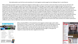
conventions. The title of the page is right at the top and makes it very clear what the page is, this makes it easy to navigate through. The text also has a
contrasting colour to the background which again, clearly states what page it is making it easier for the reader to navigate through. My product as well as the
professional one have separated the articles into 2 columns and titles them what would be regular articles and one-time articles, this is much easier for the
reader to find the information they want to read about. The page numbers and information are present on both which allows the reader to find the exact article
they want to read about and what page they can find it on (extremely easy to navigate through). However, it challenges the usual forms and conventions in
multiple ways. The background is a very plain background being solid white which is not very appealing to the audience and may make it look boring to the
reader. The images on my product are much smaller than the professional contents page and does not contain a main image that the reader would be forced to
look at first. My magazine does not say the issue date on the contents page which most professional magazines do. My product also has competitions and
subscriptions at the bottom of the page which most professional magazine contents pages do not have, this challenges to forms and conventions as it is not
usually seen. The text on my page is very simple and may look quite boring to the audience as they are all the same colour and font, the numbers could also be
a different colour or font to make them stand out more making it look more appealing.
When using QuarkXPress in the production of my magazine contents page I used a select
few features to create a unique look. I used the guideline tool to line everything up correctly
when putting it in columns so it is neat and more importantly, easier for the audience to
read as it is separated. I used the text tool to make my own unique text for the titles so it
stands out above all the rest of the text signifying what that page is, it also gives the
magazine a unique look that other magazines do not have.
2. Strengths
My product has many areas that I believe make
it look realistic and of a professional standard.
The title of the page is correctly positioned at
the top attracting attention to it and clearly
states what that page is so the reader can find it
quickly.
The two columns of information are separated
and titled according to regular information and
featured information for that one magazine and
it is clear to the reader which one is which. It
also has page numbers correctly positioned by
the side of the information so that the reader
can find the specific piece of information they
want and what page it is on so they do not have
trouble navigating through the magazine.
The colour scheme makes the magazine look
very clear in which there is not too much on it
making it difficult to see certain parts, the
contrasting colours such as the title on the
white background are very easy to see so the
reader will not have difficulty.
The font used is very professional and easy to
see so the audience can clearly find the article
they want to read about.
Whilst it does not have the magazine name, it
has a small image of the magazine front cover at
the bottom clearly showing what magazine it is
and is less boring to the reader as it is an image.
Weaknesses
My product also has many features that are not as
realistic or professional and could be improved.
It looks very basic as it is all written in the same font
and colour, I could have made the page numbers one
colour and the text another to make it look more
interesting and appealing to the audience.
The background colour is a solid white which makes
the magazine look very plain, I could have put a large
image across the page or possibly put a different
coloured background so it does not look as plain,
some audience members may find this look boring
and not want to read on.
The images I have chosen do not really anchor the
topics that are found within the rest of magazine and
are just of areas around college, I could have possibly
got some more interesting photos that have a
connection to the content in the magazine.
I also have left quite a bit of space on my contents
page that could have been filled with more
information or images which would make it more
interesting as it looks very simple.