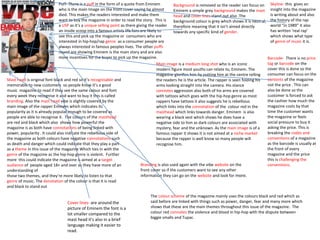
The magazine cover features rapper Eminem as the main image and story. A quote from Eminem hints that he almost died, enticing readers to learn more. The masthead uses a memorable red and black font consistent with the magazine's branding. The cover lines and images promote the article on Eminem and the themes of violence and rebellion associated with hip hop music. This targets an older audience interested in this genre.
A IV Reunião Anual do SciELO de 2014 retoma a análise e discussão sobre o fortalecimento da qualidade dos periódicos do Brasil com ênfase nos indexados no SciELO e com vistas ao aumento do seu impacto nacional e internacionalmente.
A partir de 2015 o SciELO Brasil passa a operar com novos critérios de indexação baseados no cumprimento de uma lista de requisitos e indicadores sobre a adoção das linhas de ação orientadas à profissionalização, internacionalização e sustentabilidade financeira dos periódicos que o Programa SciELO vem promovendo.
Estas linhas de ação visam contribuir para o melhor desempenho dos periódicos. A liderança dos editores-chefes é determinante na adoção das linhas de ação.
A pauta da reunião abarcará três temas principais:
o desempenho dos periódicos SciELO;
os novos critérios de indexação do SciELO Brasil; e
a função e responsabilidade dos editores no avanço dos periódicos.
Each month, join us as we highlight and discuss hot topics ranging from the future of higher education to wearable technology, best productivity hacks and secrets to hiring top talent. Upload your SlideShares, and share your expertise with the world!
Not sure what to share on SlideShare?
SlideShares that inform, inspire and educate attract the most views. Beyond that, ideas for what you can upload are limitless. We’ve selected a few popular examples to get your creative juices flowing.
A Strategic Approach: GenAI in EducationPeter Windle
Artificial Intelligence (AI) technologies such as Generative AI, Image Generators and Large Language Models have had a dramatic impact on teaching, learning and assessment over the past 18 months. The most immediate threat AI posed was to Academic Integrity with Higher Education Institutes (HEIs) focusing their efforts on combating the use of GenAI in assessment. Guidelines were developed for staff and students, policies put in place too. Innovative educators have forged paths in the use of Generative AI for teaching, learning and assessments leading to pockets of transformation springing up across HEIs, often with little or no top-down guidance, support or direction.
This Gasta posits a strategic approach to integrating AI into HEIs to prepare staff, students and the curriculum for an evolving world and workplace. We will highlight the advantages of working with these technologies beyond the realm of teaching, learning and assessment by considering prompt engineering skills, industry impact, curriculum changes, and the need for staff upskilling. In contrast, not engaging strategically with Generative AI poses risks, including falling behind peers, missed opportunities and failing to ensure our graduates remain employable. The rapid evolution of AI technologies necessitates a proactive and strategic approach if we are to remain relevant.
Palestine last event orientationfvgnh .pptxRaedMohamed3
An EFL lesson about the current events in Palestine. It is intended to be for intermediate students who wish to increase their listening skills through a short lesson in power point.
The French Revolution, which began in 1789, was a period of radical social and political upheaval in France. It marked the decline of absolute monarchies, the rise of secular and democratic republics, and the eventual rise of Napoleon Bonaparte. This revolutionary period is crucial in understanding the transition from feudalism to modernity in Europe.
For more information, visit-www.vavaclasses.com
Biological screening of herbal drugs: Introduction and Need for
Phyto-Pharmacological Screening, New Strategies for evaluating
Natural Products, In vitro evaluation techniques for Antioxidants, Antimicrobial and Anticancer drugs. In vivo evaluation techniques
for Anti-inflammatory, Antiulcer, Anticancer, Wound healing, Antidiabetic, Hepatoprotective, Cardio protective, Diuretics and
Antifertility, Toxicity studies as per OECD guidelines
2024.06.01 Introducing a competency framework for languag learning materials ...Sandy Millin
http://sandymillin.wordpress.com/iateflwebinar2024
Published classroom materials form the basis of syllabuses, drive teacher professional development, and have a potentially huge influence on learners, teachers and education systems. All teachers also create their own materials, whether a few sentences on a blackboard, a highly-structured fully-realised online course, or anything in between. Despite this, the knowledge and skills needed to create effective language learning materials are rarely part of teacher training, and are mostly learnt by trial and error.
Knowledge and skills frameworks, generally called competency frameworks, for ELT teachers, trainers and managers have existed for a few years now. However, until I created one for my MA dissertation, there wasn’t one drawing together what we need to know and do to be able to effectively produce language learning materials.
This webinar will introduce you to my framework, highlighting the key competencies I identified from my research. It will also show how anybody involved in language teaching (any language, not just English!), teacher training, managing schools or developing language learning materials can benefit from using the framework.
1. Puff- There is a puff in the form of a quote from Eminem
who is the main Image on the front cover saying he almost
died. This makes the readers interested and make them
want to buy the magazine in order to read the story. This is
a USP as it’s a unique selling point as there giving the reader
an inside scoop into a famous artists life fans are likely to
see this and pick up the magazine or consumers who are
interested in hip-hop/rap genre as a consumer people are
always interested in famous peoples lives. The other puffs
round are showing Eminem is the main story and are also
more incentives for the buyer to pick up the magazine.
Mast head is original font black and red so it’s recognisable and
memorable to new customers so people know it’s a good
music magazine to read if they see the same colour and font
every week they recognise it and want to buy it this is called
branding. Also the mast head vibe is slightly covered by the
main image of the rapper Eminem which indicates its
popularity as it is already popular enough to be covered as
people are able to recognise it. The colours of the masthead
are red and black which also shows how powerful the
magazine is as both have connotations of being linked with
power, popularity . It could also indicate the rebellious side of
the magazine as both colours have negative connotations such
as death and danger which could indicate that they play a part
as a theme in this issue of the magazine Which ties in with the
genre of the magazine as the hip-hop genre is violent. Further
more this could indicate the magazine is aimed at a target
audience of people aged 18+ and over as they have more of an
understanding of
those two themes, and they’re more likely to listen to that
genre of music. The denotation of the colour is that it is read
and black to stand out
Background is removed so the reader can focus on
Eminem a simple grey background makes the mast
head and cover lines stand out also .The
background colour is grey which shows it is neutral,
therefore meaning that it isn’t aimed directly
towards any specific kind of gender.
Main image is a medium long shot who is an iconic
modern figure most youths can relate to, Eminem. The
magazine glorifies him by putting him at the centre telling
the readers he is the article. The rapper is seen folding his
arms looking straight into the camera. His stance
connotes aggression also both of his arms are covered
with tattoos which goes with the hip-hop genre as most
rappers have tattoos it also suggests he is rebellious
which links into the connotation of the colour red in the
masthead which links towards danger. Eminem is also
wearing a black vest which shows he does have a
negative side to him as dark colours are associated with
mystery, fear and the unknown. As the main image is of a
famous rapper it shows it is not aimed at a niche market
because the rapper is well know so many people will
recognise him.
Branding is also used again with the vibe website on the
front cover so if the customers want to see any other
information they can go on the website and look for more.
Skyline- this gives an
insight into the magazine
is writing about and also
the history of the rap
world “in 1989” it also
has written ‘real rap’
which shows what type
of genre of music it is.
Barcode- There is no price
tag or barcode on the
cover this is done so the
consumer can focus on the
contents of the magazine
not the price . This can
also be done so the
customer is forced to ask
the cashier how much the
magazine costs by that
time the customer wants
the magazine or feels
social pressure to buy it
asking the price. This is
breaking the codes and
conventions of a magazine
as the barcode is usually at
the front of every
magazine and the price
this is challenging the
conventions.
The colour scheme of the magazine mainly uses the colours black and red which as
said before are linked with things such as power, danger, fear and many more which
shows that these are the main themes throughout this issue of the magazine. The
colour red connotes the violence and blood in hip-hop with the dispute between
biggie smalls and Tupac.
Cover lines- are around the
picture of Eminem the font is a
lot smaller compared to the
mast head it’s also in a brief
language making it easier to
read.
2. Mast head is the name of the magazine which is called
vibe this also sets the colour scheme for the cover which is
grey, white, red, black the bottom of the word vibe has a
fading effect into the white background, this creates an
interesting look merging the back round and title so the
main image can stand out. The denotation to this would be
that the subheadings, artist are all one and are in a close
relationship sticking to a theme
Background- is plain white as it puts the house style in focus
on the main image and cover lines. Also the contrast in the colour make the
image and font appear bigger and bold. This then grabs the readers attention.
The connotation of using a white background is that the main image speaks
for it self it pops out the target audience immediately see the main image.
Also the colour white connotes purity, angelic which the magazine are trying
to display about Ciara.
The main image is Ciara the artist relates to the genre of the magazine as
it’s hip-hop and she's a hip-hop artist. This will also be a unique selling
point as fans and readers will recognise Ciara and are more likely to buy
the magazine. The singer is seen posing naked with only heels this will
attract the target audience of men between 18-30 as they see her as a sex
object however female fans are likely to buy the magazine. The social class
that are likely to buy the magazine are the working class as they’re more
likely to listen to this type of genre of music and know who the artist is .
The image is a full body shot Ciara is seen holding her self however this
contrasts with the main cover line ‘stand up Ciara’ and pull quote ‘I’m not
going to hold back too much’. This suggests that in the article she reveals
more about her self.
Pull quote- quote taken from the main article and along with the main
cover line is an additional feature to attract the audience I’m not
goanna hold back too much is a contradiction to the main image of
Ciara, however there could be more revealed inside the magazine.
Barcode/date/issue price This is
following the usual conventions and
is displayed one every magazine.
Sell lines- the technique of alliteration has been used “sex”, “scream”
, “scandal” to draw attention to the cove. This sell line further adds to
the sexual theme of the magazine the sell line ” in bed with Robin
thicke” further adds to the sexual nature of the issue this is appealing
to female audiences as they might sexualize over Robin and have a
crush on him this is a USP as readers will buy the magazine just to
find out
Sky line- reads “RnB” goes soft.
“John legend , Ne-yo and Lloyd try
to get it up”. The use of sexual
language links with the proactive
image of Ciara they work together
to create the sexual image of this
issue. When the magazine is
placed on the shelf in a shop,
magazines are covered by other
magazines however the strap line
is always showing there fore the
sexual language is a USP to attract
the readers attention. The use of
alternate contrasting colours
further helps get the target
audiences attention
Font the same sans serif font is maintained throughout all of the
text featured on the front cover, apart from the anchorage text.
The boldness indicates strength and power and is kept the same
on all issues of the magazine this is following codes and
conventions if they didn’t stick with the same font the brand will
be un –recognisable.