
Recommended
More Related Content
What's hot
What's hot (17)
Viewers also liked
Viewers also liked (18)
Similar to Lime Green Masthead Stands Out in Rap Magazine
Similar to Lime Green Masthead Stands Out in Rap Magazine (20)
More from Leanne Pyne
More from Leanne Pyne (20)
Recently uploaded
Recently uploaded (20)
Lime Green Masthead Stands Out in Rap Magazine
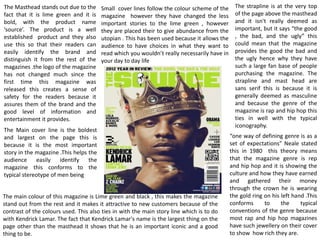
- 1. The Masthead stands out due to the fact that it is lime green and it is bold, with the product name ‘source’. The product is a well established product and they also use this so that their readers can easily identify the brand and distinguish it from the rest of the magazines .the logo of the magazine has not changed much since the first time this magazine was released this creates a sense of safety for the readers because it assures them of the brand and the good level of information and entertainment it provides. The main colour of this magazine is Lime green and black , this makes the magazine stand out from the rest and it makes it attractive to new customers because of the contrast of the colours used. This also ties in with the main story line which is to do with Kendrick Lamar. The fact that Kendrick Lamar's name is the largest thing on the page other than the masthead it shows that he is an important iconic and a good thing to be. The strapline is at the very top of the page above the masthead and it isn't really deemed as important, but it says “the good , the bad, and the ugly” this could mean that the magazine provides the good the bad and the ugly hence why they have such a large fan base of people purchasing the magazine. The strapline and mast head are sans serif this is because it is generally deemed as masculine and because the genre of the magazine is rap and hip hop this ties in well with the typical iconography. Small cover lines follow the colour scheme of the magazine however they have changed the less important stories to the lime green , however they are placed their to give abundance from the utopian . This has been used because it allows the audience to have choices in what they want to read which you wouldn’t really necessarily have in your day to day life The Main cover line is the boldest and largest on the page this is because it is the most important story in the magazine .This helps the audience easily identify the magazine this conforms to the typical stereotype of men being “one way of defining genre is as a set of expectations” Neale stated this in 1980 this theory means that the magazine genre is rep and hip hop and it is showing the culture and how they have earned and gathered their money through the crown he is wearing the gold ring on his left hand .This conforms to the typical conventions of the genre because most rap and hip hop magazines have such jewellery on their cover to show how rich they are.
- 2. The picture of Ciara, is seen as sexual and she is wearing a tight fitted body suit with her legs in the air. This conforms to the male gaze theory because she is seen in the eyes of a heterosexual male. Because of the way she is positioned this would attracted both male and female attention . She is wearing silver jewellery which emphasize her wealth. They have used san serif font on the contents page, this is typical of convention on a feminine writing styles because of the curliness it has to it. This conforms to the stereotype because women are seen as very girly and they enjoy pretty thing such as the curvy writing style.it is also bold and capitalized which shows the import ants. The contents page is taken from the vibe magazine. This is a hip hop and r&b magazine that is designed for the younger generation. The masthead is placed in the middle of the page in white. The Colour white helps it stand out form the rest of the writing on the page and draws attention away from the dark and mysterious background. The background helps emphasize that it is not only for women but it is for men as well. Having the ombre black to white allows Ciara to stand out more against the page because of her glowing skin The contents page doesn’t have much writing as it only tells you about what is inside the magazine and what page it is on, however the magazine is simplistic yet elegant and feminine. The two colours black and white create a nice contrast .
- 3. Headline: The Her Name is in florescent red which gives the audience a sense of passion and warning. The R and O of the headline has the effect of looking like it has been painted, this shows an urban lifestyle refers to street art like graffiti. Image: Rita also wears a leather jacket which gives connotations of rebellion as leather has often been associated with motorcyclists and rock stars. the jacket is covered in a tattoo pattern which further adds to the rebellious image portrayed by her outfit. Image: Rita ora has a slight urban look as she attempts to appeal to the youth like audience. She is wearing a beanie hat which connotes youth but has a gold cross which represents high status and wealth. Image: The image of Rita ora and the background take up the majority of the page and it makes it look as if there is less text so the page doesn’t look so crowded with words. Theme: The colour scheme presents the colours in red which contrast in the background and it makes it stand out so it helps them know what they are talking about Background: The background is youthful so it appeals to a younger audience , this will attract young people between the ages of 11-18 as they can relate to the urban page. The washed out white walls can connate that the artist is hanging around place that she probably shouldn’t be. Image: The main picture in the background of Rita ora makes the double page spread look slightly more interesting to read Background: Rita ora is an urban R&B/pop singer and she is in place where rap battle would usually be held this gives Rita ora more of an edge.