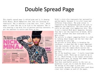
1. This double page spread from a music magazine focuses on Nicki Minaj to emphasize femininity. She is pictured wearing pink clothing with bold patterns that draws attention.
2. The page design uses pink as the main color which is repeated in the background and text. Fonts with curls emphasize femininity contrasting with typical rock magazine styles.
3. Nicki is pictured looking directly at the camera, inviting readers to focus on her as the central figure breaking past the text boxes. Headlines bring sexual attraction and discuss her toned down persona.
Unlock TikTok Success with Sociocosmos..SocioCosmos
Discover how Sociocosmos can boost your TikTok presence with real followers and engagement. Achieve your social media goals today!
https://www.sociocosmos.com/product-category/tiktok/
Multilingual SEO Services | Multilingual Keyword Research | Filosemadisonsmith478075
Multilingual SEO services are essential for businesses aiming to expand their global presence. They involve optimizing a website for search engines in multiple languages, enhancing visibility, and reaching diverse audiences. Filose offers comprehensive multilingual SEO services designed to help businesses optimize their websites for search engines in various languages, enhancing their global reach and market presence. These services ensure that your content is not only translated but also culturally and contextually adapted to resonate with local audiences.
Visit us at -https://www.filose.com/
“To be integrated is to feel secure, to feel connected.” The views and experi...AJHSSR Journal
ABSTRACT: Although a significant amount of literature exists on Morocco's migration policies and their
successes and failures since their implementation in 2014, there is limited research on the integration of subSaharan African children into schools. This paperis part of a Ph.D. research project that aims to fill this gap. It
reports the main findings of a study conducted with migrant children enrolled in two public schools in Rabat,
Morocco, exploring how integration is defined by the children themselves and identifying the obstacles that they
have encountered thus far. The following paper uses an inductive approach and primarily focuses on the
relationships of children with their teachers and peers as a key aspect of integration for students with a migration
background. The study has led to several crucial findings. It emphasizes the significance of speaking Colloquial
Moroccan Arabic (Darija) and being part of a community for effective integration. Moreover, it reveals that the
use of Modern Standard Arabic as the language of instruction in schools is a source of frustration for students,
indicating the need for language policy reform. The study underlines the importanceof considering the
children‟s agency when being integrated into mainstream public schools.
.
KEYWORDS: migration, education, integration, sub-Saharan African children, public school
Get Ahead with YouTube Growth Services....SocioCosmos
Get noticed on YouTube by buying authentic engagement. Sociocosmos helps you grow your channel quickly and effectively.
https://www.sociocosmos.com/product-category/youtube/
Exploring Factors Affecting the Success of TVET-Industry Partnership: A Case ...AJHSSR Journal
ABSTRACT: The purpose of this study was to explore factors affecting the success of TVET-industry
partnerships. A case study design of the qualitative research method was used to achieve this objective. For the
study, one polytechnic college of Oromia regional state, and two industries were purposively selected. From the
sample polytechnic college and industries, a total of 17 sample respondents were selected. Out of 17
respondents, 10 respondents were selected using the snowball sampling method, and the rest 7 respondents were
selected using the purposive sampling technique. The qualitative data were collected through an in-depth
interview and document analysis. The data were analyzed using thematic approaches. The findings revealed that
TVET-industry partnerships were found weak. Lack of key stakeholder‟s awareness shortage of improved
training equipment and machines in polytechnic colleges, absence of trainee health insurance policy, lack of
incentive mechanisms for private industries, lack of employer industries involvement in designing and
developing occupational standards, and preparation of curriculum were some of the impediments of TVETindustry partnership. Based on the findings it was recommended that the Oromia TVET bureau in collaboration
with other relevant concerned regional authorities and TVET colleges, set new strategies for creating strong
awareness for industries, companies, and other relevant stakeholders on the purpose and advantages of
implementing successful TVET-industry partnership. Finally, the Oromia regional government in collaboration
with the TVET bureau needs to create policy-supported incentive strategies such as giving occasional privileges
of duty-free import, tax reduction, and regional government recognition awards based on the level of partnership
contribution to TVET institutions in promoting TVET-industry partnership.
KEY WORDS: employability skills, industries, and partnership
Grow Your Reddit Community Fast.........SocioCosmos
Sociocosmos helps you gain Reddit followers quickly and easily. Build your community and expand your influence.
https://www.sociocosmos.com/product-category/reddit/
Social media refers to online platforms and tools that enable users to create, share, and exchange information, ideas, and content in virtual communities and networks. These platforms have revolutionized the way people communicate, interact, and consume information. Here are some key aspects and descriptions of social media:
Enhance your social media strategy with the best digital marketing agency in Kolkata. This PPT covers 7 essential tips for effective social media marketing, offering practical advice and actionable insights to help you boost engagement, reach your target audience, and grow your online presence.
The Challenges of Good Governance and Project Implementation in Nigeria: A Re...AJHSSR Journal
ABSTRACT : This study reveals that systemic corruption and other factors including poor leadership,
leadership recruitment processes, ethnic and regional politics, tribalism and mediocrity, poor planning, and
variation of project design have been the causative factors that undermine projects implementation in postindependence African states, particularly in Nigeria. The study, thus, argued that successive governments of
African states, using Nigeria as a case study, have been deeply engrossed in this obnoxious practice that has
undermined infrastructure sector development as well as enthroned impoverishment and mass poverty in these
African countries. This study, therefore, is posed to examine the similarities in causative factors, effects and
consequences of corruption and how it affects governance, projects implementation and national growth. To
achieve this, the study adopted historical research design which is qualitative and explorative in nature. The
study among others suggests that the governments of developing countries should shun corruption and other
forms of obnoxious practices in order to operate effective and efficient systems that promote good governance
and ensure there is adequate projects implementation which are the attributes of a responsible government and
good leadership. Policy makers should also prioritize policy objectives and competence to ensure that policies
are fully implemented within stipulated time frame.
KEYWORDS: Developing Countries, Nigeria, Government, Project Implementation, Project Failure
Non-Financial Information and Firm Risk Non-Financial Information and Firm RiskAJHSSR Journal
ABSTRACT: This research aims to examine how ESG disclosure and risk disclosure affect the total risk of
companies. Using cross section data from 355 companies listed in Indonesia Stock Exchange, data regarding
ESG disclosure and risk was collected. In this research, ESG and risk disclosures are measured based on content
analysis using GRI 4 guidelines for ESG disclosures and COSO ERM for risk disclosures. Using multiple
regression, it is concluded that only risk disclosure can reduce the company's total risk, while ESG disclosure
cannot affect the company's total risk. This shows that only risk disclosure is relevant in determining a
company's total risk.
KEYWORDS: ESG disclosure, risk disclosure, firm risk
Your Path to YouTube Stardom Starts HereSocioCosmos
Skyrocket your YouTube presence with Sociocosmos' proven methods. Gain real engagement and build a loyal audience. Join us now.
https://www.sociocosmos.com/product-category/youtube/
How social media marketing helps businesses in 2024.pdfpramodkumar2310
Social media marketing refers to the process of utilizing social media platforms to promote products, services, or brands. It involves creating and sharing valuable content, engaging with followers, analyzing data, and running targeted advertising campaigns.
www.nidmindia.com
2. Vibe
Contrast between colours; black and white. The pink is repeated on
the front cover to create a sense of consistency and it
complements the gold colour. It is also a contrast between the
repeated pink colour and the repeated yelloworange colour. The
artists head is edited in front of the master head to emphasize
that he is important in this edition. The magazine extends to male
readers because of the artist pictured on the front cover, but he
is stretching out to the readers with his hand, to show that
everyone is welcome. His hand is on his belt, to create a sexual
impression, witch extends to female readers. The headline “Akon
the last hit maker” makes it seem like he is a legend. His name
is bigger than the other words and in another colour, to make a
contrast and it shows that he is important. Akon`s attitude in the
front cover picture connotes to more of the “bad boy”
style, with his name on the big necklace, naked over
body, expensive clock and that his pants are showing. This
supports the `male gaze` because it attracts readers to open the
magazine, because they want know how to be as good as him, with
both their body and their success. The price of this magazine is
not placed under the master headline as many other magazines, this
might be because the editors want the readers to focus on what the
magazine features and not how expensive it is, if you can`t afford
it. The date this magazine was released is not placed under the
headline either, this is because they want you to reads the
magazine not matter when it was published, what the magazine
features will still be interesting in two years. The editors have
also listed up some of the other famous artists that sings in the
same genre to attract readers.
3. Billboard
This front cover emphasises that Lady Gaga is important in this
edition. This is because her head is edited in front of the
master head. She is touching her body to create a sexual
impression and engage the males to read the magazine. She is also
very fashionable, which attracts female readers. The background
of the photo on the front cover is grey to emphasize the artist.
The pink colour is repeated many times on the front cover to
create a consistency. They have used a big font without serifs to
make the magazine easier to read and recognise. They have also
edited in colours in the letters, this shows that even though
they are black, grey and boring on the outside, The inside is
playful, interesting, different and fun to read. Lady Gaga`s
purple hair is repeated in the cross placed behind her. This also
emphasises that they have a different and colourful twist in the
magazine than others. Her attitude in this front cover picture is
very sexual, which supports the `male gaze`. She is trying to
undress herself, which attracts men`s attention. The purple bow
on her head is emphasizing that she`s still an innocent little
girl. This the biggest contrast between her body and her hair.
The fact that she is wearing black highlights her face and the
purple hair. She is featured as a role model because her name is
written with a big and bold font with serifs to show a contrast
between that headline and the master head. The headline under her
name is `How she writes top hits`, this shows that she is poplar,
well-known and talented, which makes her a role model for the
readers. The cross is repeated many times on the front cover,
this is to give the magazine a more respectful look, and it may
attract religious people that can recognises the shape and can
relate to it.
4. Q
-Magazine
The first thing you notice about this magazine is its clear
contrasts between black, white and red. These colours are
repeated all over the magazine and that is making it
recognisable on a long distance. The front cover picture is a
medium close-up of Cheryl Cole, and this supports the `male
gaze` because most women wants to be sexy and look good. This
results in people opening the magazine and reading it, because
they want to know how to be like her. This picture is considered
as sexy mainly because she is licking her metal ring, but also
because it is raining and she is wet. She has smoky black eyes
to show that she connotes more with the `bad girl` look. The
fact that her lips are red also shows a sign of romance and it
emphasises that the red colour is repeated on the front cover.
This magazine has a headline that says `vampire weekend`, the
picture also supports this because she is showing her
teeth's, have red lips which symbolises blood, and is licking on
a sharp tooth-like ring. The price and date in this magazine is
displayed with a very small font on the front cover. This is
because the editors want the readers to focus on what the
magazine features and not on how much it costs and when it was
published. The master headline is only displayed as a Q, this
makes it recognisable and easy to read. The headline on the
bottom saying ` 3 words… Cheryl Cole ROCKS` this emphasises
that she is respected and a role model to many. On most magazine
the person pictured on the front cover always has their names
written with a big font for the audience to know and recognise
the artist. The name is always one of the biggest headlines to
make it easier for the readers to understand who the magazine
features. On top of the magazine, the editors have placed a line
saying `The UK`s biggest music magazine` which makes the
readers think that this is the best and greatest magazine, This
makes them want to buy this instead of the others.
5. Music Magazine Contents Page
The contents page of this music magazine is based on a half
page long-shot picture of a guitar player. The editors did
this to let the readers focus on him and be inspired. This
is the main cover story in this edition of the magazine, so
the audience keeps reading to know how to be as good as him.
The picture is taken with a low angle to make it seem like
he is powerful and respected. The writing on the picture
says `Rock`s new royalty` which emphasises that he is
successful and a role model to people that are interested in
the rock genre. The red and black colours in the picture is
repeated in the headlines on the side to get an overall
picture. The mise-en-scene in the picture is mainly based on
the man`s clothes, and the editors chose to use as little
props as possible to get the readers to focus on him. His
black clothes, the guitar and the speaker in the
background, all represents the rock genre. This contents
page is very organised, because they only use one row that
features the contents. The editors did this so it would be
easier for the audience to understand what the magazine
features, but they also edited the main article headlines
bigger, to let the audience see them as important. This
content page is made very masculine to represent the genre.
6. Music Magazine Contents Page
This contents page is featured as more messy and can be
compared with a gossip magazine because of the textbox that
says `exclusive` on the side. Many magazines put this to
involve the reader, and make the audience feel special.
Even though it looks messy, it has a certain pattern. The
editor has used three vertical columns to set up the page.
The editors of this magazine uses red, black and orange as
repeated colours. To repeat red, black and white colours in
rock magazines is very common and most magazines does this.
The master-head on this page says `DRUMMER` which
emphasises the music genre and attracts readers. They have
used a font without serifs, because it makes the magazine
more playful. They have displayed different pictures to let
the audience get an idea of what the magazine features. The
editors usually use low angle on band photos to make them
seem powerful and like role models.
The editors have place the date of the magazine with a big
font on top of the page, to let the readers know when the
contents is produced.
7. Music Magazine Contents Page
The first thing you notice when you look at this contents
page, is the long-shot picture of four guys. This picture
is taken from a low angle, to make them seem powerful and
like role-models fro other music interested. The name of
these bands is as usual written on top of the picture with
a big font and page, so you can read more about them. The
picture helps the reader to know what the main article in
the magazine is. The page is separated in three columns to
make a pattern in the page. By doing this, they can edit
the page to look messy, but still look serious. The red
colour from the logo is repeated in the headlines and the
page numbers. The logo is also repeated twice to advertise
and make the audience remember it. They have chosen a red
colour in the logo, on the headlines and on the page
numbers, because red makes you get more energy and it
symbolises love.
One of the headlines says `My Brilliant Career`, which
makes the reader interested and makes them want to know how
to get that successful career.
The editors have written `Oasis Special` as one of the main
headlines on this page, because it makes the reader feel
included and that he or she can receive special information
that no one else got.
The editors have chosen to place the year this magazine was
released, on top of the page in a middle sized font. They
did this to make the reader think the information still
applies.
8. Double Spread Page
This double spread page is focusing on getting attention and
can be perceived as a bit patriotic, because of the big font
in the background saying `USA`. USA is a big market for
bands that wants to succeed. The magazine wants the audience
to notice this page when they browse it. This, and the fact
that they don`t want the reader to get board, is the main
reasons for the contrast of design between the pages.
The editors used a wordplay in the
headline; Florence Welch, the girl
pictured on the page, wrote a song called
`You Got The Love`. The editors uses this
by writing `USA Got The Love`, which both
means that she`s from America, and that
the first U in USA represents `You` in
`You Got The Love`. By using a big font
on the headline, makes the reader think
it`s the magazine that got the love. The
male gaze is used in the picture
displayed on this double spread; the
woman is wearing a dress, which makes her
more feminine and that she is showing
both her legs, makes it more
sexual, which attracts men. The
repetition of the three colours;
red, white and black, is also repeated on
this page as well as the front cover and
the contents page. This is because it is
a very typical choice of colours for
Rock magazines. The increased D in the
text emphasises the femininity of the
page, because of the curl on the top.
They have used various contrasts between
the text lines. This is to make the
reader more interested and not get board
with the page.
9. Double Spread Page
This double page is focusing on the more masculine side
of the design, by having a male displayed and by using
sharper, clearer and rougher edges in the fonts. They
have also repeated the typical Rock magazine colours;
reed, white and black, on the page.
Pink is becoming more and more mutual, so
both male and female can wear it. These two
pages emphasises this with the parts of the
headlines that is edited pink. By writing
`Do I Ever Have A Casual Friday?
ABSOLUTELY!` in the headline, makes it seem
like he is very famous, successful and has
a lot to do on his spare time. This makes
him a role-model for the audience. The
colours of the mise-en-scene in the
picture, is repeated in the headlines; his
white t-shirt is repeated in the part that
says `ABSOLUTELY!` and his black tattoos is
repeated in the text and the background of
the headlines. The picture is taken from a
low angle to make him seem more powerful
than the readers.
The white polka dots on the side of the
page is representing both paparazzi lights
and the stereotypical lights that`s often
placed on mirrors in the star`s wardrobe
backstage. They are both symbolising fame,
which makes him seem famous and powerful.
10. Double Spread Page
Nicki`s style also represents her personality
This double spread page is edited pink and it is showing
and her music, because it is a bit crazy and
Nicki Minaj, which emphasises that they are focusing on
different from others. The pink colour is
femininity. She is wearing a ring that says `Icon`, which
repeated on the background and on the text to
makes it seem like she is an Icon to the audience. She is
emphasise the femininity. The fonts with the
also wearing a top with lots of pattern and big contrasts, to curls on the ends, also emphasises this. This
get the audience to notice and focus on her.
is not a typical Rock music magazine, because
they don`t use the repetition of black, white
and red. Instead they have used pink as the
main colour.
The article is almost comparing Nicki to a God,
by talking about Gospel and the fact that she
is wearing an icon ring.
The picture of Nicki Minaj is breaking the
textboxes, to show that she is more important
than the contents of the text. She is looking
straight into the camera which invites the
audience and lets your eyes get drawn towards
her face.
One of the headlines says ` I really toned down
the sexual stuff. There was no need for me to
do it`, which brings in the sexual attraction
and the male gaze, by saying that women always
should be sexy and beautiful.
They have used bullet points in the text as
headlines to get you to read the whole article.
The design of this page is also very
structured, because the editors have used three
clear text columns on each of the pages.