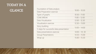
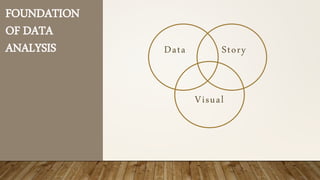
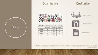
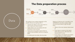
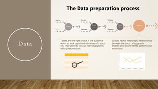
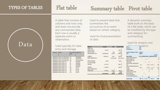
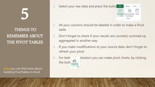
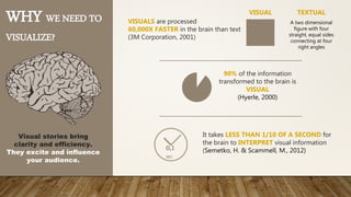
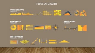
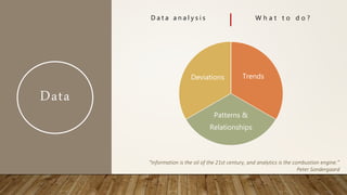
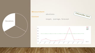
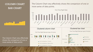
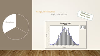
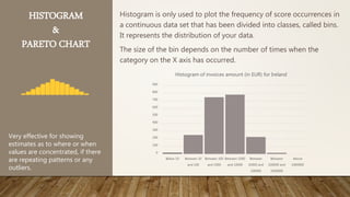
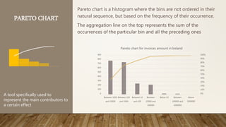
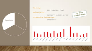
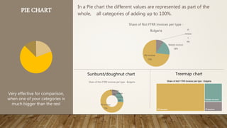
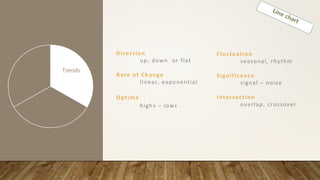
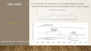
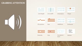
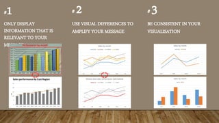
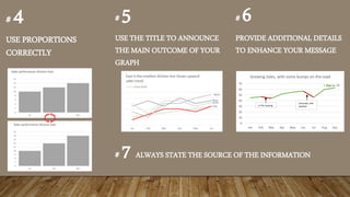
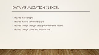
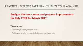
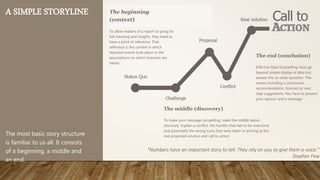
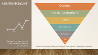
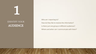
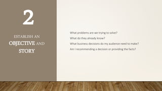
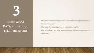
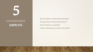
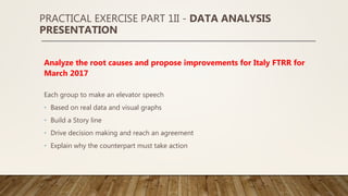
DATA ANALYSIS TRAINING
“In God we trust. All others must bring data.”
W. Edwards Deming
TODAY IN A
GLANCE Foundation of Data analysis
10:00 – 10:30
Data Preparation exercise
Types of graphs 10:30 – 11:00
COKE BREAK 11:00 – 12:00
Data Visualization 12:00 - 12:30
Visualization exercise 12:30 – 13:00
Story building
13:00 – 14:00
5 steps for successful data presentation
Data presentations exercise 14:00 – 14: 30
Group Presentations 14:30 – 15:00
Wrap up 15:00 – 15:30
HUMANS ARE PATTERN-SEEKING STORY-TELLING ANIMALS
WHAT IS THIS?
• This is not an excel training, you should have been part of it before coming here
• This is a training for basic analysis of data and presenting it effectively
“The goal is to turn data into information, and information into insight.”
Carly Fiorina
WHAT DO YOU SEE?
FOUNDATION
OF DATA
ANALYSIS Data Story
Visual
Data
Meaning
facts and statistics collected together for reference or analysis.
"there is very little data available"
Origin
Mid 17th century (as a term in philosophy): from Latin, plural of
datum.
Source: Oxford Dictionary
“Data are becoming the new raw material of business.”
Craig Mundie
Data
Quantitative Qualitative
Interview
Observation
Feedback
“Not everything that can be counted counts, and not everything that counts can be counted.”
Albert Einstein
Data
Identify
What data
Source
Acquir
e
Extract
Measure
Prepar
e
Validate
Organize
Explore
The Data preparation process
The quality of your analysis depends on the
answers that you are giving with it!
Choose your data in such a way, that it is
able to give you these answers
Gather data so you can analyse all main
attributes of your process
Think about all possible reasons that my
relate to your problem, and try to measure
them
It’s better get more data, then less data
Majority of what we do is recorded in the
SAP/BW/SSF and other systems. Make
sure you know where to get the data
from:
Where is the most relevant data stored
at
If you have no access to the report,
check with your KU / BSS lead who
may provide it to you
If your data is not placed in any report,
it might still be in a SAP database
table. Check with your KU
Data
Identify
What data
Source
Acquir
e
Extract
Measure
Prepar
e
Validate
Organize
Explore
The Data preparation process
For data which is already available in the
system, we can directly extract and use it. In
that case we should not forget to:
Check the time period for which we need
it
Make sure the data is correct and will not
change in the future
Update the data in case it becomes
irrelevant
Data which is important for our analysis and is
not available in the system we need to
manually measure it. In that case we should
always:
Make a correct plan for measurement –
who/when/how
Assign 2 different people to measure the
same data to assure correctness
Control if the data is really measured
Data
Identify
What data
Source
Acquir
e
Extract
Measure
Prepar
e
Validate
Organize
Explore
The Data preparation process
The fact that something is in our system or is
measured by us does not mean it is true.
Always validate your data!
Simple ways for validating are:
 Several measurements of the same data
 Missing data entries
 Non-logical negative values – time, money
etc.
 Extreme or inadequate values
 Dates in the future or too much time in the
past
Very often when extracted, the data first
needs to be cleaned, converted to the
right format and organized in a way
suitable for analysis. This might require
anything from the following:
 Removing/hiding sets of data
 Converting dates, numbers, currencies,
percentages, etc. into the right format
 Re-structuring of the layout
 Include calculated rows/columns
 Combine data from different sources
Data
Double check your data
Know your data – when and where it comes from
Specify the source of information in your graphs
Specify the time frame for which the data is
taken
“With data collection, ‘the sooner the better’ is always the best answer.
Marissa Mayer
Don’t forget, always to:
PRACTICAL EXERCISE PART 1 – DATA GATHERING
Analyze the root causes and propose improvements for Italy
FTRR for March 2017
Tasks to do:
• Identify what data is needed
• Understand which report is needed and extract the data to be analyzed
• Ensure data is complete and clean
• How reliable is our source – when was data updated, how it is measured/calculated?
• Do we double check?
• Is data reconciled?
• Is all data available in one report. How do you link data from other reports?
Data
Identify
What data
Source
Acquir
e
Extract
Measure
Prepar
e
Validate
Organize
Explore
The Data preparation process
Tables are the right choice if the audience
wants to look up individual values of a data
set. They allow to pick up individual points
with great precision.
Graphs, reveal meaningful relationships
between the data. Using graphs
enables you to see trends, patterns and
exceptions
TYPES OF TABLES
A table that consists of
columns and rows only,
and does not provide
any summarized data.
Each row is usually a
separate event or
observation.
Used typically for data
entry and storage
Flat table
Used to present data that
summarizes the
occurrence of an event
based on certain category
Used for final presentation
of data
Summary table
A dynamic summary
table built on the basis
of a flat table, which can
be modified by the type
and category for
summarizing
Used for analysis and
data presentation
Pivot table
Customer Name 1 Document
Type
Assignment
3400007023 ADM LTD WHOLESALE RV 3500568891
3400007023 ADM LTD WHOLESALE RV 3500570220
3400007023 ADM LTD WHOLESALE AB SSF 8001100435
3400009023 BWG FOODS LTD RF 34002000
3400009023 BWG FOODS LTD RG 341123
3400009023 BWG FOODS LTD RG 341126
Name 1 Invoice LTA Grand Total
ADM LTD
WHOLESALE 591.96
- 2
130.55
BWG FOODS
WHOLESALE LTD 3 398 830.99
941
322.81
4 398
885.46
LONDIS - 28 385.22 8.64
- 28
376.58
BWG FOODS LTD - 105 141.48 - 105 141.48
SPAR (TOPAZ) - 30.48
-
30.48
XL ATHY ROAD
COFFEE 1 217.70
1
960.79
LONDIS 1 206.30
1
226.30
BWG FOODS LTD
C/BILLING 5 378.60
- 4
633.37 745.23
3 738 753.44
871
766.84
4 666
931.00
Years (All)
Quarters (All)
Posting Date (All)
Count of Amount in doc.
curr.
Column
Labels
Row Labels AB D5RDRF RG RV RWRXZR
Grand
Total
ADM LTD WHOLESALE 1 2 3
BWG FOODS LTD 4 6 10
BWG FOODS LTD
C/BILLING 1 8 9
BWG FOODS WHOLESALE
LTD 60 1 276 5 20 3 365
BWG FOODS/LONDIS BILL
TO AC 196 3 723 1 2 2 927
LONDIS 2 1 4 2 53 62
LONDIS 06841 2 2
LYONS MATT LYONS 2 2
SPAR (TOPAZ) 1 1
SPAR CANTILLON 1 1
XL ATHY ROAD COFFEE 4 6 10
Grand Total 257 6 1 6 11
102
3 8 75 5 1392
Data
5
THINGS TO
REMEMBER ABOUT
THE PIVOT TABLES
1. Select your raw data and press the button
2. All your columns should be labeled in order to make a Pivot
table
3. Don’t forget to check if your results are counted, summed up
aggregated in another way
4. If you make modifications to your source data, don’t forget to
refresh your pivot
5. For better visualization you can make pivot charts, by clicking
the button
Here you can find more about
building PivotTables in Excel
COKE BREAK
“86% STRUGGLE TO TURN VAST VOLUMES OF DATA INTO VALUABLE
INSIGHT.”
(source: CIMA Survey, 2013)
FOUNDATION
OF DATA
ANALYSIS Data Story
Visual
WHY WE NEED TO
VISUALIZE?
VISUALS are processed
60,000X FASTER in the brain than text
(3M Corporation, 2001)
90% of the information
transformed to the brain is
VISUAL
(Hyerle, 2000)
Visual stories bring
clarity and efficiency.
They excite and influence
your audience.
VISUAL TEXTUAL
A two dimensional
figure with four
straight, equal sides
connecting at four
right angles
It takes LESS THAN 1/10 OF A SECOND for
the brain to INTERPRET visual information
(Semetko, H. & Scammell, M., 2012)0,1
SEC
TYPES OF GRAPHS
Data
D a t a a n a l y s i s W h a t t o d o ?
Trends
Patterns &
Relationships
Deviations
“Information is the oil of the 21st century, and analytics is the combustion engine.”
Peter Sondergaard
Measurement
absolutes
Context
target, average, forecast
Trends
Patterns &
Relationships
Deviations
COLUMN CHART
BAR CHART
The Column Chart very effectively shows the comparison of one or
more series of data points.
The Column Chart very effectively
shows the comparison of one or
more series of data points
Clustered column chart Clustered bar chart
0%
20%
40%
60%
80%
100%
First Time Right Rate
0%
100%
First Time Right Rate per type of invoice
First Time Right Rate - FI invoices
First Time Right Rate - Rebate invoices
First Time Right Rate - PO invoices
Austria
Bosnia-Herz.
BSS
0 50 100 150 200
First Time Right Rate per type of invoice
PO invoices
Rebate invoices
FI invoices
Range, Distribution
high, low, shape
Trends
Patterns &
Relationships
Deviations
HISTOGRAM
&
PARETO CHART
Histogram is only used to plot the frequency of score occurrences in
a continuous data set that has been divided into classes, called bins.
It represents the distribution of your data.
The size of the bin depends on the number of times when the
category on the X axis has occurred.
Very effective for showing
estimates as to where or when
values are concentrated, if there
are repeating patterns or any
outliers.
0
100
200
300
400
500
600
700
800
900
Below 10 Between 10
and 100
Between 100
and 1000
Between 1000
and 10000
Between
10000 and
100000
Between
100000 and
1000000
Above
1000000
Histogram of invoices amount (in EUR) for Ireland
PARETO CHART
Pareto chart is a histogram where the bins are not ordered in their
natural sequence, but based on the frequency of their occurrence.
The aggregation line on the top represents the sum of the
occurrences of the particular bin and all the preceding ones
A tool specifically used to
represent the main contributors to
a certain effect
0%
10%
20%
30%
40%
50%
60%
70%
80%
90%
100%
0
100
200
300
400
500
600
700
800
900
Between 1000
and 10000
Between 100
and 1000
Between 10
and 100
Between
10000 and
100000
Below 10 Between
100000 and
1000000
Above
1000000
Pareto chart for invoices amount in Ireland
Ranking
big, medium, small
Hierarchical
category, subcategories
Categorical Comparison
proportionTrends
Patterns &
Relationships
Deviations
PIE CHART In a Pie chart the different values are represented as part of the
whole, all categories of adding up to 100%.
Very effective for comparison,
when one of your categories is
much bigger than the rest
Sunburst/doughnut chart Treemap chart
FI
invoice
s
9%
Rebate invoices
18%
PO invoices
73%
Share of Not FTRR invoices per type -
Bulgaria
FI invoices
9% Rebate
invoices
18%
PO invoices
73%
Share of Not FTRR invoices per type - Bulgaria
Direction
up, down or flat
Rate of Change
linear, exponential
Optima
highs – lows
Trends
Patterns &
Relationships
Deviations
Fluctuation
seasonal, rhythm
Significance
signal – noise
Intersection
overlap, crossover
LINE CHART In a Line Chart, the vertical axis (Y-axis) always displays numeric
values and the horizontal axis (X-axis) displays time or other category
Especially effective in displaying trends
0
100
200
1.дек
2.дек
3.дек
5.дек
6.дек
7.дек
8.дек
9.дек
12.дек
13.дек
14.дек
15.дек
16.дек
17.дек
19.дек
20.дек
21.дек
22.дек
23.дек
27.дек
28.дек
29.дек
30.дек
Number of invoices per day
You can additionally add trendline and deviation. Look for trends, cycling, patterns and
outliers
Boundaries
highs – lows
Correlation
weak – strong
Exceptions
outliers
Trends
Patterns &
Relationship
s
Deviations
Clusters
bunching – gaps
Intersection
overlap – crossover
Association
variables - values
SCATTER PLOT Scatter plots are similar to line graphs in that they use horizontal and
vertical axes to plot data points. However, they show how much one
variable is affected by another.
Very useful for observing how
the values of two series
compares over time or other
category.
It quickly shows trends,
dependencies and outliers
0
5
10
15
20
25
30
0 10000 20000 30000 40000 50000 60000
Disputes Resolution time vs. its amount, per country
Resolution time - CH (in hours) Resolution time - IT (in hours)
Linear (Resolution time - CH (in hours)) Linear (Resolution time - IT (in hours))
Data
The analysis is a game of trial and error
Try different tables and graphs until you find the best
When you find peculiarity, explore it
Look in the specifics, but do not forget the big picture
Don’t forget, always to:
“If we have data, let’s look at data. If all we have are opinions, let’s go with mine.”
Jim Barksdale
PRACTICAL EXERCISE PART 1I – ANALYSIS
Analyze the root causes and propose improvements for
Italy FTRR for March 2017
Tasks to do:
• Identify the main drivers of the Not FTRR /
• Prepare different types of graphs to represent the behaviour in terms of biggest
contributors and root causes
• Discover and present deviations, trends and patterns for your data. What do you
think is the reason for those?
FOUNDATION
OF DATA
ANALYSIS Data Story
Visual
HOW MANY “5”
DO YOU SEE? 3346366328560568320549638463460345820834
0137430545049673406734029750272057206974
6039763047320457204693746039763097630976
3209673046973069736039760752323597207326
093276039673
3346366328560568320549638463460345820834
0137430545049673406734029750272057206974
6039763047320457204693746039763097630976
3209673046973069736039760752323597207326
093276039673
Visual
GRABBING ATTENTION
Line length Line width Orientation Shape
2D position Size Additions Enclosure
Intensity Hue
Blinking
Flicker
Direction
Curvature /
form
Motion
#1
ONLY DISPLAY
INFORMATION THAT IS
RELEVANT TO YOUR
MESSAGE
# 2
USE VISUAL DIFFERENCES TO
AMPLIFY YOUR MESSAGE
# 3
BE CONSISTENT IN YOUR
VISUALISATION
# 4
USE PROPORTIONS
CORRECTLY
# 5
USE THE TITLE TO ANNOUNCE
THE MAIN OUTCOME OF YOUR
GRAPH
# 6
PROVIDE ADDITIONAL DETAILS
TO ENHANCE YOUR MESSAGE
0
10
20
30
40
50
60
70
Jan Feb Mar Apr May Jun Jul Aug Sep
Growing Sales, with some bumps on the road
2 FTEs leaving
Unusualy cold
weather
+ 5pp vs. LY
# 7 ALWAYS STATE THE SOURCE OF THE INFORMATION
DATA VISUALIZATION IN EXCEL
• How to make graphs
• How to make a combined graph
• How to change the type of graph and edit the legend
• How to change colors and width of line
PRACTICAL EXERCISE PART I1I – VISUALIZE YOUR ANALYSIS
Analyze the root causes and propose improvements
for Italy FTRR for March 2017
Tasks to do:
• Visualize your analysis from Part II
• Polish your graphs in order to better represent your idea
FOUNDATION
OF DATA
ANALYSIS Data Story
Visual
Story
I think people have begun t o f o r g e t h o w p o w e r f u l h u m a n
s t o rie s are, exchanging their sense of empathy for a fetishistic
fascination with data, networks, patterns, and total information...
Really, t h e d a t a is just p a r t o f t h e story . The human stuff is
the main stuff, and the data should enrich it.
Jonathan Harris
Story
Meaning
A narrative (or story) is any account of connected events, presented to
a reader or listener in a sequence of written or spoken words, or in a
sequence of (moving) pictures
Origin
Derived from the Latin verb narrare, "to tell"
Source: Oxford Dictionary
logos | reason
ethos | credible
pathos | emotional
THE ART OF
PERSUASION
A SIMPLE STORYLINE
The most basic story structure
is familiar to us all. It consists
of a beginning, a middle and
an end.
The middle (discovery)
To make your message compelling, make the middle about
discovery. Explain a conflict, the hurdles that had to be overcome
and potentially the wrong turns that were taken in arriving at the
real proposed solution and call to action
The end (conclusion)
Effective Data Storytelling must go
beyond simple display of data but
answer the so-what-question. This
means including a conclusion,
recommendation, forecast or next
step suggestions. You have to present
your opinion and a message
The beginning
(context)
To allow readers of a report to grasp its
full meaning and insights, they need to
have a point of reference. That
reference is the context in which
reported events took place or the
assumptions on which forecasts are
based.
“Numbers have an important story to tell. They rely on you to give them a voice.”
Stephen Few
A SIMPLE STORYLINE
Context
General Comparisons
Trends
Dependencies
Conclusion
Next
steps
Make sure you highlight your key point at the front of your story, e.g. in the headline or graph title
Overview first, then zoom &
filter, details on demand
Ben Schniederman
THE 5 STEPS FOR SUCCESSFUL DATA
PRESENTATION
IDENTIFY YOUR
AUDIENCE
Who am I reporting to?
How do they like to receive the information?
Is there just one group or different audiences?
Where and when can I communicate with them?
1
ESTABLISH AN
OBJECTIVE AND
STORY
What problems are we trying to solve?
What do they already know?
What business decisions do my audience need to make?
Am I recommending a decision or providing the facts?
2
DECIDE WHAT
DATA WILL HELP YOU
TELL THE STORY
What data does the company have available to investigate the story?
Do I need new data?
What type of analysis can I use to surface the insights?
What kind of data has to be presented to persuade the counterpart to
take action?
3
CREATE A
STORYBOARD
What is the best way to bring my story to life for my audience?
What visualizations should I use?
How to make sure that the story flow is logical and understandable for
my audience?
4
CONTINUOUSLY
IMPROVE
Did my audience understand everything?
Did I give them sufficient information?
Was the decision successful?
Is there anything new to add in the future?
5
PRACTICAL EXERCISE PART 1II - DATA ANALYSIS
PRESENTATION
Analyze the root causes and propose improvements for Italy FTRR for
March 2017
Each group to make an elevator speech
• Based on real data and visual graphs
• Build a Story line
• Drive decision making and reach an agreement
• Explain why the counterpart must take action
WHAT’S WRONG WITH THIS GRAPH?
… at least 5 things
Uneven time periods for the X axis
Y axis does not start from 0, leading
to false disproportion
Over usage of the Y axis
values
No conclusion in the title
Source of information not
announced
WHAT’S WRONG WITH THIS GRAPH?

Data analysis training

  • 1.
    DATA ANALYSIS TRAINING “InGod we trust. All others must bring data.” W. Edwards Deming
  • 2.
    TODAY IN A GLANCEFoundation of Data analysis 10:00 – 10:30 Data Preparation exercise Types of graphs 10:30 – 11:00 COKE BREAK 11:00 – 12:00 Data Visualization 12:00 - 12:30 Visualization exercise 12:30 – 13:00 Story building 13:00 – 14:00 5 steps for successful data presentation Data presentations exercise 14:00 – 14: 30 Group Presentations 14:30 – 15:00 Wrap up 15:00 – 15:30
  • 3.
    HUMANS ARE PATTERN-SEEKINGSTORY-TELLING ANIMALS
  • 4.
    WHAT IS THIS? •This is not an excel training, you should have been part of it before coming here • This is a training for basic analysis of data and presenting it effectively “The goal is to turn data into information, and information into insight.” Carly Fiorina
  • 5.
  • 8.
  • 9.
    Data Meaning facts and statisticscollected together for reference or analysis. "there is very little data available" Origin Mid 17th century (as a term in philosophy): from Latin, plural of datum. Source: Oxford Dictionary “Data are becoming the new raw material of business.” Craig Mundie
  • 10.
    Data Quantitative Qualitative Interview Observation Feedback “Not everythingthat can be counted counts, and not everything that counts can be counted.” Albert Einstein
  • 11.
    Data Identify What data Source Acquir e Extract Measure Prepar e Validate Organize Explore The Datapreparation process The quality of your analysis depends on the answers that you are giving with it! Choose your data in such a way, that it is able to give you these answers Gather data so you can analyse all main attributes of your process Think about all possible reasons that my relate to your problem, and try to measure them It’s better get more data, then less data Majority of what we do is recorded in the SAP/BW/SSF and other systems. Make sure you know where to get the data from: Where is the most relevant data stored at If you have no access to the report, check with your KU / BSS lead who may provide it to you If your data is not placed in any report, it might still be in a SAP database table. Check with your KU
  • 12.
    Data Identify What data Source Acquir e Extract Measure Prepar e Validate Organize Explore The Datapreparation process For data which is already available in the system, we can directly extract and use it. In that case we should not forget to: Check the time period for which we need it Make sure the data is correct and will not change in the future Update the data in case it becomes irrelevant Data which is important for our analysis and is not available in the system we need to manually measure it. In that case we should always: Make a correct plan for measurement – who/when/how Assign 2 different people to measure the same data to assure correctness Control if the data is really measured
  • 13.
    Data Identify What data Source Acquir e Extract Measure Prepar e Validate Organize Explore The Datapreparation process The fact that something is in our system or is measured by us does not mean it is true. Always validate your data! Simple ways for validating are:  Several measurements of the same data  Missing data entries  Non-logical negative values – time, money etc.  Extreme or inadequate values  Dates in the future or too much time in the past Very often when extracted, the data first needs to be cleaned, converted to the right format and organized in a way suitable for analysis. This might require anything from the following:  Removing/hiding sets of data  Converting dates, numbers, currencies, percentages, etc. into the right format  Re-structuring of the layout  Include calculated rows/columns  Combine data from different sources
  • 14.
    Data Double check yourdata Know your data – when and where it comes from Specify the source of information in your graphs Specify the time frame for which the data is taken “With data collection, ‘the sooner the better’ is always the best answer. Marissa Mayer Don’t forget, always to:
  • 15.
    PRACTICAL EXERCISE PART1 – DATA GATHERING Analyze the root causes and propose improvements for Italy FTRR for March 2017 Tasks to do: • Identify what data is needed • Understand which report is needed and extract the data to be analyzed • Ensure data is complete and clean • How reliable is our source – when was data updated, how it is measured/calculated? • Do we double check? • Is data reconciled? • Is all data available in one report. How do you link data from other reports?
  • 16.
    Data Identify What data Source Acquir e Extract Measure Prepar e Validate Organize Explore The Datapreparation process Tables are the right choice if the audience wants to look up individual values of a data set. They allow to pick up individual points with great precision. Graphs, reveal meaningful relationships between the data. Using graphs enables you to see trends, patterns and exceptions
  • 17.
    TYPES OF TABLES Atable that consists of columns and rows only, and does not provide any summarized data. Each row is usually a separate event or observation. Used typically for data entry and storage Flat table Used to present data that summarizes the occurrence of an event based on certain category Used for final presentation of data Summary table A dynamic summary table built on the basis of a flat table, which can be modified by the type and category for summarizing Used for analysis and data presentation Pivot table Customer Name 1 Document Type Assignment 3400007023 ADM LTD WHOLESALE RV 3500568891 3400007023 ADM LTD WHOLESALE RV 3500570220 3400007023 ADM LTD WHOLESALE AB SSF 8001100435 3400009023 BWG FOODS LTD RF 34002000 3400009023 BWG FOODS LTD RF 34002000 3400009023 BWG FOODS LTD RF 34002000 3400009023 BWG FOODS LTD RF 34002000 3400009023 BWG FOODS LTD RG 341123 3400009023 BWG FOODS LTD RG 341123 3400009023 BWG FOODS LTD RG 341126 3400009023 BWG FOODS LTD RG 341126 Name 1 Invoice LTA Grand Total ADM LTD WHOLESALE 591.96 - 2 130.55 BWG FOODS WHOLESALE LTD 3 398 830.99 941 322.81 4 398 885.46 LONDIS - 28 385.22 8.64 - 28 376.58 BWG FOODS LTD - 105 141.48 - 105 141.48 SPAR (TOPAZ) - 30.48 - 30.48 XL ATHY ROAD COFFEE 1 217.70 1 960.79 LONDIS 1 206.30 1 226.30 BWG FOODS LTD C/BILLING 5 378.60 - 4 633.37 745.23 3 738 753.44 871 766.84 4 666 931.00 Years (All) Quarters (All) Posting Date (All) Count of Amount in doc. curr. Column Labels Row Labels AB D5RDRF RG RV RWRXZR Grand Total ADM LTD WHOLESALE 1 2 3 BWG FOODS LTD 4 6 10 BWG FOODS LTD C/BILLING 1 8 9 BWG FOODS WHOLESALE LTD 60 1 276 5 20 3 365 BWG FOODS/LONDIS BILL TO AC 196 3 723 1 2 2 927 LONDIS 2 1 4 2 53 62 LONDIS 06841 2 2 LYONS MATT LYONS 2 2 SPAR (TOPAZ) 1 1 SPAR CANTILLON 1 1 XL ATHY ROAD COFFEE 4 6 10 Grand Total 257 6 1 6 11 102 3 8 75 5 1392 Data
  • 18.
    5 THINGS TO REMEMBER ABOUT THEPIVOT TABLES 1. Select your raw data and press the button 2. All your columns should be labeled in order to make a Pivot table 3. Don’t forget to check if your results are counted, summed up aggregated in another way 4. If you make modifications to your source data, don’t forget to refresh your pivot 5. For better visualization you can make pivot charts, by clicking the button Here you can find more about building PivotTables in Excel
  • 19.
  • 20.
    “86% STRUGGLE TOTURN VAST VOLUMES OF DATA INTO VALUABLE INSIGHT.” (source: CIMA Survey, 2013)
  • 21.
  • 22.
    WHY WE NEEDTO VISUALIZE? VISUALS are processed 60,000X FASTER in the brain than text (3M Corporation, 2001) 90% of the information transformed to the brain is VISUAL (Hyerle, 2000) Visual stories bring clarity and efficiency. They excite and influence your audience. VISUAL TEXTUAL A two dimensional figure with four straight, equal sides connecting at four right angles It takes LESS THAN 1/10 OF A SECOND for the brain to INTERPRET visual information (Semetko, H. & Scammell, M., 2012)0,1 SEC
  • 23.
  • 24.
    Data D a ta a n a l y s i s W h a t t o d o ? Trends Patterns & Relationships Deviations “Information is the oil of the 21st century, and analytics is the combustion engine.” Peter Sondergaard
  • 25.
  • 26.
    COLUMN CHART BAR CHART TheColumn Chart very effectively shows the comparison of one or more series of data points. The Column Chart very effectively shows the comparison of one or more series of data points Clustered column chart Clustered bar chart 0% 20% 40% 60% 80% 100% First Time Right Rate 0% 100% First Time Right Rate per type of invoice First Time Right Rate - FI invoices First Time Right Rate - Rebate invoices First Time Right Rate - PO invoices Austria Bosnia-Herz. BSS 0 50 100 150 200 First Time Right Rate per type of invoice PO invoices Rebate invoices FI invoices
  • 27.
    Range, Distribution high, low,shape Trends Patterns & Relationships Deviations
  • 28.
    HISTOGRAM & PARETO CHART Histogram isonly used to plot the frequency of score occurrences in a continuous data set that has been divided into classes, called bins. It represents the distribution of your data. The size of the bin depends on the number of times when the category on the X axis has occurred. Very effective for showing estimates as to where or when values are concentrated, if there are repeating patterns or any outliers. 0 100 200 300 400 500 600 700 800 900 Below 10 Between 10 and 100 Between 100 and 1000 Between 1000 and 10000 Between 10000 and 100000 Between 100000 and 1000000 Above 1000000 Histogram of invoices amount (in EUR) for Ireland
  • 29.
    PARETO CHART Pareto chartis a histogram where the bins are not ordered in their natural sequence, but based on the frequency of their occurrence. The aggregation line on the top represents the sum of the occurrences of the particular bin and all the preceding ones A tool specifically used to represent the main contributors to a certain effect 0% 10% 20% 30% 40% 50% 60% 70% 80% 90% 100% 0 100 200 300 400 500 600 700 800 900 Between 1000 and 10000 Between 100 and 1000 Between 10 and 100 Between 10000 and 100000 Below 10 Between 100000 and 1000000 Above 1000000 Pareto chart for invoices amount in Ireland
  • 30.
    Ranking big, medium, small Hierarchical category,subcategories Categorical Comparison proportionTrends Patterns & Relationships Deviations
  • 31.
    PIE CHART Ina Pie chart the different values are represented as part of the whole, all categories of adding up to 100%. Very effective for comparison, when one of your categories is much bigger than the rest Sunburst/doughnut chart Treemap chart FI invoice s 9% Rebate invoices 18% PO invoices 73% Share of Not FTRR invoices per type - Bulgaria FI invoices 9% Rebate invoices 18% PO invoices 73% Share of Not FTRR invoices per type - Bulgaria
  • 32.
    Direction up, down orflat Rate of Change linear, exponential Optima highs – lows Trends Patterns & Relationships Deviations Fluctuation seasonal, rhythm Significance signal – noise Intersection overlap, crossover
  • 33.
    LINE CHART Ina Line Chart, the vertical axis (Y-axis) always displays numeric values and the horizontal axis (X-axis) displays time or other category Especially effective in displaying trends 0 100 200 1.дек 2.дек 3.дек 5.дек 6.дек 7.дек 8.дек 9.дек 12.дек 13.дек 14.дек 15.дек 16.дек 17.дек 19.дек 20.дек 21.дек 22.дек 23.дек 27.дек 28.дек 29.дек 30.дек Number of invoices per day You can additionally add trendline and deviation. Look for trends, cycling, patterns and outliers
  • 34.
    Boundaries highs – lows Correlation weak– strong Exceptions outliers Trends Patterns & Relationship s Deviations Clusters bunching – gaps Intersection overlap – crossover Association variables - values
  • 35.
    SCATTER PLOT Scatterplots are similar to line graphs in that they use horizontal and vertical axes to plot data points. However, they show how much one variable is affected by another. Very useful for observing how the values of two series compares over time or other category. It quickly shows trends, dependencies and outliers 0 5 10 15 20 25 30 0 10000 20000 30000 40000 50000 60000 Disputes Resolution time vs. its amount, per country Resolution time - CH (in hours) Resolution time - IT (in hours) Linear (Resolution time - CH (in hours)) Linear (Resolution time - IT (in hours))
  • 36.
    Data The analysis isa game of trial and error Try different tables and graphs until you find the best When you find peculiarity, explore it Look in the specifics, but do not forget the big picture Don’t forget, always to: “If we have data, let’s look at data. If all we have are opinions, let’s go with mine.” Jim Barksdale
  • 37.
    PRACTICAL EXERCISE PART1I – ANALYSIS Analyze the root causes and propose improvements for Italy FTRR for March 2017 Tasks to do: • Identify the main drivers of the Not FTRR / • Prepare different types of graphs to represent the behaviour in terms of biggest contributors and root causes • Discover and present deviations, trends and patterns for your data. What do you think is the reason for those?
  • 38.
  • 39.
    HOW MANY “5” DOYOU SEE? 3346366328560568320549638463460345820834 0137430545049673406734029750272057206974 6039763047320457204693746039763097630976 3209673046973069736039760752323597207326 093276039673 3346366328560568320549638463460345820834 0137430545049673406734029750272057206974 6039763047320457204693746039763097630976 3209673046973069736039760752323597207326 093276039673 Visual
  • 40.
    GRABBING ATTENTION Line lengthLine width Orientation Shape 2D position Size Additions Enclosure Intensity Hue Blinking Flicker Direction Curvature / form Motion
  • 41.
    #1 ONLY DISPLAY INFORMATION THATIS RELEVANT TO YOUR MESSAGE # 2 USE VISUAL DIFFERENCES TO AMPLIFY YOUR MESSAGE # 3 BE CONSISTENT IN YOUR VISUALISATION
  • 42.
    # 4 USE PROPORTIONS CORRECTLY #5 USE THE TITLE TO ANNOUNCE THE MAIN OUTCOME OF YOUR GRAPH # 6 PROVIDE ADDITIONAL DETAILS TO ENHANCE YOUR MESSAGE 0 10 20 30 40 50 60 70 Jan Feb Mar Apr May Jun Jul Aug Sep Growing Sales, with some bumps on the road 2 FTEs leaving Unusualy cold weather + 5pp vs. LY # 7 ALWAYS STATE THE SOURCE OF THE INFORMATION
  • 43.
    DATA VISUALIZATION INEXCEL • How to make graphs • How to make a combined graph • How to change the type of graph and edit the legend • How to change colors and width of line
  • 44.
    PRACTICAL EXERCISE PARTI1I – VISUALIZE YOUR ANALYSIS Analyze the root causes and propose improvements for Italy FTRR for March 2017 Tasks to do: • Visualize your analysis from Part II • Polish your graphs in order to better represent your idea
  • 45.
  • 46.
    Story I think peoplehave begun t o f o r g e t h o w p o w e r f u l h u m a n s t o rie s are, exchanging their sense of empathy for a fetishistic fascination with data, networks, patterns, and total information... Really, t h e d a t a is just p a r t o f t h e story . The human stuff is the main stuff, and the data should enrich it. Jonathan Harris
  • 47.
    Story Meaning A narrative (orstory) is any account of connected events, presented to a reader or listener in a sequence of written or spoken words, or in a sequence of (moving) pictures Origin Derived from the Latin verb narrare, "to tell" Source: Oxford Dictionary
  • 48.
    logos | reason ethos| credible pathos | emotional THE ART OF PERSUASION
  • 49.
    A SIMPLE STORYLINE Themost basic story structure is familiar to us all. It consists of a beginning, a middle and an end. The middle (discovery) To make your message compelling, make the middle about discovery. Explain a conflict, the hurdles that had to be overcome and potentially the wrong turns that were taken in arriving at the real proposed solution and call to action The end (conclusion) Effective Data Storytelling must go beyond simple display of data but answer the so-what-question. This means including a conclusion, recommendation, forecast or next step suggestions. You have to present your opinion and a message The beginning (context) To allow readers of a report to grasp its full meaning and insights, they need to have a point of reference. That reference is the context in which reported events took place or the assumptions on which forecasts are based. “Numbers have an important story to tell. They rely on you to give them a voice.” Stephen Few
  • 50.
    A SIMPLE STORYLINE Context GeneralComparisons Trends Dependencies Conclusion Next steps Make sure you highlight your key point at the front of your story, e.g. in the headline or graph title Overview first, then zoom & filter, details on demand Ben Schniederman
  • 51.
    THE 5 STEPSFOR SUCCESSFUL DATA PRESENTATION
  • 52.
    IDENTIFY YOUR AUDIENCE Who amI reporting to? How do they like to receive the information? Is there just one group or different audiences? Where and when can I communicate with them? 1
  • 53.
    ESTABLISH AN OBJECTIVE AND STORY Whatproblems are we trying to solve? What do they already know? What business decisions do my audience need to make? Am I recommending a decision or providing the facts? 2
  • 54.
    DECIDE WHAT DATA WILLHELP YOU TELL THE STORY What data does the company have available to investigate the story? Do I need new data? What type of analysis can I use to surface the insights? What kind of data has to be presented to persuade the counterpart to take action? 3
  • 55.
    CREATE A STORYBOARD What isthe best way to bring my story to life for my audience? What visualizations should I use? How to make sure that the story flow is logical and understandable for my audience? 4
  • 56.
    CONTINUOUSLY IMPROVE Did my audienceunderstand everything? Did I give them sufficient information? Was the decision successful? Is there anything new to add in the future? 5
  • 57.
    PRACTICAL EXERCISE PART1II - DATA ANALYSIS PRESENTATION Analyze the root causes and propose improvements for Italy FTRR for March 2017 Each group to make an elevator speech • Based on real data and visual graphs • Build a Story line • Drive decision making and reach an agreement • Explain why the counterpart must take action
  • 58.
  • 59.
  • 60.
    … at least5 things Uneven time periods for the X axis Y axis does not start from 0, leading to false disproportion Over usage of the Y axis values No conclusion in the title Source of information not announced WHAT’S WRONG WITH THIS GRAPH?

Editor's Notes

  • #4 We must account that when we work with data, analyze problems and provide solutions When analyzing we are seeking for patterns, and visualization helps us identify and communicate them If we want to communicate well and persuade our audience, the analysis should make up a story, and not come as separate graphs. And stories are factual events, which are enhanced with empathy and drama
  • #6 If you don’t believe we are ancestors of animals, tell me what do you see here?
  • #7 This is a standard psychological test. When the same has been shown to 10 year old children, none of them has seen the two naked people, but only the 9 dolphins The morale is: We are used to look in patterns We are subjective
  • #8 Another one, showing that once a create a pattern we always tend to lean on it. If you see the lady first, is hard to see the old woman afterwards, and vice versa.
  • #9 To be come good in data analysis we first need to know what it is. It consists of three elements: Obviously there should be the “data” part. This is the information that we work with. We need to be sure that we have complete, accurate, trusted and workable data to do analysis with. This is often all we think we need, but in the modern world this is absolutely not enough. Visualisation – this means, using the right graphs, to accurately present your message,
  • #16 For PTP – two types of analysis: FTRR – Two extracts – KBI001 and Handlings extract SSF report
  • #22 To be come good in data analysis we first need to know what it is. It consists of three elements: Obviously there should be the “data” part. This is the information that we work with. We need to be sure that we have complete, accurate, trusted and workable data to do analysis with. This is often all we think we need, but in the modern world this is absolutely not enough. Visualisation – this means, using the right graphs, to accurately present your message,
  • #26 Graph to be below and enlarged and ask them what they see
  • #27 To include proportional column chart To prepare data
  • #28 Graph to be below and enlarged and ask them what they see
  • #31 Graph to be below and enlarged and ask them what they see
  • #36 R square to find the formula Make a Graphic relevant for the stream
  • #39 To be come good in data analysis we first need to know what it is. It consists of three elements: Obviously there should be the “data” part. This is the information that we work with. We need to be sure that we have complete, accurate, trusted and workable data to do analysis with. This is often all we think we need, but in the modern world this is absolutely not enough. Visualisation – this means, using the right graphs, to accurately present your message,
  • #46 To be come good in data analysis we first need to know what it is. It consists of three elements: Obviously there should be the “data” part. This is the information that we work with. We need to be sure that we have complete, accurate, trusted and workable data to do analysis with. This is often all we think we need, but in the modern world this is absolutely not enough. Visualisation – this means, using the right graphs, to accurately present your message,