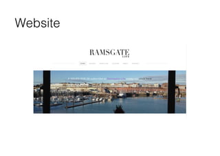
The document discusses how a magazine product uses and develops conventions of real media. It summarizes how different elements of the magazine's design follow conventions, including:
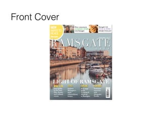
1) The masthead uses a bold serif font at the top of the page to draw attention, as seen in other magazines.
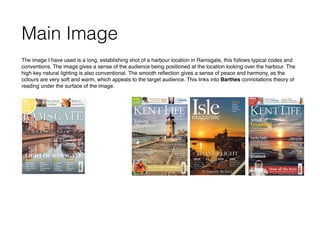
2) Images on the cover and contents page use a variety of shots and lighting to appeal to readers and promote articles, as done conventionally.
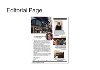
3) Layouts of pages like the contents, editorial, and ads follow typical designs with fonts, positioning of images and text, and additional details to engage the target audience.
However, some unconventional elements are also discussed, such as a more relaxed contents