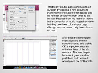
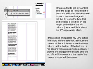
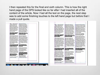
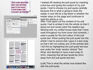
The document describes the process of creating a double page spread in InDesign. The author opened a new document, changed it to landscape orientation with 6 columns. They then added their article text by copying from Word and allowing it to flow across columns. A pull quote was added using a purple font for emphasis. Final touches like page numbers and a divider were added. The main image was imported and resized to complete the double page spread.
Thermal spray equipment to deposit 5 kg of tungsten carbide per hour, reaching a hardness of 950 HV300 in 3.75-4.0” internal diameters and over 1200 HV300 hardness in 4.5-5.0” internal diameters
Описание новейших разработок в HVAF. Оборудование для нанесения карбидов вольфрама и хрома, металлов и сплавов, алюминия, олова, титана слоями от 50 мкм до десятков миллиметров.
Kaskas Median Annina Huhtalan esitys Tutkijat ja toimittajat totuusjahdissa – miten tehdä rakentavaa mediayhteistyötä -tilaisuudessa Balderin salissa 6. lokakuuta 2016.
Informaatiomuotoiluun erikoistuneen valtioneuvoston kanslian viestintäsuunnittelijan Teemu Hotin esitys 16.6.2016 järjestetyssä valtioneuvoston selvitys- ja tutkimustoiminnan vuorovaikutuskoulutuksessa.
Sitrassa 18.3 pidetyn Resurssiviisaan suunnittelu ja rakentamisprosessin - työpajan arkkitehti Eero Lundenin esitys siitä miten Pieksämäen elämänkaarikylän suunnittelussa käyttäjät ja kestävät ratkaisut on otettu työn kantaviksi periaatteiksi.
Työpajassa perinteinen suunnittelu-rakentamisprosessi altistettiin kestäville, resurssiviisaille ja käyttäjälähtöisyyteen perustuville ratkaisuille sekä määritimme yhdessä alan ammattilaisten kanssa minkälainen uudenlainen suunnittelu-rakentamisprosessi voisi olla.
2. I started my double page construction on
InDesign by opening a new document,
changing the orientation to landscape and
the number of columns from three to six.
this was because from my research I found
that a convention of music magazines were
that they use three columns per page
although in some cases, only two columns
are used.
After I had the dimensions,
orientation and column
numbers sorted and clicked
OK, the page opened up
with clear lines of the six
columns. This was helpful
because it gave me clear
guidelines as to where I
would place my DPS article.
3. I then started to get my content
onto the page so I could start to
work around it and decide where
to place my main image etc. I
did this by using the type tool
and created a text box on the
length and width of the 4th
column (because this is where
the 2nd page would start).
I then copied and pasted my DPS article
from word into the text box. Because the
content of the article was more than one
column, at the bottom of the text box, a
red square with a cross inside appears. I
clicked and dragged the square onto the
top of the 5th column and the rest of the
content moves to this column.
4. I then repeated this for the final and sixth column. This is how the right
hand page of the DPS looked like so far after I had inserted all of the
content of the article. Now I had all the text on the page, the next step
was to add some finishing touches to the left hand page but before that I
made a pull quote.
5. I started off creating the pull quote by inserting
a text box and typing the content of my pull
quote. I had to choose my pull quote carefully
because this is what is going to draw the
reader in and will be a big factor in whether the
reader stays on the page and continues to
read the article or not.
After I had typed out the content of my pull
quote I had to embed it into the article so that it
stood out and would catch the readers eye.
Sticking with my unified house style that I have
used throughout my front cover and contents, I
used a purple for the font colour of the pull
quote text. When putting the pull quote into the
article I had to ensure that I gave it a text wrap
so that it did not overlay any of the articles text.
I did this by highlighting the pull quote text box
and under the ‘tools’ section clicked ‘Text
Wrap’ and decided to have a text wrap of
3mm, meaning that all text would be 3mm
away from the pull quote text box.
(Left) This is what the article now looked like
with the pull quote.
6. Finishing Touches
I then added some final touches to
the right hand page before adding
the main image. From my research
I found that it was a convention of
all magazines that page numbers
were located at the bottom of the
page along with the date and
name/website of the magazine. I
did this simply by using the ‘Type
Tool’ but I also used the line tool to
create a divide between the date,
I also inserted the name of the artist at website and page number as you
some point on the page in a bigger font and can see from the image above. I
somewhere other than the article, as again also used the line tool to divide this
from my research I found that this was a and the DPS article at the top and
popular convention of music magazines. I bottom of the article. I done this
used a purple font, the same as my pull because I felt that it gave it a more
quote font, to stay with the house style of classy and professional look and
my magazine and used the same font that I feel to it.
used for the main cover line on the front
cover.
7. Finally, I added the final
piece to the double page
spread, the main image. I
did this by simply clicking
File, add image and placed
the image onto the left
hand side of my page.
I then had to resize and
crop the image to the
appropriate size for the
page to ensure that it
wasn’t too stretched and
looked OK.
The final thing I did on my double page
spread was changing the quality of the
main image so that it looked crisp and
professional. I did this by clicking View on
the toolbar, then Display Performance and
then High Quality Display. And this is the
final product…