This document analyzes several magazine front covers, contents pages, and spreads. It identifies the target audiences and brand identities based on visual elements like colors, images, and layouts.
The analyses show that magazines are targeted towards both male and female audiences of different ages. Teen magazines use bright colors, photos of celebrities, and stories about music or relationships to attract teenage girls. Men's magazines depict muscular men and use red colors associated with aggression to appeal to young men. Contents pages are organized with sections, page numbers, and arrows to make navigation easy. Spreads balance large photos with brief headlines and captions to keep readers engaged.
This document analyzes several magazine front covers and contents pages. For each:
1) It identifies features like mastheads, images, and color schemes that indicate the brand identity and intended audience. Larger images and shorter texts are meant to appeal to younger audiences.
2) It analyzes how elements like colors, topics, and people depicted are used to target specific demographics like teenage girls or boys. Sexualization and gendered colors often indicate the target audience.
3) It examines how the layout, sections, and text sizes/styles facilitate easier reading and navigation for the intended readers. Separating articles and using headings allows choosing what to read.
This document analyzes the front cover and contents page of NME magazine. It discusses the layout elements like the masthead, main image, secondary stories and ads. The cover has a busy American theme focused around an interview of Lana Del Rey. The contents page has a simpler black and white design and focuses on a different main story than the cover. Overall the document provides a detailed breakdown and interpretation of the magazine's design conventions and styles.
This document summarizes conventions for double page spreads in pop magazines. It provides details on layout, design elements, and content typically included. Key points include:
1) The featured artist or band's name is prominently displayed larger than the article text. Images of the artist usually take up half the page with related pictures.
2) Interviews include pull quotes to attract readers' attention. Articles are written in columns and use a limited color palette.
3) Websites and information are listed at the bottom. This example spread follows conventions with a large central image of The Wanted band and colored text and quotes throughout.
This double page spread in a pop magazine follows conventions of the genre. It features an interview with the popular band The Wanted. They take up most of the central image smiling and making eye contact. The article is written in columns for easy reading. Pink and purple dominate the colors which appeal to the young female target audience. It includes multiple images of the band to reinforce what the article is about. Pull quotes are used around the page to tease the content of the interview. Information at the bottom promotes their new single. Additional short articles and details keep readers engaged throughout the spread.
The document analyzes magazine covers and contents pages. It summarizes the key design elements used in different magazines, including photographs, color schemes, placement of images and text, and how these elements appeal to audiences and convey information. Elements like the rule of thirds, prominent images, and high contrast are discussed.
1. This double page spread from a music magazine focuses on Nicki Minaj to emphasize femininity. She is pictured wearing pink clothing with bold patterns that draws attention.
2. The page design uses pink as the main color which is repeated in the background and text. Fonts with curls emphasize femininity contrasting with typical rock magazine styles.
3. Nicki is pictured looking directly at the camera, inviting readers to focus on her as the central figure breaking past the text boxes. Headlines bring sexual attraction and discuss her toned down persona.
This contents page from a magazine provides information on the articles and sections within the issue. At the top is the magazine logo in yellow along with the issue number and date. Below is a large image of Eminem, with section headings and page numbers listed in grey text down the right side. Key details like artist names and photographers are highlighted in white to stand out. The contents page uses the image and formatting to showcase content while maintaining the magazine's brand.
The document provides information on the layout, colour scheme, fonts, and images used in magazine spreads for various artists. For Nicki Minaj's spread, the background is one solid colour while she stands out in the image. The text takes the shape of her body and the first letter is large pink. Jay-Z's spread prominently features a large red "J" and his black and red image. The layout is clean with half the page being his image. XMC's black and white image implies he doesn't want the focus on his looks. The headline teases his past struggles and breakthrough.
The double page spread in NME focuses on the band The Vaccines. A large photo shows the band members making eye contact with the camera, holding their guitars to emphasize they are "the biggest guitar band of 2011." The photo runs across the fold and uses a simple color scheme of black, light blue and white to reflect the band's simple musical style. Short quotes and facts about the band's success entice readers to learn more in the full article.
The document analyzes several magazine covers and contents pages. Key common elements identified include the masthead, price and date, cover lines or splash text, plugs or puffs, images, subheadings categorizing article types, and page numbers. Differences in layout, colors, fonts and styles are also noted between magazines aimed at different audiences like higher-end versus cheaper magazines, and those targeting different genres like rock versus pop. Overall summaries provide overviews of design conventions across magazine front pages and inside contents spreads.
The document analyzes various elements of an issue of NME magazine. It summarizes that the magazine targets a male audience aged 13-25 from working class backgrounds. Elements like the bright red masthead and cover featuring rapper Dizzee Rascal signal this target demographic. The analysis also notes the magazine maintains consistency through its color scheme, fonts, and inclusion of the masthead on most pages to clearly establish its brand identity in each section.
The document describes the layout and design elements of various magazine pages. It notes the use of large images, colored text, drop caps, and column formatting to draw attention and guide the reader through the content. The target audiences appear to be teenagers and fans of rock music based on the featured celebrities and styles. Visual elements are used to set the scene and complement the articles.
This summarizes the key elements of the Rolling Stones and VIBE magazine cover and content pages:
The Rolling Stones and VIBE magazine covers both feature prominent mastheads and main images of artists to draw attention. The Rolling Stones cover focuses on singer Lana Del Rey in black and white, while the VIBE cover features rapper Eminem in a confrontational pose. Both magazines list other featured artists and use bold colors and fonts consistently across pages. The magazine interior pages similarly focus on key artists through large images and dedicated double page spreads, such as ones on Adele in Rolling Stones and Bruno Mars in VIBE. Both magazines maintain a consistent visual style across covers and interior pages
The student created a music magazine targeted at 16-year-old girls who enjoy indie music. For the front cover, they used a single image of an indie artist and included a competition notice and slogan to draw in readers. The contents page was inspired by Kerrang! magazine but with some customized design elements. The double-page story spread followed conventions from Q magazine and included photos, pull quotes, and short chunks of text for readability. In constructing the magazine, the student learned Photoshop skills like cutting out images and adding effects to create a polished, multi-page digital magazine.
The document provides an evaluation of a music magazine. Key points discussed include:
- The use of words like "massive" and highlighting "download" are used to draw attention and excite readers about a rock event being advertised.
- Free incentives are good for getting people to buy magazines as it adds perceived value.
- Images and layout are discussed in terms of drawing attention to important stories and standing out from other design elements.
- Techniques like using bold colors and fonts are evaluated for how well they draw attention to important mastheads and headings.
Analysis of three double page spreads from music magazineszoewarwood
This document analyzes three double page spreads from different magazines. The first is from TOTP magazine featuring Kristen Stewart. It uses pink and white colors with a black background. The main image is an interview with Stewart. The second is from NME magazine featuring Lily Allen. It uses red, white, and black colors matching the magazine. The main image is a powerful photo of Allen. The third is from Billboard magazine featuring Rihanna. It uses pink, white, and black colors appealing to its target audience. The main image shows Rihanna in a pink outfit. All three spreads use images, text, colors, and layouts tailored to their magazines and audiences.
The document provides an in-depth analysis of the layout, design elements, and stylistic choices made in magazine covers and pages. It examines how colors, images, fonts, and positioning of text and graphics are used symbolically and to appeal to target audiences. Specific techniques discussed include using red to represent danger or power, bold fonts to depict strength, and celebrity photos and quotes to preview main stories. Overall, visual elements are carefully crafted considering the magazine's demographic to effectively promote content and sell issues to readers.
The document analyzes and compares the design elements of magazine front covers and contents pages. It discusses how visual elements like images, colors, fonts and layout are used strategically to attract audiences and convey intended messages about the featured artists or content. Key techniques included using bright colors in mastheads to stand out, fitting images that relate to the artists' brands or songs, and positioning important information like charts prominently for readers. The analyses suggest the magazines aim to appeal to fans through celebrity imagery while clearly signposting their diverse music news and content.
The document provides an analysis of magazine design elements for "The Source" magazine, including the front cover, content pages, and double page spreads. Some key points:
- "The Source" is a monthly hip-hop magazine founded in 1988 covering music, politics, and culture.
- The front cover features a large image of Jay-Z with the magazine masthead obscured, along with the issue date, price, and website below.
- Content pages typically feature a large artist image on the left with red text highlighting story titles on a white background.
- Double page spreads follow conventions like a large lead image on the left page with columns of text on the right.
- Design elements
The document analyzes magazine layouts, covers, and contents pages. It finds several similarities across magazines. Front covers typically feature studio portraits of artists looking at the camera. Contents pages are organized into columns with clear headings and page numbers. Double page spreads commonly have a large image on one side and the article text divided into three columns on the other, often using drop caps. One cover analyzed breaks the convention by having the subject look in a different direction. The analyses provide insights into magazine design conventions and how elements are used to effectively present information and attract readers.
The document provides an analysis of the design elements used in magazine covers. It discusses the masthead, images, headlines, and other visual components on the covers of two classical music magazines and one music magazine focused on new music. Key elements like placement, sizing, color schemes, and framing of images and text are examined to understand how information is presented and importance is conveyed through design.
The document analyzes cover pages and content pages from Rolling Stone and Vibe magazines. For Rolling Stone, the analysis notes the use of red in the masthead and black and white imagery to draw attention. It also discusses the simplicity of covers featuring artists like Lana Del Rey. For Vibe, it discusses the bold red masthead and image of Eminem on the cover using direct address. The content pages for both magazines list headlines in bold colors without editor's letters. Double page spreads feature close-up images of artists like Adele and Bruno Mars with accompanying articles.
The document discusses the design elements of a magazine cover and contents page. It analyzes the use of color, images, typography and other conventions. The magazine cover features Eminem and 50 Cent with the title "A conversation by brothers" in red, black and yellow. The contents page features Kanye West looking at the camera with the page split into feature sections in different fonts and colors. Overall the document examines how these elements establish the magazine's brand identity and style.
The document analyzes three pages from a rock music magazine - the front cover, contents page, and a double-page article spread. It finds that they are linked through their focus on the artist Taylor Momsen. She is the main image on the front cover and in the article, promoting the story within. The contents page lists the article, guiding readers to it. All three pages also share a dark color scheme and style fitting the magazine's genre. This continuity helps readers navigate between the pages and content promoted on the front.
The magazine cover features Lady Gaga posing nude holding a bra in the shape of a gun. This controversial image draws attention and relates to Rolling Stone's history of featuring provocative covers. The placement of Lady Gaga covering the masthead suggests the magazine is still recognizable even when obscured. The tagline "Summer Double Issue" above the masthead draws the eye by looking out of place. This implies more content than a regular issue and could increase sales. The cover aims to attract both Lady Gaga's female fans who admire her artistry as well as adult men who may be drawn to the nude image.
The document discusses the importance of font and color scheme for magazines, specifically music magazines of different genres. It states that the font and colors represent the target audience and genre, and if they are incorrectly chosen it can confuse or make readers uncomfortable. Different genres, such as pop, rock, and R&B, typically have distinct color palettes and fonts that match the style of music and demographic audience. The document provides examples of suitable and unsuitable font and color combinations for magazines of different genres like pop, rock, and R&B.
This magazine article uses a double page spread with a large sepia toned photograph taking up most of the pages. The photograph and its vintage style represents the musician's classic rock style. There is minimal use of color with black text on one side of the page. The informal language and inclusion of a lighter in the photograph help provide context about the musician's rock and roll lifestyle. Overall, the simple yet effective layout and design inspire the creator to consider simplicity in their own magazine spreads.
The document provides an analysis of the deconstruction of various rock magazine covers, contents pages, and double page spreads. It examines elements like the mastheads, images, headlines, fonts, and color schemes used and what they communicate about the magazines' brands and intended audiences. Specific magazines analyzed include "Rock Sound", "NME", and "Kerrang". Key points examined include how the visual design elements relate to the genres of rock/punk music and are intended to attract target audiences interested in those styles of music.
The contents page uses stylish typography and bold fonts to appeal to younger audiences. A large image of a woman is used to grab attention and represent the magazine's ideology. Key information like articles and sections are highlighted through spacing, fonts, and positioning to easily direct the reader.
This document contains an analysis of the front cover of a music magazine. It discusses various design elements of the cover including the prominent image of Mariah Carey in a revealing bikini posing in a confident manner. The colors and fonts used are described as being summery and youthful to match the target demographic. Through the image and design, the magazine aims to portray Carey as a role model and fantasy figure to attract young readers.
This document analyzes the front cover of a magazine featuring Mariah Carey. It discusses various design elements of the cover and how they target a young, urban audience interested in hip hop and R&B. Elements like Carey's revealing outfit, sexy facial expression, and the summery colors are meant to draw in this key demographic. The minimal text and bold font also give the magazine a fast-paced feel aligned with the music industry.
The document provides an analysis of the cover and contents of a magazine called "MOJO". It examines various design elements including the use of color, images, text formatting and layout. Key points analyzed include the obscured but recognizable magazine title, artist quotes in contrasting colors, placement of advertisements, minimalist and clean design aesthetic compared to metal magazines, and use of red accent colors to draw attention to important details. Photographs on pages are examined for historical and mysterious qualities. The overall analysis focuses on how various visual elements are used to engage readers and convey information.
This document analyzes magazine covers and pages from a textual perspective. It discusses how various design elements like color schemes, fonts, images and layout are used symbolically to represent themes, target audiences and highlight key information. Specific magazine examples are described in detail, noting how techniques like large images and quotes are used to draw the eye to important stories. Color, typography and stylistic choices are also analyzed in the context of representing different music genres and artists.
The document provides details on the layout, design and visual elements of various magazine covers and contents pages. Key points discussed include:
- The use of images, fonts, and color schemes to represent the genres of music featured and appeal to target audiences.
- Placement of mastheads, headlines, and other text elements to guide the reader and draw attention.
- Separating content into clear sections and including page numbers to aid navigation.
- Inclusion of multiple images on spreads to preview articles and engage readers.
The contents page uses a simple layout to easily guide readers through the magazine. It separates content into sections like "Regulars" and "Features" with corresponding images. Bold text for headings and page numbers helps navigation. Four preview images at the top also attract readers' attention and indicate additional internal content. The minimalist design allows readers to quickly find desired articles or artist pages.
This document provides a textual analysis of magazine covers and pages from the music magazine Kerrang!. It summarizes key elements of the magazine's front cover, contents page, and a double page article spread. The front cover highlights information about the issue number and release date. The contents page is organized by category and provides article summaries and contact information for subscriptions. The double page spread features a large image drawing attention to the main article about a singer's transformation into a "wild child."
The document provides details about various magazine covers, including their layout, color schemes, featured artists, and target audiences. Key elements that are highlighted include the use of prominent images and text to attract readers' attention, consistency in branding and house styles, and inclusion of previews of article topics to entice reading. The magazines profile various music genres including rock, indie, and pop artists in order to appeal to a range of teenage listeners.
The document provides an analysis of magazine covers and contents pages, summarizing the design elements used and how they appeal to target audiences. Various magazines are examined, from music magazines like Kerrang and Q targeting teenagers, to magazines for young girls aged 6-13. Design elements like images, colors, fonts, and written elements are discussed in terms of conveying brand identity, attracting readers, and representing the interests of the target demographic through rebellion, femininity, or innocence.
This double page spread in NME focuses on the band White Lies. A large image spans both pages, showing the band members in a dark, mysterious pose. The headline quotes the band saying they want the same career success as Kings of Leon. The article uses descriptions of a bar and alcohol to set the scene and draw in both younger and older readers.
This document contains analyses of magazine covers and contents pages from music magazines such as NME, The Fly, Clash, and Spin. The analyses note design elements that attract audiences such as large eye-catching images, bold colorful fonts for titles, and organized layouts with clear navigation. Photographs are described as captivating due to facial expressions or production elements. Text is generally organized into columns for readability. Overall the document evaluates how magazine covers and contents pages use visual design and text elements to engage and inform audiences.
1) The document discusses the layout, design, and stylistic elements of different music magazines, focusing on how they represent the genres and images of the bands featured.
2) Key aspects analyzed include the use of photos, headlines, and text to attract readers and portray bands in ways that fit their brands.
3) Different magazines are seen to take varied approaches, from more aggressive, rock-oriented styles to more understated, serious designs, tailored to the musicians.
1) The document discusses the layout, design, and stylistic elements of different music magazines, focusing on how they represent the genres and images of the bands featured.
2) Key aspects analyzed include the use of photos, headlines, and text to attract readers and portray bands in ways that fit their brands.
3) Different magazines are seen to take varied approaches, with some using elaborate photos and styles to depict rock bands as energetic while others feature simpler images to give a more serious impression.
The document describes a music magazine the author created focused on the pop genre targeting young female audiences. Key details include:
- The magazine uses bright colors and images of popular young artists to attract young readers and allow them to indulge in information about their favorite musicians.
- Both male and female artists are featured to serve as role models or "crushes" for the target audience and intensify their desire to purchase the magazine.
- In creating the magazine, the author took inspiration from existing popular magazines like "We Love Pop" in its design conventions and layout.
The magazine uses specific design elements and colors to attract and engage readers. Red is prominently featured in logos and headers to make elements stand out. Photos are carefully selected to represent the artists and intrigue readers based on music interests. Descriptions provide just enough information to entice learning more. The layout balances white space with relevant content divided into columns for easy reading. Overall the magazine employs intentional design and formatting to draw in readers and market featured musicians.
This document analyzes a double page spread from a magazine about the artist Jay-Z. The central image of Jay-Z wearing sunglasses is meant to portray him as a hidden artist while also signaling that the article will reveal more about him. The bold colors used in the magazine give it a serious tone appropriate for an older audience interested in learning about Jay-Z. The large photograph of Davey Havok dominating the double page spread is intended to emphasize that the interview focuses on him and present him as an important figure.
ISO/IEC 27001, ISO/IEC 42001, and GDPR: Best Practices for Implementation and...PECB
Denis is a dynamic and results-driven Chief Information Officer (CIO) with a distinguished career spanning information systems analysis and technical project management. With a proven track record of spearheading the design and delivery of cutting-edge Information Management solutions, he has consistently elevated business operations, streamlined reporting functions, and maximized process efficiency.
Certified as an ISO/IEC 27001: Information Security Management Systems (ISMS) Lead Implementer, Data Protection Officer, and Cyber Risks Analyst, Denis brings a heightened focus on data security, privacy, and cyber resilience to every endeavor.
His expertise extends across a diverse spectrum of reporting, database, and web development applications, underpinned by an exceptional grasp of data storage and virtualization technologies. His proficiency in application testing, database administration, and data cleansing ensures seamless execution of complex projects.
What sets Denis apart is his comprehensive understanding of Business and Systems Analysis technologies, honed through involvement in all phases of the Software Development Lifecycle (SDLC). From meticulous requirements gathering to precise analysis, innovative design, rigorous development, thorough testing, and successful implementation, he has consistently delivered exceptional results.
Throughout his career, he has taken on multifaceted roles, from leading technical project management teams to owning solutions that drive operational excellence. His conscientious and proactive approach is unwavering, whether he is working independently or collaboratively within a team. His ability to connect with colleagues on a personal level underscores his commitment to fostering a harmonious and productive workplace environment.
Date: May 29, 2024
Tags: Information Security, ISO/IEC 27001, ISO/IEC 42001, Artificial Intelligence, GDPR
-------------------------------------------------------------------------------
Find out more about ISO training and certification services
Training: ISO/IEC 27001 Information Security Management System - EN | PECB
ISO/IEC 42001 Artificial Intelligence Management System - EN | PECB
General Data Protection Regulation (GDPR) - Training Courses - EN | PECB
Webinars: https://pecb.com/webinars
Article: https://pecb.com/article
-------------------------------------------------------------------------------
For more information about PECB:
Website: https://pecb.com/
LinkedIn: https://www.linkedin.com/company/pecb/
Facebook: https://www.facebook.com/PECBInternational/
Slideshare: http://www.slideshare.net/PECBCERTIFICATION
Main Java[All of the Base Concepts}.docxadhitya5119
This is part 1 of my Java Learning Journey. This Contains Custom methods, classes, constructors, packages, multithreading , try- catch block, finally block and more.
This presentation was provided by Steph Pollock of The American Psychological Association’s Journals Program, and Damita Snow, of The American Society of Civil Engineers (ASCE), for the initial session of NISO's 2024 Training Series "DEIA in the Scholarly Landscape." Session One: 'Setting Expectations: a DEIA Primer,' was held June 6, 2024.
বাংলাদেশের অর্থনৈতিক সমীক্ষা ২০২৪ [Bangladesh Economic Review 2024 Bangla.pdf] কম্পিউটার , ট্যাব ও স্মার্ট ফোন ভার্সন সহ সম্পূর্ণ বাংলা ই-বুক বা pdf বই " সুচিপত্র ...বুকমার্ক মেনু 🔖 ও হাইপার লিংক মেনু 📝👆 যুক্ত ..
আমাদের সবার জন্য খুব খুব গুরুত্বপূর্ণ একটি বই ..বিসিএস, ব্যাংক, ইউনিভার্সিটি ভর্তি ও যে কোন প্রতিযোগিতা মূলক পরীক্ষার জন্য এর খুব ইম্পরট্যান্ট একটি বিষয় ...তাছাড়া বাংলাদেশের সাম্প্রতিক যে কোন ডাটা বা তথ্য এই বইতে পাবেন ...
তাই একজন নাগরিক হিসাবে এই তথ্য গুলো আপনার জানা প্রয়োজন ...।
বিসিএস ও ব্যাংক এর লিখিত পরীক্ষা ...+এছাড়া মাধ্যমিক ও উচ্চমাধ্যমিকের স্টুডেন্টদের জন্য অনেক কাজে আসবে ...
This slide is special for master students (MIBS & MIFB) in UUM. Also useful for readers who are interested in the topic of contemporary Islamic banking.
The simplified electron and muon model, Oscillating Spacetime: The Foundation...RitikBhardwaj56
Discover the Simplified Electron and Muon Model: A New Wave-Based Approach to Understanding Particles delves into a groundbreaking theory that presents electrons and muons as rotating soliton waves within oscillating spacetime. Geared towards students, researchers, and science buffs, this book breaks down complex ideas into simple explanations. It covers topics such as electron waves, temporal dynamics, and the implications of this model on particle physics. With clear illustrations and easy-to-follow explanations, readers will gain a new outlook on the universe's fundamental nature.
Physiology and chemistry of skin and pigmentation, hairs, scalp, lips and nail, Cleansing cream, Lotions, Face powders, Face packs, Lipsticks, Bath products, soaps and baby product,
Preparation and standardization of the following : Tonic, Bleaches, Dentifrices and Mouth washes & Tooth Pastes, Cosmetics for Nails.
Exploiting Artificial Intelligence for Empowering Researchers and Faculty, In...Dr. Vinod Kumar Kanvaria
Exploiting Artificial Intelligence for Empowering Researchers and Faculty,
International FDP on Fundamentals of Research in Social Sciences
at Integral University, Lucknow, 06.06.2024
By Dr. Vinod Kumar Kanvaria
How to Build a Module in Odoo 17 Using the Scaffold MethodCeline George
Odoo provides an option for creating a module by using a single line command. By using this command the user can make a whole structure of a module. It is very easy for a beginner to make a module. There is no need to make each file manually. This slide will show how to create a module using the scaffold method.
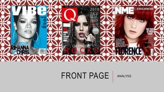
2. Masthead
The title of the
magazine, usually
formally placed at
the top left, or the
top. The font also
represents the
genre of hip hop
Direct Address
The directed audience of this
can vary. It may be directed
to young males as they may
see this as inspirational. Also
the colors and the capital
letters symbolise masculinity
and strength. Therefore
young boys may be
motivated to buy this
magazine to achieve this
body.
However, it may be appealing
towards females as he is in
the shower and is wet.
Therefore there are some
sexual connotations, which
may persuade females to
purchase the magazine.
Price
Barcode
Main Feature
Story
The main story in
the magazine,
which the picture
tends to relates
to.
Buzz Word
The use of the
colour red
represents
danger however
contrasts with
the background
Advertiseme
nt
The background of the
image is of bathroom
tiles which is similar to a
prison room, which gives
off the impression that
the artist is a hard
character, which works
well with the facial
expression and tattoos
3. Masthea
d
Price
Barcod
e
Main feature story
Hence how the feature story
of the magazine relates to
the image on the front
cover. Bright, bold, red
colours to match the
seductive and powerful side
There are different
interpretations of this front
cover. It is directed to both a
male and female audience. We
can see this because
immediately there are sexual
connotations to the image. The
singer Ciara is quite clearly
naked which agrees with the
ideology of the ‘male gaze’.
The idea that she is allowing
men to view her and she is
subsequently teasing by not
revealing anything.
Furthermore we can see that it
may influence girls as they may
feel motivated by the image
and the caption following it:
‘I’m not gonna hold back’. This
shows that her story may be
motivational which pushes
women to read on.
The nudity of the R&B artist
Ciara almost gives us a view
that she is hiding something
and the little amount of light
makes us want to find out
more. However the main image
contrasts with the buzz word
‘Stand up!’ this reveals that in
the main article she reveals
more about what she may
possibly be hiding
The brand identity we can see
through the colour scheme,
black, red and white/grey. The
magazine has a professional
look to it because the masthead
‘vibe’ has a fading effect into the
background. Also the titles and
subheadings are all quite close
together
The quote ‘I’m not gonna
hold back too much’
contradicts the image of her
as she is completely naked.
Therefore there is an
automatic wonder of what
there is to be revealed
The header
represents
additional
information about
the magazine
which leads us to
carry on reading
4. Masthead
The masthead is around a speech bubble or
text icon, which is what young teenage girls
enjoy doing. Texting or using social media
therefore this shall appeal to them because
this is what they enjoy doing. This helps to
identify the audience
Barcode/price/web
address
Main feature story
The main feature story is
a boy band talking about
love, ‘One Directions
Lessons In Love’, this is
clearly directed to young
female girls as they enjoy
reading about this
certain topic
The mode of address is clearly directed
to young teenage girls because of
different reasons. To begin with the
colour scheme, blue, hot pink, yellow
and white are upbeat colours they’re very
vibrant and outstanding. Pink is a very
girly colour (it means love or affection)
which would not normally be associated
The main feature story
is also right at the
front, central in bright
colours which will
immediately catch the
audiences eye
Exclusive
feature
Banner and a
free gift
6. This is clear indication that this is a
contents page because we can see
in large text it says ‘contents’ and
the background is black which
contrasts to the rest of the page
indicating exactly what it is. Also
the of the magazine ‘NME’ is a
different font to the rest of the font
on the page and also is a different
colour therefore highlighting
exactly that it’s a contents page
and the magazine is ‘NME’.
The main
feature
stories are
included here
The form of the contents gives off a harsh
effect, with the shapes being all rectangles, it
is more organized ordered and easy to
navigate. Which gives us an idea of the mode
of address as the magazine is about rock and
rock is a harsh sound therefore the layout of
this gives off a harsh effect. Furthermore the
brand identity is created with the three colour
scheme which also relates to the mode of
address using the three colours black, red and
white which connotates anger. This relates to
rock as again it is a loud harsh music and
rock artists tend to convey their passion for
music through aggression.
The anchors on the page show
which page the story is on which
makes it easier to navigate
They have separated different sections of
the magazine to make it easier to read
and easier for the readers to find exactly
what they want to read, also followed by
arrows from which was on the front page
so they know where to go
They have separated their
advertisement using different
sized font and different
colours, such as yellow and
white. They have also used a
black background which is
more eye catching and
appealing to the eye
They have put this in
front of a red
background so it stands
out more to the reader
7. Similar colour scheme to
the previous contents, the
use of colour here is used
to separate the different
sections. For example
‘features’ and ‘every
month’. Also to make
certain text stand out.
The ‘Oasis Special’ is in gold,
this therefore connotates
that it is a limited edition as
gold relates to royalty, or
presents which are things
received only at certain
times. Also it is called
‘special’ which also means it
is a one off and has a box
around it separating it from
the rest of the article.
The mise en scene of this image
is that they’re in a field standing
in a band structure, which may
lead the audience to think that
they’re at a music festival or a
concert which leads them to
read on. The image is very large
and dominating this
immediately allows the reader
to see the image as soon as
they open the page therefore
the reader can see exactly what
the magazine is going to
feature straight away
‘The worlds biggest and best
music guide’, there is also an
image beside it which shows
that the reviews have some
sort of importance
The every month
section shows that
the regular readers
can find the pages
they enjoy to read
8. The title ’contents’
and ‘Q’ are together in
front of a black
background, both are
different texts and
colours which catches
the readers eye and
shows the importance
of the magazineThe largest picture dominates
the page, and appeals to the
reader. The image takes up
most of the page showing that it
may be an interesting article,
and the anchor below shows a
sneak peak into what the article
is about
At the bottom of the page there is a
review and it has been separated from
the rest of the page by using a black
header with bold white text saying
‘review’, this draws the reader to the
text as it is separate from the rest of
In the bottom left
hand corner there
is an ‘every
month’ section
which helps
regular readers to
find exactly what
they enjoy reading
every month and
it is easier for
them to navigate
to the correct
page
10. Drop
capital
Large photo
on the left
Anchor
Copy in columns
Info box
Upcoming bands:
Different but linked,
e.g black not white,
separated by blue
Signifies teenagers in
their room, lazy. The
photos show what
goes through a
teenage boys mind,
‘girls’ – ‘filthy tunes’.
Sexual pun.
Parents décor out of
date, dreaming of
escape of their
everyday lives.
‘NME loves’, this will make
readers read on as a
professional magazine
company has almost
recommended/persuaded the
reader read on
The title is covering the
main image and matches the
text in the bottom right
corner and the top left which
catches the readers eye and
they continue reading on
The layout of the double page spread is
similar to other magazines, there is a
large image central and text on the right
hand side. We know the brand identity
through the colour scheme, blue, white
and black which again gives us an idea of
the mode of address. We know it is
directed to an audience of predominately
males because of the colours. We also
know it is specifically directed to young
teenage males because the main image
is a group of apparent ‘young’ males in
their bedroom thinking about as I spoke
about earlier the ‘sexual pun’ this then
leads young teenage male readers to
read on as they can relate to this
11. Large photo
on the left
Drop
capital
Copy in
capitals
Colour scheme
Black, orange,
grey
An alliteration in the top hand right
corner which makes the article fun and
gives us an insight of the artists
personality and what the article may
contain
More
image
s
The mention of other
artists draws the reader
in as everyone can relate
to her and see she is
quite famous. Also
‘meet our new girl
crush’ warms the article
as it puts a personal
feeling on the article
Relating to the other magazine we can see it is directed at young females
due to the genre of the magazine ‘pop’ and Jessie J is a large pop icon in
todays music world. Also we know it is aimed at young teenage girls
because as we can see there are headings and a smaller amount of text to
keep the reader amused as young females will not want to read a large
amount of information. Again the subheadings also help them as they
can only read the paragraphs they want to read making it simpler for
The colour scheme also
helps to understand
who it is aimed at. The
colours are an orange,
white and grey. This
gives off a calm
atmosphere and that
the article is quite calm
and not so intense
12. Large photo
shows main
feature story
The masthead of this
page is taking up most
of the page. It is two
contrasting fonts as we
can see followed by two
different colours. This
makes the article stand
out because it
immediately catches the
readers eye
The colour scheme of this magazine
is quite clearly pink and black with
different shades of pink. This gives
the magazine a feminine touch and
immediately we know it is aimed at
females. Also the main image is very
over powering and shows almost an
example of an independent woman.
She is giving off the idea that she
wants you to view her and read on
We can also see
that this is
aimed at young
teenage girls
because that is
who listens to
Nicki Minaj
Only one image has
been included it is
bright and colourful
and popping which
represents the genre
‘pop’ of the
magazine and the
artist is also wearing
a bright pink lipstick
to match the pink
colour scheme
The layout of the text is split up into
different sections each discussing a
different topic. This will appear to a
younger age range as they may not
want to read such large amount of text
therefore smaller amounts of texts
with key information is more appealing
to them. The subheadings also make it
easier to read as they can read certain
13. KEY TERMS/CONCEPTS
Form – formal, formulaic: format of page
Mise en scene – clothes, background etc and how they work together to create a mode of address
Mode of address
Convention
Connotation – ‘ this connotates’
Semiotics
Uses and gratifications – why/how do we use the media and how are we gratified (what do we get out of
it) by it?
4 things we get out of the media: entertainment, (escapism), information (knowledge is power), social
interaction (a large part of our lives) and personal identification (the media we consume tells us
something about our everyday life)
Maslow- dreams and aspirations never will be fulfilled, therefore the media sells dreams and aspirations
Brand Identity – three colour scheme, masthead, general design consistency
Exchange – Web 2.0, interactivity, we don’t just consume with the media anymore we engage with it and
create. (Interactivity)