Download to read offline

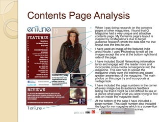
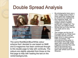

The document discusses how the media product challenges conventions of real indie magazines. Research was conducted on target markets and magazine formats. The front cover uses a unique masthead design and black and white photo. The contents page is inspired by Q Magazine's layout. Double page spreads use a vintage style and acoustic guitar images to reinforce the indie feel. Color schemes, photo editing, and social media integration are used to engage audiences and feel professionally indie.


