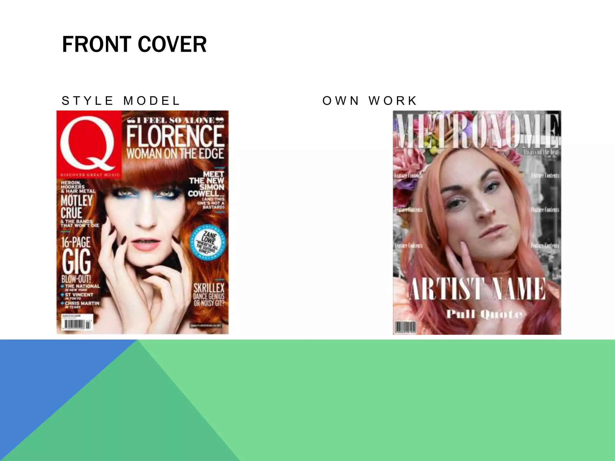
QUESTION
In what ways does your media product use, develop or
challenge forms and conventions of real media products?
FRONT COVER
S T Y L E M O D E L O W N W O R K
FRONT COVER
For the front cover of my music magazine I used Q as my style model, I
used this magazine and more particularly an artist specific front cover
for its use of typical conventions and main image.
When looking at my front cover I do not feel that I challenged any
conventions that are seen on front covers such as a masthead, barcode,
featured contents, slogan and a main image with direct address. These
are typical conventions that I have used on my cover page.
I used these typical conventions to create the impression of a magazine
from my front cover, I decided that if I were to challenge conventions on
the front cover it may not give the same impression to an audience as
one that uses conventions does.
CONTENTS PAGE
S T Y L E M O D E L O W N W O R K
CONTENTS PAGE
For my contents page I decided to use a fashion magazine as my style
model, despite doing this I have found that all the main conventions still
feature like they would on a music magazine contents page. I have also
found an example of a music magazine (VIBE) who used a similar layout
to what I decided to go with which supported my decision to go against
typical conventions.
I have been consistent and used my masthead as a logo for my magazine
including it at the bottom of my contents page. I have stuck with the
house-style of my magazine not straying from the black and white
theme. There is a clear indication of which page is used which is typical
for contents pages so that readers can see what page it is and I have
included one main image rather than a number of image with different
artists, by doing this I challenged a general convention of contents
pages however I have found a number of examples that have done this
as well.
OTHER STYLE-MODELS
DOUBLE PAGE SPREAD
S T Y L E M O D E L O W N W O R K
EXAMPLES OF DOUBLE PAGE SPREADS
OTHER STYLE MODELS
For my double page spread I decided to look at artist specific double page spreads
rather than a certain magazine, I did this because there was a number of artists
who I felt fit with the style that I wanted for my magazine, I chose an Indie Pop
genre for my magazine and used these artists for inspiration of how to layout my
double page spread.
I went against the more traditional convention of a bleeding image over two pages and
instead chose to have one side of text and one side of images, I chose to have a
number of images that is also less conventional as it gives more of an impression
of who the artist is before they read the article. I found a style model of Sloange
Knowles that uses a number of images of her on the double page spread, I used
this basis to create my image side. Originally I had planned a larger scale of the
diamond on Marina & The Diamonds double page spread however this idea was
too complicated to layout.
I used the conventional main feature image as well use of a stand first, main headline,
drop capital and three columns of text. I also ensured that I included my magazine
title on double page spread so that it was consistent.

Evaluation question 1

  • 2.
    QUESTION In what waysdoes your media product use, develop or challenge forms and conventions of real media products?
  • 3.
    FRONT COVER S TY L E M O D E L O W N W O R K
  • 4.
    FRONT COVER For thefront cover of my music magazine I used Q as my style model, I used this magazine and more particularly an artist specific front cover for its use of typical conventions and main image. When looking at my front cover I do not feel that I challenged any conventions that are seen on front covers such as a masthead, barcode, featured contents, slogan and a main image with direct address. These are typical conventions that I have used on my cover page. I used these typical conventions to create the impression of a magazine from my front cover, I decided that if I were to challenge conventions on the front cover it may not give the same impression to an audience as one that uses conventions does.
  • 5.
    CONTENTS PAGE S TY L E M O D E L O W N W O R K
  • 6.
    CONTENTS PAGE For mycontents page I decided to use a fashion magazine as my style model, despite doing this I have found that all the main conventions still feature like they would on a music magazine contents page. I have also found an example of a music magazine (VIBE) who used a similar layout to what I decided to go with which supported my decision to go against typical conventions. I have been consistent and used my masthead as a logo for my magazine including it at the bottom of my contents page. I have stuck with the house-style of my magazine not straying from the black and white theme. There is a clear indication of which page is used which is typical for contents pages so that readers can see what page it is and I have included one main image rather than a number of image with different artists, by doing this I challenged a general convention of contents pages however I have found a number of examples that have done this as well.
  • 7.
  • 8.
    DOUBLE PAGE SPREAD ST Y L E M O D E L O W N W O R K
  • 9.
    EXAMPLES OF DOUBLEPAGE SPREADS
  • 10.
    OTHER STYLE MODELS Formy double page spread I decided to look at artist specific double page spreads rather than a certain magazine, I did this because there was a number of artists who I felt fit with the style that I wanted for my magazine, I chose an Indie Pop genre for my magazine and used these artists for inspiration of how to layout my double page spread. I went against the more traditional convention of a bleeding image over two pages and instead chose to have one side of text and one side of images, I chose to have a number of images that is also less conventional as it gives more of an impression of who the artist is before they read the article. I found a style model of Sloange Knowles that uses a number of images of her on the double page spread, I used this basis to create my image side. Originally I had planned a larger scale of the diamond on Marina & The Diamonds double page spread however this idea was too complicated to layout. I used the conventional main feature image as well use of a stand first, main headline, drop capital and three columns of text. I also ensured that I included my magazine title on double page spread so that it was consistent.