
Recommended
More Related Content
What's hot
What's hot (20)
Viewers also liked
Viewers also liked (20)
Similar to Magazine deconstruction
Similar to Magazine deconstruction (20)
More from kendra20003
Recently uploaded
Recently uploaded (20)
Magazine deconstruction
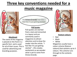
- 1. Three key conventions needed for a music magazine Masthead: The name of the magazine is placed on the front in a specific font and is used for all of their issues. This is used for advertising and branding purposes. Pull quote: Pull quotes are exerted from a text and reinserted in a layout and are commonly used in magazines to attract attention and to draw the reader into the article. “I feel like I’m just getting started “ , this creates excitement as we wonder what is yet to come from Ariana Grande. Feature colours: • Red • Black • White Magazines usually have a colour scheme (feature colours) that contains up to 3 colours. This scheme runs through to the contents page.
- 2. Deconstruction of a music magazine CLASH MAGAZINE
- 4. FEATURE COLOURS: • Black • White The colours above have been used as the main colours for the issue of CLASH to match and compliment the attire of the artist. The photograph that has been taken has dark lighting so the colour of the text (white ) brightens the image. White and black are the key colours used within media publications. BARCODE/ISSUE NUMBER : The barcode has been and is usually placed strategically to ensure the principal features are not distorted. The price is also placed by the side to prevent the price from being the principal feature. MASTHEAD: The masthead takes up ¼ of the magazine cover. It is placed at the top of the magazine so that is seen when placed in shop stands. The font is large , bold and in capitals to give emphasis to the magazine title. As the word CLASH sounds powerful. COVER LINES: The magazine doesn’t include any captions of what the article entails ; it gives a basic list of the content of the magazine such as Albums of the year. This could act as their UP as it causes the consumer to question what is within and as a result purchasing the magazine.ANCHOR: “BANKS , step in to the light” the anchor. This is used to help people interpret the photo in a way which links to the text. The image is quite dark which links to the idea of light which is within the text , it creates the idea that BANKS is becoming a well-known artist ,a public figure and her sound is being heard by many .whereas previously she was underground. ANGLE OF GAZE: The subject (the singer Banks) has a direct gaze towards the public which emphasises her confidence and creates a explicit connection between the target audience and the artist (BANKS) TARGET AUDIENCE : The magazine is aimed at mature audience ; people aged 17 and above. The magazine is also aimed at those who enjoy the music that Banks makes and have a interest in the music industry. the feature colours used (black and white ) are gender neutral which could suggest that the magazine is aimed at both genders. MISE-EN –SCENE: the artist on the front cover of this issue of CLASH is BANK an alternative R&B singer. The image of her is dark which reflects the sound of her music and the lyrics she creates. The dark image also reflect the month the issue was released (January). The photograph itself is intriguing which catch the eyes of many before they read the text. All of these features are being used to attract a specific audience into buying their music magazine.
- 5. Deconstruction of music magazine Billboard magazine
- 7. MASTHEAD: the masthead is placed on the left – hand side of the magazine vertically. To enable the image to be the focal point and also it suggests that the magazine is well-known without the masthead. ANCHOR: “ everything's working for the weekend” This phrase “ pins” the image to text. It also helps the readers to gain a understanding on the meaning of the photograph. The text suggest that the weekend has gained a lot of success which could mean that the angle of gaze could represent the idea that everything is looking up for him in the future. FEATURE COLOURS: • Blue • White These two colours are the key colours used throughout the front cover of the magazine. The colour blue is cool/relaxing which could represent his musical sound and his nature. The colour blue is also linked to confidence which the artist the weekend has. Blue is often stereotypically linked to males , this could be billboards way of attracting the male demographic. PULL QUOTE: the quote is used to entice the potential buyer to want to know more on how he is going to overcome the challenge and what experiences he has had in his new found stardom. DATE AND ISSUE NUMBER tells the year and month it was published and also the issue number ANGLE OF GAZE: The subject (Weekend) is looking at something other than the camera (away from the camera) and is gazing upwards and outside the frame which creates intrigue. (what is he looking at?) its quite affective which would cause the target audience to look at the content within as we are unable to gain eye contact with the image. Cover lines: there isn’t much text surrounding the image which keeps the focus on the photography. There is reference to music artists and streaming. The text is also justified The pull quote is larger in size to separate it from the cover lines. Boxed text to separate the other text and to make it less crowded.