This is my second magazine analysis of a general movie magazine, promoting comedy film, 'Anchorman 2'. I analysed this in order to find out more about conventions of general movie magazines, in order to help me when creating my own magazine.
How to Make a Field invisible in Odoo 17Celine George
It is possible to hide or invisible some fields in odoo. Commonly using “invisible” attribute in the field definition to invisible the fields. This slide will show how to make a field invisible in odoo 17.
The Indian economy is classified into different sectors to simplify the analysis and understanding of economic activities. For Class 10, it's essential to grasp the sectors of the Indian economy, understand their characteristics, and recognize their importance. This guide will provide detailed notes on the Sectors of the Indian Economy Class 10, using specific long-tail keywords to enhance comprehension.
For more information, visit-www.vavaclasses.com
Palestine last event orientationfvgnh .pptxRaedMohamed3
An EFL lesson about the current events in Palestine. It is intended to be for intermediate students who wish to increase their listening skills through a short lesson in power point.
The Roman Empire A Historical Colossus.pdfkaushalkr1407
The Roman Empire, a vast and enduring power, stands as one of history's most remarkable civilizations, leaving an indelible imprint on the world. It emerged from the Roman Republic, transitioning into an imperial powerhouse under the leadership of Augustus Caesar in 27 BCE. This transformation marked the beginning of an era defined by unprecedented territorial expansion, architectural marvels, and profound cultural influence.
The empire's roots lie in the city of Rome, founded, according to legend, by Romulus in 753 BCE. Over centuries, Rome evolved from a small settlement to a formidable republic, characterized by a complex political system with elected officials and checks on power. However, internal strife, class conflicts, and military ambitions paved the way for the end of the Republic. Julius Caesar’s dictatorship and subsequent assassination in 44 BCE created a power vacuum, leading to a civil war. Octavian, later Augustus, emerged victorious, heralding the Roman Empire’s birth.
Under Augustus, the empire experienced the Pax Romana, a 200-year period of relative peace and stability. Augustus reformed the military, established efficient administrative systems, and initiated grand construction projects. The empire's borders expanded, encompassing territories from Britain to Egypt and from Spain to the Euphrates. Roman legions, renowned for their discipline and engineering prowess, secured and maintained these vast territories, building roads, fortifications, and cities that facilitated control and integration.
The Roman Empire’s society was hierarchical, with a rigid class system. At the top were the patricians, wealthy elites who held significant political power. Below them were the plebeians, free citizens with limited political influence, and the vast numbers of slaves who formed the backbone of the economy. The family unit was central, governed by the paterfamilias, the male head who held absolute authority.
Culturally, the Romans were eclectic, absorbing and adapting elements from the civilizations they encountered, particularly the Greeks. Roman art, literature, and philosophy reflected this synthesis, creating a rich cultural tapestry. Latin, the Roman language, became the lingua franca of the Western world, influencing numerous modern languages.
Roman architecture and engineering achievements were monumental. They perfected the arch, vault, and dome, constructing enduring structures like the Colosseum, Pantheon, and aqueducts. These engineering marvels not only showcased Roman ingenuity but also served practical purposes, from public entertainment to water supply.
Welcome to TechSoup New Member Orientation and Q&A (May 2024).pdfTechSoup
In this webinar you will learn how your organization can access TechSoup's wide variety of product discount and donation programs. From hardware to software, we'll give you a tour of the tools available to help your nonprofit with productivity, collaboration, financial management, donor tracking, security, and more.
How to Create Map Views in the Odoo 17 ERPCeline George
The map views are useful for providing a geographical representation of data. They allow users to visualize and analyze the data in a more intuitive manner.
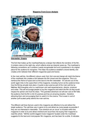
1. Magazine Front Cover Analysis
Interstellar - Empire
The font that makes up the masthead features a design that reflects the narrative of the film,
it contains stars on the night sky, which reflects what we interpret space as. The masthead is
following conventions as it contains it easily recognisable font and is positioned in its original
place for the audience to recognise. This helps the audience establish a brand identity and
creates a link between their different magazines (past and future).
In the main sell line, the different colours used, font, font size and design all match the theme
of the masthead, this creates a link between the film shown and the magazine. This is to
reinforce the theme of space and so link back to the film interstellar. ‘On set and out of this
world’ again links to the space them of the magazine, including humor as the audience know
how the filming actually took place. A quote is also used as part of the main sell line by
Matthew McConaughey who is a well known and well respected actor, director, producer
and writer. This will encourage people to buy the magazine and watch the film as they would
respect his opinion and trust his views. “The grandest adventure we will ever see on film”tells
the audience that the film is full of surprises and has an amazing storyline - therefore
attracting them and encouraging them to watch it in the cinema. This is seen in sort of
another puff located partly behind the main sell line.
The different sell lines that are used in this magazine are effective to try and attract the
target audience. The sell lines vary in genre to try and attract as many people as possible if
they are not interested in interstellar. “Can sherlock win an oscar” is included within this
magazine in order to try and attract sherlock and oscar fans into buying their magazine to
read this article. “Still the world's biggest movie magazine” located under the masthead
suggests it's the best and most popular film magazine, and has been for a while. It indicates
2. it is read by many people of a wide audience that they are able to attract through various sell
lines. The sell lines again are also trying to attract another audience through “Scariest movie
of the year revealed”. If you are not a fan of interstellar, a horror film is used to attract more
people to the magazine.
The puff is located in a place that covers up some of the masthead. This can be effectively
completed as they are so well known that their brand identity is still easily recognisable to
their target audience. The colours of the puff (silver and white) reflects the narrative of the
film as it is the same colour as the spacesuit the actor is wearing as the main image. In this
case, the puff is not promoting a sell line or an offer but rather that the magazine has been
sold for 25 years. This encourages the reader to buy the magazine as they feel they can
trust them.
The skyline “inside Christopher Nolan’s science-fiction masterpiece” is used again to
promote the main image and sell line. “Masterpiece” depicts to the audience how the film is
very advanced and would be fascinating to watch. The skyline is rather large in comparison
to other empire issues which can be seen as a way of promoting to the audience how good
they believe this film is. It is conventional to have a skyline is a film magazine.
The red banner at the bottom right hand side of the page regarding a different topic to
interstellar creates a huge contrast to the theme of the rest of the page as the tones and
colours are all blue white and grey tones, having a red banner at the bottom makes it clear to
the viewers that it is totally separate and isn't related to any of the interstellar content. This
will enable people to understand that there are more than one topics within this magazine so
if they aren't interested in interstellar then there is still some content that may interest them.
The red ensures they won't disregarded it and presume it’s related to interstellar, forcing
them to look at it.
In regards to the main image, the background is a snowy picture, which relates to the
narrative of the film as it is set on another planet to Earth. Again the white colour scheme is
used on his own costume as it reflects the character's innocence and purity to the audience.
The main image on this film magazine front cover is a medium close up shot. This allows the
characters costume to be part of the image as well as displaying the characters facial
expressions in detail. This shot is effectively used as we can see that the character looks
concerned about something, this will reflect the narrative that s partly displayed by his
costume.
Maleficent - Total Film
3. The masthead of this total film magazine is maintaining their usual brand identity by following
the conventions of where it is placed and the colors it is in. In this issue, the masthead has
been covered up by part of the image. This is because the mast head isn't as important as
the image, this is because the magazine is well known and the mast head will still be
recognisable to the target audience. Total film is such a big brand that the editors have more
freedom/creativity in terms of how they can design their covers, they don't need to display
the whole masthead as their brand is still recognisable.
It is conventional to have the main character of the film to feature on the front cover of a
magazine, this is why they have used an image of Maleficent on the cover. However this
isn't the only reason. Maleficent is played by Angelina Jolie who is a very famous hollywood
actress, this is likely to attract more people to view the film and by the magazine as she is
easily recognisable to the audience. The audience may want to know what new film she is in
and what character she plays to require her to be seen in that makeup and costume. Direct
address is another common convention that features in this image, this is where the image is
looking at the audience. This makes them feel directly targeted by the actress herself and
will encourage impulse buyers to buy the magazine. The image of Maleficent is a mid shot,
this enables her head wear and costume worn on her upper body to all be in shot. However
as her costume is a very similar colour to the background it almost blends in, drawing very
little attention to the details of her costume. This leads our attention to be draw to the face of
the character, as it is a totally different colour which is white and stands out due to how
bright it is. The reason for this is because it is another way of drawing the audience to the
face of the character and enabling them to recognise that it is Angelina Jolie, which attracts
more people to the magazine.
The background of the main image is meant to resemble the set of the film in which it is
located. The character lives in a woodland area and when mist falls on the forest during the
4. night, what you would see resembles the background to this image. As well as this, the
blurry background not only resembles the forest but also reflects the mystery that features in
the narrative of the film.
The skyline that is located at the top of the page above the masthead says “massive epic
movie preview”, this is located here as it is another way of getting the attention of the
audience. “Epic” is used to draw the audience in and help them make a decision on the film
based on the reviews - in this case it is epic. The word “preview” suggests they will be
seeing this content before other people, and the buzz words “massive” and “epic” also make
the strap line more interesting for the audience.
The main sell line “epic blockbuster issue” again features the word “epic” which is a
buzzword and is used to showcase the film and attract the target audience. Conventionally,
it is the largest piece of text on the page other than the mast head which will immediately
draw the reader's eye to it and encourage them to read it. The color scheme of the main sell
line is similar to the rest of the page, white and blue. This helps the sell line remain part of
the film as is still relates to the main image.
There are more sell lines located underneath the banner which are again used to promote
other films in this issue. They are all arranged together and are a smaller text compared to
the other sell lines. This is done as it ensures that people are aware that the content on
Maleficent is more important to the magazine, however there is still more content on other
topics/films. For example, 'Avengers: Age of Ultron', sin city 2 and more information on
'Interstellar'. Although these are included, they are in a smaller more basic font than the
strap line and masthead are, which suggests that they are not the main attraction.
A sell line promoting godzilla is larger than these as they are promoting it more. This is easily
recognisable when you compare their location within the page. The godzilla sell line is in a
conventional place, however, the other less important films are not. The godzilla film sell line
is located in an important place when looking at the rule of thirds and z line formations. This
helps draw the reader into the magazine and will encourage them to purchase this issue.
The banner that is located underneath the main sell line is used again to stand out on the
page and attract the target audience. It is used to promote additional content to the reader
and so create an illusion that they are receiving more for their money. The colour of this
banner which is yellow is specifically prominent. This is the case as it will draw the eye to
this part of the page next.
The puff is conventionally used in this issue to promote what else is inside the magazine. As
previously mentioned, this is used effectively as it will give a false impression that there's
5. more content than there actually is in the magazine. The colour of the puff again fits in with
the rest of their magazine bt also effectively stands out on the background of the main
image.
As the color scheme reflects the film narrative maleficent. It is a disney film with a storyline
surrounding magic and mysterious creatures, the front cover has been designed to reflect
this and the colours play the biggest part in this. Furthermore, throughout the film she
becomes a relatively scary and unpredictable character. There are also a fair amount of dark
tones on the front cover of this magazine as well, these are meant to reflect the her darkside
that evolves throughout the narrative of the film.
The front cover has a focus on the film Maleficent, however when analysing, I noticed there
is some content on the cover that isn't related to the film Maleficent. This has be singled out
from the film as it has attention drawn to it by creating a contrast in the colours of content
relating to Maleficent and the colors of content not. Everything that is not related to
Maleficent is yellow, there is no content on Maleficent that is yellow, they have been kept
totally separate for the reader ease when reading.
Captain America The Winter Soldier Cover - Empire
6. Again, following conventions, this empire magazine's masthead is located at the top of the
page in a bold standout font. It is the same colours and font used on each magazine which
maintains brand identity and attracts their target audience to buy the magazine. The colours
used in this masthead in this issue directly relate to the film being promoted. Captain
America’s shield features lots of red which creates a link with the masthead.
In the main sell line that has been provided, buzz words such as ‘limited’ has been used
singly to attract the target audience and create lots of attention to this film in particular. This
sell line is in silver as it links with the metallic background that we can see behind the image
of Captain America, it also links in with his metal shield. The main sell line is located in a
conventional place in the fact of the height of it. It is positioned however to the left of the
image to try and make the image more attracting to the audience and to make them want to
look at the full image. This is also because the shield is located here and it is very important
to the narrative of the film, and so it should not be covered.
A puff is used in this issue to promote that this is a 25 year anniversary for the company.
This is used specifically to try and encourage the reader to buy the magazine as they will
see it is being truthful and of a good quality if people have been buying it for 25 years. The
location of the puff is important here as they did not want to cover any of the image - as
7. previously mentioned with the sell lines. It is located over the masthead as the brand is still
easily recognisable and aso would not affect the target audience. Again the puff is also
located in silver which fits in nicely with the metallic background, this creates a link between
the magazine and the film which is being featured.
Now in regards to the presentation of this magazine front cover, it is different from previous
and newer issues that have come out since. Usually Empire have a glossy or shiny finish to
their covers but this one is matte. This is because matt is generally seen to be more
expensive and as this addition is a special edition celebrating the 25th anniversary it makes
it look more of a luxury item.
When analysing the colours on this magazine front cover, the puff and the sell line as
previously mentioned are in a silver colour. This matches the silver on Captain America's
costume and shield as well as the background - this is creating a symbiotic link between the
film and the magazine. The silver used also connotes luxury which goes hand in hang with
the matt finish and celebrating the 25th anniversary. Also, The masthead, exclusive sell line
and parts of his shield are all red, red has connotations of danger and violence. Super heros
often are dressed in red for this reason as it excites the audience and encourages them to
watch the film.
For the main image, unconventionally three characters from the film have been used. In
regards to positioning, Captain America is positioned in the centre at the front so it is clear
that he is the most important character in the film. A medium long shot has been used so
that his whole outfit and shield are on show, making it easier for people to recognise him as
the very popular marvel superhero. The shot is taken from a relatively low angle and he is
looking slightly down upon the camera, this reflects his dominance and power he has over
the normal person. Although he is wearing a mask, it is a relatively revealing mask, leaving a
lot of his face uncovered and on show, this implies he has nothing to hide and is an good
character in the narrative of the film. He has his shield on the floor in front of him, this
suggests that he wishes for his shield to be on show and noticeable however he doesn't feel
threatened as he is not holding it in front of him. The star on the shield which is has chosen
to have on display reflects the american flag and the fact he is american - this is used a a
signal of hope for the americans who watch this film.