SlideShare a Scribd company logo
How effective is the combination of my main product and
ancillary texts
 A film distributor makes the decisions about the marketing
strategy, the media that the audience will be able to view the
movie on and the release date of cinema screening and home
viewing/DVD. Films can be shown to the public in various ways,
most commonly films that are thought will be popular amongst
the majority of the population will be shown in cinemas;
whereas other films, possibly with lower budgets will go straight
to DVD release. They also come up with a marketing plan of how
to promote the film and to what target demographics.
 Promoting the film is vital to attracting customers and social
media has now become a big part of marketing campaigns.
Posters can now be shared on Twitter, Facebook and Instagram.
Magazines can now be viewed online, which again can also be
seen on social media platforms. As well as this, YouTube is
usually the biggest promoting website for films as people can
easily view the trailer. Social media creates a larger audience and
a bigger reach of consumers that will view the products.
 The movie is based on a short book written by J.K. Rowling (Harry Potter) but it was presented
as a guide book written by Newt Scamander. The textbook is referenced briefly in one of the
Harry Potter books; which was in fact, the leading selling point throughout advertising and
promotion.
 The marketing was very well planned and thought out. It was emphasised that the movie was a
prequel of the Harry Potter sequels, which would have attracted fans of the movie of all ages
and genders; despite it being a film typically aimed towards the younger generation.
 There were a series of teaser posters released as well as teaser trailers to build up the release of
the film. There were also character posters released to allow the audience to identify with the
characters before watching the film; something that is not usually done.
 Due to the film being released by Warner Bros. it meant that it got a lot of promotion and
marketing, possibly more than the average film. For example, the movie received plenty of
social network advertising and also used the movie as a way to become the first studio to buy
into Twitter’s Promoted Stickers ad and used Promoted Hashtags that turned specific ‘hash-
tagged’ words into emoji on the network. Further Twitter integration allowed people to type in
special commands to unlock clips of unseen footage.
 The main theme was that the studio is expanding the Harry Potter world into this new franchise
and trying to persuade fans of Harry Potter to join, as well as bring new ones. Although, the
posters, trailers and social network promotion didn’t reveal much about the actual narrative it
was about being taken on a ‘magical journey’ and being brought into the crazy world of magic.
This, however, is what enticed viewers to watch the film and made it become a success; leading
to the next five films in the series.
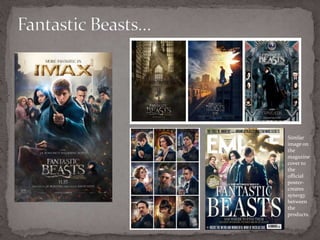
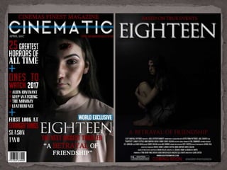
Similar
image on
the
magazine
cover to
the
official
poster-
creates
synergy
between
the
products.
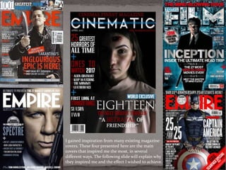
I gained inspiration from many existing magazine
covers. These four presented here are the main
covers that inspired me the most, in several
different ways. The following slide will explain why
they inspired me and the effect I wished to achieve.
 Whilst designing my magazine cover I looked at existing media texts to aid me when making my own magazine cover. I was
able to gain inspiration from many different magazines, which helped me to create a professional-looking cover.
 Mastheads are an important feature on a magazine cover, therefore I looked at existing mastheads. Although, my masthead is
different compared to Total Film and Empire it still has similarities. For example, the use of sans serif font and the white text
on a dark background (James Bond Cover). I thought this made the masthead standout compared to the other text on the
cover; this is complemented by a blue strip going through the masthead, to make it even more eye-catching.
 The colour scheme of these existing media texts also heavily influenced my own colour scheme on my cover. The Total Film
cover and the Empire covers are similar to my own, in terms of the colour scheme used. I used red and black as they
connote horror and evil; these colours were also used on my poster and within the trailer; keeping unity between the
products and showing a clear connection. The shade of red used within all three products are also the same as I
wanted it to be clear they were all promoting the same product. However I decided to add another colour to make
the magazine standout. I decided to use blue, like on all four of the covers the because it is complimentary with the
red and is also used on many professional magazines. Adding another colour also makes it easier for the audience to
read and would attract a more general audience. Although, the magazine is a ‘horror edition’ I would still need to
consider all the other consumers that would normally purchase the magazine; therefore including the blue makes it
more appealing to those who are not overly interested on the horror genre, but at the same time it would appeal to
those who like the genre. This makes the product available to a larger target audience.
 The composition of the image and cover lines was inspired by the Empire magazines (James Bond in particular) as I
thought these were simple yet effective. The cover lines also framed the face of the model, which made her stand out
more; something that would attract customers. The cover lines were also similar to the Captain America cover in
regards of the styles of font used. The Captain America cover shows several different fonts, some bold and some
smaller; this makes parts of the text standout to the readers which is what I also wanted to achieve. Additionally,
using different fonts makes the cover more interesting and aesthetically pleasing to look at. Moreover, I wanted the
main cover line (Eighteen) to be in completely different font (Total Film Cover) as this would show that the main
selling point is the film. Additionally, the main cover line is the same font used in both my poster and trailer; again
creating synergy and letting consumers know they are all connected.
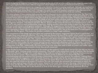
 I also decided to have a medium close up of the model so the audience could clearly see her face but also see her top
as this pink, ‘girly’ clothing would connote innocence. The model is also using direct mode of address, like the James
Bond cover, because I thought this would appeal to the audience and give them an ‘eerie’ feeling almost as you can
clearly see she is a victim. Many magazine covers use direct mode of address as it is almost like they are
communicating with the audience and forming a relationship; which in turn, attracts the audience, making them
want to purchase the magazine. I used the main character, who would also be the most popular amongst the viewers
as she is the victim, on the front cover; again relating to the James Bind cover as he is also a well known character. I
have also used the victim on my poster to reinforce her role; this would also persuade the consumers to watch the
trailer as they want to know why she is the victim. However, the trailer does not give this away, which would then
make them see the film. This uniformed marketing is the most persuasive way to get the audience to go see the final
product. Within the trailer, she is also featured in most of the shots; again creating synergy between all of my
products.
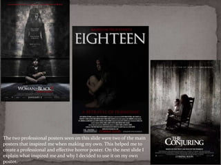
The two professional posters seen on this slide were two of the main
posters that inspired me when making my own. This helped me to
create a professional and effective horror poster. On the next slide I
explain what inspired me and why I decided to use it on my own
poster.
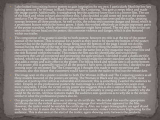
 I also looked into exiting horror posters to gain inspiration for my own. I particularly liked the low-key
lighting seen on The Woman in Black Poster and The Conjuring. This gave a creepy effect and made
the image scarier. Additionally, it straightaway lets the audience know that it is a horror film. The use
of the black and white colours also reinforce this. I also decided to add some red text on the poster,
similar to The Woman in Black one; this relates back to the magazine cover and the trailer, creating
synergy between all three products. As well as this, the colour red connotes danger and blood, which is
a prominent feature within the horror genre. I think this worked effectively as it made important parts
of the poster standout, which otherwise the audience might have missed. The red also links to the cut
seen on the victims head on the poster; this connotes violence and danger, which is also featured
within our trailer.
 The composition of my poster is similar to both posters; however my title is at the top of the poster
instead of the bottom. This is unusual for a poster as they tend to be nearer the bottom of the poster;
however due to the main part of the image being near the bottom of the page I could not do this.
Instead having the title at the top of the page makes it the first thing the audience sees; possibly
attracting them more. Additionally, the title is also the same font as the magazine main cover line and
the title featured within the trailer. This makes the film quickly identifiable and would show
consumers they are all connected and promoting the same product. I decided to add a duplicate title
behind, which was slightly faded as I thought this would make the poster standout and memorable. It
also adds a creepy and scary effect to the poster. The billing block and release date is all at the bottom
of the poster; this is generally typical of all the posters I have seen. In addition to this, I decided to put
‘coming soon’ on my poster like The Conjuring as I thought this made it more mysterious and
ominous; also this meant that customers would have to watch the trailer to find out the release date.
 The image seen on the e poster is similar to both The Woman in Black and The Conjuring posters as all
three models featured on the posters are sitting. The Woman in Black and my poster are the most
similar as it portrays the victim as vulnerable and innocent; this is something I wanted the audience to
infer. Despite on the professional posters the main image is a child, which makes hem seem even
more vulnerable, I think the victim on my poster also suggests this as she is almost child-like in the
way she is huddled in a corner; this could suggest her personality is young and naive; possibly why she
could be the victim. All these features makes the audience asks questions as to why she is the victim;
similar to what the professional posters also do.
 Our group decided we would give our trailer an 18 certificate. We decided this was the appropriate
certificate due to the violent scenes and strong language that would have appeared in the film.
However, the trailer would be suitable for certificate 15. Also, our target demographic are aged 18 and
over. Also the fact it states that the film is based on true events, makes it even more frightening for the
audience. This is also seen at the start of the trailer; again showing unity between the products
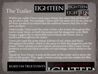
 Within my trailer I have used many things that show that all three of
my products link. For example, I have used the same text for my title on
all three products to ensure that the audience knows that this is the
same product.
 Additionally, I have used the main victim, who is seen throughout the
trailer many times, on both the poster and the magazine cover. Both
images suggest she is vulnerable and is clearly the victim; this is
reinforced throughout the trailer.
 I have also used the same colour scheme of red, white and black
throughout the trailer, which is also seen on both the magazine and the
poster. These colours are also typical colours seen within many horror
products as red and black connote evil and danger, which relates to the
genre.
 ‘Based on True Events’ is seen at the start of the trailer and is above the
title on the poster. This, again, creates synergy and also makes the film
seem even more scary.
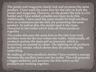
 The poster and magazine clearly link and promote the same
product. I have used the same font for the title on both the
poster and magazine. However, on the poster the title is a lot
bolder and I have added a double text layer to do this.
Additionally, I have used the same model for both ancillary
texts so consumers can see they are promoting the same
product. As well as this, the model used is the main
character in the trailer which links all three products
together.
 The trailer also uses the same font as the title from both
ancillary texts for the text within the trailer. Additionally, all
products portray the main girl as innocent; which is
something we wanted to create. The lighting on all products
is also very similar, which shows they are promoting the
same thing.
 By making all three products similar I have created a synergy
between the ancillary texts and the trailer. This will generate
a bigger audience and promote the film better as the
products are working together.

More Related Content

What's hot

Cohesive Marketing
Cohesive Marketing Cohesive Marketing
Cohesive Marketing
katherinemedia
 
Evaluation, Question one - Poster
Evaluation, Question one - PosterEvaluation, Question one - Poster
Evaluation, Question one - Poster
rachie1234
 
The perfect pr 2
The perfect  pr 2The perfect  pr 2
The perfect pr 2
shanneal
 
Unfriended website
Unfriended websiteUnfriended website
Unfriended website
katherinemedia
 
Evaluation, Question one - Poster
Evaluation, Question one - PosterEvaluation, Question one - Poster
Evaluation, Question one - Poster
rachie1234
 
Advanced Portfolio Evaluation
Advanced Portfolio EvaluationAdvanced Portfolio Evaluation
Advanced Portfolio Evaluation
TreySongz
 
Media Evaluation
Media EvaluationMedia Evaluation
Media Evaluation
Christina
 
Shutter island
Shutter islandShutter island
Shutter island
shanneal
 
Research into billboard advertisements
Research into billboard advertisementsResearch into billboard advertisements
Research into billboard advertisements
09higginsa
 
Media Evaluation
Media EvaluationMedia Evaluation
Media Evaluation
John Wood
 
How effective is the combination of your main product and ancillary texts?
How effective is the combination of your main product and ancillary texts?How effective is the combination of your main product and ancillary texts?
How effective is the combination of your main product and ancillary texts?
jordangriffin1
 
Question One Evaluation
Question One EvaluationQuestion One Evaluation
Question One Evaluation
AlexandraIAwalsh
 
First question
First question First question
First question
ellad96
 
What I have learnt from my research
What I have learnt from my researchWhat I have learnt from my research
What I have learnt from my research
taliadonoghue
 
Evaluation question 2
Evaluation question 2Evaluation question 2
Evaluation question 2
OC11134
 
Evaluation question 1 more added
Evaluation question 1 more addedEvaluation question 1 more added
Evaluation question 1 more added
ChezInspireMe
 
Evaluation question 2
Evaluation question 2Evaluation question 2
Evaluation question 2
OC11134
 
Evaluation powerpoint
Evaluation powerpointEvaluation powerpoint
Evaluation powerpoint
UniqueName
 
Advanced Portfolio Evaluation
Advanced Portfolio Evaluation Advanced Portfolio Evaluation
Advanced Portfolio Evaluation
guest90963e8d
 
Question 2
Question 2Question 2
Question 2
hththththt
 

What's hot (20)

Cohesive Marketing
Cohesive Marketing Cohesive Marketing
Cohesive Marketing
 
Evaluation, Question one - Poster
Evaluation, Question one - PosterEvaluation, Question one - Poster
Evaluation, Question one - Poster
 
The perfect pr 2
The perfect  pr 2The perfect  pr 2
The perfect pr 2
 
Unfriended website
Unfriended websiteUnfriended website
Unfriended website
 
Evaluation, Question one - Poster
Evaluation, Question one - PosterEvaluation, Question one - Poster
Evaluation, Question one - Poster
 
Advanced Portfolio Evaluation
Advanced Portfolio EvaluationAdvanced Portfolio Evaluation
Advanced Portfolio Evaluation
 
Media Evaluation
Media EvaluationMedia Evaluation
Media Evaluation
 
Shutter island
Shutter islandShutter island
Shutter island
 
Research into billboard advertisements
Research into billboard advertisementsResearch into billboard advertisements
Research into billboard advertisements
 
Media Evaluation
Media EvaluationMedia Evaluation
Media Evaluation
 
How effective is the combination of your main product and ancillary texts?
How effective is the combination of your main product and ancillary texts?How effective is the combination of your main product and ancillary texts?
How effective is the combination of your main product and ancillary texts?
 
Question One Evaluation
Question One EvaluationQuestion One Evaluation
Question One Evaluation
 
First question
First question First question
First question
 
What I have learnt from my research
What I have learnt from my researchWhat I have learnt from my research
What I have learnt from my research
 
Evaluation question 2
Evaluation question 2Evaluation question 2
Evaluation question 2
 
Evaluation question 1 more added
Evaluation question 1 more addedEvaluation question 1 more added
Evaluation question 1 more added
 
Evaluation question 2
Evaluation question 2Evaluation question 2
Evaluation question 2
 
Evaluation powerpoint
Evaluation powerpointEvaluation powerpoint
Evaluation powerpoint
 
Advanced Portfolio Evaluation
Advanced Portfolio Evaluation Advanced Portfolio Evaluation
Advanced Portfolio Evaluation
 
Question 2
Question 2Question 2
Question 2
 

Similar to Question 2

Question 2
Question 2Question 2
Question 2
Sienna_Cumby
 
Question 2
Question 2Question 2
Question 2
Sienna_Cumby
 
Question 1
Question 1Question 1
Question 1
Heeral Patel
 
Evaluation Question 2 Redone
Evaluation Question 2 RedoneEvaluation Question 2 Redone
Evaluation Question 2 Redone
emmachilton
 
Q2
Q2Q2
Q2
Q2Q2
Evaluation
EvaluationEvaluation
Evaluation
EllaRoseMedia
 
Evaluation 2
Evaluation 2Evaluation 2
Evaluation 2
Crystalle Cox
 
Q2
Q2Q2
Evaluation question 2
Evaluation question 2Evaluation question 2
Evaluation question 2
matt perki
 
Question 2
Question 2 Question 2
Question 2
charlottepl
 
Media Evaluation Presentation Complete
Media Evaluation Presentation CompleteMedia Evaluation Presentation Complete
Media Evaluation Presentation Complete
Christina
 
2. How effective is the combination of your main product and ancillary texts?
2. How effective is the combination of your main product and ancillary texts?2. How effective is the combination of your main product and ancillary texts?
2. How effective is the combination of your main product and ancillary texts?
Khari Holland
 
Question 2
Question 2Question 2
Question 2
Shauna-Mullen
 
Eval question 1 part two
Eval question 1 part twoEval question 1 part two
Eval question 1 part two
8210_SK
 
Media evaluation
Media evaluationMedia evaluation
Media evaluation
MaxSchofield1
 
Evalution
EvalutionEvalution
Evalution
benjamib1130
 
Media Evaluation: Question 1 & 2
Media Evaluation: Question 1 & 2 Media Evaluation: Question 1 & 2
Media Evaluation: Question 1 & 2
JoeTheJaxon1997
 
Evaluation
EvaluationEvaluation
Evaluation Question 2
Evaluation Question 2Evaluation Question 2
Evaluation Question 2
sophieoldman
 

Similar to Question 2 (20)

Question 2
Question 2Question 2
Question 2
 
Question 2
Question 2Question 2
Question 2
 
Question 1
Question 1Question 1
Question 1
 
Evaluation Question 2 Redone
Evaluation Question 2 RedoneEvaluation Question 2 Redone
Evaluation Question 2 Redone
 
Q2
Q2Q2
Q2
 
Q2
Q2Q2
Q2
 
Evaluation
EvaluationEvaluation
Evaluation
 
Evaluation 2
Evaluation 2Evaluation 2
Evaluation 2
 
Q2
Q2Q2
Q2
 
Evaluation question 2
Evaluation question 2Evaluation question 2
Evaluation question 2
 
Question 2
Question 2 Question 2
Question 2
 
Media Evaluation Presentation Complete
Media Evaluation Presentation CompleteMedia Evaluation Presentation Complete
Media Evaluation Presentation Complete
 
2. How effective is the combination of your main product and ancillary texts?
2. How effective is the combination of your main product and ancillary texts?2. How effective is the combination of your main product and ancillary texts?
2. How effective is the combination of your main product and ancillary texts?
 
Question 2
Question 2Question 2
Question 2
 
Eval question 1 part two
Eval question 1 part twoEval question 1 part two
Eval question 1 part two
 
Media evaluation
Media evaluationMedia evaluation
Media evaluation
 
Evalution
EvalutionEvalution
Evalution
 
Media Evaluation: Question 1 & 2
Media Evaluation: Question 1 & 2 Media Evaluation: Question 1 & 2
Media Evaluation: Question 1 & 2
 
Evaluation
EvaluationEvaluation
Evaluation
 
Evaluation Question 2
Evaluation Question 2Evaluation Question 2
Evaluation Question 2
 

More from Sienna_Cumby

Q 3
Q 3Q 3
Representation of women
Representation of womenRepresentation of women
Representation of women
Sienna_Cumby
 
Q 3
Q 3Q 3
Survey results
Survey resultsSurvey results
Survey results
Sienna_Cumby
 
Representation of women
Representation of womenRepresentation of women
Representation of women
Sienna_Cumby
 
Target audience
Target audienceTarget audience
Target audience
Sienna_Cumby
 
Survey results
Survey resultsSurvey results
Survey results
Sienna_Cumby
 
Magazine Publishers
Magazine PublishersMagazine Publishers
Magazine Publishers
Sienna_Cumby
 
Magazine industry
Magazine industryMagazine industry
Magazine industry
Sienna_Cumby
 
College Magazine Survey Results
College Magazine Survey ResultsCollege Magazine Survey Results
College Magazine Survey Results
Sienna_Cumby
 

More from Sienna_Cumby (10)

Q 3
Q 3Q 3
Q 3
 
Representation of women
Representation of womenRepresentation of women
Representation of women
 
Q 3
Q 3Q 3
Q 3
 
Survey results
Survey resultsSurvey results
Survey results
 
Representation of women
Representation of womenRepresentation of women
Representation of women
 
Target audience
Target audienceTarget audience
Target audience
 
Survey results
Survey resultsSurvey results
Survey results
 
Magazine Publishers
Magazine PublishersMagazine Publishers
Magazine Publishers
 
Magazine industry
Magazine industryMagazine industry
Magazine industry
 
College Magazine Survey Results
College Magazine Survey ResultsCollege Magazine Survey Results
College Magazine Survey Results
 

Recently uploaded

How to Fix the Import Error in the Odoo 17
How to Fix the Import Error in the Odoo 17How to Fix the Import Error in the Odoo 17
How to Fix the Import Error in the Odoo 17
Celine George
 
ISO/IEC 27001, ISO/IEC 42001, and GDPR: Best Practices for Implementation and...
ISO/IEC 27001, ISO/IEC 42001, and GDPR: Best Practices for Implementation and...ISO/IEC 27001, ISO/IEC 42001, and GDPR: Best Practices for Implementation and...
ISO/IEC 27001, ISO/IEC 42001, and GDPR: Best Practices for Implementation and...
PECB
 
C1 Rubenstein AP HuG xxxxxxxxxxxxxx.pptx
C1 Rubenstein AP HuG xxxxxxxxxxxxxx.pptxC1 Rubenstein AP HuG xxxxxxxxxxxxxx.pptx
C1 Rubenstein AP HuG xxxxxxxxxxxxxx.pptx
mulvey2
 
বাংলাদেশ অর্থনৈতিক সমীক্ষা (Economic Review) ২০২৪ UJS App.pdf
বাংলাদেশ অর্থনৈতিক সমীক্ষা (Economic Review) ২০২৪ UJS App.pdfবাংলাদেশ অর্থনৈতিক সমীক্ষা (Economic Review) ২০২৪ UJS App.pdf
বাংলাদেশ অর্থনৈতিক সমীক্ষা (Economic Review) ২০২৪ UJS App.pdf
eBook.com.bd (প্রয়োজনীয় বাংলা বই)
 
Exploiting Artificial Intelligence for Empowering Researchers and Faculty, In...
Exploiting Artificial Intelligence for Empowering Researchers and Faculty, In...Exploiting Artificial Intelligence for Empowering Researchers and Faculty, In...
Exploiting Artificial Intelligence for Empowering Researchers and Faculty, In...
Dr. Vinod Kumar Kanvaria
 
PCOS corelations and management through Ayurveda.
PCOS corelations and management through Ayurveda.PCOS corelations and management through Ayurveda.
PCOS corelations and management through Ayurveda.
Dr. Shivangi Singh Parihar
 
writing about opinions about Australia the movie
writing about opinions about Australia the moviewriting about opinions about Australia the movie
writing about opinions about Australia the movie
Nicholas Montgomery
 
Chapter 4 - Islamic Financial Institutions in Malaysia.pptx
Chapter 4 - Islamic Financial Institutions in Malaysia.pptxChapter 4 - Islamic Financial Institutions in Malaysia.pptx
Chapter 4 - Islamic Financial Institutions in Malaysia.pptx
Mohd Adib Abd Muin, Senior Lecturer at Universiti Utara Malaysia
 
Smart-Money for SMC traders good time and ICT
Smart-Money for SMC traders good time and ICTSmart-Money for SMC traders good time and ICT
Smart-Money for SMC traders good time and ICT
simonomuemu
 
The simplified electron and muon model, Oscillating Spacetime: The Foundation...
The simplified electron and muon model, Oscillating Spacetime: The Foundation...The simplified electron and muon model, Oscillating Spacetime: The Foundation...
The simplified electron and muon model, Oscillating Spacetime: The Foundation...
RitikBhardwaj56
 
Digital Artifact 1 - 10VCD Environments Unit
Digital Artifact 1 - 10VCD Environments UnitDigital Artifact 1 - 10VCD Environments Unit
Digital Artifact 1 - 10VCD Environments Unit
chanes7
 
How to Make a Field Mandatory in Odoo 17
How to Make a Field Mandatory in Odoo 17How to Make a Field Mandatory in Odoo 17
How to Make a Field Mandatory in Odoo 17
Celine George
 
Liberal Approach to the Study of Indian Politics.pdf
Liberal Approach to the Study of Indian Politics.pdfLiberal Approach to the Study of Indian Politics.pdf
Liberal Approach to the Study of Indian Politics.pdf
WaniBasim
 
How to Setup Warehouse & Location in Odoo 17 Inventory
How to Setup Warehouse & Location in Odoo 17 InventoryHow to Setup Warehouse & Location in Odoo 17 Inventory
How to Setup Warehouse & Location in Odoo 17 Inventory
Celine George
 
South African Journal of Science: Writing with integrity workshop (2024)
South African Journal of Science: Writing with integrity workshop (2024)South African Journal of Science: Writing with integrity workshop (2024)
South African Journal of Science: Writing with integrity workshop (2024)
Academy of Science of South Africa
 
Natural birth techniques - Mrs.Akanksha Trivedi Rama University
Natural birth techniques - Mrs.Akanksha Trivedi Rama UniversityNatural birth techniques - Mrs.Akanksha Trivedi Rama University
Natural birth techniques - Mrs.Akanksha Trivedi Rama University
Akanksha trivedi rama nursing college kanpur.
 
What is Digital Literacy? A guest blog from Andy McLaughlin, University of Ab...
What is Digital Literacy? A guest blog from Andy McLaughlin, University of Ab...What is Digital Literacy? A guest blog from Andy McLaughlin, University of Ab...
What is Digital Literacy? A guest blog from Andy McLaughlin, University of Ab...
GeorgeMilliken2
 
S1-Introduction-Biopesticides in ICM.pptx
S1-Introduction-Biopesticides in ICM.pptxS1-Introduction-Biopesticides in ICM.pptx
S1-Introduction-Biopesticides in ICM.pptx
tarandeep35
 
Life upper-Intermediate B2 Workbook for student
Life upper-Intermediate B2 Workbook for studentLife upper-Intermediate B2 Workbook for student
Life upper-Intermediate B2 Workbook for student
NgcHiNguyn25
 
MARY JANE WILSON, A “BOA MÃE” .
MARY JANE WILSON, A “BOA MÃE”           .MARY JANE WILSON, A “BOA MÃE”           .
MARY JANE WILSON, A “BOA MÃE” .
Colégio Santa Teresinha
 

Recently uploaded (20)

How to Fix the Import Error in the Odoo 17
How to Fix the Import Error in the Odoo 17How to Fix the Import Error in the Odoo 17
How to Fix the Import Error in the Odoo 17
 
ISO/IEC 27001, ISO/IEC 42001, and GDPR: Best Practices for Implementation and...
ISO/IEC 27001, ISO/IEC 42001, and GDPR: Best Practices for Implementation and...ISO/IEC 27001, ISO/IEC 42001, and GDPR: Best Practices for Implementation and...
ISO/IEC 27001, ISO/IEC 42001, and GDPR: Best Practices for Implementation and...
 
C1 Rubenstein AP HuG xxxxxxxxxxxxxx.pptx
C1 Rubenstein AP HuG xxxxxxxxxxxxxx.pptxC1 Rubenstein AP HuG xxxxxxxxxxxxxx.pptx
C1 Rubenstein AP HuG xxxxxxxxxxxxxx.pptx
 
বাংলাদেশ অর্থনৈতিক সমীক্ষা (Economic Review) ২০২৪ UJS App.pdf
বাংলাদেশ অর্থনৈতিক সমীক্ষা (Economic Review) ২০২৪ UJS App.pdfবাংলাদেশ অর্থনৈতিক সমীক্ষা (Economic Review) ২০২৪ UJS App.pdf
বাংলাদেশ অর্থনৈতিক সমীক্ষা (Economic Review) ২০২৪ UJS App.pdf
 
Exploiting Artificial Intelligence for Empowering Researchers and Faculty, In...
Exploiting Artificial Intelligence for Empowering Researchers and Faculty, In...Exploiting Artificial Intelligence for Empowering Researchers and Faculty, In...
Exploiting Artificial Intelligence for Empowering Researchers and Faculty, In...
 
PCOS corelations and management through Ayurveda.
PCOS corelations and management through Ayurveda.PCOS corelations and management through Ayurveda.
PCOS corelations and management through Ayurveda.
 
writing about opinions about Australia the movie
writing about opinions about Australia the moviewriting about opinions about Australia the movie
writing about opinions about Australia the movie
 
Chapter 4 - Islamic Financial Institutions in Malaysia.pptx
Chapter 4 - Islamic Financial Institutions in Malaysia.pptxChapter 4 - Islamic Financial Institutions in Malaysia.pptx
Chapter 4 - Islamic Financial Institutions in Malaysia.pptx
 
Smart-Money for SMC traders good time and ICT
Smart-Money for SMC traders good time and ICTSmart-Money for SMC traders good time and ICT
Smart-Money for SMC traders good time and ICT
 
The simplified electron and muon model, Oscillating Spacetime: The Foundation...
The simplified electron and muon model, Oscillating Spacetime: The Foundation...The simplified electron and muon model, Oscillating Spacetime: The Foundation...
The simplified electron and muon model, Oscillating Spacetime: The Foundation...
 
Digital Artifact 1 - 10VCD Environments Unit
Digital Artifact 1 - 10VCD Environments UnitDigital Artifact 1 - 10VCD Environments Unit
Digital Artifact 1 - 10VCD Environments Unit
 
How to Make a Field Mandatory in Odoo 17
How to Make a Field Mandatory in Odoo 17How to Make a Field Mandatory in Odoo 17
How to Make a Field Mandatory in Odoo 17
 
Liberal Approach to the Study of Indian Politics.pdf
Liberal Approach to the Study of Indian Politics.pdfLiberal Approach to the Study of Indian Politics.pdf
Liberal Approach to the Study of Indian Politics.pdf
 
How to Setup Warehouse & Location in Odoo 17 Inventory
How to Setup Warehouse & Location in Odoo 17 InventoryHow to Setup Warehouse & Location in Odoo 17 Inventory
How to Setup Warehouse & Location in Odoo 17 Inventory
 
South African Journal of Science: Writing with integrity workshop (2024)
South African Journal of Science: Writing with integrity workshop (2024)South African Journal of Science: Writing with integrity workshop (2024)
South African Journal of Science: Writing with integrity workshop (2024)
 
Natural birth techniques - Mrs.Akanksha Trivedi Rama University
Natural birth techniques - Mrs.Akanksha Trivedi Rama UniversityNatural birth techniques - Mrs.Akanksha Trivedi Rama University
Natural birth techniques - Mrs.Akanksha Trivedi Rama University
 
What is Digital Literacy? A guest blog from Andy McLaughlin, University of Ab...
What is Digital Literacy? A guest blog from Andy McLaughlin, University of Ab...What is Digital Literacy? A guest blog from Andy McLaughlin, University of Ab...
What is Digital Literacy? A guest blog from Andy McLaughlin, University of Ab...
 
S1-Introduction-Biopesticides in ICM.pptx
S1-Introduction-Biopesticides in ICM.pptxS1-Introduction-Biopesticides in ICM.pptx
S1-Introduction-Biopesticides in ICM.pptx
 
Life upper-Intermediate B2 Workbook for student
Life upper-Intermediate B2 Workbook for studentLife upper-Intermediate B2 Workbook for student
Life upper-Intermediate B2 Workbook for student
 
MARY JANE WILSON, A “BOA MÃE” .
MARY JANE WILSON, A “BOA MÃE”           .MARY JANE WILSON, A “BOA MÃE”           .
MARY JANE WILSON, A “BOA MÃE” .
 

Question 2

  • 1. How effective is the combination of my main product and ancillary texts
  • 2.  A film distributor makes the decisions about the marketing strategy, the media that the audience will be able to view the movie on and the release date of cinema screening and home viewing/DVD. Films can be shown to the public in various ways, most commonly films that are thought will be popular amongst the majority of the population will be shown in cinemas; whereas other films, possibly with lower budgets will go straight to DVD release. They also come up with a marketing plan of how to promote the film and to what target demographics.  Promoting the film is vital to attracting customers and social media has now become a big part of marketing campaigns. Posters can now be shared on Twitter, Facebook and Instagram. Magazines can now be viewed online, which again can also be seen on social media platforms. As well as this, YouTube is usually the biggest promoting website for films as people can easily view the trailer. Social media creates a larger audience and a bigger reach of consumers that will view the products.
  • 3.  The movie is based on a short book written by J.K. Rowling (Harry Potter) but it was presented as a guide book written by Newt Scamander. The textbook is referenced briefly in one of the Harry Potter books; which was in fact, the leading selling point throughout advertising and promotion.  The marketing was very well planned and thought out. It was emphasised that the movie was a prequel of the Harry Potter sequels, which would have attracted fans of the movie of all ages and genders; despite it being a film typically aimed towards the younger generation.  There were a series of teaser posters released as well as teaser trailers to build up the release of the film. There were also character posters released to allow the audience to identify with the characters before watching the film; something that is not usually done.  Due to the film being released by Warner Bros. it meant that it got a lot of promotion and marketing, possibly more than the average film. For example, the movie received plenty of social network advertising and also used the movie as a way to become the first studio to buy into Twitter’s Promoted Stickers ad and used Promoted Hashtags that turned specific ‘hash- tagged’ words into emoji on the network. Further Twitter integration allowed people to type in special commands to unlock clips of unseen footage.  The main theme was that the studio is expanding the Harry Potter world into this new franchise and trying to persuade fans of Harry Potter to join, as well as bring new ones. Although, the posters, trailers and social network promotion didn’t reveal much about the actual narrative it was about being taken on a ‘magical journey’ and being brought into the crazy world of magic. This, however, is what enticed viewers to watch the film and made it become a success; leading to the next five films in the series.
  • 5.
  • 6. I gained inspiration from many existing magazine covers. These four presented here are the main covers that inspired me the most, in several different ways. The following slide will explain why they inspired me and the effect I wished to achieve.
  • 7.  Whilst designing my magazine cover I looked at existing media texts to aid me when making my own magazine cover. I was able to gain inspiration from many different magazines, which helped me to create a professional-looking cover.  Mastheads are an important feature on a magazine cover, therefore I looked at existing mastheads. Although, my masthead is different compared to Total Film and Empire it still has similarities. For example, the use of sans serif font and the white text on a dark background (James Bond Cover). I thought this made the masthead standout compared to the other text on the cover; this is complemented by a blue strip going through the masthead, to make it even more eye-catching.  The colour scheme of these existing media texts also heavily influenced my own colour scheme on my cover. The Total Film cover and the Empire covers are similar to my own, in terms of the colour scheme used. I used red and black as they connote horror and evil; these colours were also used on my poster and within the trailer; keeping unity between the products and showing a clear connection. The shade of red used within all three products are also the same as I wanted it to be clear they were all promoting the same product. However I decided to add another colour to make the magazine standout. I decided to use blue, like on all four of the covers the because it is complimentary with the red and is also used on many professional magazines. Adding another colour also makes it easier for the audience to read and would attract a more general audience. Although, the magazine is a ‘horror edition’ I would still need to consider all the other consumers that would normally purchase the magazine; therefore including the blue makes it more appealing to those who are not overly interested on the horror genre, but at the same time it would appeal to those who like the genre. This makes the product available to a larger target audience.  The composition of the image and cover lines was inspired by the Empire magazines (James Bond in particular) as I thought these were simple yet effective. The cover lines also framed the face of the model, which made her stand out more; something that would attract customers. The cover lines were also similar to the Captain America cover in regards of the styles of font used. The Captain America cover shows several different fonts, some bold and some smaller; this makes parts of the text standout to the readers which is what I also wanted to achieve. Additionally, using different fonts makes the cover more interesting and aesthetically pleasing to look at. Moreover, I wanted the main cover line (Eighteen) to be in completely different font (Total Film Cover) as this would show that the main selling point is the film. Additionally, the main cover line is the same font used in both my poster and trailer; again creating synergy and letting consumers know they are all connected.  I also decided to have a medium close up of the model so the audience could clearly see her face but also see her top as this pink, ‘girly’ clothing would connote innocence. The model is also using direct mode of address, like the James Bond cover, because I thought this would appeal to the audience and give them an ‘eerie’ feeling almost as you can clearly see she is a victim. Many magazine covers use direct mode of address as it is almost like they are communicating with the audience and forming a relationship; which in turn, attracts the audience, making them want to purchase the magazine. I used the main character, who would also be the most popular amongst the viewers as she is the victim, on the front cover; again relating to the James Bind cover as he is also a well known character. I have also used the victim on my poster to reinforce her role; this would also persuade the consumers to watch the trailer as they want to know why she is the victim. However, the trailer does not give this away, which would then make them see the film. This uniformed marketing is the most persuasive way to get the audience to go see the final product. Within the trailer, she is also featured in most of the shots; again creating synergy between all of my products.
  • 8. The two professional posters seen on this slide were two of the main posters that inspired me when making my own. This helped me to create a professional and effective horror poster. On the next slide I explain what inspired me and why I decided to use it on my own poster.
  • 9.  I also looked into exiting horror posters to gain inspiration for my own. I particularly liked the low-key lighting seen on The Woman in Black Poster and The Conjuring. This gave a creepy effect and made the image scarier. Additionally, it straightaway lets the audience know that it is a horror film. The use of the black and white colours also reinforce this. I also decided to add some red text on the poster, similar to The Woman in Black one; this relates back to the magazine cover and the trailer, creating synergy between all three products. As well as this, the colour red connotes danger and blood, which is a prominent feature within the horror genre. I think this worked effectively as it made important parts of the poster standout, which otherwise the audience might have missed. The red also links to the cut seen on the victims head on the poster; this connotes violence and danger, which is also featured within our trailer.  The composition of my poster is similar to both posters; however my title is at the top of the poster instead of the bottom. This is unusual for a poster as they tend to be nearer the bottom of the poster; however due to the main part of the image being near the bottom of the page I could not do this. Instead having the title at the top of the page makes it the first thing the audience sees; possibly attracting them more. Additionally, the title is also the same font as the magazine main cover line and the title featured within the trailer. This makes the film quickly identifiable and would show consumers they are all connected and promoting the same product. I decided to add a duplicate title behind, which was slightly faded as I thought this would make the poster standout and memorable. It also adds a creepy and scary effect to the poster. The billing block and release date is all at the bottom of the poster; this is generally typical of all the posters I have seen. In addition to this, I decided to put ‘coming soon’ on my poster like The Conjuring as I thought this made it more mysterious and ominous; also this meant that customers would have to watch the trailer to find out the release date.  The image seen on the e poster is similar to both The Woman in Black and The Conjuring posters as all three models featured on the posters are sitting. The Woman in Black and my poster are the most similar as it portrays the victim as vulnerable and innocent; this is something I wanted the audience to infer. Despite on the professional posters the main image is a child, which makes hem seem even more vulnerable, I think the victim on my poster also suggests this as she is almost child-like in the way she is huddled in a corner; this could suggest her personality is young and naive; possibly why she could be the victim. All these features makes the audience asks questions as to why she is the victim; similar to what the professional posters also do.  Our group decided we would give our trailer an 18 certificate. We decided this was the appropriate certificate due to the violent scenes and strong language that would have appeared in the film. However, the trailer would be suitable for certificate 15. Also, our target demographic are aged 18 and over. Also the fact it states that the film is based on true events, makes it even more frightening for the audience. This is also seen at the start of the trailer; again showing unity between the products
  • 10.  Within my trailer I have used many things that show that all three of my products link. For example, I have used the same text for my title on all three products to ensure that the audience knows that this is the same product.  Additionally, I have used the main victim, who is seen throughout the trailer many times, on both the poster and the magazine cover. Both images suggest she is vulnerable and is clearly the victim; this is reinforced throughout the trailer.  I have also used the same colour scheme of red, white and black throughout the trailer, which is also seen on both the magazine and the poster. These colours are also typical colours seen within many horror products as red and black connote evil and danger, which relates to the genre.  ‘Based on True Events’ is seen at the start of the trailer and is above the title on the poster. This, again, creates synergy and also makes the film seem even more scary.
  • 11.  The poster and magazine clearly link and promote the same product. I have used the same font for the title on both the poster and magazine. However, on the poster the title is a lot bolder and I have added a double text layer to do this. Additionally, I have used the same model for both ancillary texts so consumers can see they are promoting the same product. As well as this, the model used is the main character in the trailer which links all three products together.  The trailer also uses the same font as the title from both ancillary texts for the text within the trailer. Additionally, all products portray the main girl as innocent; which is something we wanted to create. The lighting on all products is also very similar, which shows they are promoting the same thing.  By making all three products similar I have created a synergy between the ancillary texts and the trailer. This will generate a bigger audience and promote the film better as the products are working together.