2. In order to ensure I have the knowledge to be able to produce
a professional looking magazine front cover, which contains
all of the typical conventions of which a real life example
would; I will undertake extensive research into real life
examples and use this PowerPoint to deconstruct real life film
magazine front covers.
The magazine front cover is one of the several ancillary tasks
in which I must produce in order to create a professional and
successful media promotional package for a film.
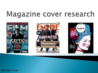
3. Empire magazine is owned by the Bauer publishing group.
Bauer is the biggest privately owned publishing company in
Europe, with it publishing in Spain, France, Portugal and the
United Kingdom. Bauer was founded in 1875.
It employs over 6,600 employees and has an annual turnover
of 1.7 billion Euros.
4. Little white lies is published in London by TCOLondon. Little white
lies originated from an adventure sport magazine named
‘Adrenalin’, when the magazines owner went bankrupt, a group of
friends working there looked to turn Danny Miller’s student degree
project ‘Little white lies’ into a professional, published magazine.
The magazine was founded in 2005.
5. Masthead- The font for the
masthead is the same on every
issue, however empire
regularly adapt the colour
depending on the film that is
being featured. Mostly, the text
is in red however to link it with
the ‘electric’ iron man 2 theme
they have made the font an
electric blue. By changing the
colour to match the rest of the
colour scheme, I feel that the
cover flows better and looks a
lot more natural. The masthead
spans the whole width of the
page and is always at the top
of the page.
Puff- This draws some
important information to the
audience and can be an
important selling point. The
puff usually contains
information about
something for free or an
exclusive article. The varied
font colours and size, make
it easily identifiable. The
‘stuck on’ effect also gives
the front cover a more
relaxed aesthetic, of what a
magazine should be.
Buzz words- These are also
selling points. Words such as
‘PLUS!’ and ‘Amazing’ are
short and simple but suggest
to the audience that if they
buy the magazine they will
not be disappointed, it hints
at the vast material and
exclusivity of which the
magazine contains, attracting
readers.
Barcode- It is evident that I need to
place my barcode somewhere in
the bottom right hand corner. It is
not something you want to stand
out but something that is needed, I
will ensure my barcode is as tight
to the edge of the page as
possible.
The main image is a very dominant
one and stands out the most on the
front cover, the direct mode of
address as iron man is looking
directly at the audience is effective
as it makes the whole cover more
personal to the audience. The
enhanced colours makes the image
‘pop’ and I have realised that having
the ‘p’ covered by the image is
typical of ‘Empire magazine’.
Strapline- The strapline of this cover displays varied font colours,
making the important factors such as ‘George Clooney’ stand out. The
use of exclamation marks hints that the read will be exciting and is not
something you will want to miss. The positioning of the strapline above
the masthead makes it stand out a lot.
6. Little white lies, takes the opposite approach to Empire and strives for it’s covers to
look as simple as possible. Unlike Empire, there is very little variation in design,
aesthetics of the central image and fonts used. The content within the magazine is
also less varied, with one film taking the spotlight and featuring throughout the
whole magazine.
While Empire look to create a front cover with a perfectly airbrushed image to
achieve a Hollywood effect, Little white lies purposely make use of hand drawn
images in order to draw the readers attention to the independent aspect of the
magazine and the roots of the company. Little white lies covers are so easily
identifiable and this is what makes them so successful. The Little white lies covers
are far less integrated than Empire’s and the title stands out from the main image
as it doesn’t look like it belongs there. I think people like the Little white lies covers
because it suggests that the magazine is all about the roots of film, they like the
fact that the magazine recognise that they are not something more spectacular and
Hollywood like than they are.
7. Tagline- This is mainly always placed at the top of
the magazine, above the title and plays a major
role in pulling readers in, as it lets them know
what the magazine will mostly contain within a
short sentence.
Date ad price-To ensure my cover looks as
much like the real thing, I will ensure that my
date and price is placed in the exact same
place, between the ‘M’ as this is where it is
always positioned.
Main image- The main image is usually of
the main actor, of whom is usually well
known and famous. The image is usually
edited and airbrushed to create a perfectly,
clean image which matches the Hollywood
aesthetic.
Website- The web
address is always
placed in this position
and with the internet
dominating everything,
it is essential that the
audience can easily
locate the web address
and view the magazine
and other features
through the desired
internet.
Masthead- Bold as possible and is
easily identifiable. The masthead is
always the same to allow existing
fans and readers to be able to
recognise the magazine. ‘Empire’
has such a big reputation that it is
essential that people can easily see
the name.
8. Cover line- These highlight what will be the main feature in the magazine and
can sometimes be the make or break as to whether someone buys the
magazine or not. There are usually several cover lines on empires covers to
highlight to the reader how much content they will miss out on if they do not
read and buy the magazine.
Tagline- encourages people to buy the magazine
and makes the feature sound a lot more excitable.
9. Barcode- Every cover must have a
barcode in order to be able to sell
the issue. I will place my barcode
in the same place as the barcode
shown, as it is out of the way and
not intrusive of the cover.
Puff- This adds another layer to the cover which makes it
clearly identifiable. It usually contains something short but
also encourages the reader. It usually includes something
about an exclusive etc. To make the reader feel as if they
will miss out if they do not purchase the magazine.
10. After researching and analysing examples of real life
magazine covers, I have decided that I will look to produce a
magazine front cover in the style of ‘Empire’. I enjoy the
‘busy’ looking covers of Empire and feel that I am best suited
to produce a front cover in the that style. Although Little
White lies is a lot more simple looking, I feel that the more
action packed cover of Empire will be better suited to my
teenage target audience. I feel that the conventions that
Empire front covers include and Little white lies do not, such
as the puff, strap line, plug etc. Are essential in creating a
professional looking magazine front cover.